Dear Amigos,
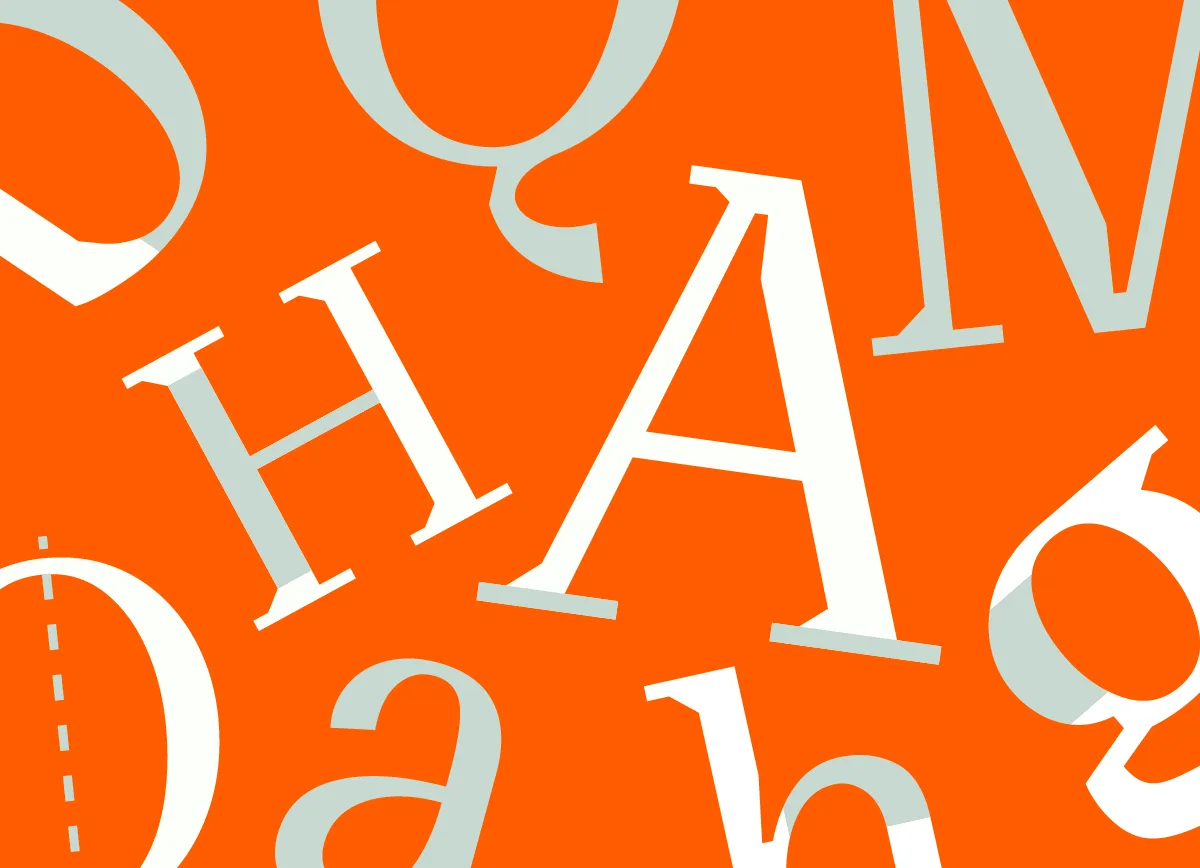
As the world prepares for the 97th Academy Awards, we too are gearing up to celebrate this iconic event. We are fascinated by every small detail that brings a movie to life. Typography and the art of title design are among those details that surprise us every year. Due to this not-so-secret passion, we’ve created a shortlist of some of the wonders found in this years nominated works. Our favorite movie titles and the hidden stories behind them. Discover how typography stole the spotlight in the big screen.
The titles for Wicked and Nosferatu created by Teddy Blanks
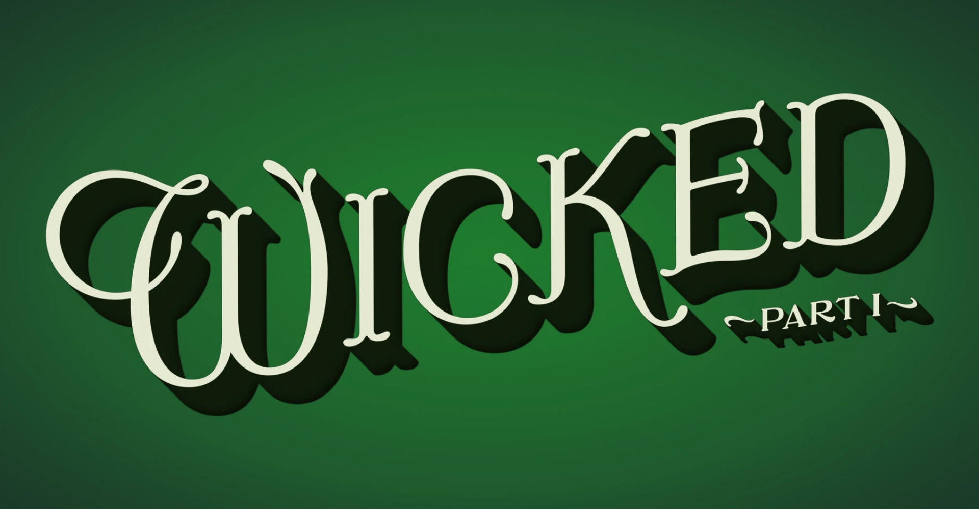
Image credits: Universal Pictures
It’s not a common achievement to design the titles for two Oscar-nominated films, but for Teddy Blanks, it’s not as bizarre. Collaborating with huge names such as Greta Gerwig, Ben Stiller and Ari Aster, Blanks manages a directory of amazing film titles through his work at CHIPS, the New York-based graphic design studio he co-founded with Dan Shields and Adam Squires.
The lettering from L. Frank Baum’s first Oz book inspired the opening title for Wicked, a careful hand-made work that sprouted the audience with fairy-tale nostalgia.
Nosferatu brought an entirely different vibe to the screen, a gothic script that welcomed viewers into the haunting world of the movie. The work feels like it was made with a dip pen, a tool that traces back to Romain Britain. Dip pens require the user to constantly refill the ink from a bottle to continue working and they were the main writing instrument used in the 19th century. Germany, where the story of Nosferatu takes place, had a few outstanding dip pens manufacturers arount the 1800’s such as Heintze & Blanckertz and Soennecken.
Blanks worked closely with Robert Eggers, who predicts the designer to become one of the all-time greats when it comes to title design.
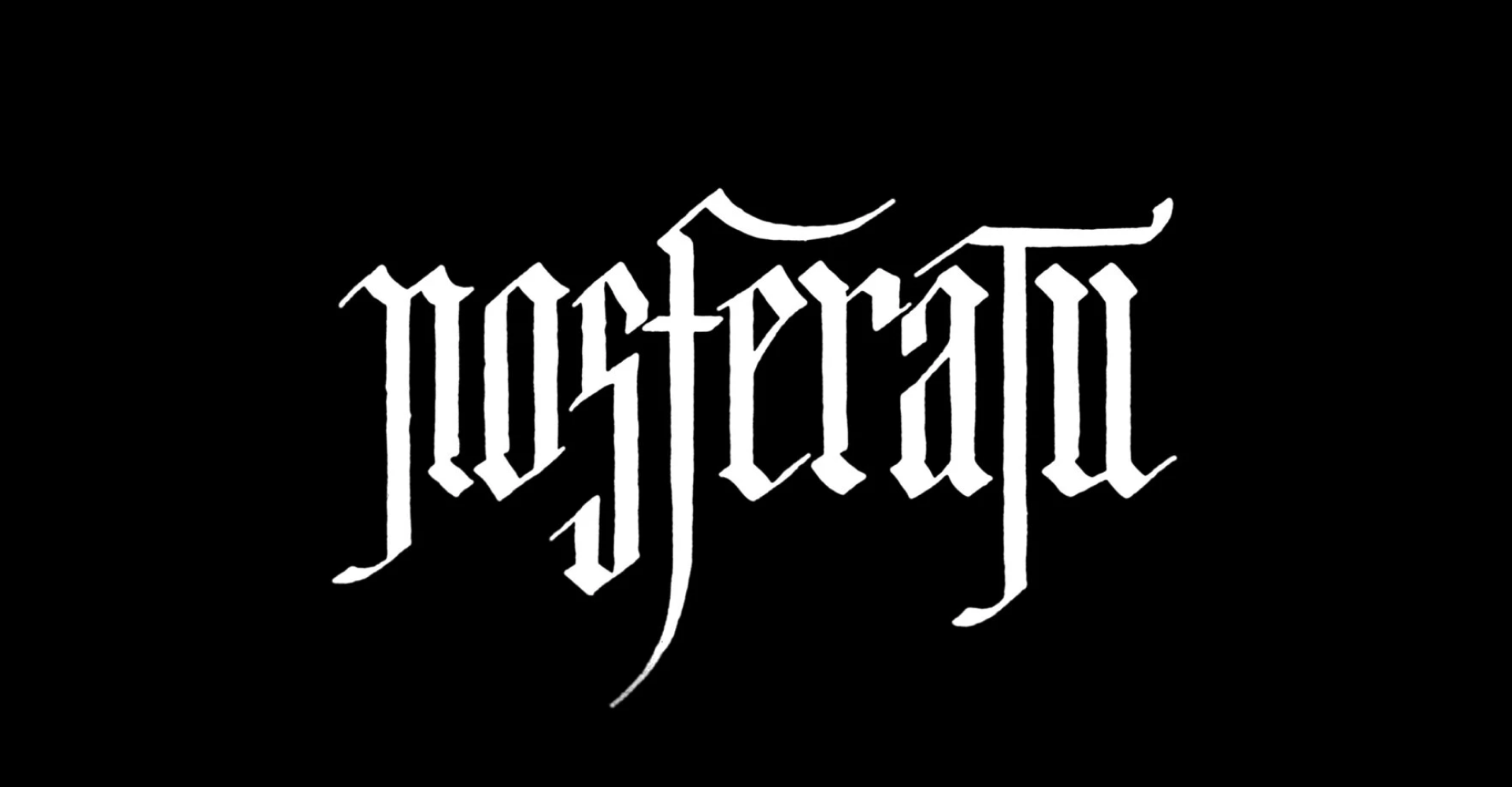
Image credits: Focus Features
The upfront branding from The Substance
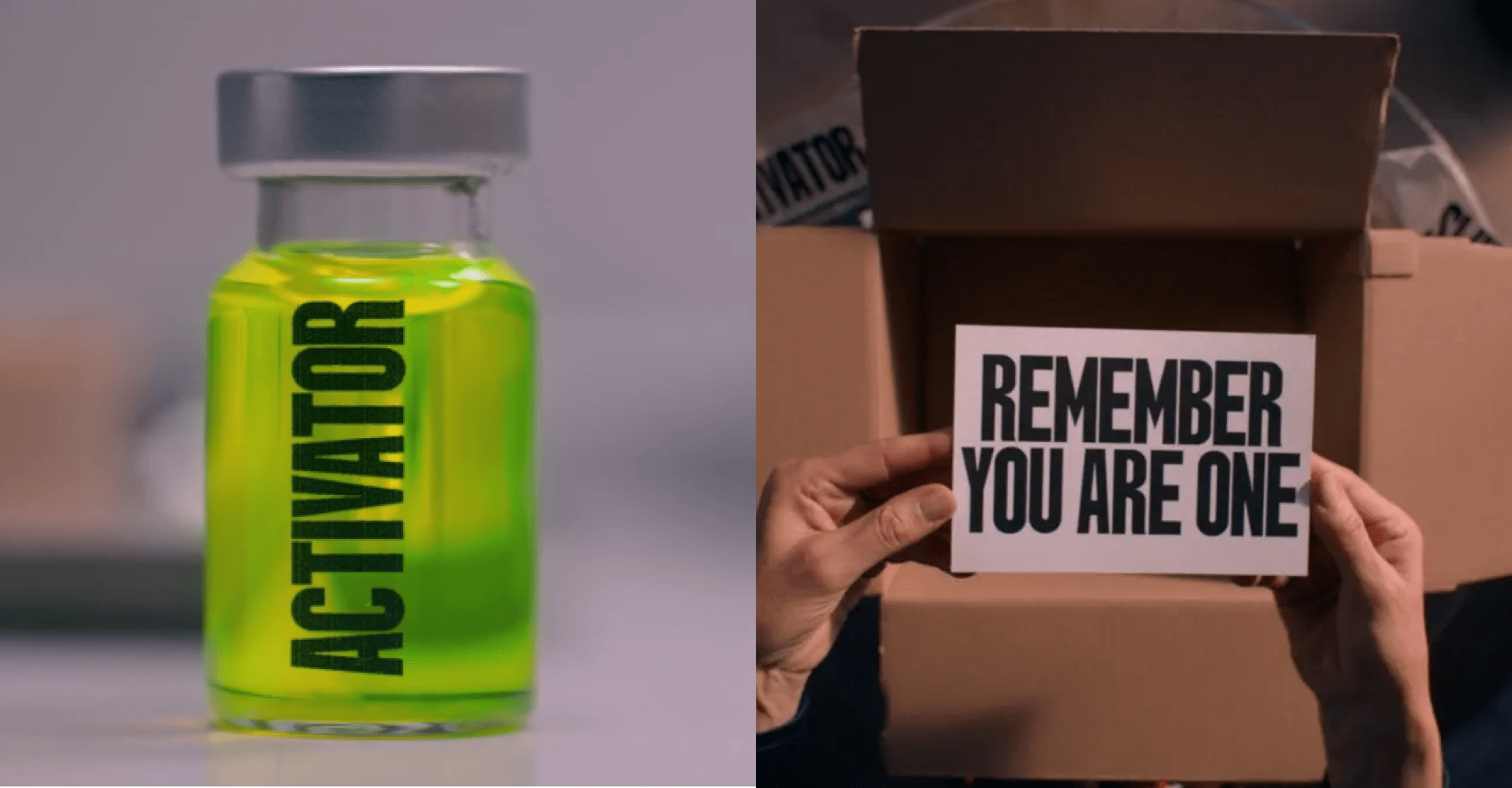
Image credits: MUBI
While ruthless and shocking, there’s a lot of scary relatability you can find inside The Substance. One of these aspects is the use of typography and branding, developed by Fugu Productions, a title and motion designed studio located in Paris, France.
The touchpoints displayed in the movie create a sense of urgency. It’s like the graphic translation of screaming into your face. While clean and minimalistic, the narrow, strong type conveys an authoritarian tone. A sort of aesthetic uneasyness.
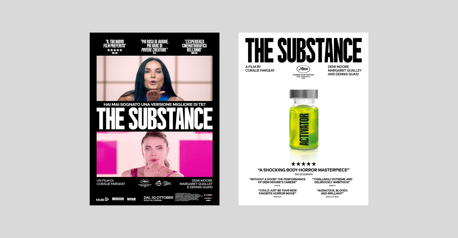
Image credits: MUBI
The film does a lot of visual recalling to the 80’s. We can notice that trough the classic aerobics class set and costumes. In terms of typography, this decade featured a lot of bold, condensed sans-serif type over minimalistic backgrounds. Some examples can be found in Volkswagen printed advertisements from the 80’s, the Motorcycle Industry Council Inc. ad campaign (Futura Extra Bold Condensed) and the Akira logo (Schmalfette Grotesk).
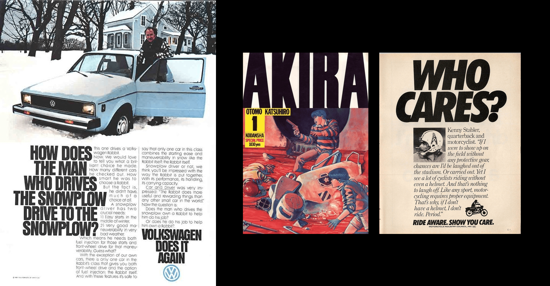
Image credits: Volkswagen / The Motorcycle Industry Council Inc. ad campaign / The Akira logo
We can see that trends are cyclical, since condensed type is becoming a preferred choice by current brands. Some of the reasoning behind this shift includes the need to stand out in overcrowded markets, taking a more agressive and vibrant approach to the way we present products. Also, narrow typefaces take up more space in vertical formats, prioritizing their visual positioning.
What are some brands that communicate similarily to The Substance in today’s market-place? Supreme comes to mind, as well as Nike’s use of typography.
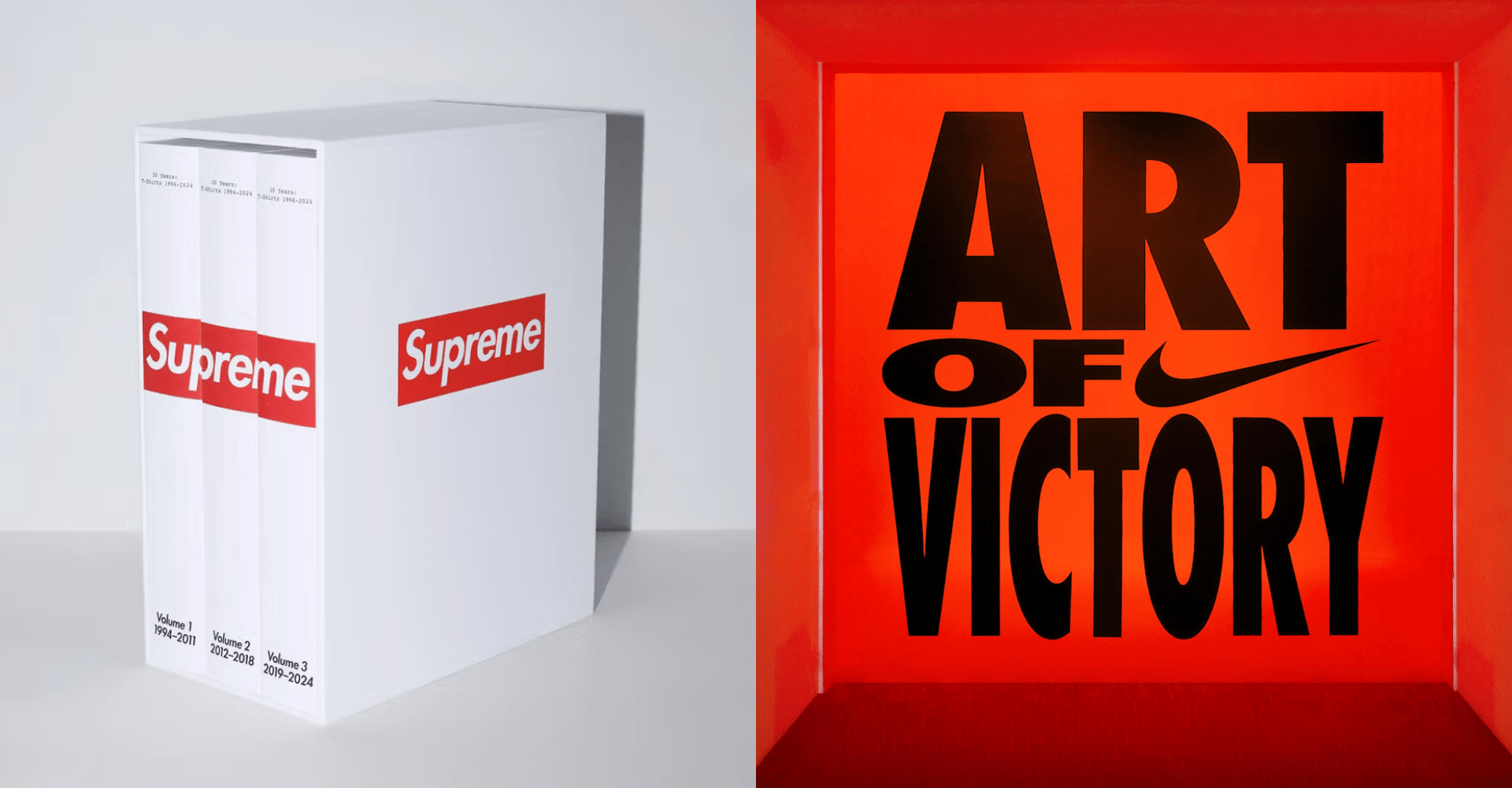
Image credits: Supreme 30 Years: T-shirts 1994-2024 book / Porto Rocha’s visual system for Nike’s “Art of Victory”
The experimental layouts of The Brutalist
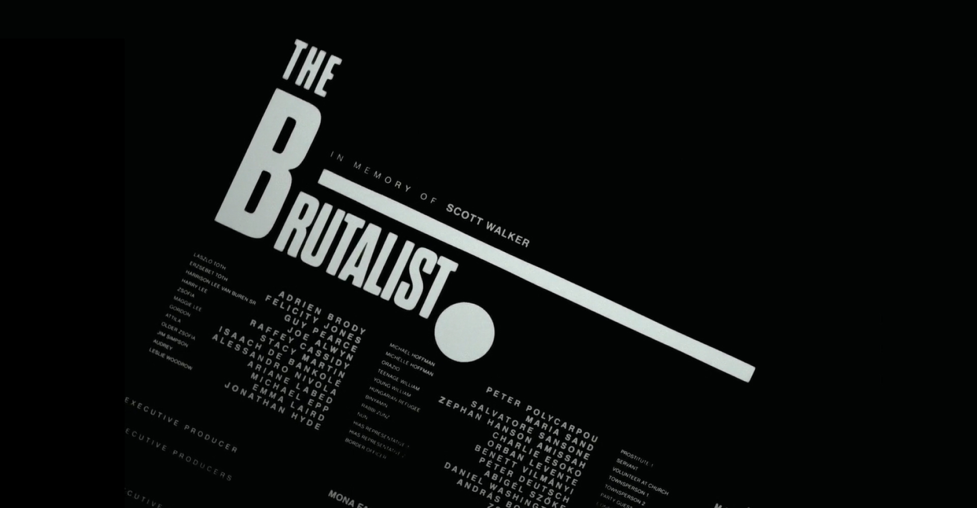
Image credits: A24
Sebastian Pardo was in charge of the title sequences for The Brutalist, a special chance to play around the elements of 20th-century design. Specially the influence generated by the Bauhaus movement, a pillar of graphic design history.
One of the main aspects from this period that made it into the movie was the experimental layouts, an often overlooked aspect of design that became a space of expression in the Bauhaus. Complex grids and text displays that followed different geometric shapes were common practices in their posters. As an example, the Bauhaus Weimar Exhibition poster by Joost Schmidt in 1923.
From the poster to the final credits of The Brutalist, we can see the use of diagonal layouts supported by lines that break and create spaces.
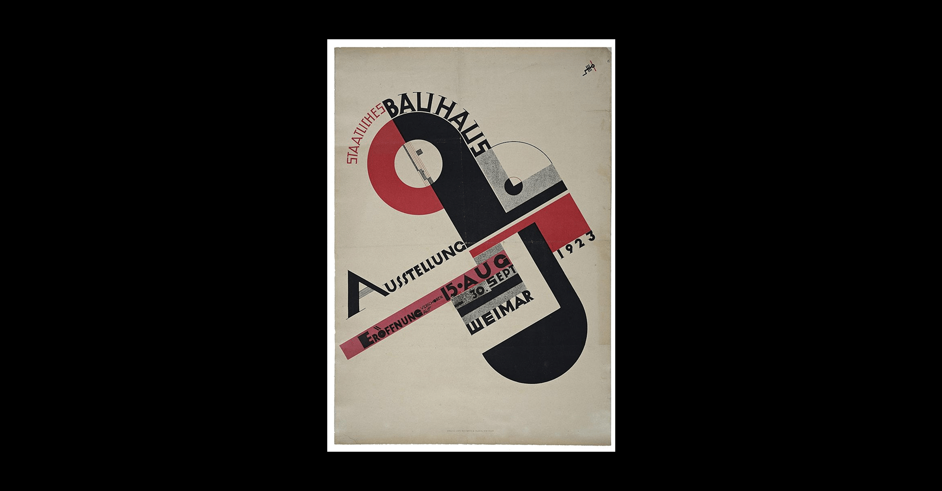
Image credits: Bauhaus Weimar Exhibition poster by Joost Schmidt in 1923.
László Moholy-Nagy (who shares his first name with the main character of the film) was one of the teachers at the Bauhaus school of art. He advocated for the unhibited use of all linear directions, as well as the variation of typefaces, sizes, shapes and colors. His design vision was applied throughout publications and books released by the Bauhaus.
Herbert Bayer, one of his students, was trained in a variety of disciplines that converged in great developments such as the Universal alphabet. His typographic treatment included both vertical and horizontal alignments, the use of text as dividers of space and intentional alteration of sizes and weights.
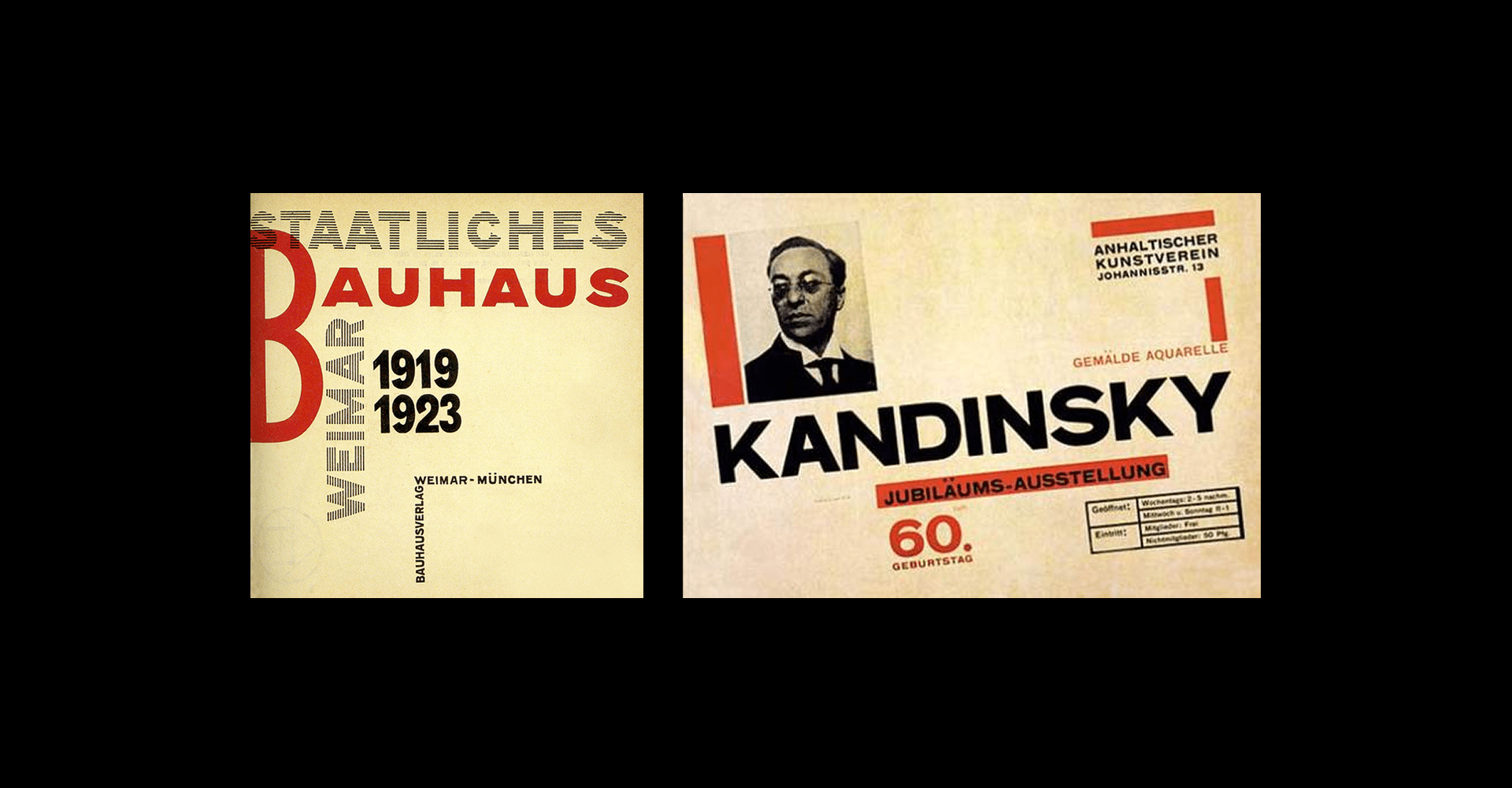
Image credits: László Moholy-Nagy, title page for Staatliches Bauhaus in Weimar 1919-1923 / Exhibition poster for Kandinsky’s 60th birthday. 1926.
The typographic contrast was a huge aspect for the Brutalist. The smaller glyphs variate in spacing and style, becoming almost ornamental to the big, bold and condensed Dharma Ghotic that displays the title of the film, a type family designed by Ryoichi Tsunekawa for Dharma Type.
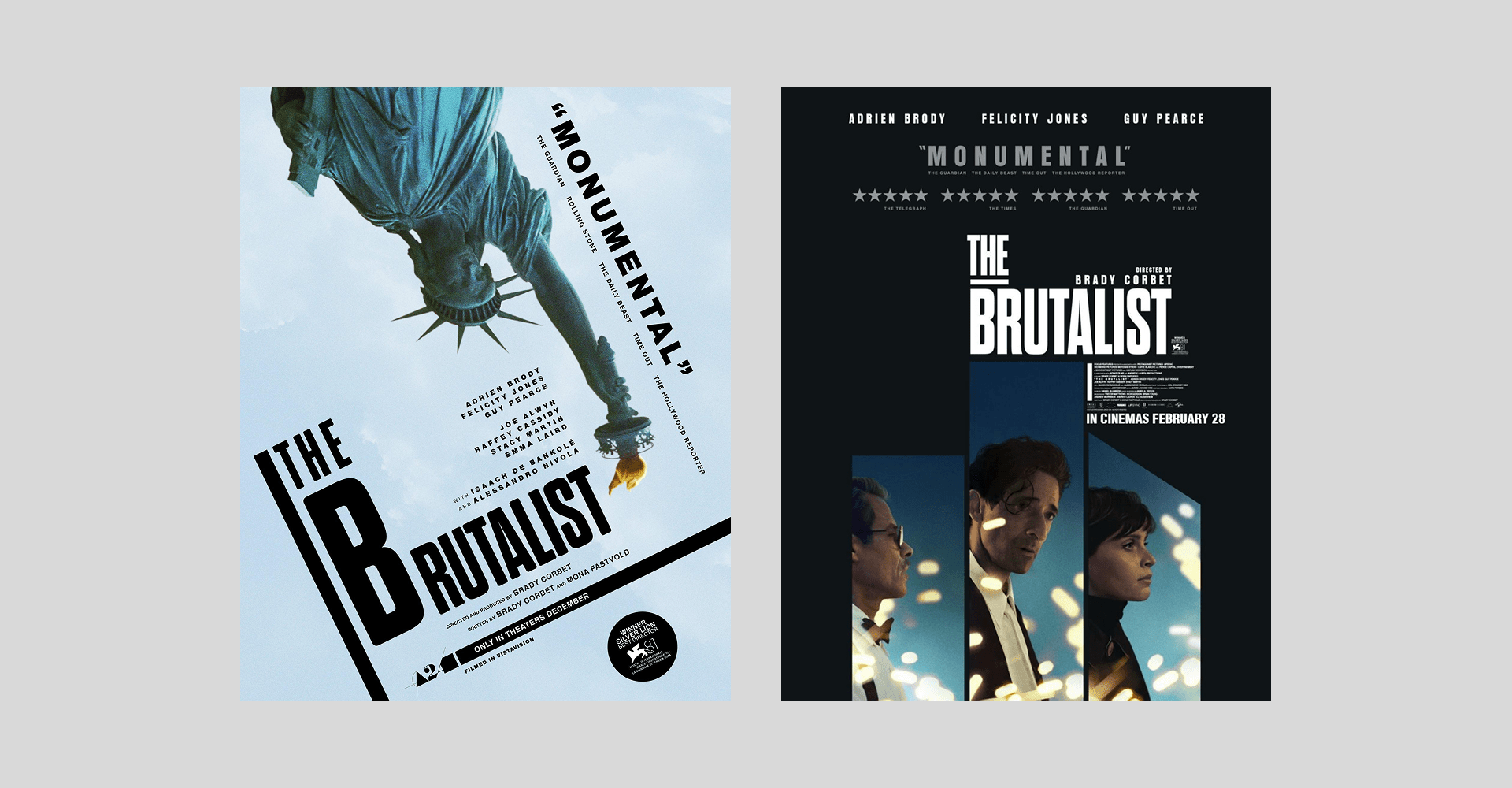
Image credits: A24
Sean Baker is a one-font type of director
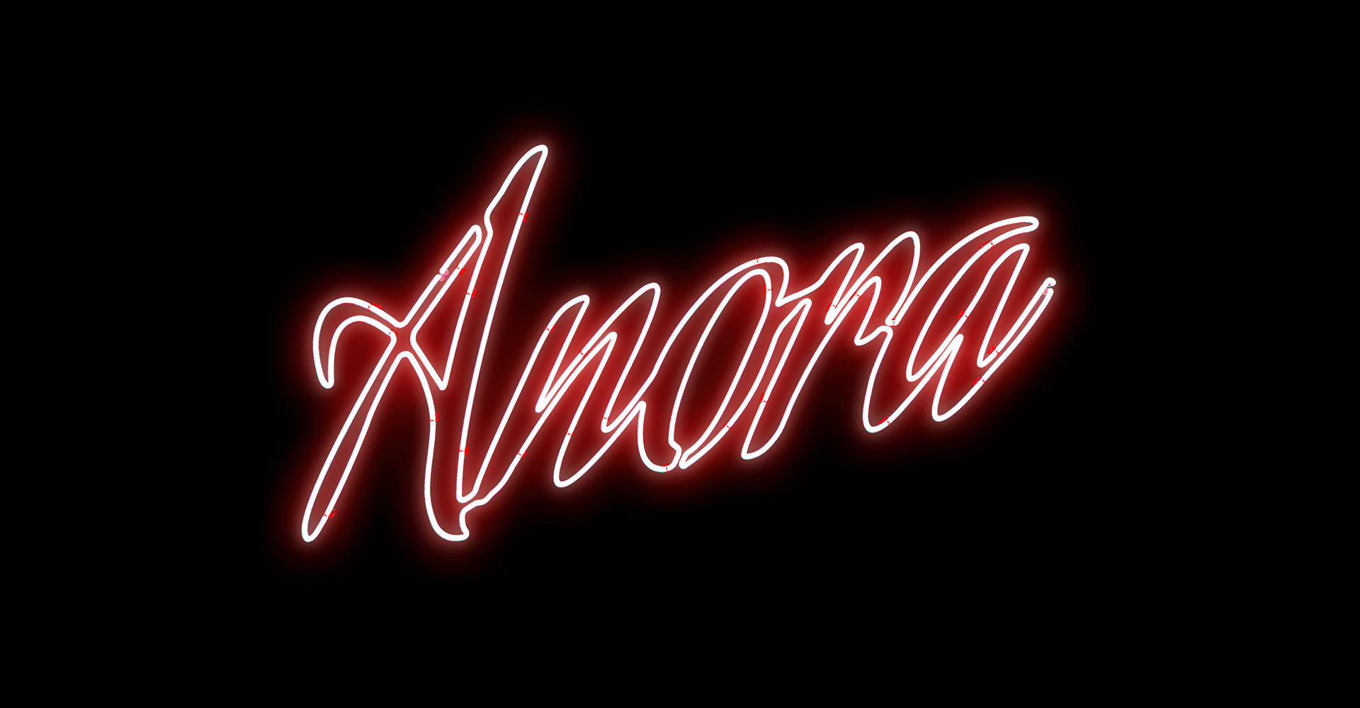
Image credits: NEON
Before starting to make any movie, there’s one thing that Sean Baker has already covered: the title font. While you might not notice it too easily since every poster has a personality of his own, they all share the protagonic use of Aguafina Script Pro.
Sudtipos is an Argentina-based graphic design collective founded in 2002. They have provided type for brands like The New York Times, Coca-Cola and Levi’s. There are over 250 fonts available in their catalogue, receiving awards from the Type Directors Club, Communication Arts, Tipos Latinos, and others.
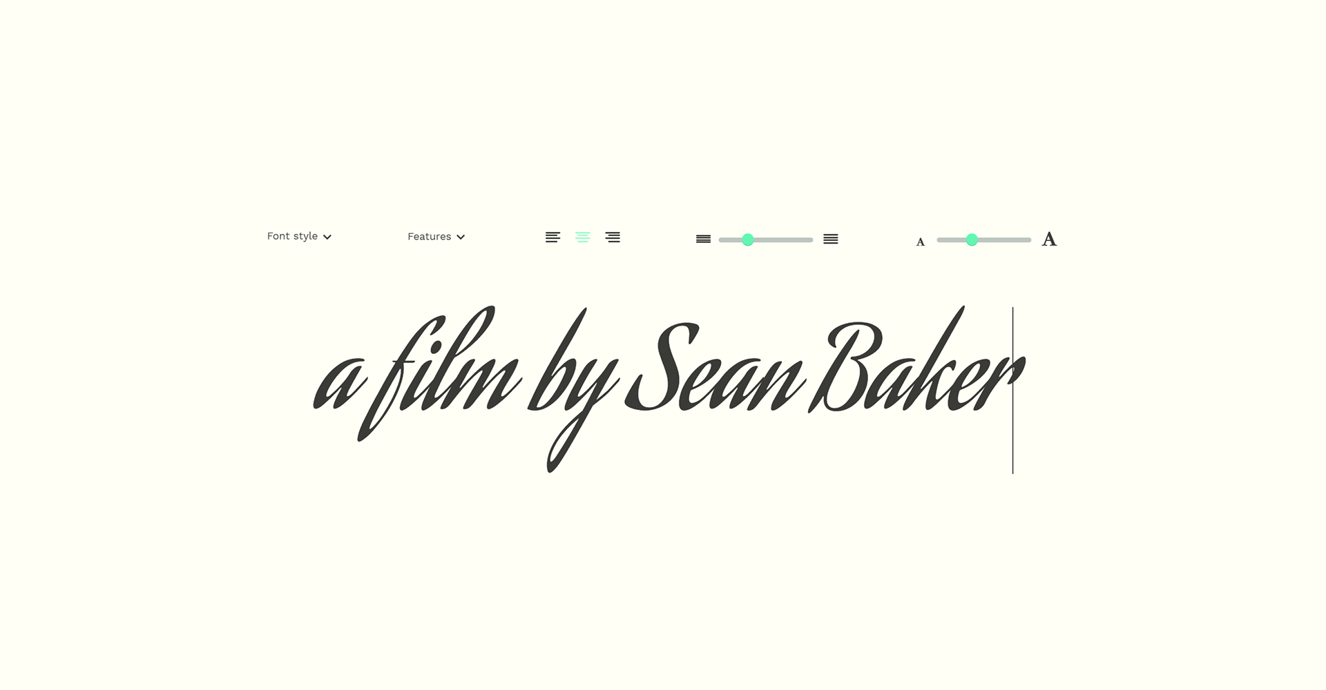
Image credits: Sudtipos
One of the fonts in their collection is Aguafina Script Pro, designed by Alejandro Paul and Angel Koziupa. It offers a striking, balanced elegance, where the characters flow into each other. Its singular style offers a compact lowercase and elongated ascenders/descenders that ensure readability. If you’re interested in purchasing the font, check this page.
Aguafina first appeared in the Sean Baker universe with Tangerine (2015). Back then, he didn’t have a graphic design team, and since he was the editor, he chose the font and designed the opening sequence himself. The irony of contrasting the raw nature of his fims with a sophisticated script font fueled the decision.
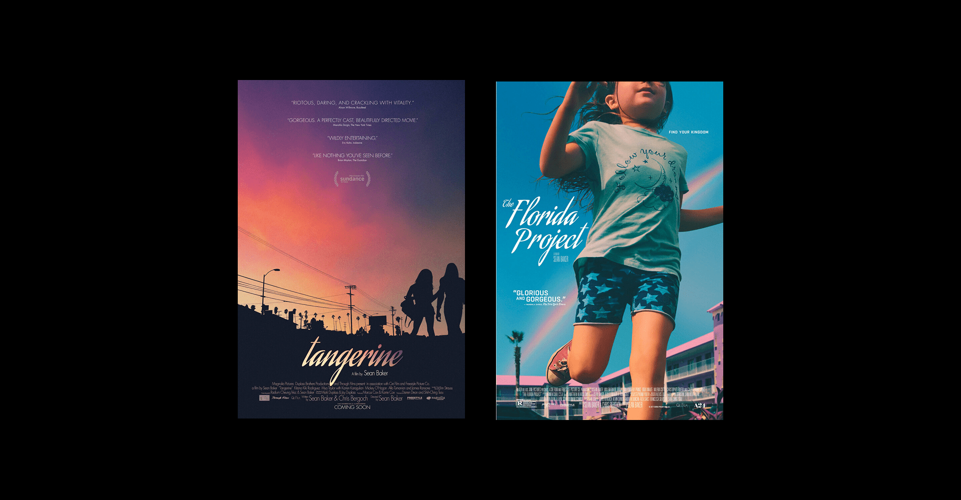
Image credits: Posters for Tangerine and The Florida Project
To mantain consistency between the credits and the advertisement, Baker has worked with the design teams of different distributors to always keep the font. Each studio has created outstanding posters that differentiate themselves while keeping a similar vibe. For Anora (2024), the designers worked around Aguafina to create a charming neon sign effect. You can read the full interview about Sean Baker and his journey with this singular font in this article by MUBI.
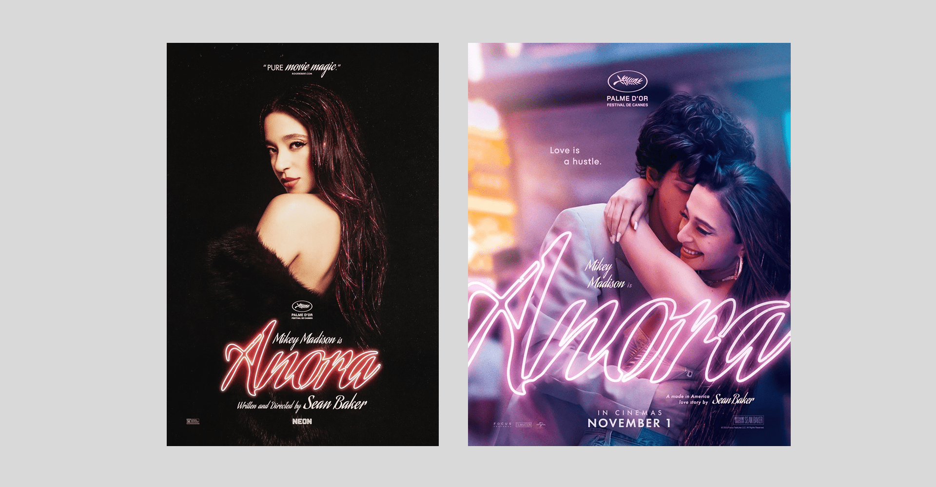
Image credits: NEON
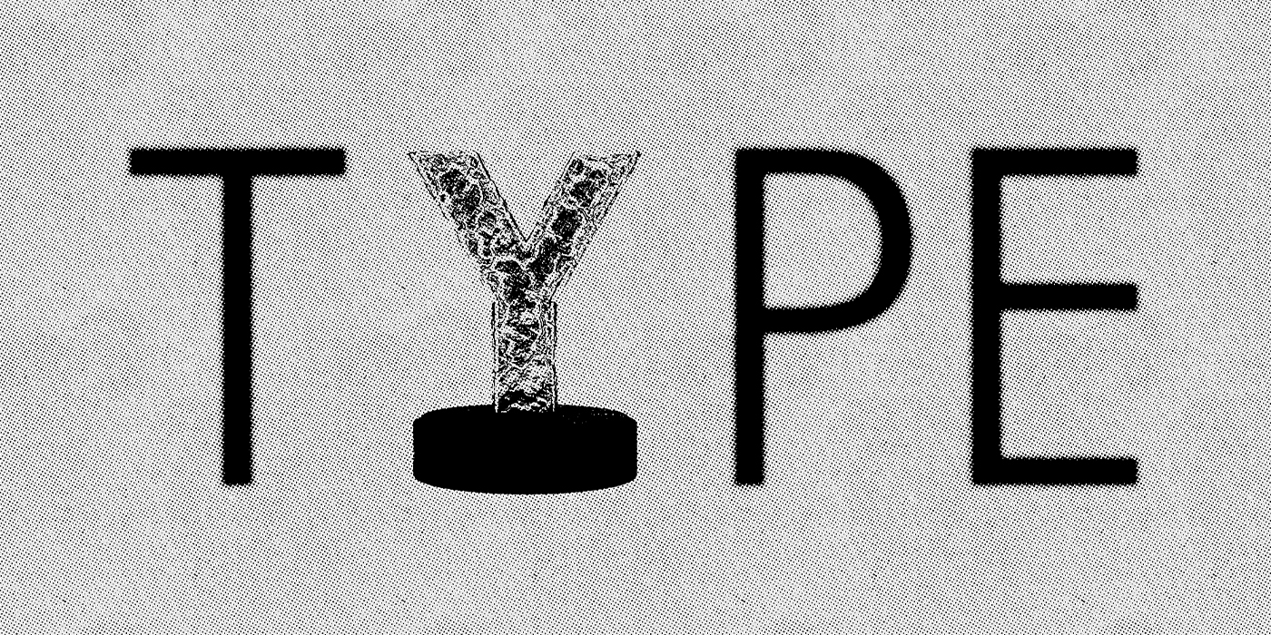
Movie titles are sometimes as iconic as the movie they are representing. Sometimes, even more than the movie itself. In any case, today we praise all those talented type, graphic designers, and art directors. Creators of iconic lettering and perfectly crafted typography, set in a 16:9 format. Today, we celebrate you and your creative teams. We hope you enjoy this shortlist amigos, and that it serves as inspiration for the community.
Yours truly,
A Type of Ari
Since you are really into branding, you might be interested in these other articles and resources:
Futura Typeface: Top 4 Reasons Why It Shaped History
The Manifesto Every Designer Should Read: First Things First