
Dear Amigos,
EB Garamond is currently the most popular digital reinterpretation of Claude Garamond’s typographic work from the 16th century. While standing as one of the most used typefaces today, there’s a long history of Garamond revivals. What versions of this typeface are out there? How can we recognize them? What were the characteristics of Garamond’s original work? Let’s deep dive into one of the most popular fonts in the world.
The begginings of the Garamond we know today

Claude Garamond, portrait by Léonard Gaultier, 1582
On the topic of historical fonts, Garamond can be called one of the G.O.A.T’s (greatest of all time). Born in Paris in 1510, Claude Garamond was a skilled type designer with great influence in 16th century France. However, let down by the profits he made in comparison with the publishers, he wanted to take over the entire printing process by becoming a punch-cutter, meaning he engraved individual letters into steel for typesetting printing. He’s registered as one of the first people offering his punch-cutting services independently instead of being tied to a specific printer. That’s why his work is considered a starting point for commercial printing.
Although we relate Garamond to a single family, each reinterpretation condenses the characteristics of many fonts created by Claude. His work was influenced by the cuts of Francesco Griffo for Aldus Manutius. Back then, the objective behind punch-cutting was to transition from calligraphy to typography, taking the most refined forms of handwriting and standarizing them into glyphs that could be used in mass printing. That’s how the serif style was born.
How was Garamond distributed?

Claude Garamond’s original punches, stored in the Plantin-Moretus Museum.
By seeing how prevalent Garamond’s work still is in culture, it’s surprising that his creations were distributed after his death in 1561. His widow was in charge of selling his punches, ending up in various places across France and crossing over to Holland, Italy and Germany. Through this dispersion, the quality of his typefaces was quickly recognized, and they became a blueprint for the creation of many typographic works for hundreds of years.
Because Garamond became so popular, many type designers worked to capture its style in complete font families. This resulted in numerous reinterpretations, each offering a unique tribute to Claude Garamond’s craftsmanship. Even 500 years later, many of these versions are available digitally, ensuring Garamond remains culturally significant and a competitive choice in today’s graphic design landscape.
What Sets Garamond Apart?
1. Balanced proportion between uppercase and lowercase letters

Claude Garamond meticulously crafted his letterforms to achieve a visual equilibrium. The relative sizes of his uppercase and lowercase letters work together harmoniously, creating a sense of refined balance.
2. Delicate strokes creating subtle contrasts between thick and thin parts of each character

Garamond’s designs exhibit a subtle yet sophisticated contrast between the thick and thin strokes within each letter. This delicate variation, a hallmark of Renaissance typography, adds a sense of refinement and visual interest without being overly pronounced.
3. Distinctive details

- A small “eye” in the lowercase “e”: The lowercase “e” in Garamond’s typefaces features a small, often slightly angled “eye,” the enclosed space within the loop. This detail, though subtle, adds a touch of character and helps to differentiate Garamond from other typefaces.
- A distinctive curve in the lowercase “a”: The lowercase “a” is characterized by a unique curve in its bowl, contributing to its distinctive and recognizable shape. This subtle curve adds a touch of calligraphic flair and enhances the overall aesthetic appeal of the letterform.
- An extended leg on capital “Q” and “R”: The capital “Q” and “R” in Garamond’s designs feature an extended, often slightly curved, leg. This characteristic detail adds a touch of elegance and visual interest, making these letters stand out while maintaining overall harmony within the text.
4. High readability, particularly in large blocks of text:

The carefully designed letterforms, combined with the balanced proportions and subtle stroke contrasts, contribute to the exceptional readability of Garamond’s typefaces. This makes them particularly well-suited for setting large blocks of text, such as those found in books and other lengthy publications. You probably already had the pleasure of loosing yourself inside a book printed in Garamond. One popular example that comes to mind is the Harry Potter series.
Download EB Garamond: The Open-Source Revival of a Classic Typeface

Designed by Georg Duffner and Octavio Pardo, EB Garamond is based on the “Berner specimen”, a 1592 print sample created by Conrad Berner, one of the original buyers of Garamond’s punches after his death. Conrad took over the Egenolff print office from his father-in-law Christian Egenolff. This source material is where the font gets its name, EB being “Egenolff-Berner”.
Released under the SIL Open Font License, it’s freely accessible. This typeface retains Garamond’s classic features: delicate serifs, a calligraphic feel, and high readability, and benefits from ongoing development. You can download it here.
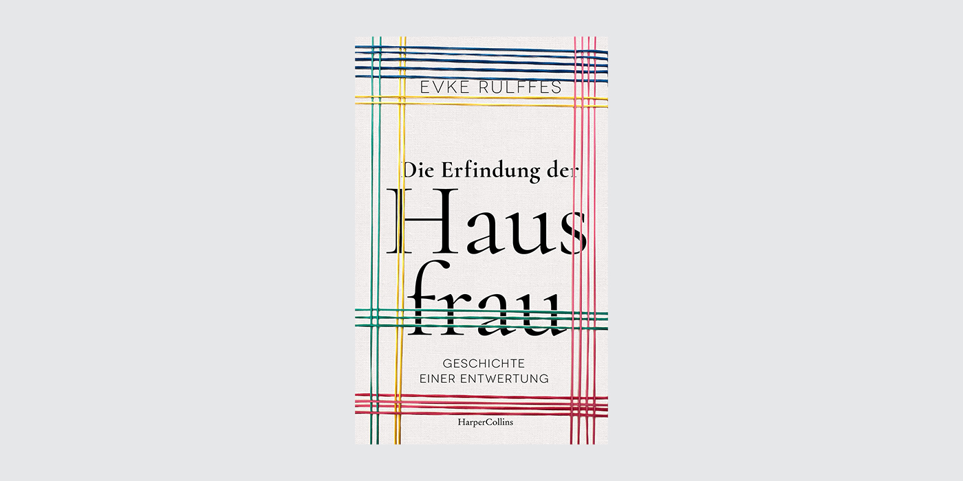
One use of EB Garamond we want to highlight is the Viction brand identity by Rice Studios. Here, the typeface works in contrast with the clean, sans-serif logo. It adapts across touchpoints, working in large bodies of text as well as expressive titles.

What other Garamond revivals are out there?


Cormorant, designed by Christian Thalmann and released in 2011 as an open-source project, offers a unique take on the Garamond legacy. Unlike other revivals that base their forms on historical prints, Cormorant draws inspiration from the theoretical elegance of Claude Garamond’s original punches, aiming for a more idealized interpretation. You can download the font for free here.

Monotype’s Garamond design might be one of the first versions you’ll encounter in your day-to-day use, since it comes with Microsoft Office. It was originally created in 1922 by Frederic Goudy, being a replica of Jean Jannon’s typographic work. Jannon’s work is often confused with Garamond’s original typefaces, but the former’s work can be identified for its calligraphic nature. You can purchase MT Garamong here.

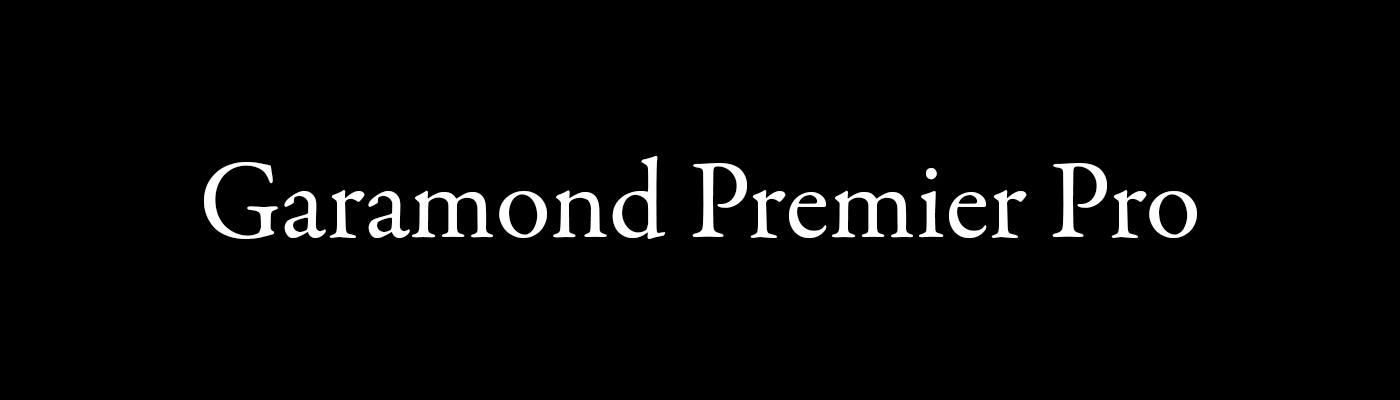
Garamond Premier Pro, designed by Robert Slimbach and released by Adobe in 2005, represents a sophisticated and comprehensive interpretation of Claude Garamond’s work. Unlike many revivals that focus on a single historical source, Slimbach’s design draws inspiration from a wide range of Renaissance printing, aiming to capture the spirit of Garamond’s era rather than a strict replication. This font is included in the Adobe Fonts subscription, you can find it here.


ITC Garamond was designed by Tony Stan and Alexander Tarbeev in 1975. Unlike revivals focused on historical accuracy, this version released by the International Typeface Corporation (ITC)is a contemporary adaptation. It emphasizes larger x-heights and shorter ascenders and descenders, giving the font a condensed look. This design choice makes it particularly well-suited for display purposes and headlines. You can buy this font here.
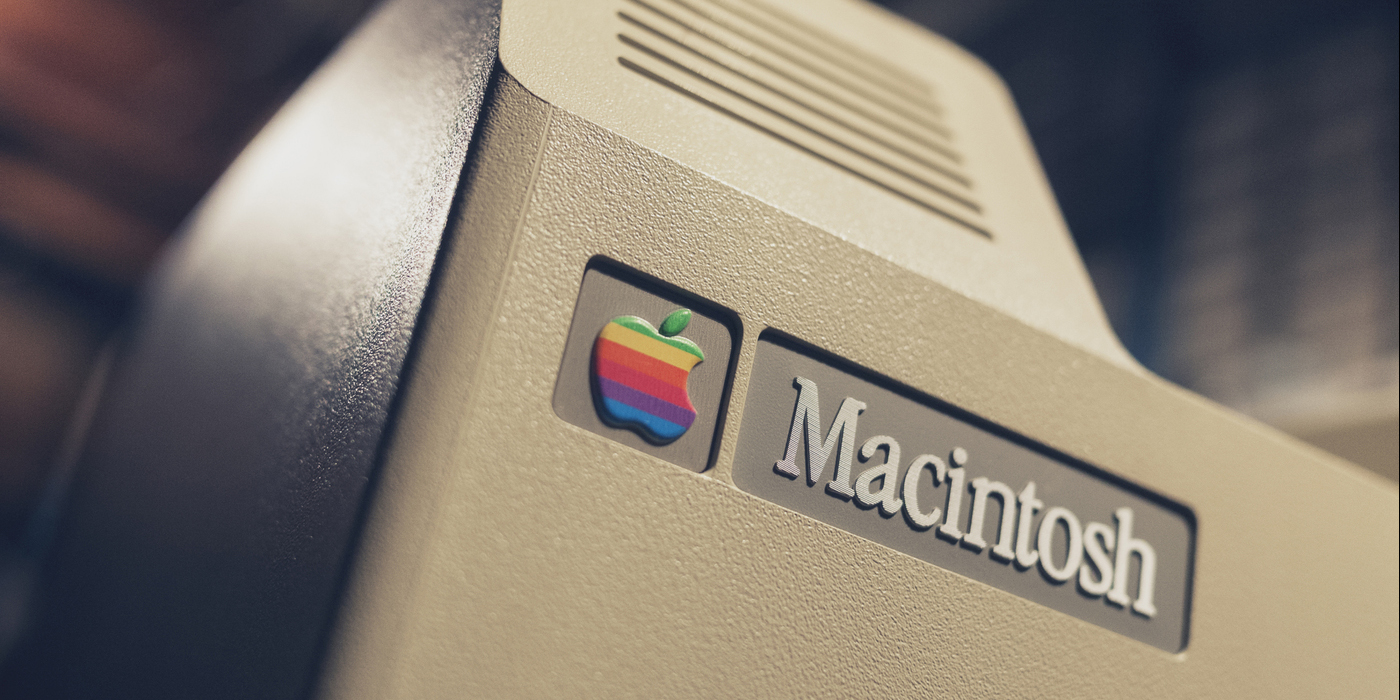
5. Apple Garamond

Unfortunately, this font is not available under any licensing, but since it was culturally relevant we’re including it anyways. Apple Garamond was a condensed variation of the ITC Garamond font. It was developed by the Bitstream typefoundry, condensing the original font to an 80%. It was set as the corporate font for apple from 1984, famously appearing in the logo of the first Macintosh, as well as in many Apple advertisements from the 80’s, being paired with Goudy Heavy, Goudy Oldstyle and Belwe.

Sabon was designed by Jan Tschichold in the late 60’s, a joint release by three type foundries: Linotype, Monotype and Stempel. It was created with practicality in mind, since it needed to fit the different equipments of all three typefoundries. That’s why the italic and bold styles take the same space as the roman style. You can purchase Sabon here.
Stanford University logo from 2005 to 2012.

Adobe Garamond, designed by Robert Slimbach, stands out as a careful digital interpretation of Claude Garamond’s roman and Robert Granjon’s italic types. Differing from other revivals that rely on later interpretations, Adobe Garamond is fixed on original sources from the 16th century, aiming for a more historically accurate representation. It’s distributed by Adobe Fonts, you can find it here.
Abercrombie & Fitch logo.
Yours truly,
Ariana Irady
Since you are really into typography, you might be interested in these other articles and resources:
Stunning Movie Titles Taking The Spotlight At This Years Oscars
Best 7 Y2K fonts filled with digital nostalgia – Free Download