Dear Amigo,
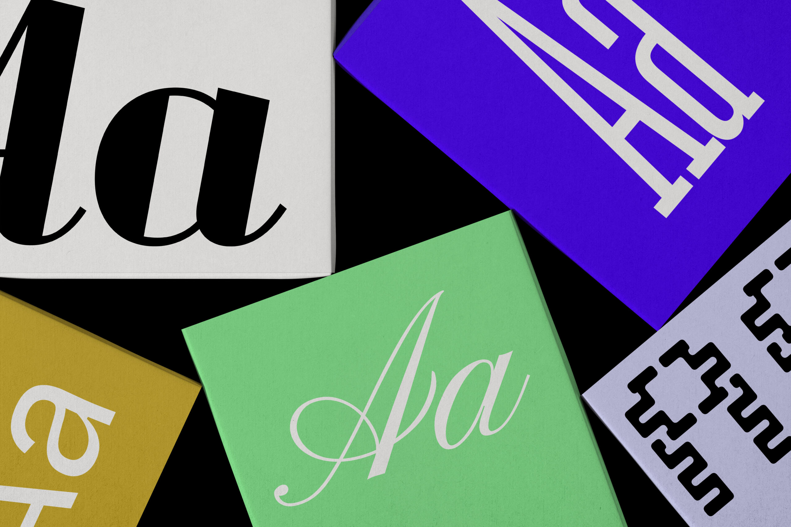
When you look closely at a typeface, you’ll discover that every character is a carefully structured and functional piece of art, made up of distinct elements we call Type Anatomy. Understanding these details is key to picking the right font for any project, or to create the perfect glyph, for a font family with high legibility. Today you’ll learn more about the Bowl and the Counter, two of these elements that work together in the composition of certain letters, and you’ll see how they give out a hand on setting the tone and feel that a typeface can have.
Bowl
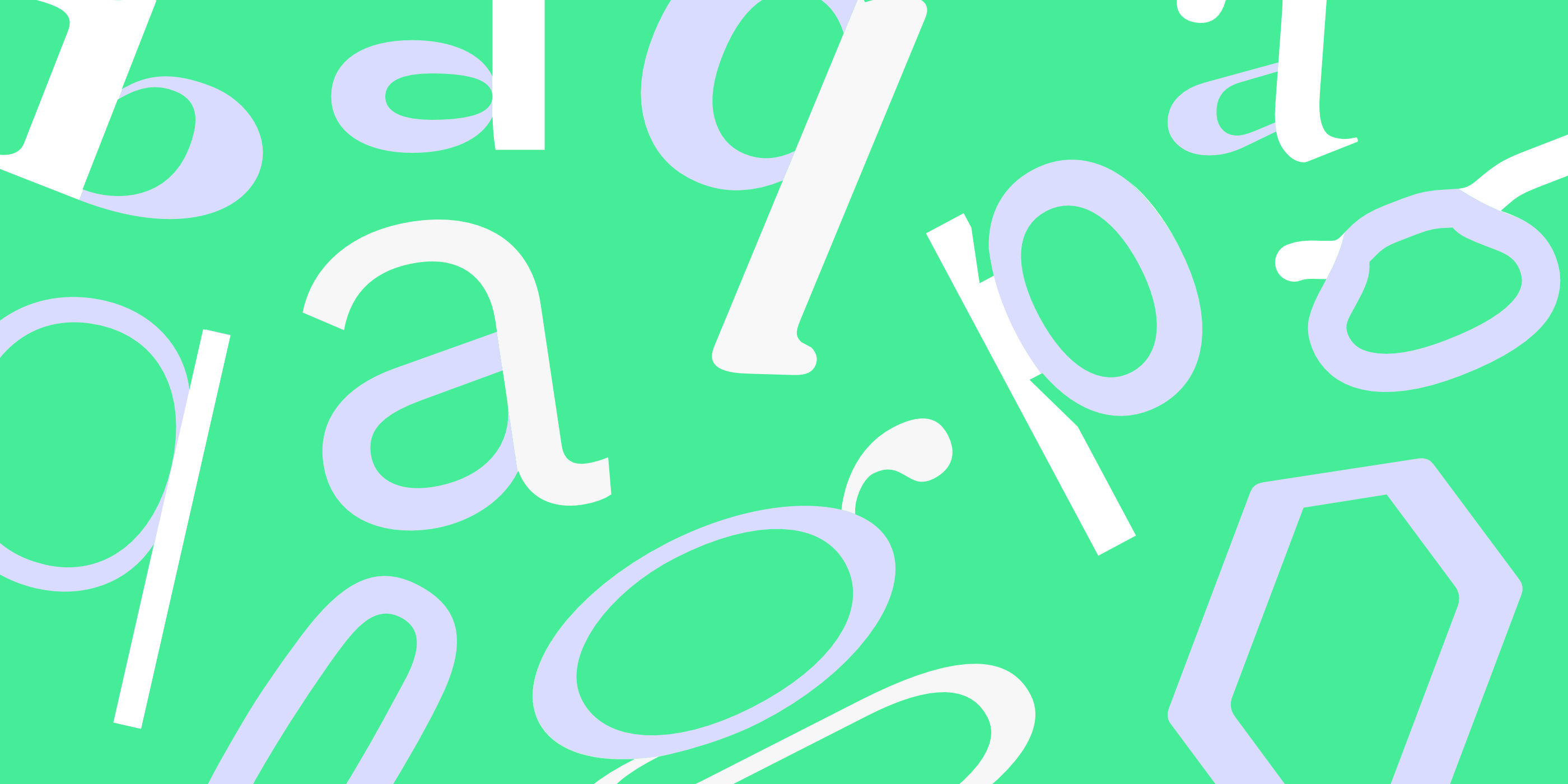
A bowl is one of the elements that compose the DNA of a typeface. This term refers to the smooth, curved stroke that forms the rounded section of letters like ‘d,’ ‘b,’ ‘o,’ ‘D,’ and ‘B,’ containing an enclosed space known as the counter, which we’ll talk about later. The way this curve is shaped, its thickness and its proportion to the counter, does a lot of heavy lifting for your design.
This directly influences the overall visual weight of the text and how open or airy a word appears, making the bowl a major factor in a font’s legibility and personality. Whether it’s thin and elegant or thick and chunky, the bowl works alongside other elements to convey emotion and function.

Counter
Like we mentioned earlier, Bowls and Counters are interconnected. In type anatomy, Counters (also called counterform or counterspace in type anatomy) are the spaces within the bowls, the negative space inside it. They can be classified in two categories:
- Closed counter: Completely enclosed, like in “o” or “b,” seen with the bowl of those letters.
- Open counter: Partially open, as in “c”.
Another term related with Open Counters is “aperture” which is the opening between an open counter and the outside of the letter, such as in letter “C” for example.
The term “Counter” comes from the traditional craft of type making, where a counterpunch was used to carve indentations into the metal punch that formed the molds for letters.

Font Recommendations for Unforgettable Bowls and Counters
Here are some recommendations, curated by our team for you to look at and see which of these fonts with eye-catching bowls and counters suit your ideas best.
1. Syne by Lucas Descroix
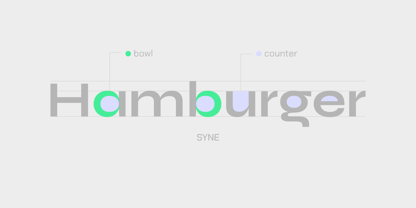
Syne is that perfect mix of modern geometric structure and unexpected Renaissance flair in its italic. If you need a font family with a Type Anatomy that’s stable yet surprising across seven different styles, this one designed by Lucas Descroix for Bonjour Monde is ideal to grab. Get it here.
2. Truculenta by Iván Castro
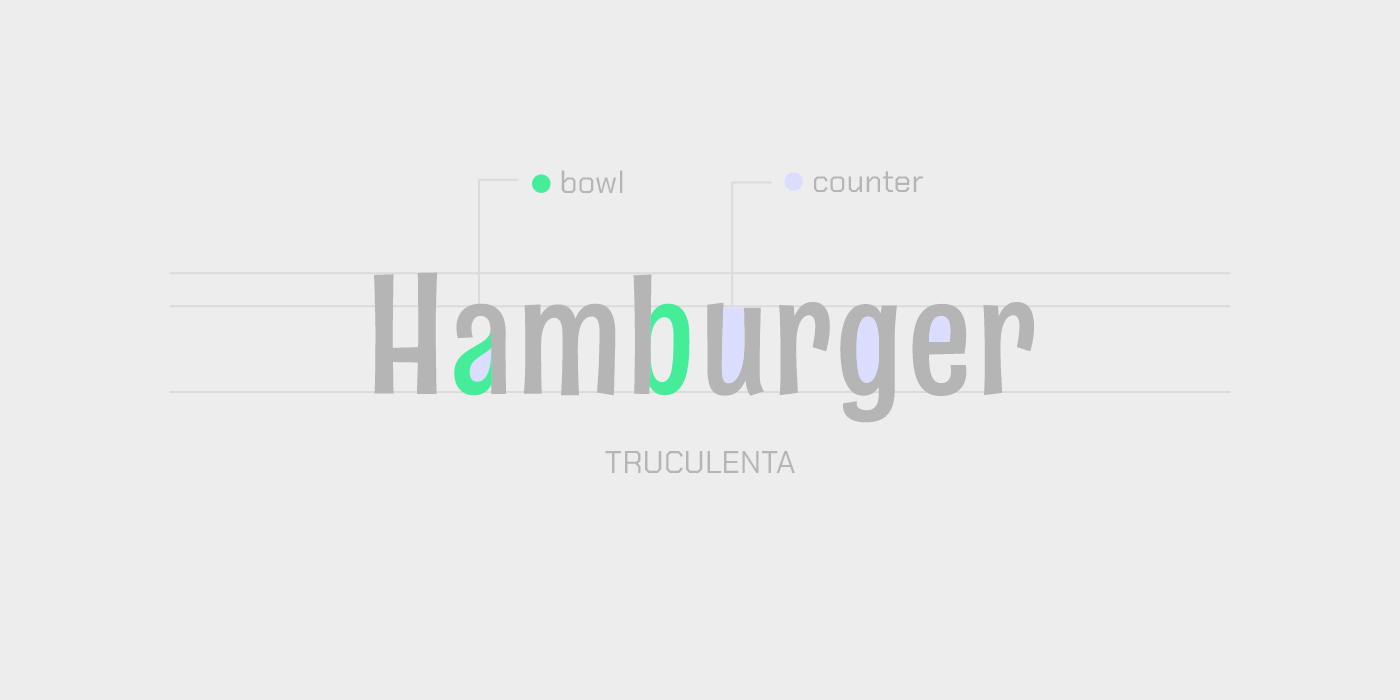
Truculenta is an irregular sans designed by Iván Castro for Omnibus Type that brings a cool, mid-century vibe with a fun, distorted twist in its type anatomy. Try the “Dirty” version when your headline needs a distinctive grotesque edge and a little character. Find it here.
3. Fraunces by Phaedra Charles & Flavia Zimbardi
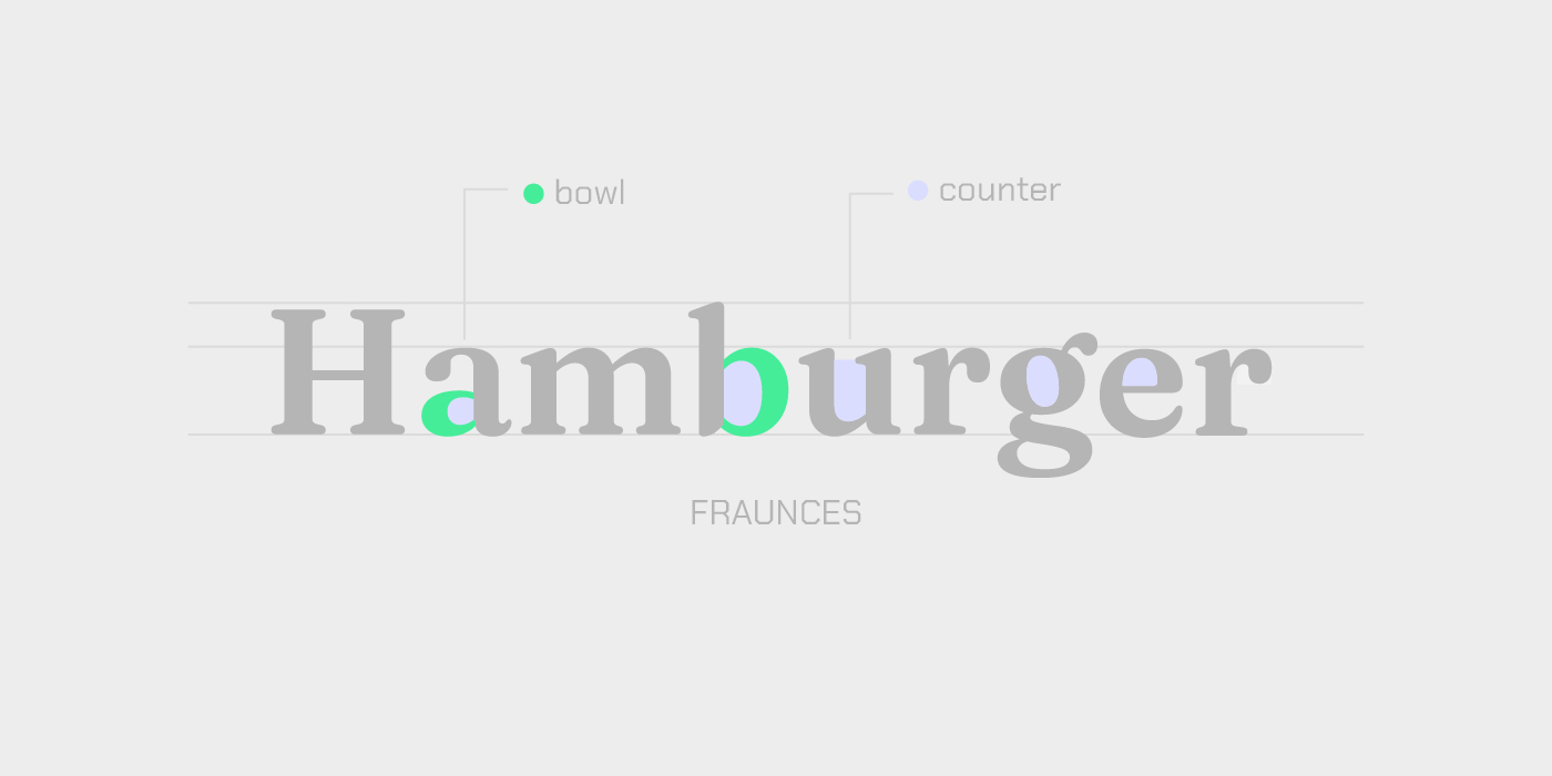
Fraunces is an Old Style soft-serif designed by Phaedra Charles and Flavia Zimbardi and has a bowl that makes it feel both classic and totally fresh. It’s perfect for creating a display type that has that warm, early 20th-century charm without looking dated. Check it out here.
4. Velvelyne by Mariel Nils and Manon Van der Borght
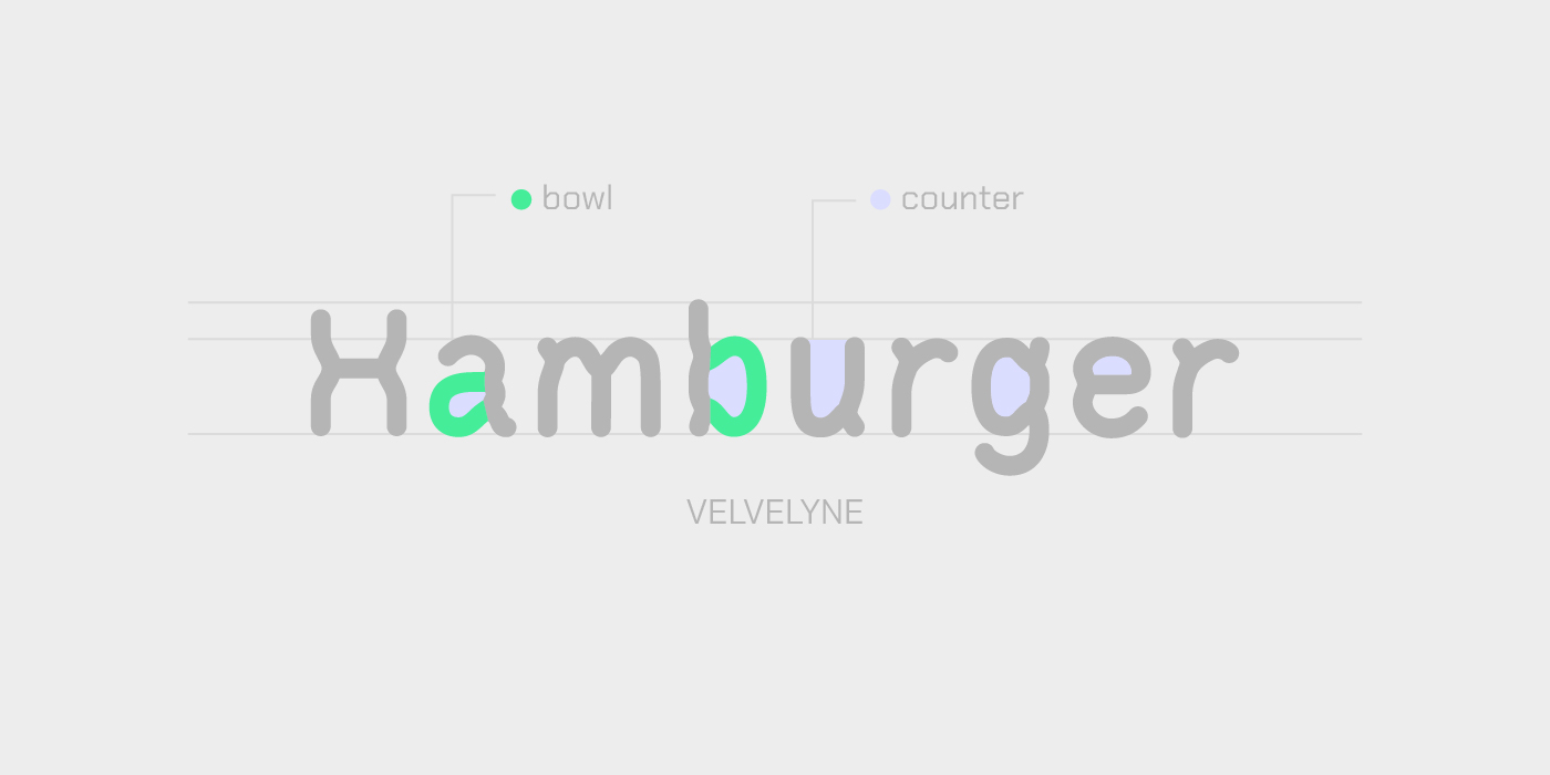
Velvelyne is a modern take that evolves from the classic Liberation Sans structure, making it a reliable, flexible choice for screen-based projects. Distributed by Velvetyne and designed by Manon Van der Borght and Mariel Nils with contributions by Raphaël Bastide and Benjamin Dumond, use this one when you need a clear, contemporary digital voice that’s available under a super friendly license. Get it now here.
5. Standard Graf by Peter Wiegel
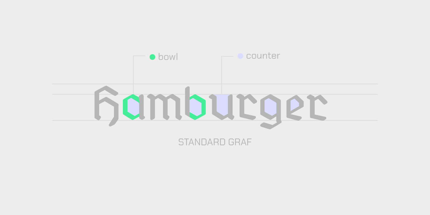
Standard Graf is a fantastic stencil Gothic made by Germany-based designer Peter Wiegel that brings an industrial, cut-out look right to your desktop. If you’re designing something that needs a raw, impactful, or vintage signage feel, this digitized classic is your best friend. Look for it here.
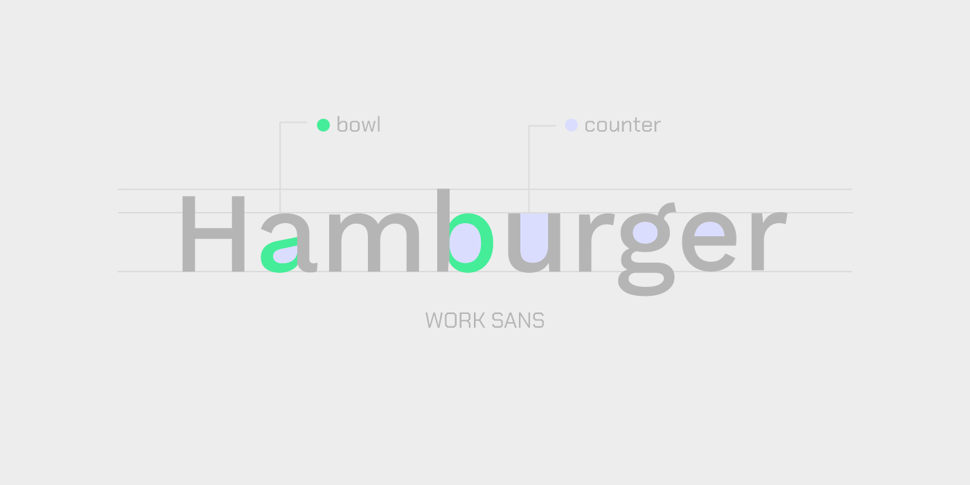
6. Work Sans by Wei Huang
7. Destra by Cédric Rossignol-Brunet
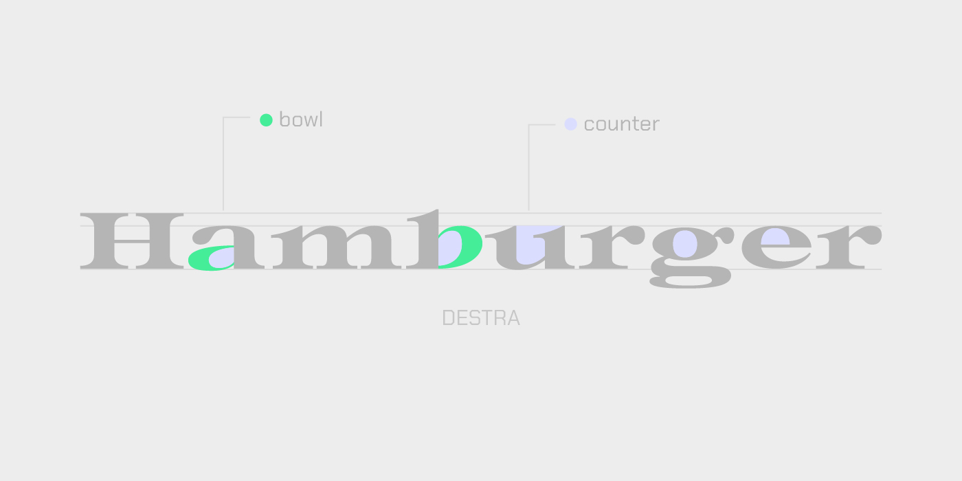
Destra is a beautiful revival typeface, designed by Cédric Rossignol-Brunet and inspired by a tiny character found on an old Italian theater ticket. Use this font to bring a unique, historical touch and a sense of discovery to your branding projects. Take it here.
8. Cormorant Unicase by Christian Thalmann
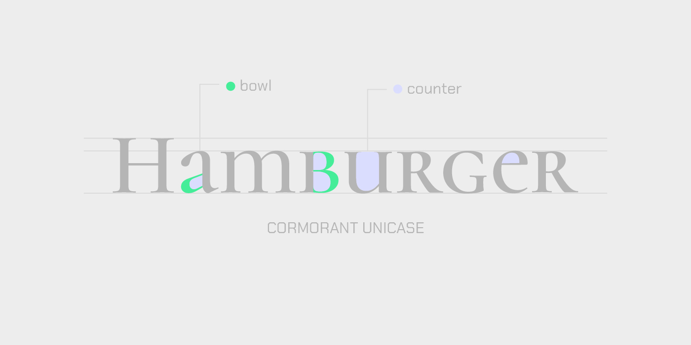
This is a distinctive unicase serif made by Christian Thalmann that gracefully blends uppercase and lowercase forms into a single visual style. Distributed by Catharsis Fonts Foundry, it takes its inspiration from 16th-century Garamond types but feels completely fresh and contemporary for display use. Find it here.
9. Fliege Mono by Pavel Laptev

Fliege Mono breaks the usual rigidity of monospaced fonts by adding a unique human touch, like playful ink traps. Designed by Pavel Laptev, If you need a font that looks like clean code but still has plenty of character, this one is a great pick. Check it here.
This has been a short trip to learn about bowls and counters, concepts often overlooked when selecting fonts. But if you understand them well, you’ll have an easier time choosing a typeface that represents exactly what you need. Your instinct is always important in the creative endeavor of choosing a font, but when you back it with type anatomy, a clearer path can open—one where your idea becomes a masterpiece.
Signed,
A Type Of Jesús.
Since you are really into typography, you might be interested in these other articles and resources:
EB Garamond: History, Best Uses and Other Great Alternatives