Dear amigos,
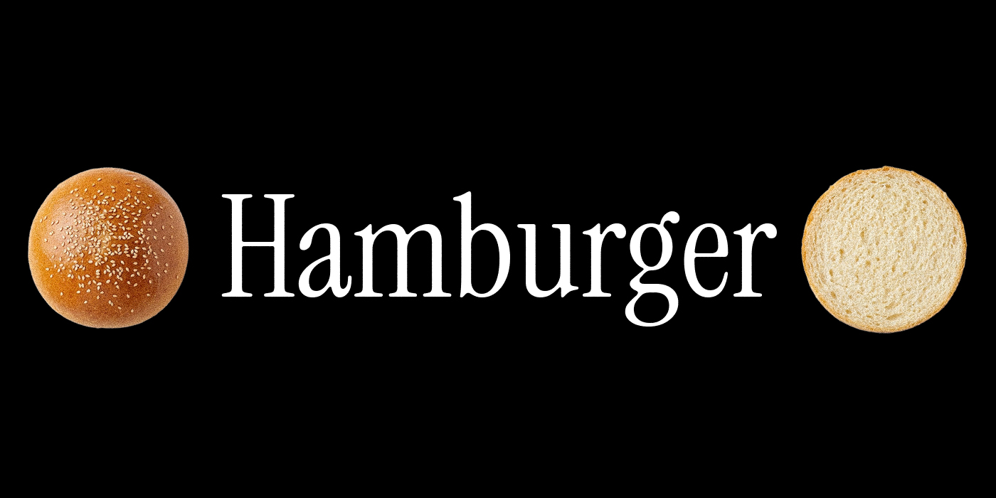
Font hunting is often my favorite part of a design project. Whether I’m updating my personal collection or searching for the perfect choice for a client, I’ve spent hours scrolling through type foundries to find hidden gems. While most websites default to a standard pangram or the classic Lorem Ipsum, there is one specific word that seasoned typographers reach for when they want to truly stress-test a typeface: Hamburger.
How deep does this typographic tradition go, and what exactly makes this combination of characters so effective? Today we’ll be learning all about the Hamburger test, and for those that stay till the end, we’ve selected our favorite Hamburger test results from our font collection, so if any of them feel tasty enough, you can easily download them.
The History of Hamburger in Typography
The practice of using “Hamburger” traces its roots back to the physical punch-cutting and metal type traditions of the 19th century. While the exact inventor is lost to history, the practice became a cornerstone of German and Central European typefounding, specifically linked to the city of Hamburg.
The original string was often Hamburgevons or Hamburgefons. In the late 1800s, influential foundries like Genzsch & Heyse (based in Hamburg) began using these key words in their specimen books to showcase the defining traits of a new typeface. Because the German type industry was the global epicenter of production during the industrial era, this practice spread through international trade. At the time, the “m” and “g” were considered the “proof of the master”, if a punch-cutter could balance the three legs of the m and the loops of the g, the rest of the alphabet was considered excellent.

As typography moved into the digital age, the tradition was solidified by the URW Type Foundry (Unternehmensberatung Karow Rubow Weber) in the late 1990s. Also based in Hamburg, URW was a pioneer in digital font technology and used the word extensively to test the legibility and spacing of their digital releases. This helped transition the term from a niche foundry tool into a universal standard for digital designers.
Over time, different regions adopted their own variations to test specific linguistic needs:
- Hamburgevons: The classic Dutch and German variation (using the ‘v’).
- Hamburgefons: The standard German variation.
- Hamburgefonts: The Anglicized version.
- Hamburgefonstiv: A longer variation used to test more complex character interactions.
- Hamburger: The modern, simplified shorthand we use today to quickly check the “vibe” and balance of a font.
The Secret Sauce of Helvetica
Perhaps the most famous endorsement of the Hamburger test comes from the creation of the world’s most ubiquitous typeface: Helvetica. In the late 1950s, Eduard Hoffmann, director of the Swiss Haas Type Foundry, was collaborating with designer Max Miedinger on what would become Neue Haas Grotesk (the original name for Helvetica). Hoffmann’s notebooks reveal that “Hamburgers” was their north star. He famously wrote to Miedinger, asserting that their first priority was the word “Hamburgers” because it was the universal type founders word that contains all the varieties of letters.
By obsessively testing this single word, they ensured that Helvetica would have the neutral balance and perfect rhythm that eventually made it a global standard. It’s a testament to the word’s power, if it was good enough to build Helvetica, it’s certainly good enough for your next project.

Eduard Hoffmann and Max Miedinger
A Timeless Human Tradition
So, why this word specifically? Why not “Sandwich” or “Typography”? The magic of “Hamburger” (and the extended “Hamburgefonts”) lies in its character diversity. It is a distilled laboratory for type anatomy.
- A Perfect Mix of Structures The word contains a balanced variety of basic geometric forms. You have the straight verticals of the H, the rounds of the a, m, b, u, g, e, and o, and the diagonal potential in some variations. This allows a designer to immediately see if the round letters feel like they belong to the same family as the square ones.
- Testing Vertical Extremes “Hamburger” is a great display for a font’s vertical proportions. It features:
🡢 Ascenders: The stem of the b.
🡢 Descenders: The tail of the g.
🡢 X-height: The consistency of the a, m, u, e, r. By looking at “Hamburger,” you can instantly judge the balance between the body of the word and its extensions.

- Rhythm and Texture: One of the hardest things to get right in type design is the contrast, the overall evenness of the black and white space. The combination of m, b, and u creates a rhythmic series of vertical strokes and curves. If the spacing (kerning) or the thickness of the stems is off, it will show up here first. The m in particular is one of the most difficult letters to draw, as it requires balancing two counters without looking too heavy.
- Font personality through “g” and “e” : The g and the e tend to be the soul of a font, since its curves always become an opportunity for distinct features. The g (especially if it’s double-storey) shows off the designer’s flair, while the e tests the clarity of the eye and the terminal.

Hamburger tests that approved with flying colors
After learning so much about the legacy of Hamburger, we wanted to test our own collection of fonts with this legacy trial text. This is our selection of favorites.
1. Heal The Web

Testing the word “Hamburger” with Heal the Web reveals a fascinating interplay of geometric shapes and edgy lines. Originally designed for Mozilla’s Internet Health Report, this font transforms the rounded “a” and “e” into a series of web-inspired connections. The high contrast and sharp angles provide a unique rhythm to the word, making it an excellent choice for projects that need to feel technical yet human. Get Heal the Web here.
2. Host Grotesk

Host Grotesk is a uniwidth sans-serif that brings a contemporary feel to the “Hamburger” test. Because it is duplexed, meaning character widths remain constant across weights, you can see how the bowl of the “g” and the arches of the “m” and “n” maintain their spatial integrity even as the font gets bolder. It balances the friendly geometry of Poppins with a more compact structure. Explore Host Grotesk here
3. Goudy Bookletter

For a classic approach, Goudy Bookletter 1911 offers a beautiful look at historical Roman lettering. When typing “Hamburger,” the calligraphic influences are immediately apparent in the elegant serifs and the traditional construction of the lowercase “g.” It is an ideal font for testing how historical features and old-style proportions translate to modern readability in long-form text or formal invitations. Download Goudy Bookletter 1911 here
4. Ballet

This whimsical reinterpretation of Spencerian script features over 800 glyphs, allowing the “H” to flourish and the “r” to trail off with elegance. Testing the word with “Ballet Aligned” or “Ballet Crooked” showcases how variable script weights can change the visual weight and personality of a brand identity. Discover Ballet here
5. Runtti

Runtti takes the “Hamburger” test in a completely different direction with its curveless design. This display typeface uses only straight lines and a subtle forward slant to create a raw, industrial attitude. In “Hamburger,” the lack of curves forces the eye to focus on the negative space and the sharp, geometric intersections of letters like the “a,” “m,” and “b,” making it a powerful choice for bold headlines. Get Runtti here.
Yours truly,
A Type Of Ari.
Since you are really into typography and history, you might be interested in these other articles and resources:
Futura Typeface: Top 4 Reasons Why It Shaped History
EB Garamond: History, Best Uses and Other Great Alternatives