The Nokia we remember
We all remember Nokia for unforgettable phones, such as the Nokia 3310 and the N95, as well as other iconic models that made history. However, over time, the company became known solely for a nostalgic memory of the 2000s. The downfall of this once “tech giant” can be attributed to various poor choices, including “arrogant” leadership, a failure to envision the future, and technology that didn’t evolve—a regrettable trinity of mistakes. Nevertheless, today the story continues.
The Company’s Shift of Direction
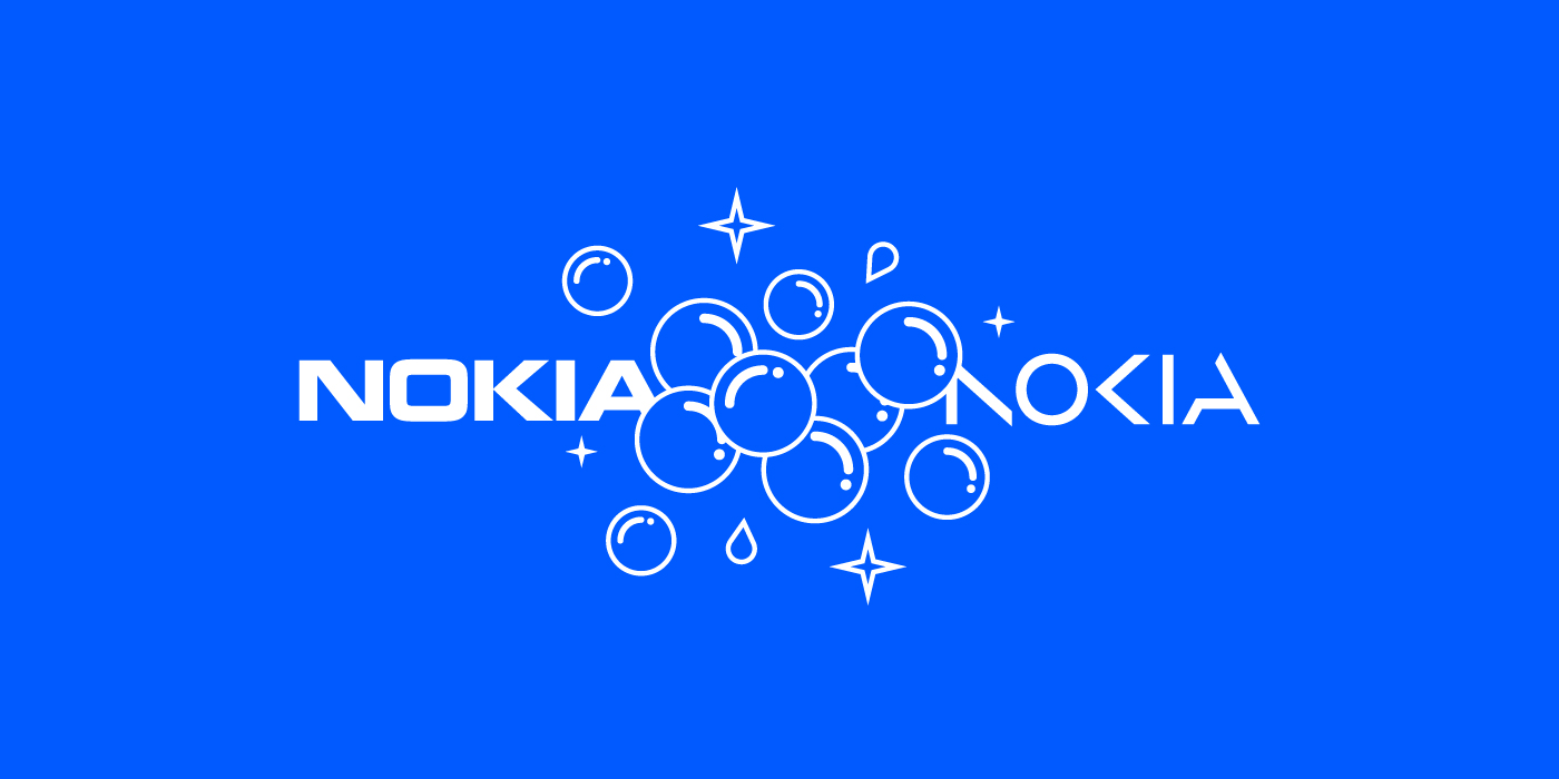
How is this Finnish telecommunication company changing after almost 60 decades? This transformation is characterized by a shift in logo and strategy, a drastic change. Nokia is pointing towards positioning itself as “a B2B technology innovation leader realizing the potential of digital in every industry.” In February 2023, the new Nokia logo was revealed, saying goodbye to the classic sober “Nokia Blue” and block-shaped typography, and welcoming a fresh, up-toned color palette accompanied by a brand new custom typography. This new “tech” flavor (that reminds us of Samsung’s or Motorola’s visual communication) represents the different path the company is taking.
Nokia’s CEO, Pekka Lundmark, emphasized that the rebrand is aimed at changing the perception that Nokia is solely a mobile phone brand. Instead, the company is focusing on its role as a business-to-business (B2B) technology innovation leader, particularly in the realms of networks and industrial digitalization.
The new brand’s communication
Nokia’s rebranding, developed in collaboration with the consulting design firm Lippincott, goes beyond a visual facelift. Quoting Nokia’s Vice President, Stacey Brierly, this new minimalist and angular logo is described as follows: “Our new logo is a bold evolution of the 1960s classic. It’s dynamic, precise and brings new meaning, cleverly representing our purpose with abstracted letters that, when acting together, read as Nokia.” The strategic refresh aims to convey Nokia’s values, emphasizing networking expertise, technology leadership, innovation, and collaborative partnership.
Rebranding is not just about visual identity; it’s a strategic move to align with the company’s evolving goals. This transformation aims to position Nokia as a technology company with a B2B focus, placed for future success and growth, capturing new markets and redefining Nokia’s identity in the rapidly evolving technology sector.
The new Nokia logo seeks to convey that they’re ‘alive and kicking,’ not merely surviving. Will the result of this rebranding be as positive as everyone hopes? Will this new direction bring a second opportunity to this company that was once cherished by us all?
Let’s see how this new chapter in branding and graphic design plays out.
Yours truly,
If you’re interested in more design and creativity content, check out this other articles:


