Dear Amigos,
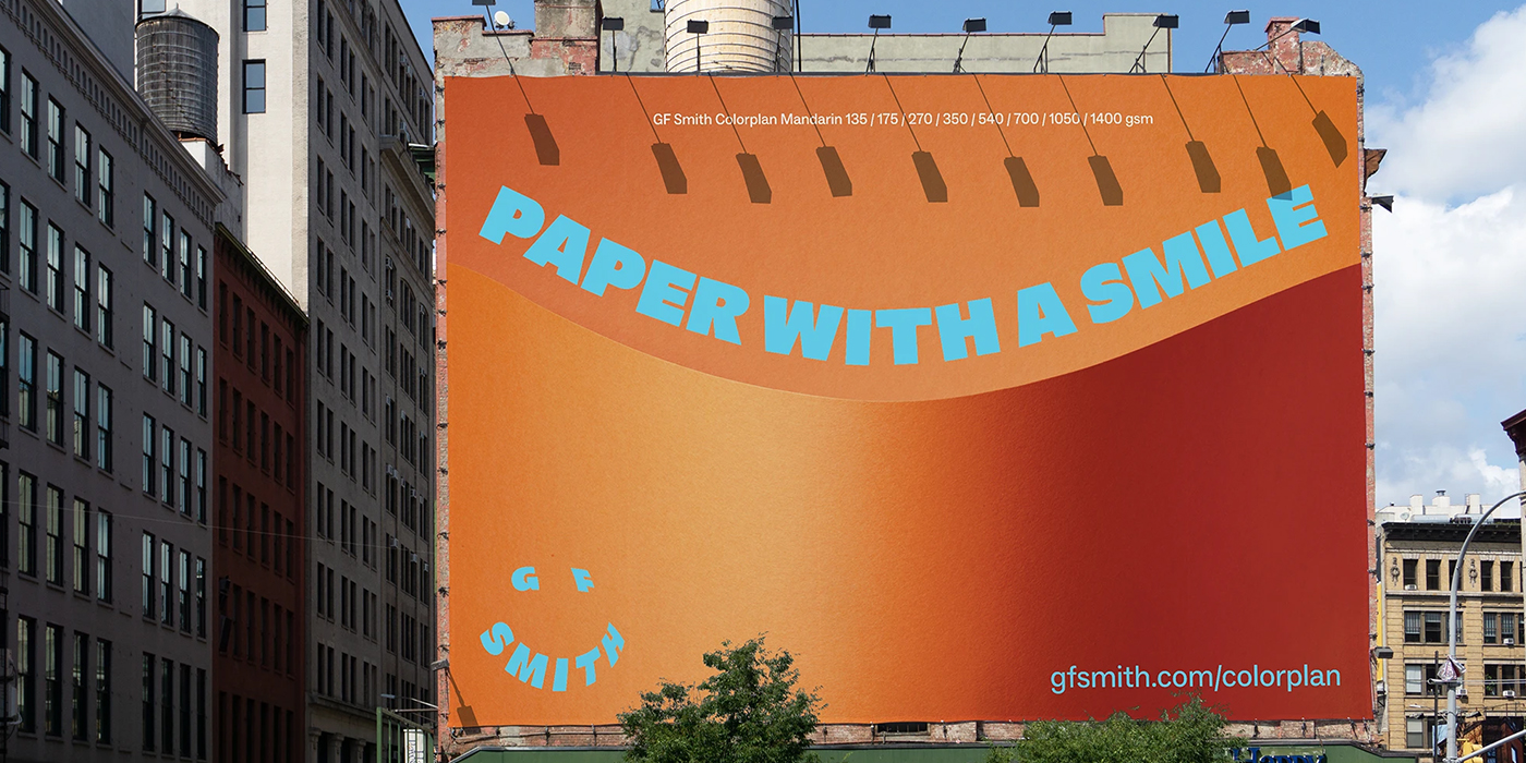
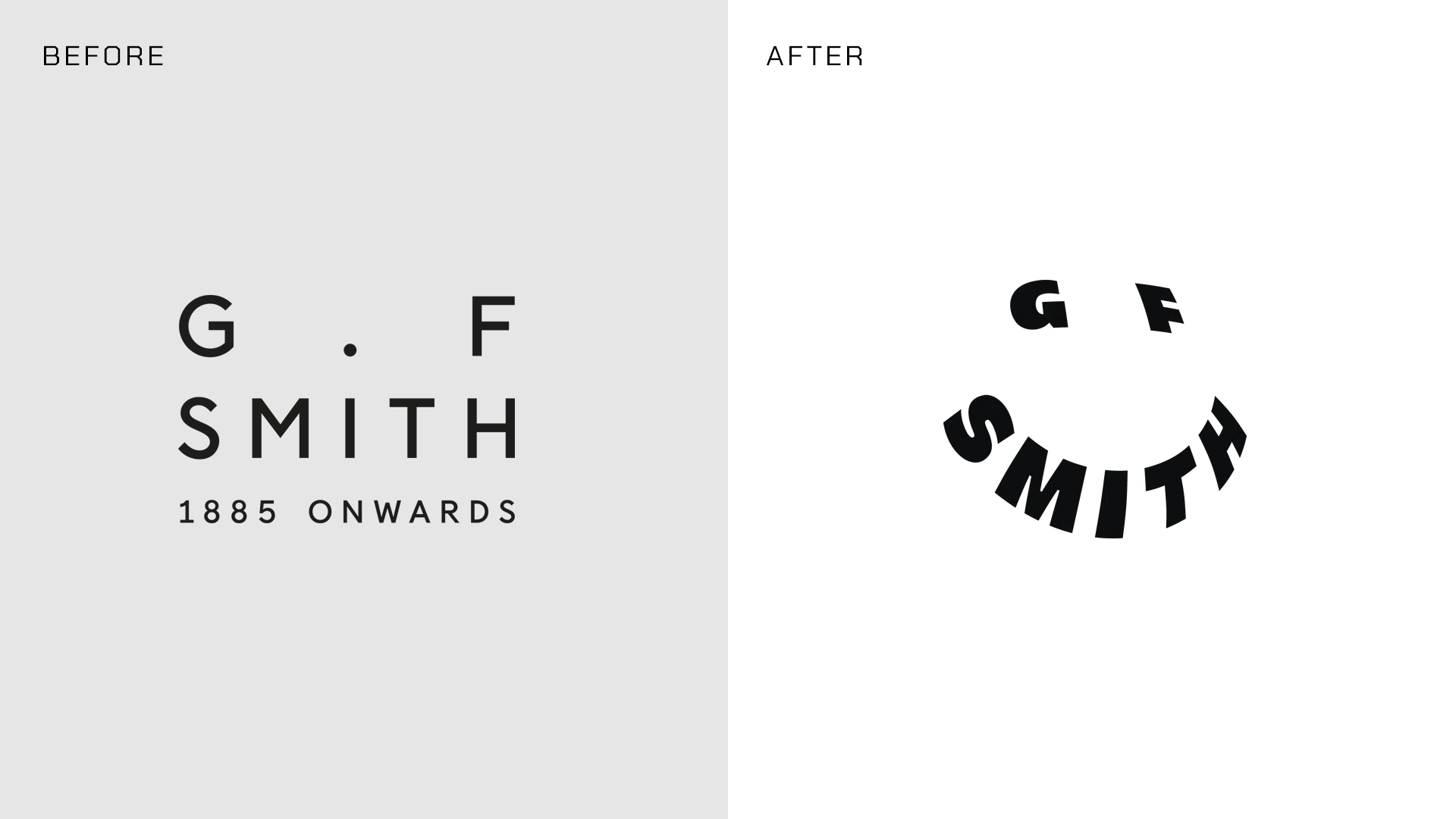
Rebranding GF Smith was never going to be an easy task. Why? Because their audience shares a quiet love for an increasingly unknown luxury: paper. Naturally, when they replaced their classy image for a bold, moving, and colorful identity, some of its consumers were quite puzzled. The confusion grew as Ben Watkinson, their global brand director, explained the need to meet their public’s changing expectations drove the change. The question is, what are these expectations? Who are we designing for?
Templo’s Rebrand of GF Smith
Templo took the lead at creating the first major branding project GF Smith has had since 2014. They conducted interviews, forums and workshops to grasp their audiences needs. This led them to create a vibrant branding system that adapts to a variety of touchpoints for its omni-directional nature. The new identity promises a future where paper fosters community and creativity for current and future generations.

Image credits: © Templo, 2025
GFS Homie is one of the custom typefaces that complement the brands new look. Developed by Blaze Type, Homie is a versatile sans-serif, drawing inspiration from 20th-century French humanist type but evolving into a unique blend of humanist and geometric forms. GFS Social works as a complementary font for secondary texts.
The typographic selection works greatly with a rich color palette, took from the GF Smith paper collection.
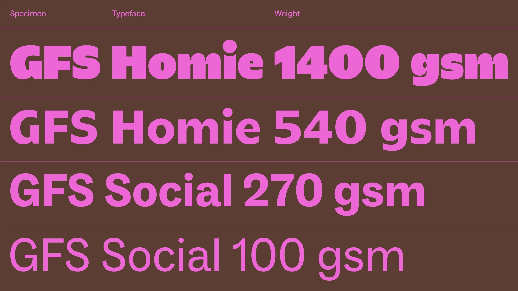
Image credits: © Templo, 2025
The Dangers of Brand Over-Saturation

Image credits: © Templo, 2025
The creative decisions are well justified, and the proposal to make paper fun again is endearing and necessary, but the reactions were mostly skeptical. Some comments show concern about why the identity seems to be optimized for screens and digital spaces, since it shines quite a spotlight over motion graphics, when GF Smith is a paper company. Critiques will, and should always exist, but this reaction has opened a way bigger debate, specially for consumers that are part of these “New Generations” that ask themselves, is this what we are becoming?
Audiences are more screen addicted than ever, and media seems to be in a constant fight for their time, creating techniques to grab their attention for as long as possible, like flashing a colorful toy in front of a baby. Maybe brands are inclined to act similarly, feeling like their identity needs to be in constant movement, displaying bold and expressive typography with loud colors that beg you to keep looking at them.
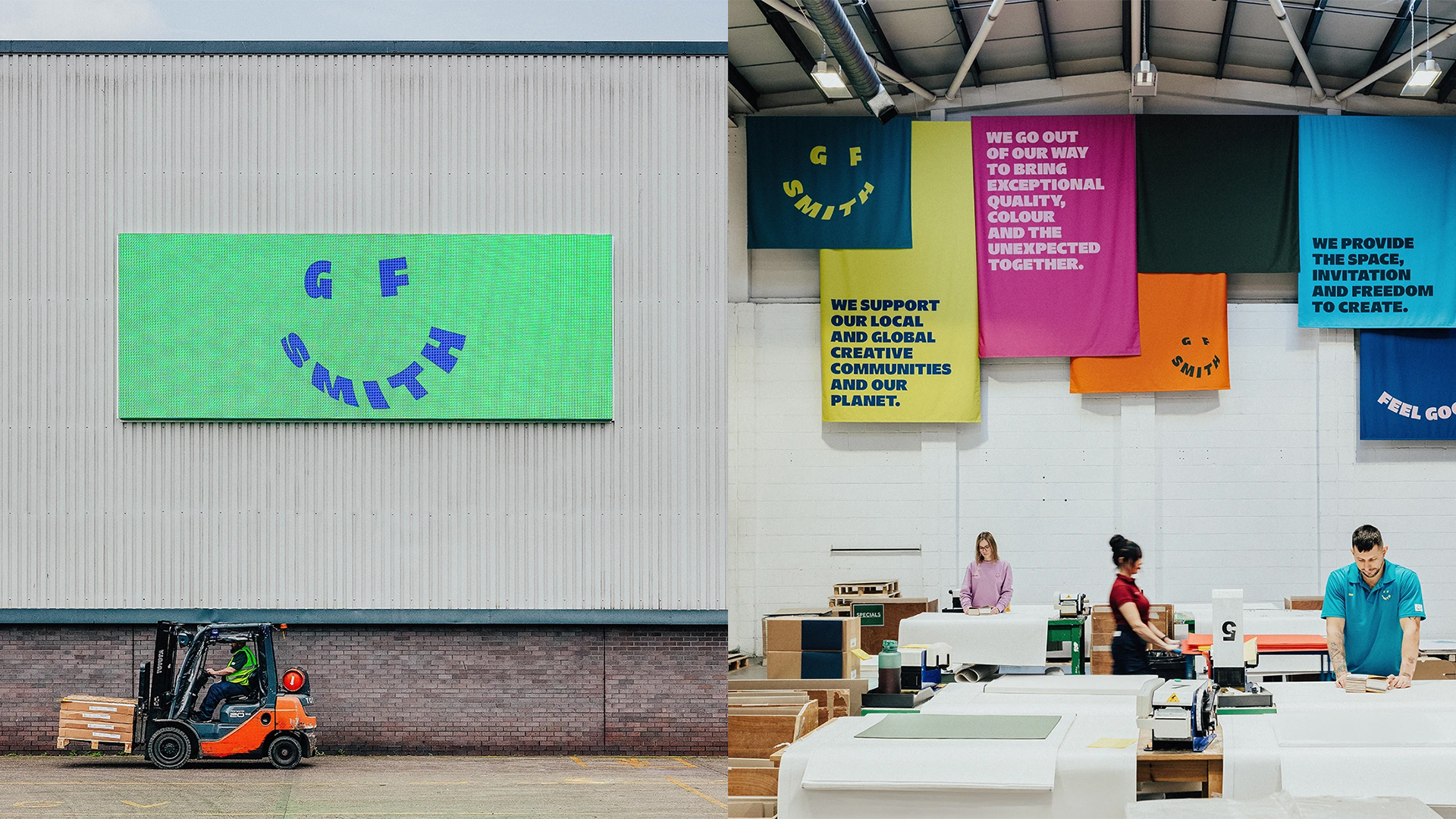
Image credits: © Templo, 2025
While these techniques may serve some brands (many of which seem to be more hyped about the idea of appearing on Pinterest boards rather than building a timeless look), audiences seem to be catching up to these visual tricks. Gen Z users are reaching a burnout, the rose-colored lens that brands want to force on them are not enough to hide the overconsumption that hides behind flashy vectors.
A Bigger Cultural Debate
It’s Nice That, a design blog we follow closely, explored the topic in their article, “How Templo’s colourful rebrand brings GF Smith into the future.” However, this raises a broader question: will the future of branding be an endless pursuit of trends driven solely by what boosts user retention on social media? It seems that the distinction between branding and marketing has blurred, with quantitative metrics now steering the ship.
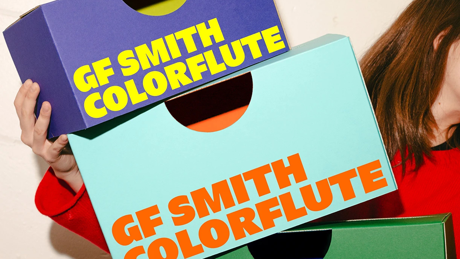
Image credits: © Templo, 2025
Ben Watkinson said:
“This rebrand isn’t about leaving our roots behind; it’s about adapting to meet changing expectations while staying true to who we are.”
It feels as though the paper brand is now primarily addressing a digital-first audience, potentially overlooking what print enthusiasts like us cherish most about paper: the grid, typography, and the tactile experience of printing. This is admittedly a biased perspective, but for those passionate about printmaking and editorial design (like us), the new universe created by Templo seems to exist in a different planet altogether. Paper is already exciting for us; we don’t need a smiley to confirm that feeling.
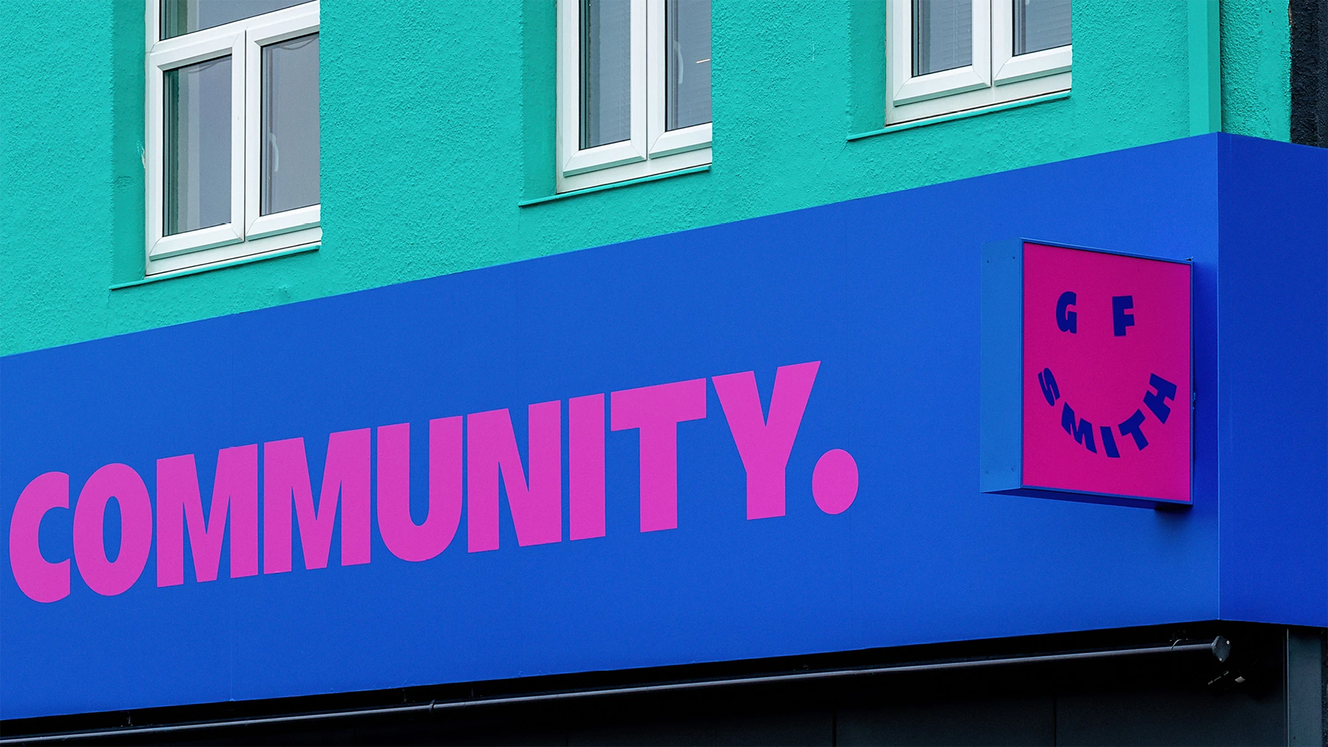
Image credits: © Templo, 2025
Quoting designer Giulia Boggio’s colorful comment on the topic:
“The GF Smith rebrand is showing how messed up the design world is getting because of the social media-fixation of it all. Not everything needs to move and be flashy and trend coded. Good Design needs to outlive and potentially ignore trends.”
Yours truly,
Since you are really into branding, you might be interested in these other articles and resources:
A Masterclass on how to destroy an iconic brand: Jaguar’s rebranding
