Dear Amigo,
There are several terms in the graphic design glossary that we’ve noticed people often exchange without fully understanding their true meaning. We believe that for all the designers out there, mastering these terms related to the typography realm is fundamental to maintaining a professional approach as a graphic designer, creative, or art director. Typography is the main pillar of communication, and therefore, we must appreciate and understand it deeply. Today we’ll be covering the differences of typeface vs. font. Enjoy!
Typography, the main pillar
If we organize the following terms from large to small, typography would be the broad umbrella covering all, defined as the art and technique of arranging type to ensure clear, readable, and visually appealing written communication, whether in print or digital form. It involves selecting letterforms and managing spacing, alignment, and the overall layout. Typography is the backbone of conveying meaning and emotion while creating a visually harmonious experience for the reader. In short, typography is the practice of logically and purposefully arranging type.
“a typographer is someone who designs with type and has a good working knowledge of the practice of typography. A typographer is not someone who designs typefaces—that’s a type designer”. – Google Fonts
Typefaces, a characteristic set of design features
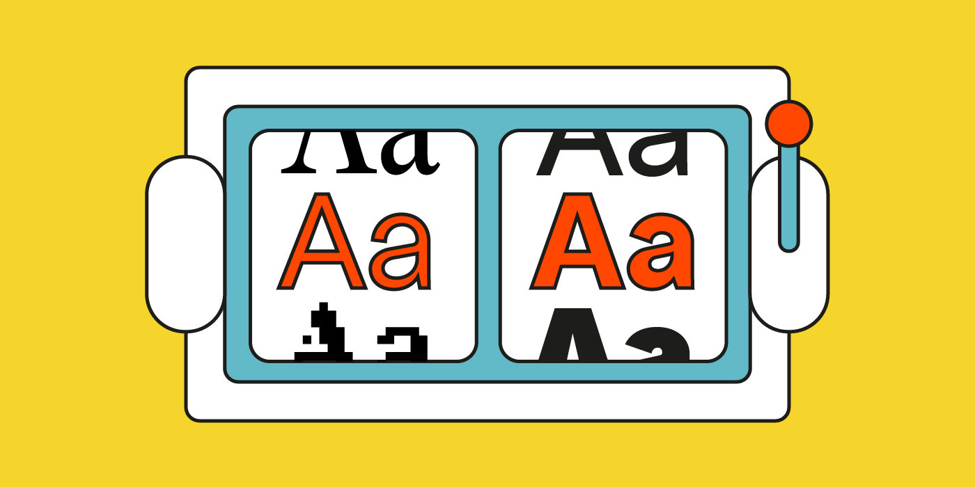
Probably the most misused term of all. What people often refer to as a “font” is actually a typeface. Roboto, Calibri, and Bodoni are not fonts; they are distinct typefaces. A typeface encapsulates a set of design features that define a particular style of type. These features refer to specifics of the design itself, such as: Does the typeface have serifs? What is the stroke weight? Are there any ligatures? How are the balance, descenders, and ascenders of the typeface?
Typefaces are unique sets of letters with special characteristics that set them apart from any other.
Typefaces can be divided into several categories, the most common being Serif, Sans Serif, Slab Serif, and monospaced, among others. We’ll dive deeper into this topic in an upcoming article. Just to have a general idea, in the following image, you can see which category corresponds to an already existing typeface.
Fonts, the typeface variations (and what you download and use)
Within a typeface, you find several fonts—variations that focus on the size, weight, and style (light, regular, bold) of the typeface.
In practical terms, when you choose a specific typeface, you’re essentially opting for a certain aesthetic. The subsequent decision will be to choose a font within that typeface to use. If Merryweather is the typeface, then Merryweather Black 900 is the font.
As Google fonts glossary puts it “…a typeface is what you see and a font is what you use.”
Knowledge is power, Amigo. Understanding these terms enables designers and enthusiasts to enrich the design conversation, be more precise, and fully appreciate the wonderful world of typography. Typography is part of your everyday life as a designer. Understand it, study it, and embrace the strength that type can give you.
We hope this was useful! Now that you know the difference between typeface vs. font, don’t forget to check out our curated selection of type foundries and sites with free, curated selection of type foundries and sites with free, open-type fonts (and typefaces) created by top graphic designers.
Here some books we’ve found on Amazon that will help you better understand typography:
This site contains affiliate links, view the disclosure agreement for more information.
Hopefully, you’ve found this useful. If you would like to discover more about contemporary typography and get to know outstanding typefoundries that are changing the open-source scene, you might be interested in reading this articles:
Yours truly,