
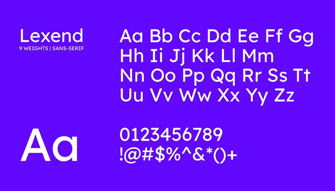
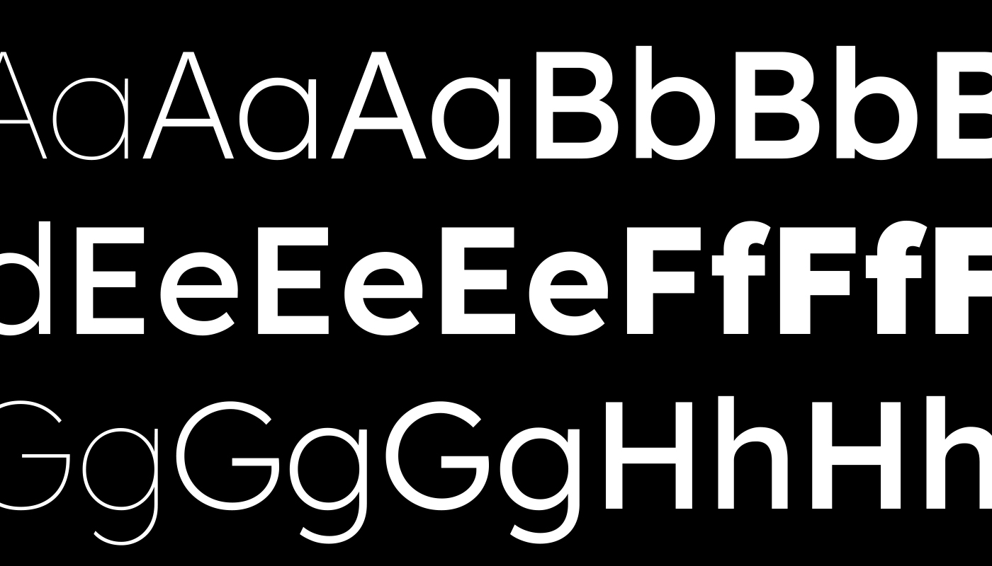
Dear amigos, have you ever heard of the Lexend font? Of course, you have! Today, it is one of the most popular fonts available on Google Fonts. With over half a million downloads, Lexend has proven to be a truly functional font family, improving readability, particularly for individuals with dyslexia.
Did you know that 1 in 10 people could be dyslexic? Dyslexia is a learning disability that affects the growth and development of millions worldwide. With the right typeface, individuals with this condition might be able to reach their full potential.
This font family was designed by Dr. Bonnie Shaver-Troup in collaboration with talented designers such as Linnea Lundquist, Thomas Jockin, Santiago Orozco, Héctor Gómez, and Design Bridge, with support from Google.
Lexend’s origin
Dr. Shaver-Troup, an educational therapist, realized that many of her patients had reading issues. This clear problem was masking the individuals’ true learning capabilities and undermining their intelligence. In 1999, this insight led to a theory developed one year later: Bonnie proposed that a patient’s reading performance—and consequently their learning potential—could be improved by creating the right typeface.
In 2000, Bonnie theorized that reading performance could be enhanced through the use of sans-serif fonts with expanded scaling and hyper-expansion of character spacing. But why?
Bonnie realized that specific typographical considerations could help people with dyslexia:
- Sans-serif fonts reduce cognitive noise
- Expanded scaling improves potential for character recognition
- Hyper-expansion of character spacing, creates a greater lag time and reduces potential crowding and masking effects
“We have a global reading crisis and we can change much of it by delivering fonts that are optimized for the visual field and for the individual. The answer is hidden in plain sight. It’s the font,” said Shaver-Troup.

During her time as an educational therapist in Silicon Valley, Bonnie Shaver-Troup worked with students facing challenges like dyslexia and other reading difficulties. She experimented with adjusting the spacing between letters in their reading materials and discovered that this simple change significantly enhanced their reading and comprehension abilities. Shaver-Troup concluded that the problem lay not in her students’ cognitive abilities but in the visual perception of the letterforms presented on paper or screens.
“The majority of the reading problems, including dyslexia, are not cognitive or phonological. They are visual or perceptual. Our testing has a built-in design flaw. We use fonts to deliver text for reading that are too tight for efficient or successful visual processing. Then we get poor results, suggesting the reading issue is phonological or cognitive. If we change the font to the tested optimized font fit, then we change the outcome,”
Visual aspects of fonts that hinder readability for people with dyslexia

In general, design decisions that minimize the differences between glyphs, which can confuse readers about how a letter should appear, or that reduce the contrast between the background and glyphs, or that impair text readability—such as narrow spacing—can hinder individuals with dyslexia. A good design choice to enhance readability involves using clear, concise letter forms that are distinct from one another, yet similar to how we know a letter should look like. Avoiding complex shapes, and clear glyph differentiation is a good starting point. The following list points out some of the main aspects that hinder readability for people with dyslexia:
- Serif Fonts
- Crowded Spacing
- Inconsistent Letter Heights
- Similar Letter Shapes
- Thin or Light Font Weights
- Complex Letterforms
- Digital Screen Glare
“The biggest challenge is that when text is too tight, the letters are too close to one another and create crowding and masking problems. Crowding occurs when too many letters are too close to each other. Masking is when individual letters just seem to disappear. These are both perceptual phenomena and, for most people, these problems can be corrected by extra spacing,” – Shaver-Troup.
Lexend Font in Use

Image credit: Roche Studio

Image credit: Claire Gil Jacquenod
3. WDNN Website

Image credit: WDNN
Dear amigos, Lexend has proven to be an exceptional typeface, offering benefits that extend beyond aiding individuals with dyslexia. While there is no universal solution that works for everyone, Lexend stands out as a highly legible font that adapts to diverse needs. If you’re searching for a typeface designed to enhance readability and meet various requirements, Lexend font could be the perfect choice for your project.
Yours truly,
Since you are really into typography, you might be interested in these other articles and resources:
Here Are The Best Font Libraries Curating Open-Source Fonts
Open Source Fonts Licensing and Use: What You Need to Know
Insider Tips: The Best Type Foundries with Open Source Fonts