Dear Amigos,
Jaguar’s new rebranding is breaking the internet apart. A brand that is (or was) a symbol of luxury, performance, and British heritage has revealed a new logo and communication strategy aimed at positioning itself in the electric vehicle (EV) market and speaking directly to a “younger” audience.
Everyone keeps wondering, “Where is the car?” But personally, we’re asking: what is going on with brands all looking the same? Why is a historic brand like Jaguar sharing visual similarities with companies like Samsung or Motorola? Why is a “trend” dictating how a brand behaves? If brands constantly chase trends, can they truly build a solid, lasting identity?
How is this rebranding helping Jaguar stand out? The new slogan is “Copy Nothing,” but to us, it feels quite the opposite.

The All-Electric Pivot and the New Logo
Jaguar’s rebranding aligns with its ambitious push to become an electric-only carmaker by 2026, reflecting broader trends in the automotive industry. In 2008, the company was acquired by Tata Motors, an Indian multinational automotive giant headquartered in Mumbai, which also owns Land Rover.
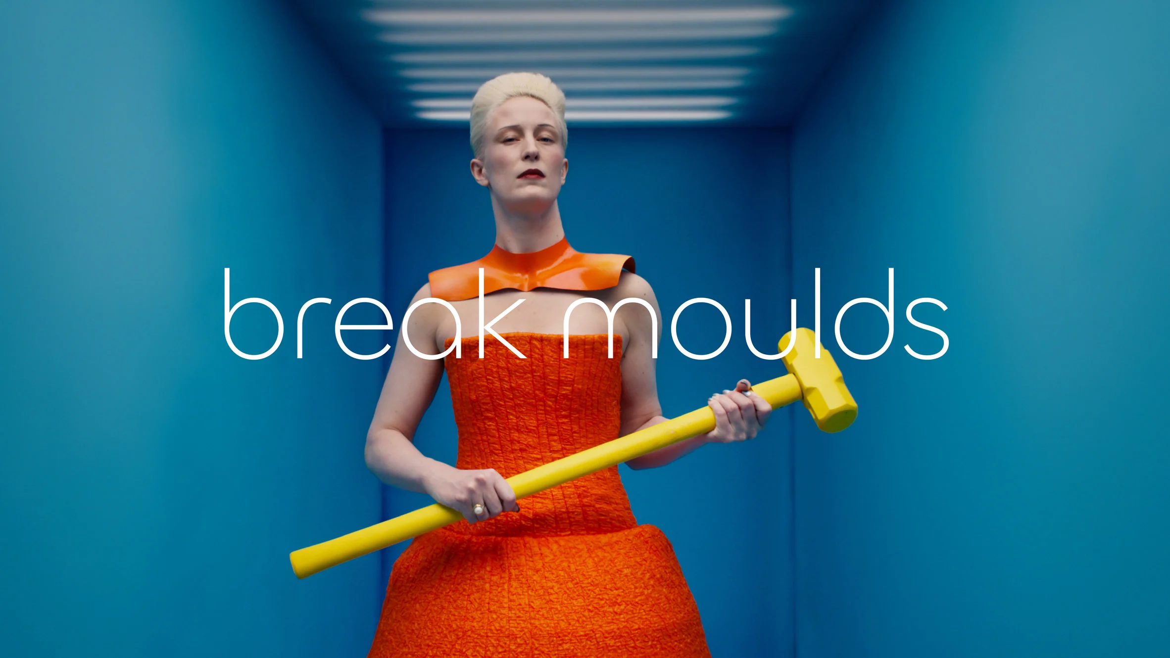
The brand is leaning heavily on its founder Sir William Lyons’ philosophy that “a Jaguar should be a copy of nothing.” This ethos is now encapsulated in the new slogan, “Copy Nothing.” On the surface, it’s a strong and inspiring message—but does the communication truly reflect it? More importantly, does the brand still feel like Jaguar?
Video credits: Jaguar
The rebranding is clearly bold, and by this, we mean it can be considered as a risky direction. The iconic all-caps “JAGUAR” has been replaced by a geometric, minimalist, Bauhaus-inspired typeface, that plays with the upper-lower cases: JaGUar, supposedly to play with the naming pronunciation: The typeface aims to harmonize upper and lowercase letters while nodding to the brand’s posh British pronunciation—“Jag-you-are”—and conveying a sense of “modernism”, but does it? Is it still innovative to use a 1920’s inspired font?
Was the previous logo perfect? From a technical perspective, there was room for improvement, as everything in life. However, the core purpose of a rebrand is to maintain a connection to the brand’s heritage, while innovating, and connecting with the brand’s goals and main purpose. In this case, the leap from Jaguar’s previous logo—a dynamic and powerful symbol—to a subtler, more abstract design feels like a step toward something static and rather standard.

Image credits: Jaguar
The real question is: Why? The rationale behind these changes isn’t compelling enough. The branding and aesthetic decisions driving this rebrand feel superficial and insufficiently considered. It’s as though the “why” behind the “what” wasn’t thoroughly pondered, leaving the new identity struggling to connect to Jaguar’s legacy.
Everything feels strangely familiar—if not outright derivative. The striking similarities between Jaguar’s new wordmark and Motorola’s, particularly in font and color choices, cast doubt on the originality promised by the brand’s bold slogan.

Creative Intent or Misaligned Execution?
One of the most jarring aspects of Jaguar’s rebranding is the apparent disconnect between its messaging and its visual communication. The launch video, set against a futuristic, almost lunar backdrop, feels more like an homage to sci-fi escapism than a statement about a greener planet (referring to the electric vehicle as a main product they want to launch with this rebrand). For a brand touting its commitment to sustainability, the creative choices seem detached from earthly concerns—literally.
Furthermore, the embrace of Bauhaus-inspired minimalism feels like a cliché in 2024. While Bauhaus was revolutionary in its time, its overuse in contemporary branding risks coming across as unimaginative. Jaguar’s rebranding pivots to this aesthetic to evoke modernity and timelessness, but to many, it feels like yet another “safe” design trend. The result? A brand that once roared with individuality now purrs with conformity.

Image credits: Jaguar
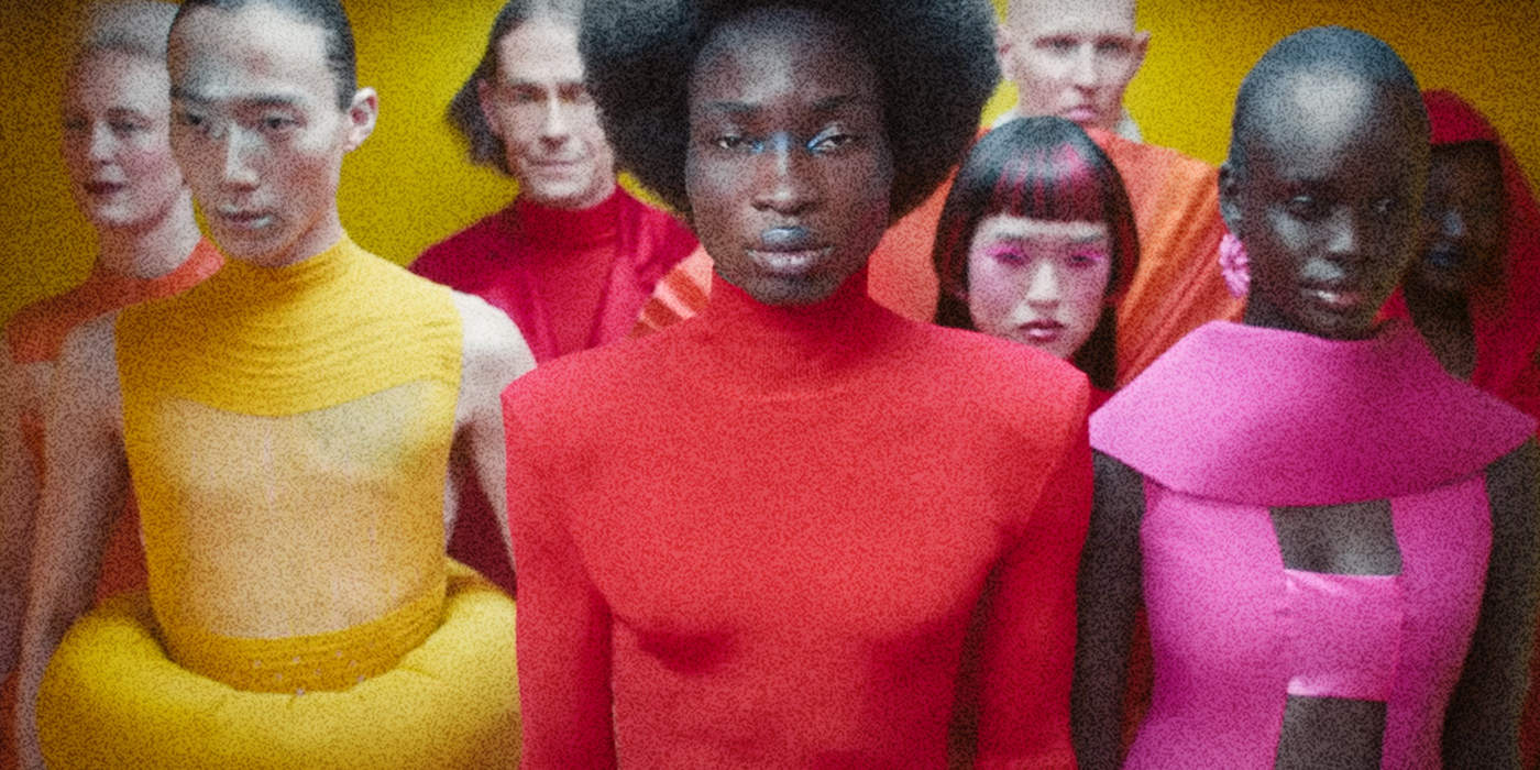
“Jaguar’s transformation is defined by Exuberant Modernism, a creative philosophy that underpins all aspects of the new Jaguar brand world. It embraces bold designs, unexpected and original thinking, creating a brand character that will command attention through fearless creativity. “ – Jaguar Media
Lessons from Formula 1 and Burberry
Rebranding historical icons is no easy task, but it can be done with finesse. Burberry’s 2023 rebranding lead by Creative director Daniel Lee embraces the brand’s roots and praises tradition. Both brands managed to evolve while staying true to their core identities. Similarly, Formula 1, remained faithful to its DNA while modernizing the visual communication, with truly innovative imagery and type. F1 today feels like NASA, but that is a great coincidence.

Image credits: Burberry
Jaguar’s rebranding, on the other hand, seems to be walking a fine line between reinvention and alienation. While its transition to EVs is commendable and necessary, the rebranding risks alienating loyal customers who value the brand’s heritage. A sleeker logo and Bauhaus vibes might appeal to a younger, tech-savvy audience, but do they resonate with Jaguar’s historic narrative of bold creativity and craftsmanship?

Image credits: F1
Copy Nothing or Copy Everything?
The irony of Jaguar’s new slogan isn’t lost on critics. Despite the declaration to “Copy Nothing,” the brand appears to be mimicking tech industry aesthetics and trends that feel detached from its storied past. The overlap in visuals with brands like Motorola and Samsung only amplifies this perception. Are we witnessing a global echo-effect where every brand is starting to look and sound the same?
As Jaguar accelerates toward an electric future, it must ensure that its brand identity matches the innovation of its vehicles. This requires more than just a new font or slogan—it demands a reimagining that respects its legacy while embracing the future. For Jaguar, the challenge now is to rediscover its roar and prove that “Copy Nothing” is more than just a tagline—it’s a philosophy.

Image credits: Jaguar
It’s easy to critique someone’s work—a team’s work—but we want to take a moment to acknowledge the immense effort behind this massive launch. The countless hours, the dedication of hundreds, if not thousands, of talented creatives who brought this project to life deserve recognition, this hate letter to Jaguar’s rebranding is not their fault. The problem is in the initial brief.

We can’t ignore an issue that’s becoming increasingly pervasive in the world of communication—a homogenization that’s reshaping the landscapes we live in. Every day, the world feels more uniform, regardless of the city, audience, or cultural context.
I don’t want to live in a giant echo chamber, dictated by algorithms that push people and brands to follow whatever the metrics dictate.
That’s it for today, amigos. Hope you enjoyed this and would love to hear your thoughts!
Yours truly,
A Type of Camila.
Since you are really into branding, you might be interested in these other articles and resources:
