
Dear Amigos,
In April, the ATOA team got the chance to be at the Milan Design Week 2026. Our founder, Camila, visited the Humanrace installation and saw their amazing packaging first-hand. That inspired us to write this feature, enjoy!
The wellness industry is famously saturated, often rigidly segmented by demographics, age, and gender. So when visionary artist Pharrell Williams looked at the landscape, he recognized the need for a shift in perspective. In 2020, he founded Humanrace with a simple but profound belief: “Humanrace doesn’t differentiate by race or gender. We’re creating for humans; we are all born in the same skin.”
To translate this philosophy of collective well-being into a brand, the communication challenge was clear: how do you build a visual identity that steps away from traditional beauty tropes and feels as universal and essential as the products themselves? The brand needed to act as a provider of “tools for living,” prioritizing intention, sustainability, and industrial design. Noë & Associates, the global brand consultancy, was tasked with the strategy, design, content, innovation and production for this brand.


A New Map of Well-being Through Design Decisions
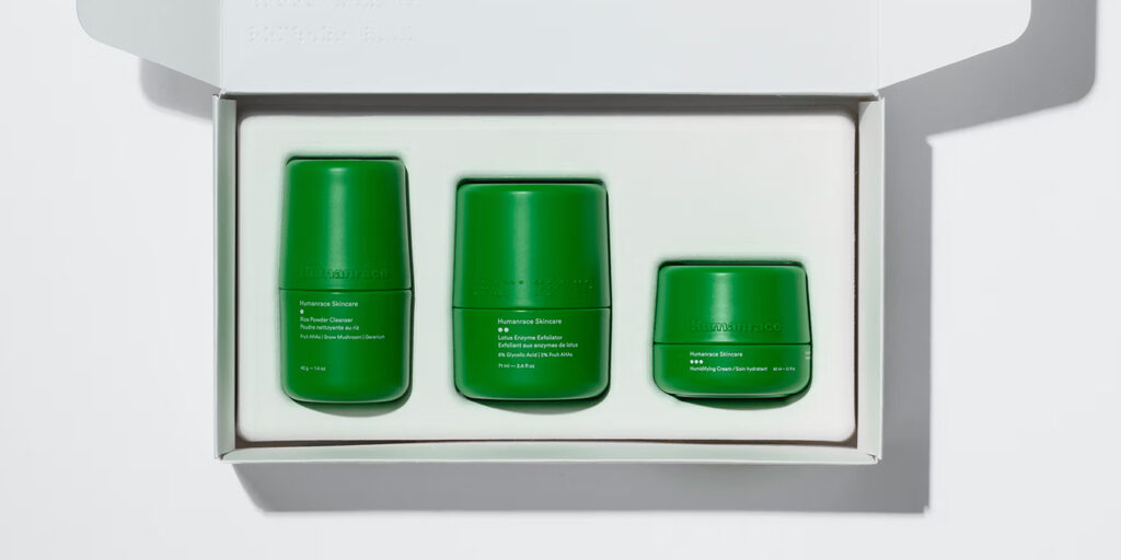
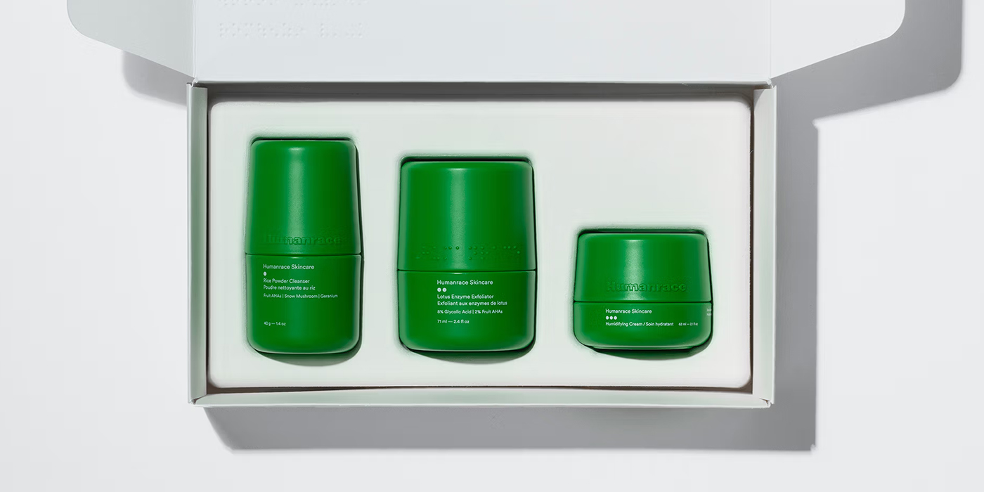
Noë & Associates anchored the visual decisions for Humanrace in meticulous craft and accessibility, stripping away the decorative excess usually found in skincare. We can see how their signature vibrant green packaging (crafted from over 51% post-consumer recycled plastic with prominent braille detailing) compresses both function and sustainability. This essential design concept was further reflected in the brand’s editorial material. Their assets feature stunning, minimalist layouts and striking macro photography of natural materials alongside diverse human skin textures. More than instructions or results, these images codify a lifestyle. By balancing textural imagery with clinical white space, their visual language perfectly marries narrative with functionality, treating daily care as a universal ritual.


Seeking Clarity: The Humanrace Sans
Humanrace uses a custom typeface throughout the project, Humanrace Sans (based on the data on their website). Why does its design make sense within the brand’s radically inclusive narrative? By avoiding quirky serifs or highly stylized scripts, this grotesque sans-serif provides the ultimate functional clarity. Its uniform geometry, wide stance, and clean lines perfectly mirror the industrial design ethos of the physical packaging. The font feels modern and entirely stripped of any cultural or gendered bias. In a system where the products are meant to speak to everyone seamlessly, Humanrace Sans acts as a neutral vessel, allowing the core message of humanity to remain front and center.


About Noë & Associates
Noë & Associates is a global brand consultancy that believes their work must leave a positive, lasting legacy. Working across the entire lifecycle of a project, they focus on making the complex simple with precision and purpose. Their “lens of excellence” has earned them partnerships with some of the most visionary businesses and developers in the world. Beyond their striking work for Humanrace, they have built enduring brand universes for luxury giants like Baccarat, Rolex, Aman, and Waldorf Astoria. Make sure to check out their full portfolio to see how they continue to reimagine the established.
Signed,
A type of Ari.