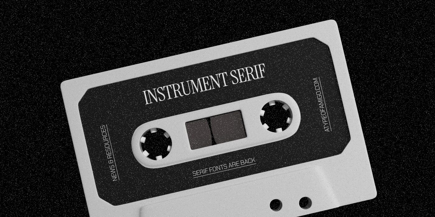
Instrument Serif, exquisite and flexible
A couple years ago, it was inconceivable to think a technology-related brand could use a serif font for their headlines, let alone for the logo. Fast forward to 2025, and you find brands like Hook creating a system with a strong serif flavor, guided by a font that is leading the scene on this front: Instrument Serif.
From AI Agents to the oval room, Instrument Serif is leaving a big mark. Another relevant (and surely polemical) example is the White House’s rebrand. And yes, now the White House’s website feels like Vogue. Rodrigo Fuenzalida’s and Jordan Egstad’s typeface is the font of the wordmark. Having your font used by one of the most known governments in the world (for several reasons) is quite a milestone. Instrument Serif is conquering the world with its big personality and stylish traits.

Image credit: Hook (Font: Instrument Serif)
Remember Macintosh’s, New balance’s 70s, 80s communication? Or the classic “Say hello to iPod” advertising? Big on serif, related with technology, quite an odd choice for the time. This type of advertising marked an era, and today we are seeing similar visual traits all over the internet.

Image credit: Macintosh & iPod (Font: Apple Garamond) | New Balance (Font: Poppl Pontifex)
Instrument Serif offers a contemporary twist on the old-style serif that brings us back to an iconic era. Its elegant forms nod to historical serif traditions but bring new life to the ’80s-inspired ecosystem we are seeing more and more nowadays.

Image credit: Sonagi | David (Font: Instrument Serif)
That prized tactile look, from VHS grain textures to airbrush art and faux paper backgrounds—that once dominated the visual panorama not by choice, but because that’s how things were—is being seen more and more. From luxury to tech, passing through food and beverages with brands like LikeLouis (branding project already featured by your favourite amigos) not using Instrument Serif per se, but a similar condensed sans-serif released by Pangram Pangram. Instrument Serif’s style and the possible cousins of this iconic typeface translate that text-driven, high-impact message delivery for today’s brands craving that same balance of nostalgia and modernity.
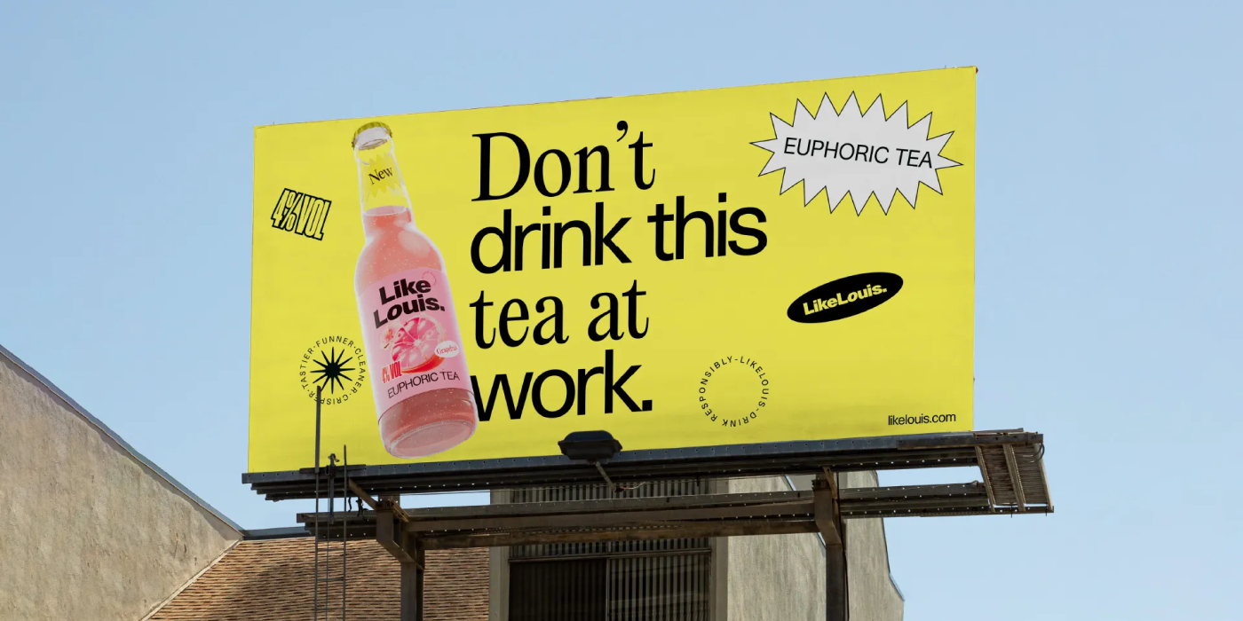
Image credit: LikeLouis (Fonts: Haas Unica SH, Editorial New, Druk X Condensed)
Talking with the creators: Rodrigo Fuenzalida on the rise of Instrument Serif
We reached out to Rodrigo, one of our dearest amigos, to hear his thoughts on the rise of Instrument Serif.

What was the original inspiration behind the font?
R: When we were working on the font, truth is we focused on making something to truly contrast Instrument Sans, but also could work alongside that font and define certain design items, specially from the condensed font. Besides, the very display appearance of the font contrasted with the functionality of the sans, and that somehow represented the mixture of people working on the Instrument team, which is very diverse.

What do you think about it becoming one of the main choices of this on-going design trend?
R: Sincerely, I have a hard time imagining my fonts as trendsetters, specially because when I’m designing or working with them I’m thinking about the brief and the clients needs more than an specific use, so based on that, seeing Instrument Serif as one of the most emblematic fonts from this trend has been surprising and gratifying.
The diversity of applications makes me happy because it basically adresses the concept of its design, a display font for a diverse world that doesn’t remain boxed in specific uses. I don’t think I’d dare to day its the origin of the trend, but I can recognize that it’s part of its most visible faces.
Why do we keep going back?
The font’s choice speaks to a broader cultural craving for the feeling of safety and polished sophistication that Millennials and Gen Z alike associate with the era’s aesthetic. What’s going on? Trends have always come and go, often driven from past cycles. We are seeing different comebacks in newer generations, some worrisome. The comeback of all trends and styles also comes with some values recycling that are sometimes best left in the garbage. We see how Sabrina Carpenter, for example, is creating a visual communication based in nostalgia for values from a past decade that are not aligned with the contemporary concept of womanhood, or trends in social media that bring back ways of living in which male validation is primal. It seems there is always the need to “bring back the past”. When we look in the rear window, we see the cultural pastiche humanity is.

Image credit: Universal Music Group
Many designers love Instrument Serif because it channels the exuberance and indulgence of the ’80s—when consumer culture was brash, nightlife was vibrant, and advertising screamed confidence. A good memory. Instrument Serif takes us back to a decade where everything was golden. Post-pandemic disenchantment has caused a retreat from the antiseptic minimalism of recent years, swinging back to typefaces and layouts that feel alive and tactile. Instrument Serif’s condensed form delivers personality and legibility, much like the ’80s editorial fonts that challenged the status quo of their time. The use of an elegant serif in an expressive way definitely has its punch. The White House hasn’t had this much personality as today, never before (too much personality some might say). It fits seamlessly into the nostalgia-driven trend cycle, satisfying a collective yearning for a time that felt both bold and safe—a time when perfection was promised, loudly and visually, in every headline.

Image credit: The White House (Font: Instrument Serif, Instrument Sans)
Memorability in design stems from repetition, which explains why we connect more deeply with a font seen 100 times over a decade ago than with a brand-new one circulating just for the past week. We naturally relate to the past, and in communication as well as trend flows, this is why elements that once worked can effortlessly resonate with a brand-new audience even 30 years later—nothing is truly brand new, as influences always emerge from the back row.

Image credit: Stranger Things
Tips when choosing your fonts
When choosing your fonts, context is always important. Understand the motivations behind choosing a font, and why, in terms of historic context, use, and emotions, the designer and the brand try to convey. Innovation in design often lies in finding unique yet unconventional combinations. In many of the cases we’ve seen in this article, Instrument Serif is being used in unexpected ways, a protein bar with an elegant condensed serif? Something to be remembered.

Image credit: Trulioo (Font: Tobias)
Before, designers were resistant to using serifs in digital contexts for accessibility situations. Serifs weren’t optimized for pixels, and in a certain size, they could be deformed, worsening legibility. Today, all of that has changed. One, because in this digital-centered world we live in, things are mostly created considering digital content. And secondly, screens are so developed that quality is no longer an issue—a serif can live in a digital ecosystem, no questions asked. Emotion, intention and output are three good aspects to have in consideration when choosing a font. Are we saying you should now always use Serifs? Absolutely not! Think outside the box, the same might be true for using a boring Sans-Serif like Montserrat for an extremely editorial product. You never know until you try! Be bold, be wild, but also be strategic with your fonts. Keep it simple, but memorable. Easier said than done.
Signed,
A Type Of Camila.
Since you are really into typography, you might be interested in these other articles and resources:
Yorgos Lanthimos’ movies: Outstanding and Offbeat Typography
EB Garamond: History, Best Uses and Other Great Alternatives