Dear amigos,
Great advertising starts with clever writing. But making an ad stand out also takes a creative art director and a sharp design team. They work together to turn words into visuals that help the brand’s message stick in people’s minds and feel meaningful to audiences. In great ads, this mix of words and design makes brands easy to spot and hard to forget. We’ve gathered a selection of famous ads, with both classics and fresh hits that stick with us long after we’ve seen them. This lineup highlights how the perfect marriage of great copywriting and smart typography, aligned with strong choices, can make advertising unforgettable. Let these famous ads inspire your next big idea—maybe even one worthy of a Cannes Lion.
The Economist – Econ Sans
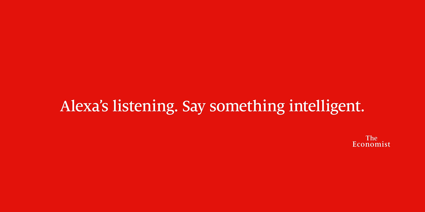
Image Credit: The Economist
We start with a brand that has relied on great ideas shown on text and asks “How do you make complexity look simple?” The Economist. The England-based magazine has always been characterized by making head-turning sentences to show their clever style. When making a choice, agency AMV BBDO returned to this tradition, showcasing these famous ads with the in-house Econ Sans Bold on a 2020 campaign with Billboards, and it is proof that great advertising is all about bold messaging and simple, big impact. They didn’t shy away from the hard topics of the moment; they attacked them with a perspective-sharpening combo of killer, clever writing and that iconic, powerful red design.
When the world gets complicated, The Economist goes sharp. This is a great lesson in making complicated analysis stick in your mind—a perfect marriage of copywriting and sharp design that doesn’t make you think harder, but makes you know faster.
Agency: AMV BBDO
Typeface: Econ Sans
Credits: Nicholas Hulley and Nadja Lossgott (Creative Directors), Augustine Cerf and Lauren Peters, Etyan Smith and Tim Van Der Mee, Andy Vasey, Tim Riley (Creatives).
McDonald’s “Iconic Stacks” – Helvetica

Image Credit: McDonald’s
Can you taste typography? Leo Burnett London probably thought of that in 2020 when they launched “Iconic Stacks.” They went bold: By showing absolutely nothing of the product, they instead delivered pure, unadulterated cleverness that makes you savor the brand. Simply stacking the names of ingredients in McDonald’s products (a foundational taste profile) rendered in the eternally crisp, reliable Helvetica typeface, they made the audience relish the idea of the burger. To find out more about this timeless element, read our article.
These aren’t just famous ads: it’s a creative masterclass that reminds us that true icons live in your mind, and with sharp design and clever writing, you don’t just see the ingredients, you can taste the recognition.
Agency: Leo Burnett London, UK
Typeface: Helvetica
Credits: Pete Hayes (Creative Director), James Millers (Art Director), Andrew Long (Copywriter), Jake Arnold, David Schwen (Designers), Phil Bosher (Head of Design).
Heinz “Pass The Heinz” – HeinzLabel

Image Credit: Heinz
All a great idea needs is to convince someone. And the right moment. The concept, the simple call to “Pass the Heinz”, was first pitched by Don Draper in a fictional 1963 episode of Mad Men. It didn’t get picked up then, but 54 years later, the smart team at DAVID agency decided to execute it in real life for its famous ads. The concept works because of its striking simplicity, by placing the phrase “Pass the Heinz,” rendered in their Heinzlabel custom type, to signify the missing ingredient, their ketchup.
The campaign’s viral nature stemmed from this clever tie-in to the TV show and its clean, direct approach, ultimately earning two Cannes Golden Lions in 2018. It just goes to show that great strategy combined with smart design, even if it’s born for fiction, can truly make an idea a masterpiece.
Agency: DAVID / Miami
Typeface: Heinzlabel
Credits: Tony Kalathara, Russell Dobson (Creative Directors), Carlos Lange (Designer), Matthew Weiner, Erin Levy, Juan Javier Peña Plaza (Writers).
Domino’s Pizza Rebrand Campaign “Dommmino’s” – Domino Sans

Image Credit: Domino’s
How does deliciousness sound? Domino’s has rebranded. A new look, a custom typeface: Domino Sans. Fresh colors, bold messaging: We make great pizza. As great ads in life: simple, big impact. Want to know more? Check out our full article.
But there’s more to it than a visual update. The rebrand came with a clever insight that turned into an evergreen campaign: “MMM”, the sound we all make after tasting truly great pizza. That satisfying sound meets a perfect coincidence hidden in the logo: Dommmino’s™. Among this decade’s most memorable ads and rebrands, Domino’s definitely earned a slice of our hearts, well done WorkInProgress.
Agency: WorkInProgress
Typeface: Domino Sans
Nike Future Movement – Formula

Image Credit: New Studio
One of the most recognizable brands in all of sport knows the value of words. From their “Just do it” slogan to their billboards with powerful messages and impactful ideas, Nike is no stranger to famous ads remembered by a lot of people. But the launch of Future Movement commissioned agency New Studio to answer the question of what a brand like Nike can do for the community. Taking inspiration from traditional media like broadsheet newspapers, they created a look that’s characterful, energetic, and visually compelling, and using Pangram Pangram’s Formula as main typeface, then customizing it to feel strong and rebellious, shows a perfect matchup of a confident design and a typeface that embodies the grassroots energy, matching the uniqueness of Nike’s most famous ads from the past.
Agency: New Studio
Typeface: Formula by Pangram Pangram Foundry.
Credits: Axel Peemoeller (Strategy and Creative Direction), Rita Matos (Art Direction, Design), Bruno Rodrigues (Design, Type Design)
So, amigos, the takeaway here is clear: clever writing is only half the battle.
It also takes a sharp design team to ensure the font choice, spacing, and visual presentation turn words into an unforgettable, iconic statement. These campaigns prove that the perfect marriage of copy and typography doesn’t just make a brand easy to spot, it makes it impossible to forget. A true testament to the power of great design.
See you next time, worldwide friends.
Signed,
A Type Of Jesús.
Since you are really into typography, you might be interested in these other articles and resources:
EB Garamond: History, Best Uses and Other Great Alternatives