Dear Amigos,
Almost every computer in the world has the Helvetica typeface installed. Today, Helvetica is a widely used font family that has not only survived the test of time but has become a symbol of minimalism, order, function, and the Swiss Style. From pharma to airlines, Helvetica is everywhere — from iconic logos that live in our brains without paying rent to the title of the school document you wrote in 2010. You are probably here because you where looking for an outstanding 2 hour Helvetica documentary. Here we’ve gathered for you all the highlights you need to know about the typeface, and you’ll also find other more contemporary alternatives
Helvetica is considered a classic nowadays, so much so that in the design world, it’s sometimes seen as a “turn down” or an “easy,” even “unexciting” choice when it comes to picking a typeface. It’s great, it was great, and it will continue to be great. But with so many neo-grotesque alternatives out there (some of which we’ll add at the end of this article), the creative director of your studio knows you can do better than Helvetica, unless you are doing the corporate identity of the swiss embassy, or the cover for Dieter Ram’s biography.
When choosing design elements for a project, understanding the context, origin, and meaning is crucial. This is especially true for typography. So, if you’re choosing Helvetica for your next editorial project or branding wordmark, get ready to travel back in time to Switzerland and discover the power of simplicity and function.
What Is a Neo-Grotesque Typeface? A fancy way of saying ugly
Helvetica is categorized as a neo-grotesque typeface. The term “grotesque” dates back to the 19th century when sans-serifs were new and considered “strange” or “ugly” compared to the more ornate serif fonts of the time. Imagine John Baskerville being shown a specimen without embellishments—its raw simplicity might have seemed sloppy, even unbearable to see, much less something you would waste ink, paper and time on. The first sans serif specimen is known as “Two Lines English Egyptian” or “Caslon Egyptian,” was created by William Caslon IV around 1816.

A detail from the 1819 Specimen of Printing Types (published by Blake, Garnett, and Co., Sheffield), showing William Caslon IV’s groundbreaking typeface, ‘Two Lines English Egyptian’. Courtesy of St Bride Foundation.
Helvetica’s creation
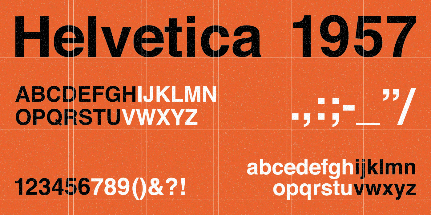
In 1957, a “new” grotesque was born. Helvetica, initially named Neue Haas Grotesk, made its debut in the land of the cantons: Switzerland. Crafted by typeface designer Max Miedinger alongside Eduard Hoffmann’s art direction at the Haas Type Foundry, this international style typeface represented the movement’s core principles: neutrality and exceptional legibility.
Yet, even today, reflecting on what we know now and on how Helvetica inhabits a specific cultural imaginarium, one cannot help but wonder if true neutrality is ever possible. Probably not. Much like Switzerland’s supposed neutrality in politics, Neue Haas Grotesk was renamed Helvetica in 1960 to emphasize its Swiss roots (“Helvetia” in Latin). Its versatility made it the perfect choice for signage, branding, and a broad spectrum of communication needs. Everywhere you look, Helvetica.

Helvetica is one of the key elements for the visual identity and signage of subways around the world, including New York and Toronto.
The International Style and Its Modernist Roots
Simplicity, grids, objectivity—and of course, sans serif typefaces. The International or Swiss Style emerged from modernism, influenced by movements like Bauhaus, De Stijl, and Constructivism around the 1950s. The movement’s philosophy? Design is a tool for clear communication, suppressing personal expression.

In order: The Bauhaus building, Contra-Construction Project (Axonometric) by Theo van Doesburg and Cornelis van Eesteren (1923), “Books” poster by Alexander Rodchenko (1924).
Form follows function. This philosophy still echoes in design schools worldwide. Key figures like Armin Hofmann and Josef Müller-Brockmann, students of Ernst Keller, shaped this timeless style, that shape a generation and the future of design history. Helvetica is the result of this, a clear representation of Swiss Style thanks to its clean, neutral, and highly legible design.

Graphic design works by Armin Hofmann, Josef Müller-Brockmann, and Ernst Keller respectively.
The Rise and Global Impact of Helvetica
Impressively, Helvetica was initially better known in the U.S. during the 1960s than in Europe. As a matter of fact, this typeface wasn’t just popular; it became a standard used by great brands during that time.
You can still find the Helvetica typeface in historic logos and brand identities such as American Airlines, BMW, Target, NASA, and let’s not forget the typography used by the iconic New York Metro—yes, Helvetica. Ironically, this typeface was more prevalent in the U.S. than in the land of the Swiss, Helvetia.
With Helvetica, the International (Swiss) style conquered the world. Later on, Helvetica was also in your house and forever part of digital culture: Steve Jobs famously made Helvetica a system font on the Macintosh, cementing its presence in digital culture.

Some of the most famous logos using Helvetica as their main typeface.
With Helvetica, the International (Swiss) style conquered the world. Later on, Helvetica was also in your house and forever part of digital culture: Steve Jobs famously made Helvetica a system font on the Macintosh, cementing its presence in digital culture

Helvetica in use: the swiss design conquering earth (and beyond!).
If you are looking for more in depth information about the iconic typeface, we advice you to take a look at this outstanding Helvetica Documentary.
Helvetica’s heirs: typeface alternatives
Over time, new variations were created, but the essence of this typeface has not been drastically modified; instead, it was improved in practical ways such as enhancing legibility, multilingual support, improvements for digital applications, among other aspects.
This are some variations of helvetica that you may find online, under open-source licences:

Designed by Rasmus Andersson, Inter is a workhorse sans-serif typeface designed for a wide range of applications, particularly detailed user interfaces, as well as marketing and signage. It features optical sizing with a tall x-height in the “text” size for legibility and contrast-enhancing details like ink traps. It’s weight axis ranging from Thin (100) to Black (900), including corresponding Italic variants for each weight. It also features a variable optical size axis. You can download it here.

Nimbus Sans is a comprehensive neo-grotesque sans-serif typeface family, created as a substitute for Helvetica. It is based on URW++ font sources and includes numerous variations such as Nimbus Sans Poster, Diagonal, Mono, and the global version with CJK support. The main family includes Ultra Light to Black weights, with roman (upright) and italic styles. It also comes in Condensed, Medium, and Extended widths. A subset, Nimbus Sans L, is available in 5 weights and 2 widths. Check it out here.

Manrope is an open-source modern geometric sans-serif typeface family designed by Mikhail Sharanda. It is described as a crossover design that is semi-condensed, semi-rounded, semi-geometric, semi-Din, and semi-grotesque, ideal for both display and text applications. Available as a Variable Font (supports weights from 200 to 800) and 7 static weights. It also includes an Italic fork. You can access Manrope here.
Helvetica earned its status as one of the most important faces of modern design for a reason. Its clean, distinct look still defines clarity and function in communication worldwide. Whether you select a modern alternative or stick with the classic, carry its core lesson forward: form follows function. The legacy of this single, purposeful typeface continues to shape how we all communicate. See you soon amigos!
Yours truly,
Camila Curiel
Since you are really into typography, you might be interested in these other articles and resources:
EB Garamond: History, Best Uses and Other Great Alternatives