Dear Amigos,
As Gen Z grows into a more essential pillar of the global market, brands are moving to satisfy a deep-seated nostalgia for brand mascots. In an age where digital interactions often feel increasingly algorithmic, friendly characters provide a tactile sense of personality in a sterile landscape.
With the recent appearance of Lil’ Finder Guy in the latest MacBook Neo release, I’m fairly certain we are witnessing the beginning of a mascot comeback, or at least a very loud symptom of one. We’ve had big mascots in recent years, like the Duolingo owl, but maybe now it will be a standard practice for brands to include them in their brand system. What does this shift tell us about the current state of consumerism? And does it have anything to do with our current obsession with trinkets?
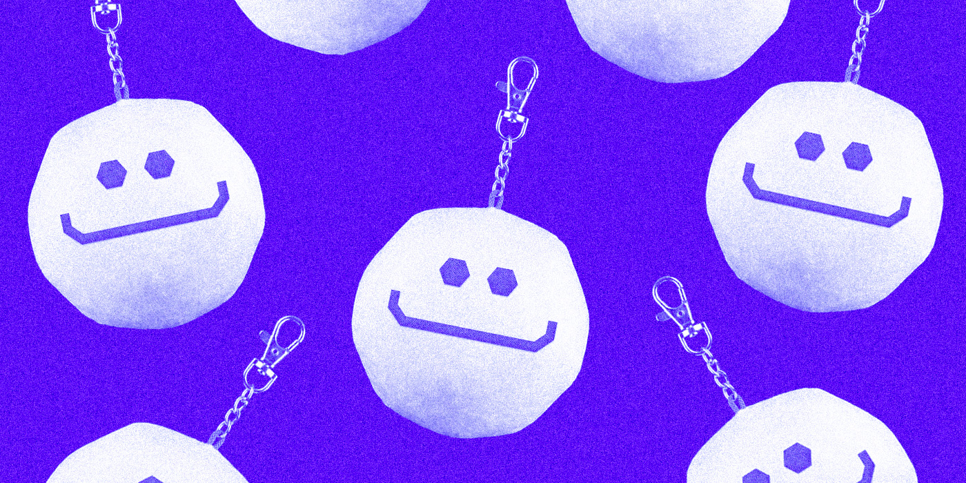
A friend inside the desktop: Lil’ Finder Guy
For years, Apple has been the primary blueprint for simplified design. One could argue they are responsible for the aesthetic migration toward clean lines and neutral sans-serif identities over the last decade. Historically, I wouldn’t have connected their assets to the concept of a mascot; the closest reference is perhaps the iconic Macintosh icon set developed by Susan Kare in the early 90s. Apple felt a lot sillier, and perhaps more human, back then.

In 2026, Apple released the MacBook Neo. Starting at $599, it is their most accessible laptop to date, clearly positioned for students and early-career creatives. We see this in the campaign imagery: high school and college students using the device for light gaming, academic work, and creative projects. The release video was particularly acclaimed for its lack of AI-generated visuals, focusing instead on the human nature of design. The Neo also introduced “Citrus,” a fresh, yellow alternative to the classic metallic palette. I don’t have a lot of evidence of yellow being a preferred color by Gen Z, but it definitely made me want to own it.

During the rollout, specifically on TikTok, users spotted a new character they quickly nicknamed Lil’ Finder Guy. A 3D reinterpretation of the classic Finder logo, which traditionally features two faces in profile. This mascot is seen doing all kinds of activities, including the use of its own mini MacBook, which made online users completely fall in love.

Tech brands are coming to a conclusion: a friendly face makes the hours spent staring at a screen feel slightly less isolating. As technology brands fully integrate AI, a successful strategy may involve moving away from replicating human likeness (which often falls into the uncanny valley) and moving toward character design. Notice the brands you use daily; how many have replaced bots with a silly name and a cute animated character?
Gen Z’s Hyperfixation on Collectibles
The first thing I thought when I saw Lil’ Finder Guy was how perfectly he would adapt to a blind box toy or a bag trinket. We are seeing the worldwide success of stores like Miniso, the massive comeback of Sanrio, and a Snoopy fever that refuses to break. Even fashion brands like Bershka are dedicating significant floor space to bag charms and adorable characters, items that might have been dismissed as childish in the past, but are now the ultimate ambition for people in their 20’s.

More than a trend, this feels like a response to emotional and economic fatigue. In a landscape defined by volatility and the rapid AI takeover of creative careers, the promise of traditional stability feels increasingly out of reach. In the middle of this chaos, we seek comfort. When “big” milestones (like homeownership or stable careers) feel unreachable, young buyers often seek community and status through a curated catalog of characters. This is a classic example of the “Lipstick Effect”: investing in small luxuries to reclaim a sense of joy in a difficult context.

Maybe It’s Not That Serious
It is easy to view this through a cynical lens, seeing a market trying to keep us content with micro-luxuries while the larger system feels broken. However, from a design perspective, the return of the mascot is a welcome evolution. It builds richer visual universes and allows illustrators (hopefully human ones) to bring craftsmanship back to the forefront of brand identity.

Lil’ Finder Guy is a strong example of a mascot done right: he is coherent with the brand’s heritage but adapted for a new era of personality. As customers, I can only hope we invest in objects that truly connect with us and make us happy, rather than drowning in void trends. For designers, the challenge is to ensure these characters have a soul that lasts longer than a TikTok cycle.
Yours truly,
A Type of Ari.
Since you are really into design and creativity, you might be interested in these other articles and resources:
How to Win Clients, and Make Friends on the Way