Dear Amigo,
If you have searched for a font or had an English class, chances are you’ve found the line “The Quick Brown Fox Jumps Over The Lazy Dog” around. This isn’t just a quirky, whimsical phrase: it’s the OG sentence that’s been the unsung MVP of typography and design for well over a century. For anyone who’s ever designed a typeface, tested font families, or picked through alphabet sets, this sentence is a trusty companion that makes sure no letter gets left behind. But, unlike an awkward, head-scratching writing like “Waltz, bad nymph, for quick jigs vex!”, our fox and dog combo doesn’t just hit every letter; it flows like a little poem that’s easy on the eyes and the brain. But why is that? Let’s find out.
What is a Pangram?
A pangram, if you’re new to the term, is a sentence or phrase that packs in every letter of the alphabet at least once. The word comes from Greek roots: pan meaning “every” and gramma meaning “letter.” At first glance, it sounds like just a quirky language trick, but pangrams actually serve a handful of essential roles in typography, design, and technology. For anyone who’s ever designed a typeface, tested font families, or picked through alphabet sets, the pangram is a trusty companion that makes sure no letter gets left behind. It’s the perfect shortcut to a full alphabet check without looking like you’re deciphering cryptic gibberish.
Now, sure, there are a plethora of pangrams out there, some quirky and some downright bizarre. But not all of them have captured the collective design imagination. Ideally speaking, they have to hit the right balance between functionality and charm.
Think of pangrams as the ultimate alphabet soup: squeezing every letter’s flavor into one bite-sized sentence. The goal often is to keep these pangrams as short and coherent as possible, which turns crafting one into a sort of word puzzle for linguists and typographers alike. Classic examples include “Pack my box with five dozen liquor jugs” (sounds like a mini-mystery!) alongside the most famous and beloved one: “The quick brown fox jumps over the lazy dog.”
The Curious Tale of “The Quick Brown Fox Jumps Over The Lazy Dog”
Among all pangrams, one reigns supreme both in design lore and popular culture: “The quick brown fox jumps over the lazy dog.” This phrase has been around since at least the late 19th century, originally serving practical purposes like testing typewriters and telegraph equipment. Its clever construction ticks all the boxes: it’s comprehensible, fluid, poetic, and just the right length, making it ideal for quickly checking every letter of the English alphabet. So why has this particular pangram stuck around and stayed super relevant for designers, typographers, and tech geeks? Well: it’s iconic. And really useful.
The earliest known appearance of a version of the phrase dates back to February 10, 1885, in a publication called The Boston Journal. In an article titled “Current Notes,” the newspaper refers to the sentence, “A quick brown fox jumps over the lazy dog,” as a “favorite copy set by writing teachers for their pupils.” This initial use highlights its original purpose: a simple, effective tool for handwriting students to practice every letter. Dozens of other newspapers picked up and published this slightly shorter version (starting with “A” instead of “The”) throughout the following months, rapidly spreading the pangram’s popularity across America.
It wasn’t long until the phrase found its true calling: the typewriter. As the use of typewriters expanded in the late 19th century, the pangram was quickly adopted for touch-typing practice. The earliest known use of the sentence in its now-famous, 35-letter version—”The quick brown fox jumps over the lazy dog”—is recorded in Linda Bronson’s 1888 book, Illustrative Shorthand. This precise phrasing became the default standard, replacing earlier, longer sentences previously used in typing lessons, thanks to its brevity and comprehensive coverage of the keyboard’s most crucial keys.
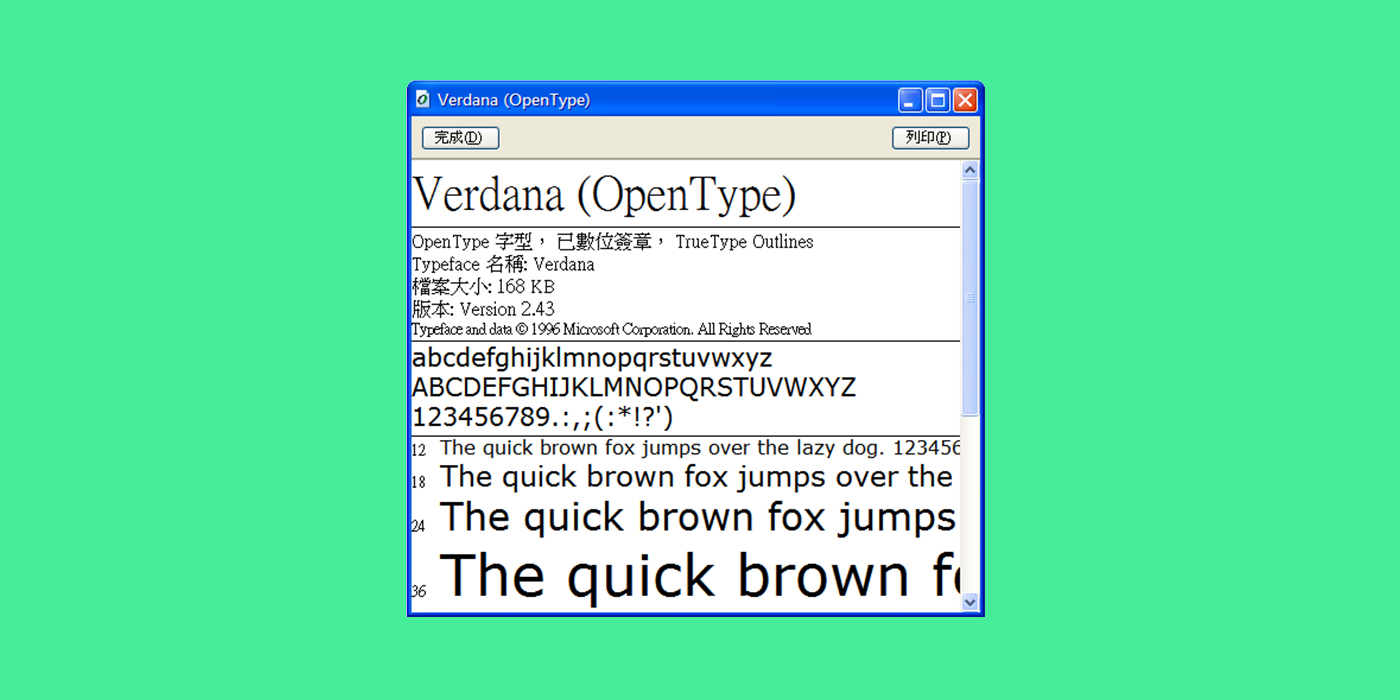
“The quick brown fox jumping over the lazy dog” has been the go-to pangram since the days of typewriters to modern-day font previews. Its short length and readability make it easy to use when testing typefaces, whether it’s checking every letter’s shape or testing kerning and spacing. Plus, it’s adaptable: you see it everywhere from printing presses and type specimen sheets to your computer’s font settings and even coding environments. It’s the Swiss Army knife of pangrams, simple, versatile and dependable.
Pangrams in Typography
Probably you know by now, but pangrams aren’t just party tricks for language nerds—they’re vital tools for anyone working with typefaces and fonts. They show off every letter simultaneously, making them perfect for testing the legibility, style, and spacing of fonts. Whether you’re a type designer trying to polish character designs or a graphic designer previewing font choices, pangrams help you catch subtle quirks in how letters behave together. You’ll see pangrams pop up in software demos, printing proofs, keyboard layout tests, calligraphy practice, and even coding environments where full alphabet coverage matters. Since pangrams include the entire alphabet, they’re like the ultimate quality control check, ensuring no letter is left behind in design or display.
They have gone into everyday use as the default mode of testing fonts because of its sheer practicality and delight. It can be short enough to fit on one line and they can be versatile enough to try out different fonts, kerning, and alignment. In typography, it has become a standard for showcasing typefaces because it highlights letter forms cohesively, giving users a consistent baseline for comparison.
Cool Pangrams to test your fonts
Now that you learned more about pangrams, here are some other choices that we curated, interesting and playful phrases to give variety to your testing to bring your best font game.
The five boxing wizards jump quickly
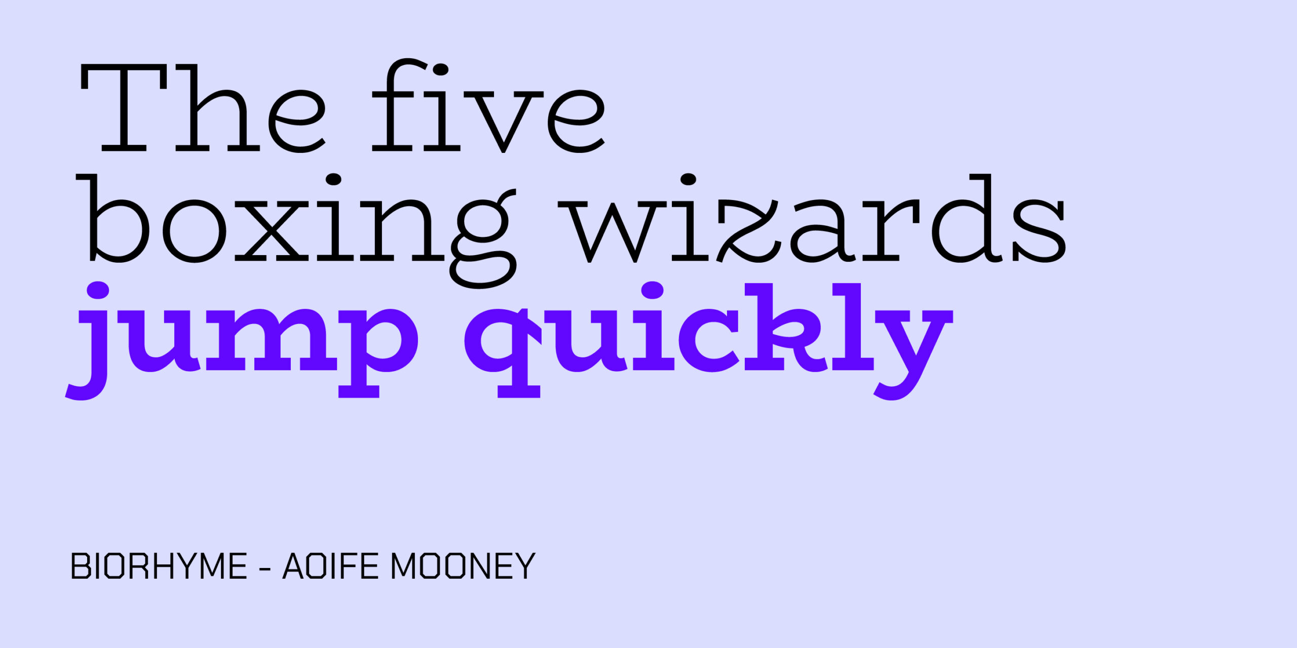
This pangram does not have a well-known author, but is a frequent template online. The sentence in itself paints a funny image, as it would be hilarious to see wizards that love boxing. We tested it with the font BioRhyme, as this font, that you can get here, brings out a vintage and whimsical quality that matches the pangram.
Pack my box with five dozen liquor jugs
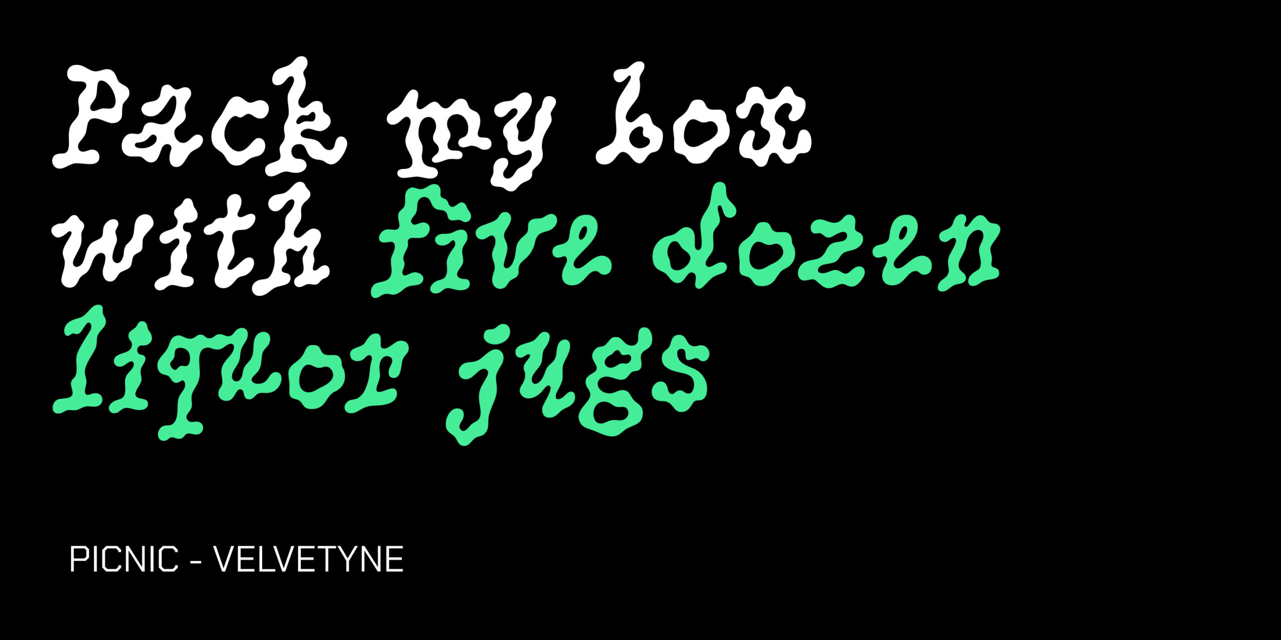
Although this sentence also does not have a well-known author in its origin, it was popularized by author Mark Dunn in his “progressively lipogrammatic” (as it progresses, less words are used) 2001 novel Ella Minnow Pea, which is a fantastic place to be for a pangram. To test it we matched it up with font PicNic, a type designed by Mariel Nils and co-released between Velvetyne and No-Foundry, their font has a liquid feel that reminds that massive amount of liquor pictured by the sentence. Get it here.
My grandfather picks up quartz and valuable onyx jewels
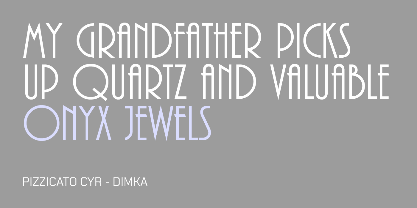
This pangram was popularized by calligraphy and typographic artist Randall Hasson, but has been in use a long time as well. The image it presents is clearly-defined, of your grandfather’s hobby. The font Pizzicato was tested with this phrase, as it has a well-established retro vibe, very reminiscent of the 1940’s, get it here.
A large fawn jumped quickly over white zinc boxes
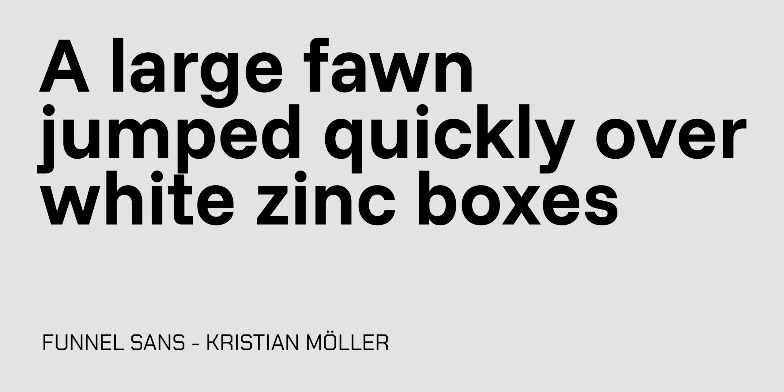
This sentence is also an interesting alternative for testing, presenting a picture of a fawn jumping over white zinc boxes. We tested the font Funnel Sans, which you can get here, that has a very sober stylization in contrast with this pangram.
Jim just quit and packed extra bags for Liz Owen
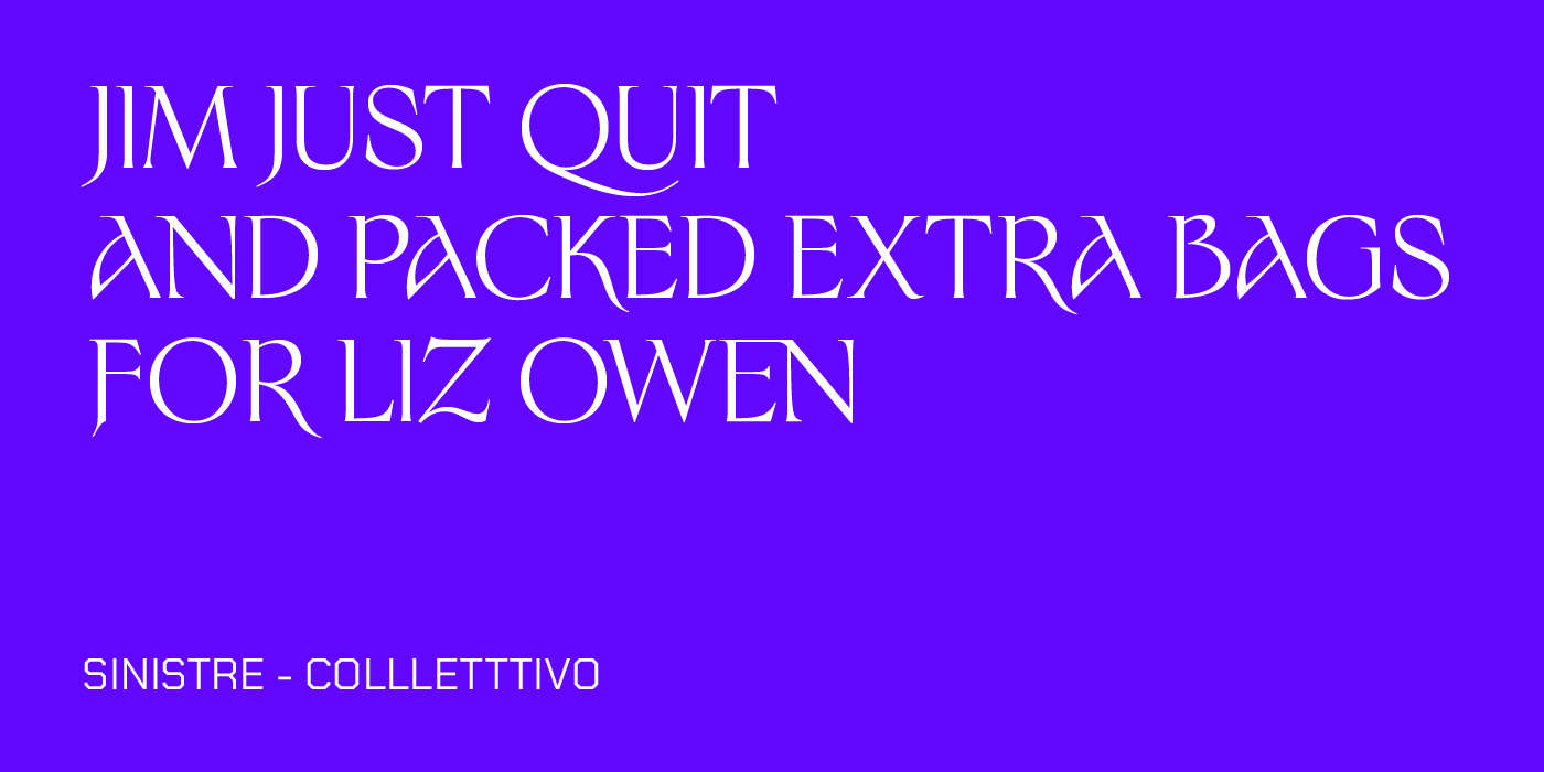
We like this pangram because you can picture not only a clear image, but the start of a story, it has a literary feel. Also of an unknown author, this sentence was used to test the font Sinistre regular, made by Jules Durand, and found here. This font walks the fine line between the tradition of its past references and the modernity it carries.
Veldt jynx grimps waqf zho buck
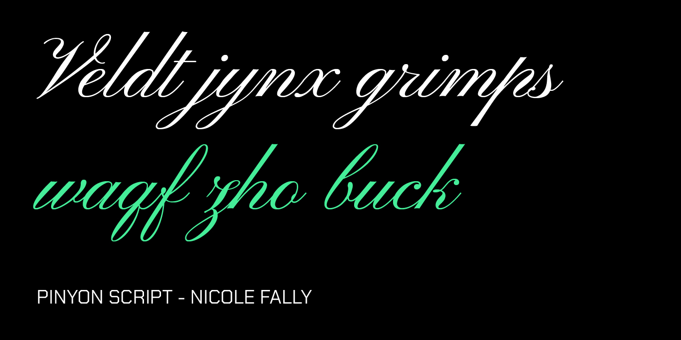
This sentence is one of the more esoteric and challenging pangrams to read, featuring several rare letters like ‘V’, ‘J’, ‘X’, ‘Q’, and ‘Z’ in quick succession. The image it paints is cryptic—a veldt (open country) jynx (a type of woodpecker) “grimping” (a unique verb that combines climbing/scrambling) a waqf (an endowment of property to a religious institution) owned by “zho buck” (a blend of a male yak and cow hybrid). This bizarre, almost alien phrase is an excellent pairing for Pinyon Script, a flowing, formal-leaning cursive font. The contrast between the challenging readability of the pangram and the smooth, elegant nature of the script font beautifully highlights its stylistic features, demonstrating how calligraphic fonts handle complicated letter forms. Get Pinyon Script here.
Brawny gods just flocked up to quiz and vex him
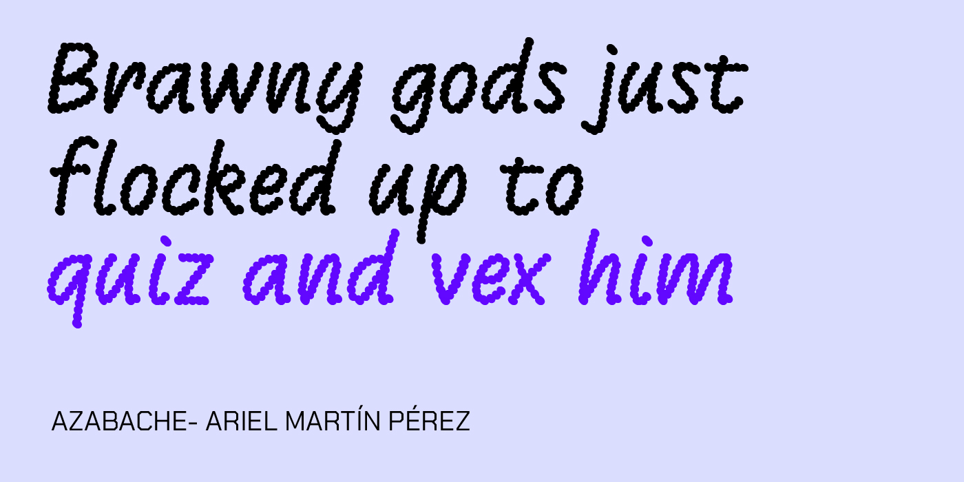
You could say that this highly engaging pangram tells a short, dramatic tale of powerful deities descending to challenge a single, presumably unfortunate, individual. Such a punchy, narrative-driven sentence deserves a font with equal weight and character, like Azabache. This geometric, blocky font, often associated with display and technical design, emphasizes the power and structure of the sentence, making every word feel important. Give Azabache a try here.
Big July earthquakes confound zany experimental vow

A truly descriptive and memorable pangram, this sentence captures a chaotic and slightly humorous event. It’s perfect for testing how a typeface handles longer words and complex visual themes, balancing the sharp sounds of “earthquakes” and “experimental” with the smoother feel of “July” and “confound.” The clear, modern style of Jost is a fantastic match here as is a geometric sans-serif font inspired by the classic Bauhaus designs. Its clean lines and highly legible structure provide a clear, neutral ground that lets the dramatic text shine, ensuring maximum readability even when the vocabulary gets tricky. Test this stunning sans-serif by getting it here.
Five wine experts jokingly quizzed sample chablis
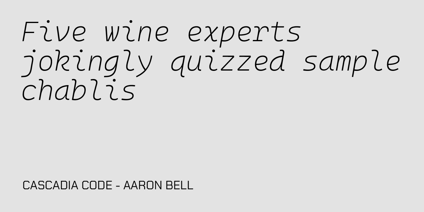
This pangram offers a sophisticated, yet lighthearted, scene involving fine wine and a bit of professional jest. It’s notable for its use of double letters and the rare ‘Z’, making it useful for evaluating kerning in common word patterns. The subject matter makes it a great fit for a font like Cascadia Code. This monospaced font, designed by Microsoft, brings a unique, modern touch. Its even spacing and distinct letter shapes ensure that even a sentence about wine tasting is rendered with crisp, consistent precision, Experience a crisp and clear font by downloading it here.
Turgid saxophones blew over Mick’s jazzy quiff

This pangram is arguably the most evocative, painting a vivid picture of a smoky jazz club with loud, bombastic music and an impeccably styled man named Mick. It’s a great example of a pangram that feels like a full sentence rather than a simple alphabet exercise. For a sentence with such literary and classic flair, the elegant old-style serif EB Garamond is the perfect pairing. A highly accurate and beautiful open-source revival of the classic Garamond typeface with its refined curves, high contrast, and deep historical roots complement the jazz-era imagery of the pangram, demonstrating how traditional serifs handle a wide range of weights and sophisticated phrasing. Get it here.
In the end, despite the vast array of pangrams out there (including the ones we showed you) “The Quick Brown Fox” timelessness lies in its perfect blend of iconic status, compact form, and flexibility. It’s the little phrase that could—which it still does, every time a designer wants to see their letters in action. So next time you see that fox leap over the dog on your screen, remember that you’re not just looking at words: you’re witnessing a tiny piece of typographic history in motion.
Signed,
A Type Of Jesús.
Since you are really into typography, you might be interested in these other articles and resources:
Type Anatomy: Bowl and Counter, Typography’s Beautiful Details
Unlock Your Type’s Potential: Understanding Tracking in Design