Dear Amigos,
From the millions of creative projects all over the world, there’s always a brand identity that goes viral on every design platform you follow. In April 2026, the Amazonia brand took the spotlight, and it’s not hard to understand why. It is a revolutionary concept that changes the way we think about destination brands, encouraging us to look for the answers that are already there. In this case, the answer was found in the largest river in the world that gives its name to the region. Let’s learn how FutureBrand crafted a visual identity that connects the entire region, just as its river does.
The Amazonia Brand: What does it cover?
The Amazonia brand was born from a monumental challenge: creating a unified identity for the Brazilian Legal Amazon, a territory spanning nine different states and a population of over 28 million people. Commissioned by RAI (Integrated Amazon Routes) in partnership with Embratur and Fornatur, the project aimed to solve a long-standing issue of fragmented messaging. Despite its unparalleled biodiversity and cultural richness, the region lacked a singular narrative that could translate its tourism and business potential to the world. FutureBrand’s task was to honor the distinct identities of these nine states while building a shared vision that empowers local communities and promotes a sustainable global bioeconomy.

The narrative starts from the typography
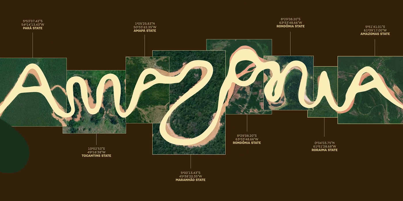
In any good brand, typography becomes essential. For Amazonia, the entire identity relies on a singular typographic concept: creating an alphabet from the curves of the Amazon River. This process led the team to identify various letterforms within satellite maps of the river’s 25,000 kilometers of navigable waterways, discovering that there is a whole universe to explore when reading a river. While these finds were enough to build the iconic logo, they also created Igaratype, an interactive experience on their website where you can write any word, your name, your city, or even a pet’s name, and see it customized with different lengths, thickness, and movement based on real river shapes. It’s a perfect way to create an instant souvenir and a digital connection to the brand.


This creation is supported by two secondary typefaces that contrast the fluid lettering: Aberta, a custom display font born from the modular sign paintings found in the streets of Northern Brazil, and Pacaembu, a beautiful sans-serif inspired by the Art Deco stone signage of the Paulo Machado de Carvalho Stadium in São Paulo. Both were developed by Naipe, an independent type studio based in Rio de Janeiro that specializes in creating fonts that tell stories through the places and cultures that shape them. Aberta’s boldness provides a strong base for the identity, while Pacaembu celebrates the unique tropical personality that European design principles took on once they reached Brazil.
Visual Universe
To ensure the brand felt authentic to brazilians, FutureBrand co-created the visual universe with artists and professionals from all nine Amazonian states. This collaborative effort resulted in an audiovisual library of illustrations and photography that respects the immense cultural diversity of the territory. Furthermore, the project introduced the “Feito de Amazônia” (Made of Amazon) label. This seal acts as a certification for native creators, encouraging a sense of shared pride and ensuring that the brand acts as a real engine for the local economy.

About FutureBrand
When wondering which studio could’ve produced such an impressive brand identity, it’s no surprise to find it was FutureBrand. With a global presence spanning offices from London and New York to São Paulo and Lima, they are a leading brand transformation agency that balances data with high-level creativity. They are the same studio that crafted the Perú country brand, which remains one of the most successful references for regional branding in Latin America. Their commitment to purpose-driven strategies has earned them international acclaim and numerous awards, solidifying their reputation for shaping brands that don’t just look good, but change the future of the communities they represent.
Signed,
A type of Ari.