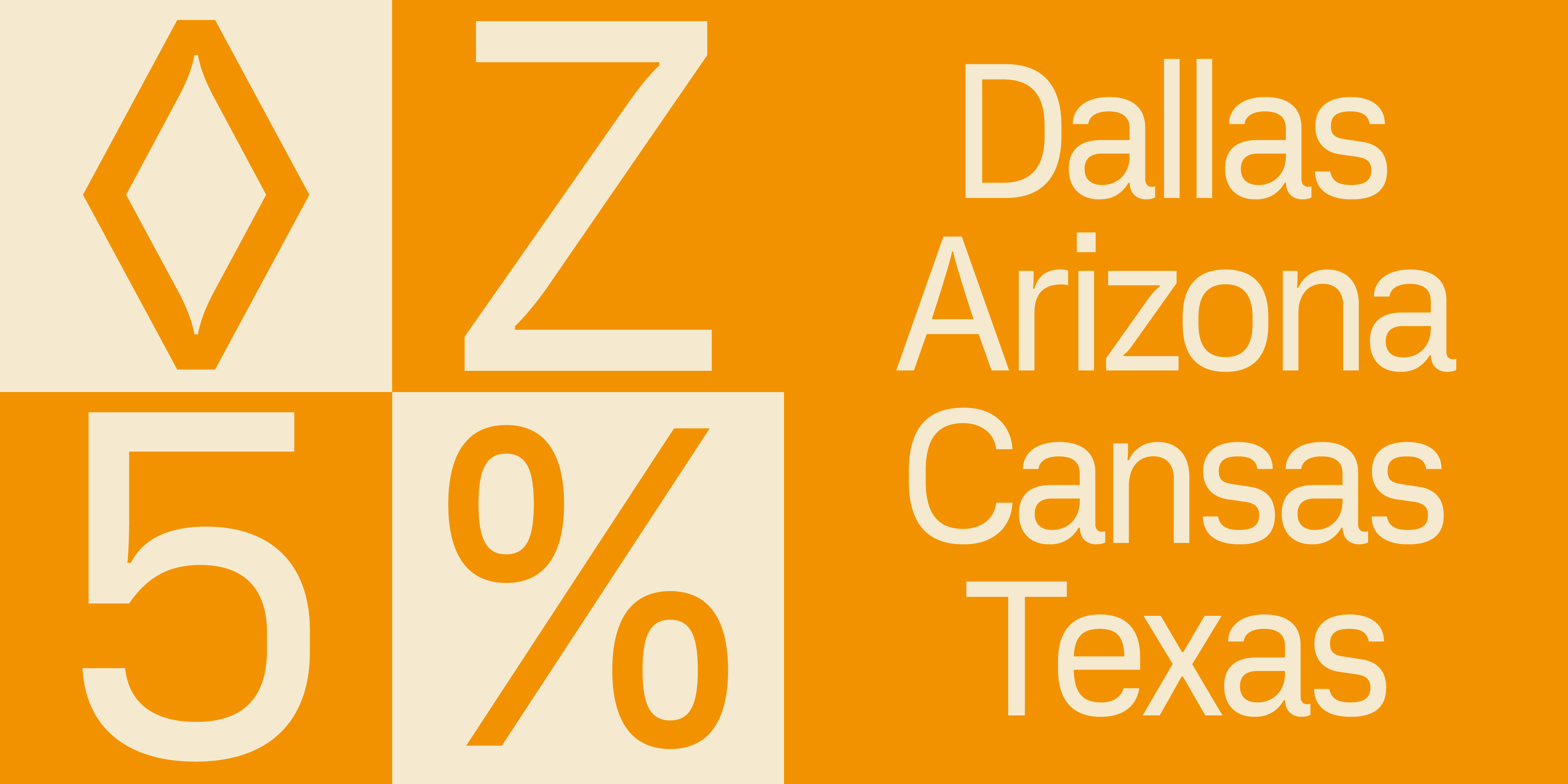
Thankfully for designers all over the world, the free font marketplace has evolved to an endless catalogue of resources. But inside the open-source bliss, many projects lay uncompleted and outdated. That was the context that gave birth to the Vercetti font, a solution for the growing need for high-quality fonts that could be useful for the design community.
We had the opportunity to speak with Filippos Fragkogiannis, the creator behind the Vercetti font, so he could share with us some of the behind the scenes for this wonderful font.
Let’s start from the beginning, what’s the story behind the Vercetti font? From the name to the initial inspiration
F: The name Vercetti is inspired by Tommy Vercetti, the protagonist of Grand Theft Auto: ViceCity. The game’s vibrant visuals and aesthetics left a lasting impression on me, and the name pays subtle homage to that nostalgic era.
The Vercetti font is largely based on the open-source typeface MgOpen Moderna, created in Greece in 2004. While the current version excludes Greek characters, it revitalizes the original design with significant enhancements. Feedback from experienced type designers was crucial throughout the process, ensuring the font met higher design standards.
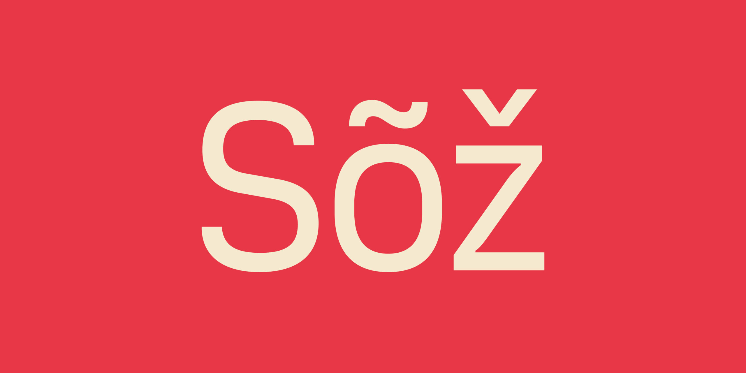
Getting into the specifics: What does Vercetti include?
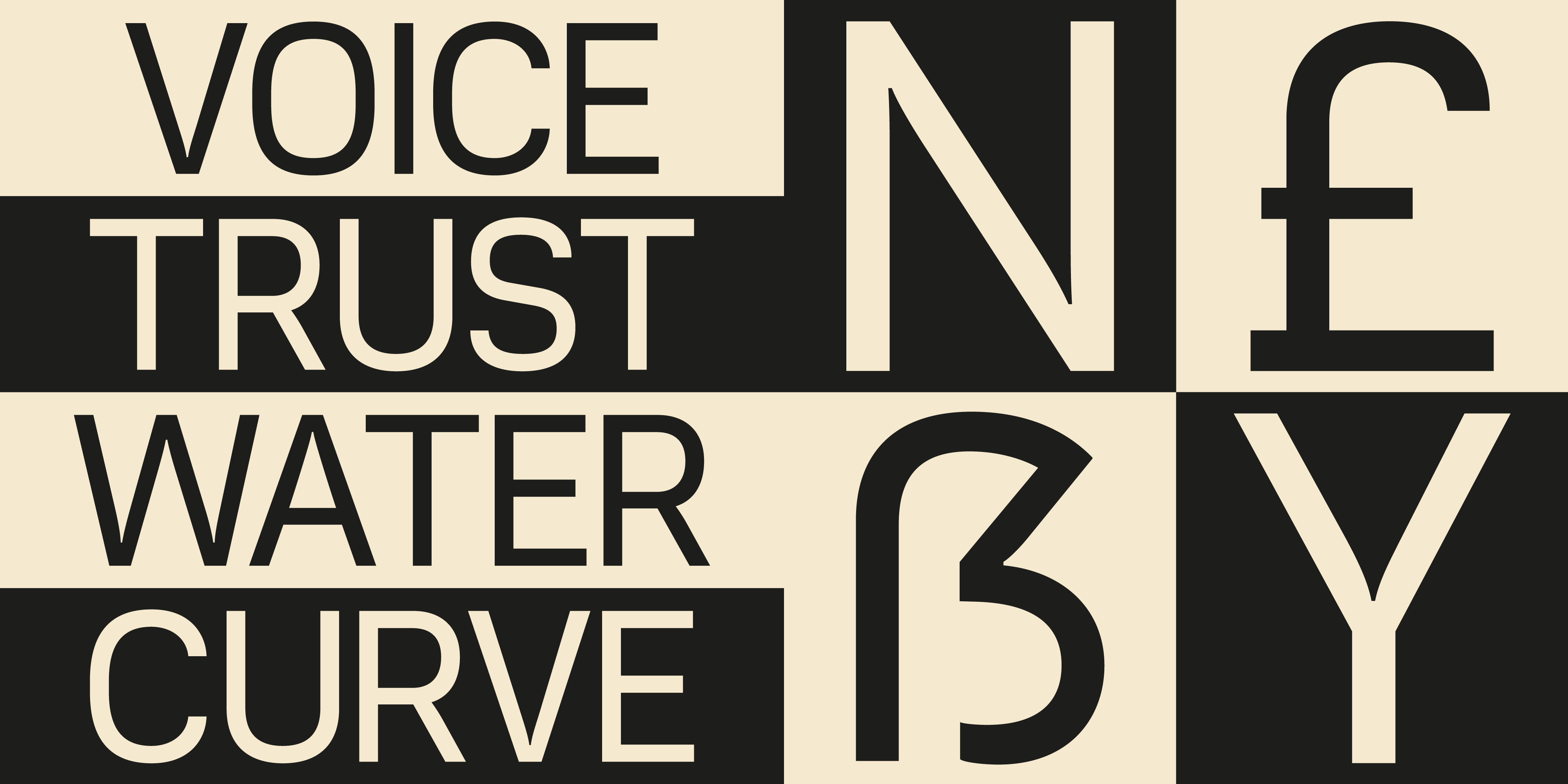
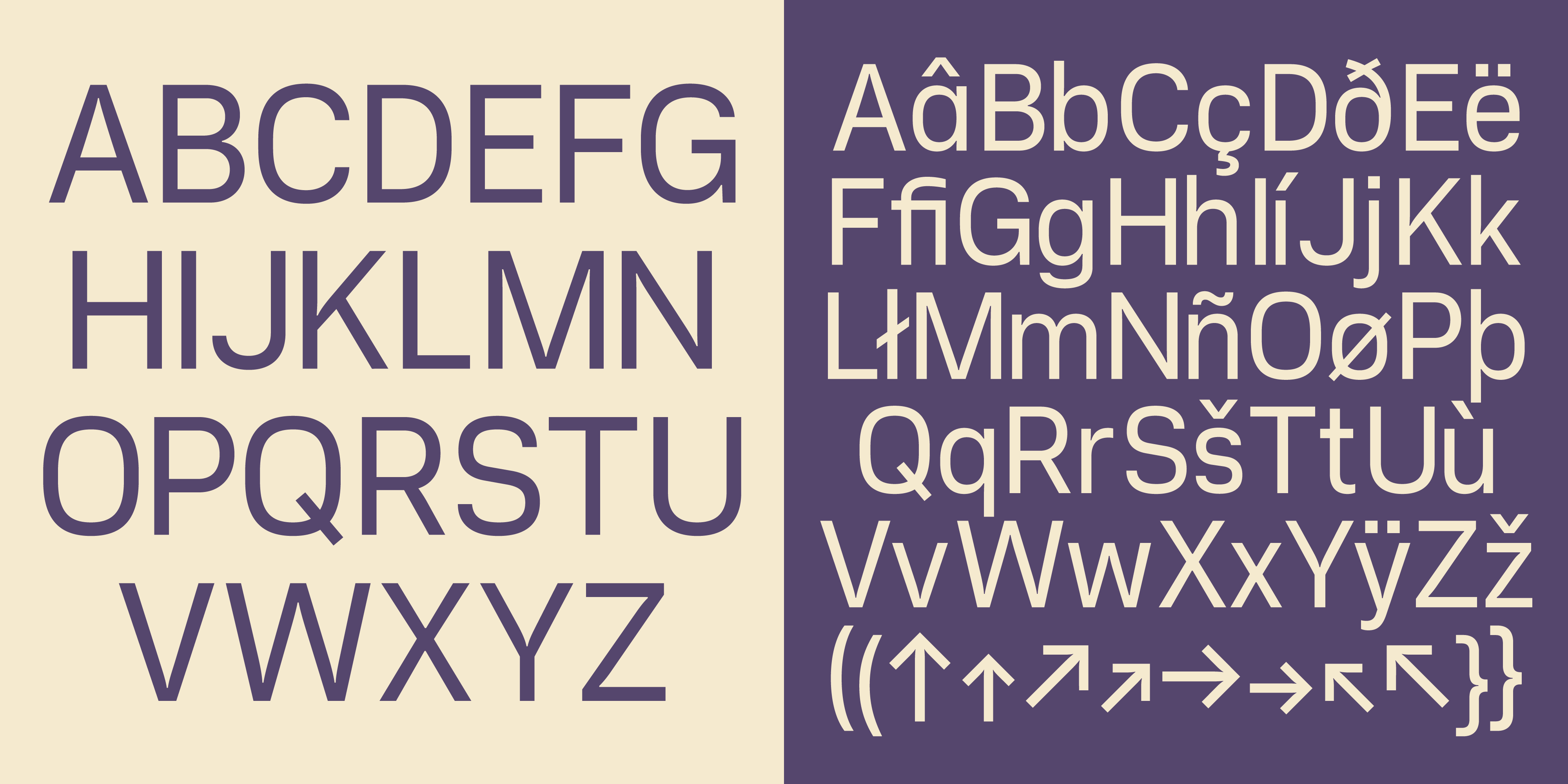
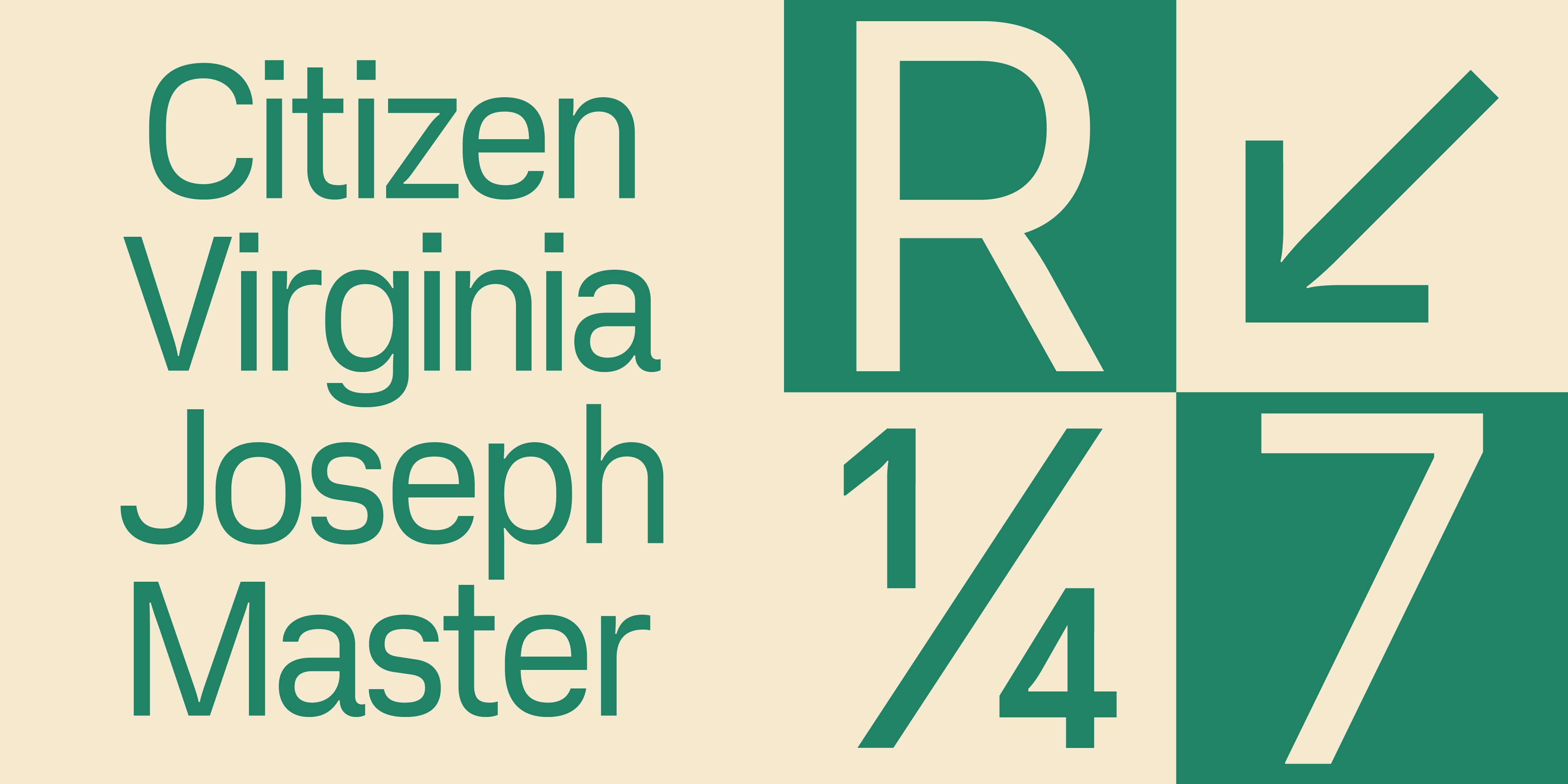
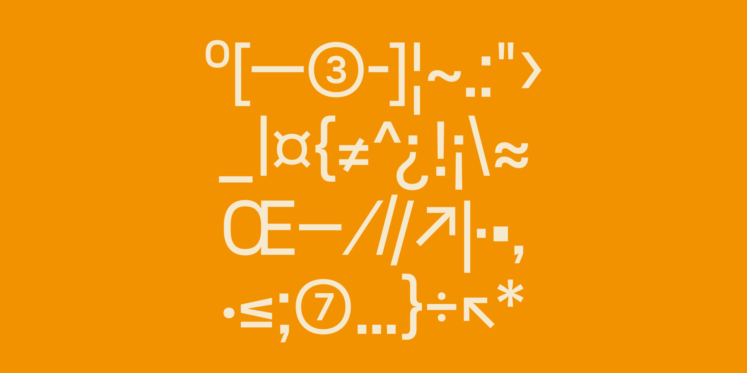
F: Currently, Vercetti is a single-weight font with 325 glyphs. The next version will include over 1,000 glyphs, focusing on expanded language support, alternate characters and new symbols rather than additional weights or italics. We are, however, considering introducing more weights in future updates.
The Vercetti font is distributed under the Licence Amicale, which encourages the organic sharing of creative works in private contexts. This license permits both commercial and non-commercial use, as well as sharing via email or external drives.
Who’s the team behind the project?
F: As the creative director and publisher, I led the concept development, naming, licensing, and distribution of the font. Richard Mandona focused on type design and the technical aspects of font development. Our collaboration and mutual feedback were instrumental to the project’s success.
Vercetti Regular has been honored with several accolades, including an Award of Excellence at the Communication Arts Typography Competition and first place at the Peru Bienal 2022. Other awards include recognition at the Graphis Design Awards, Online Design Awards, Hiiibrand Awards, Indigo Design Awards, Creativepool Annual 2023, DNA Paris Design Awards, International Design Awards (IDA) and C-IDEA Design Awards. It was also ranked among Awwwards’ Top 100 Free Fonts of 2022.

The motivation behind Vercetti. Why did you decide to create it?
F: Even before studying graphic design, I understood from personal experience the importance of accessible tools for aspiring designers. Vercetti is my way of giving back—a font designed to spark creativity and reduce barriers for those just starting their design careers.
Vercetti was designed with versatility in mind. So far, it has primarily been used in web design projects. However, we envision it being applied to public spaces, objects, print media and educational projects. The upcoming second version will expand its usability with additional features and enhanced character support.
Designing a font is a complex yet immensely rewarding process. Seeing the Vercetti font used in real-world design projects has been more fulfilling than most client work. This experience has strengthened my appreciation for typography and the role of high-quality freeware in contemporary graphic design.
Now that you have Vercetti “under the belt”, do you consider yourself a Type Designer?
F: Not quite—I still identify as a graphic designer. Creating the Vercetti font deepened my understanding and appreciation of type design, I view it as a specialized discipline that I’m continuing to learn about.
About Filippos
Filippos Fragkogiannis (b. January 11, 1993, Greece) is an award-winning freelance graphic designer, art director, and poster artist based in Athens. He studied visual communication and graphic design at Vakalo Art & Design College, where he developed a deep interest in semiotics, language and symbols, with a particular focus on typography. His design portfolio spans advertising, branding, logos, posters and digital design. Fragkogiannis strives for his designs to be direct and honest, conveying their message clearly and effectively. He advocates for simplicity, truthfulness and a type-centered approach to design.
Let’s finish with some personal questions:
What is design for you? Design, to me, is a blend of creativity and methodology—a way to solve problems, tell stories and inspire thought through visual language, typography and unexpected approaches. Creativity drives my curiosity and pushes me to explore new ideas.
Why did you decide to do what you do? My attention to detail and desire to improve the functionality and aesthetics of my surroundings naturally led me to design. I’ve always been fascinated by typography, branding and how public communication shapes cultural narratives.
What is your dream project? I aspire to work on a cultural design project that explores the history, heritage and traditions of a city. This would combine travel, research and storytelling, allowing me to create meaningful and informative designs.
Give a piece of advice to a young designer: Trust your creative instincts and never let others diminish your vision. Stay curious and observant. Challenge yourself to step outside your comfort zone, embrace diverse perspectives and adapt to cultural shifts. Always remain open to reinterpreting the world around you.
You can download Vercetti Regular in our free fonts hub.
Don’t forget to check out Filippos amazing portfolio, if you wish to contact him you can email him at info@filipposfragkogiannis.com and also find him through WhatsApp, Instagram, LinkedIn and X.
See you soon amigos!
A Type of Ari.

