Dear Amigos,
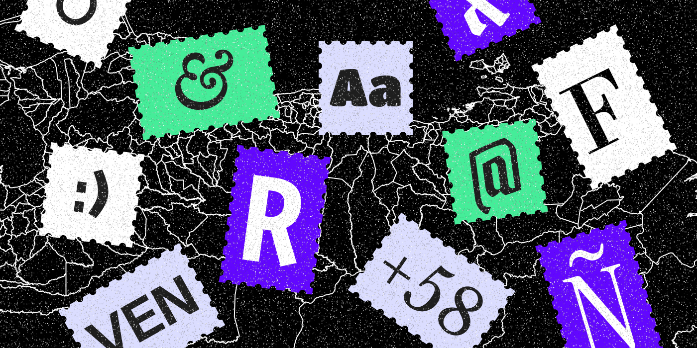
Many of the fonts we use today are easily accessible thanks to Google Fonts, an open-source platform that has transformed how we access and use typography. It has grown from a modest collection of about 100 fonts to a vast library of thousands, each created by talented designers committed to enriching our visual landscape.
Among these designers is Rodrigo Fuenzalida, a Venezuelan type designer and co-author of at least a dozen fonts featured on Google Fonts. His work shows us the passion and precision required to craft typefaces that not only look beautiful but make creativity widely accessible.
You’ve probably heard of Raleway, almost as popular as Monserrat or Roboto. Or Instrument Serif, which might already be part of your portfolio projects. Creating a typeface is no small feat; it demands skill, vision, and attention to detail. But the real reward comes when these fonts find their way into the real world—on posters, websites, products, and more—helping others bring their projects to life.
We recently had a chat with Rodrigo about his motivations, experiences, and the process behind his type design work. Discover one of the masterminds behind the OTF files in your font folder, a reminder that while we may not know everything about our origins, we can always trace the roots of great design back to passionate individuals who shape the way we see—and read—the world.
Rodrigo Fuenzalida’s Journey Through Type
Rodrigo Fuenzalida has become a prominent voice in type design. He graduated from Prodiseño, one of Caracas best design schools, in 2007. His immersion into typography grew through self-study and hands-on work, taking him from Buenos Aires and Santiago de Chile to his current base in Portugal.
Early in his career, Rodrigo contributed to the design department at the Museum of Contemporary Art in Venezuela. Here, he helped create a catalog for the Pirelli Salon, which later won the National Book Award alongside Carlos Rodríguez. His time in South America brought him close to influential figures like Pablo Impallari (a key force behind Google Fonts), Aldo De Losa, and Rubén Fontana, whom he deeply admires as a mentor.
Today, Rodrigo works independently for various clients, including major names like Google Fonts and Monotype. He also regularly collaborates on typographic projects with design studios such as InHouse and F37, currently being part of their team. His exceptional work has been recognized and showcased globally, appearing in prestigious events like the Bienal de Tipos Latinos (in 2012, 2016, and 2018), at the Museo de la Estampa y el Diseño Carlos Cruz Diez, and in various publications by Slanted.
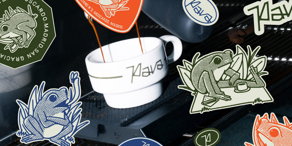
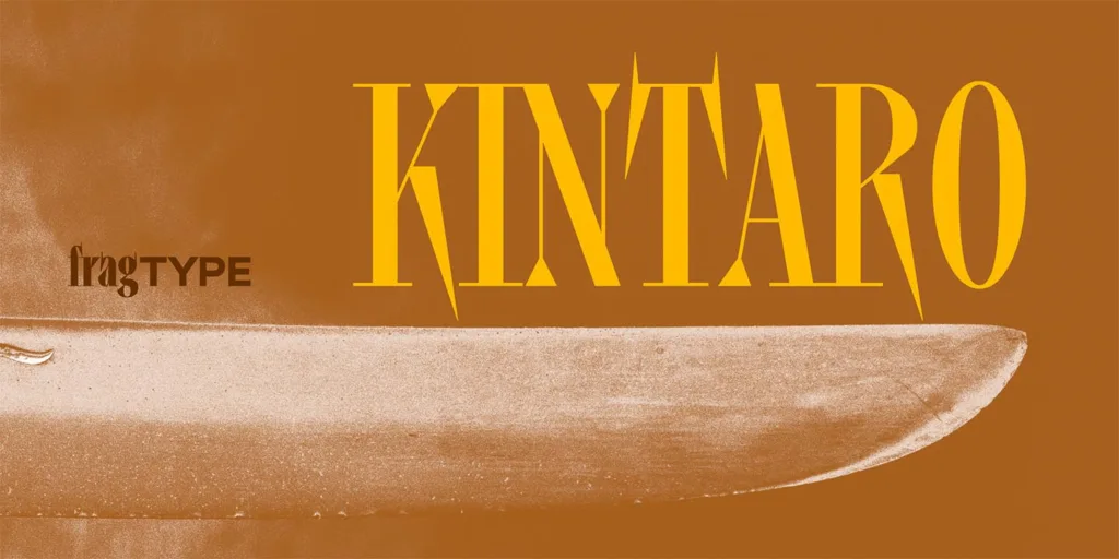
Now Rodrigo has his own independent type foundry, fragTYPE, building amazing typefaces such as Kintaro. They have a special focus for videogame-inspired fonts and actively looking to create projects that fit into their digital universe.

A Type of Interview with Rodrigo
What motivates you to create so many open-source typefaces?
R: Basically because I love making fonts, I’m in love. Seeing a font in use is something indescribable and knowing that thousands of people can make use of my work because they can access it for free is a great satisfaction.
How did your collaboration with Google Fonts begin, and what has that experience been like?
R: It started a few years ago, if I remember correctly it was in 2011 when Dave Crossland was in South America looking for people to participate in the project, at that time I wrote him to see if he would be interested in Titan for the project, he said yes and from then on I have always kept in touch with the project in some way or another.
What inspired you to fall in love with type design?
R: My teachers, Gabriela Fontanillas, Pedro Holder, Carlos Rodríguez, Luis Giraldo y Eduardo López among others, were the ones who implanted in me the seed of typography, it is thanks to them that I started to design fonts and the rest is history.
How did you start your journey as a type designer?
R: My journey in typography design began in a self-taught way in 2009, it was during that year that I made my first “usable” fonts that you could install on the system and write with them. From that moment on I’ve made mistakes, I’ve learned, I’ve improved and every day I learn something new related to font design.
What advice would you give to someone just starting out in type design?
R: Do it, start to draw letters, if you have doubts look for online resources (there’s a lot of them) reach out to other type designers, it would surprise how open most of them are to share their knowledge with others. And just keep doing, that’s the best way to improve.

Image credit: Brinca Font
What are some type designers who you believe are currently influencing contemporary visual culture?
R: Alec Tear, Ricardo Báez, Kris Sowersby.
Which designers have inspired you personally in your career, and why? It would be especially interesting if you could mention any connections to Venezuelan design history.
R: Nedo and Leufert are my biggest Venezuelan references, obviously because of their graphic design work that always keeps floating around the letters. Wim Crouwel, Susan Kare, Zuzana Licko, Neville Brody, The Designers Republic, would be other international references that have marked my own typographic design.
From your perspective, what impact is the Latin American design community having on the world of type design? What do you see as its most significant contributions globally?
R: I believe that in a world as interconnected and globalized as the one we live in now, it is difficult to measure specific contributions coming from delimited groups, most of the great design works result from collaborations between studios, clients and designers that end up uniting influences from different parts of the world. If I had to talk about the specific Latin American contribution I think I would have to talk about our way of seeing design, that thing of always integrating the “Latin” look to any work we do. Considering that most of our training comes from European and North American schools, our design work always ends up having a mixture of those influences with our local roots and culture, and I think that is the greatest contribution of Latin America to global design.

Image credit: Fall Guys
A project using one of your fonts that makes you proud:
R: Fall Guys and its use of Titan. Having a big-scale game displaying my work is one of my biggest achievements.
You can check out Rodrigo’s work at Google Fonts, as well as his Behance profile and purchase one of his latest typefaces, Ocho, at MyFonts.

Image credit: Ocho Font
Open-Source Gems: Fonts by Rodrigo Fuenzalida
Rodrigo’s dedication to open-source has made a significant impact in many designers lives, providing them with high-quality, free-to-use typefaces. Some of these works are so iconic that many designers can identify the font just by name. Featured in Google Fonts and used by millions of people, here are some of the typefaces where his expertise has played a crucial role:

Raleway:
Raleway is an elegant sans-serif typeface that began as a single thin weight designed by Matt McInerney. It has since expanded into a versatile 9-style family, plus italics, making it a popular choice for everything from headlines to body text. Its clean, geometric lines offer a sophisticated and modern feel. Rodrigo Fuenzalida was instrumental in expanding and refining this typeface alongside multiple designers, including Pablo Impallari, and Andres Torresi, under the Impallari Type foundry. It’s also featured in The League of Moveable Type. You can download it here.

Libre Baskerville:
The Libre Baskerville font project comes from the classic American Type Founder’s Baskerville from 1941, but it has been thoughtfully re-engineered for digital screens. Key adaptations include a taller x-height, more expansive counters, and a slightly reduced contrast, all enhancing readability on various displays. Designed for Impallari Type by Pablo Impallari and Rodrigo Fuenzalida, you can download Libre Baskerville here.

Titan One
Titan One is a display typeface with a cheerful personality. This bold, rounded font draws its essence from the organic feel of hand-lettering with large brushes. Designed by Rodrigo Fuenzalida, Titan One comes in a single Regular style and supports 109 languages, making it a versatile choice for expressive, impactful designs. You can download Titan One here.

Libre Bodoni
Libre Bodoni is a revival of the classic Bodoni typeface, reimagined for contemporary digital use. It retains the elegant contrast and refined serifs of the original while optimizing it for screen readability. This beautiful serif typeface adds a touch of classic sophistication to any project. It comes in 4 styles (Regular, Italic, Bold, Bold Italic). Designed by Pablo Impallari and Rodrigo Fuenzalida, you can get the family here.

Outfit
Outfit is a modern, geometric sans-serif typeface designed with versatility in mind. It was designed by Fuenzalida for for brand automation company outfit.io. Its clean and friendly appearance makes it highly adaptable for branding, web design, and digital interfaces. The typeface offers a wide range of weights, providing flexibility for various design needs. Outfit features 9 styles (Thin to Black). You can download it here.

Freeman
Freeman is a bold, industrial-inspired display typeface. It’s based on the ased on the work done by Vernon Adams on Francoise One. Its strong, condensed forms make it perfect for impactful headlines, logos, and packaging. It commands attention with a contemporary yet rugged feel, bringing a distinct personality to projects. Designed by Rodrigo Fuenzalida and Aoife Mooney, Freeman is available in a single Regular style. Get it here.

Pirata One
Pirata One is a unique display typeface with an adventurous character. Its distinctive letterforms and sharp serifs evoke a sense of history and excitement, making it ideal for designs that need a bold, memorable statement. This single-style display font was designed by Rodrigo Fuenzalida and Nicolás Massi. Pirata One is available here.

Instrument Sans
Instrument Sans is a versatile and highly readable sans-serif typeface designed for clarity and functionality across various applications. It was designed for Instrument, a design and technology company. Created by Rodrigo Fuenzalida with direction from Jordan Egstad, Instrument Sans is part of a larger family offering 8 styles (from regular to bold, plus italics). Access Instrument Sans here.

Some of our favorite uses of Rodrigo’s Fonts
Browsing through one of the best tools for typography enthusiasts like us, Fonts in Use, we want to shoutout a few great projects that apply some of the fonts we listed in this article. As we always like to say, make sure to show some love to the creators and studios behind these projects, visit their portfolios and follow them on social media. Add them to your never-ending list of inspiration just like we do.

Image Credit: Athanor Akademie
Athanor Akademie: Snare
Highlighting one of his commercial typefaces, Snare was the inspirational seed for the entire visual rebranding for Athanor Akademie, a german performing arts school. The designer behind this stunning identity work, Manuel Kreuzer, was inspired by the nervous energy of this font, featuring its playful aesthetic, to reflect the training. Snare was designed by Rodrigo Fuenzalida and Alexander Wright (another talented venezuelan type designer) for In-House International. You can learn more about Snare here.

Image Credit: David Protein
David Protein Bars: Instrument Serif
Day Work, the LA/NYC based creative studio, launched David from naming to packaging. A luxury protein bar designed to increase muscle and decrease fat. The main typeface that identifies David across their logo, website, packaging, messaging, and all other forms of content is Instrument Sans, beautifully paired with Suisse Int’l and Monument Grotesk Mono.

Image Credit: Peter Salling
Sælhud short film: Libre Baskerville and Instrument Sans
The posters for Sælhud, short film by Peter Salling, were designed by Amelie Bormann and they feature 2 of Fuenzalida’s fonts in a stunning pairing: Instrument Sans and Libre Baskerville. This combination creates a subtle contrast that works really well, imagine the posibilities for editorial projects. The title of the movie is displayed in Nora.
Venezuela’s emerging typography scene has always been reduced to very small workshops and schools, mostly coming from experienced designers that want to mantain the passion for type in younger generations. This quiet, almost family-like approach has plainted a growing love for the craft in designers like Rodrigo, who took their teachings and put them into practice to the max expression: becoming a major contributor for global creativity.
Through his dedication to accessible, high-quality typefaces, Fuenzalida ensures that designers worldwide can access excellent tools, transcending economic barriers. His work not only inspires but also directly fuels creative projects, enriching visual culture for everyone.
See you soon amigos!