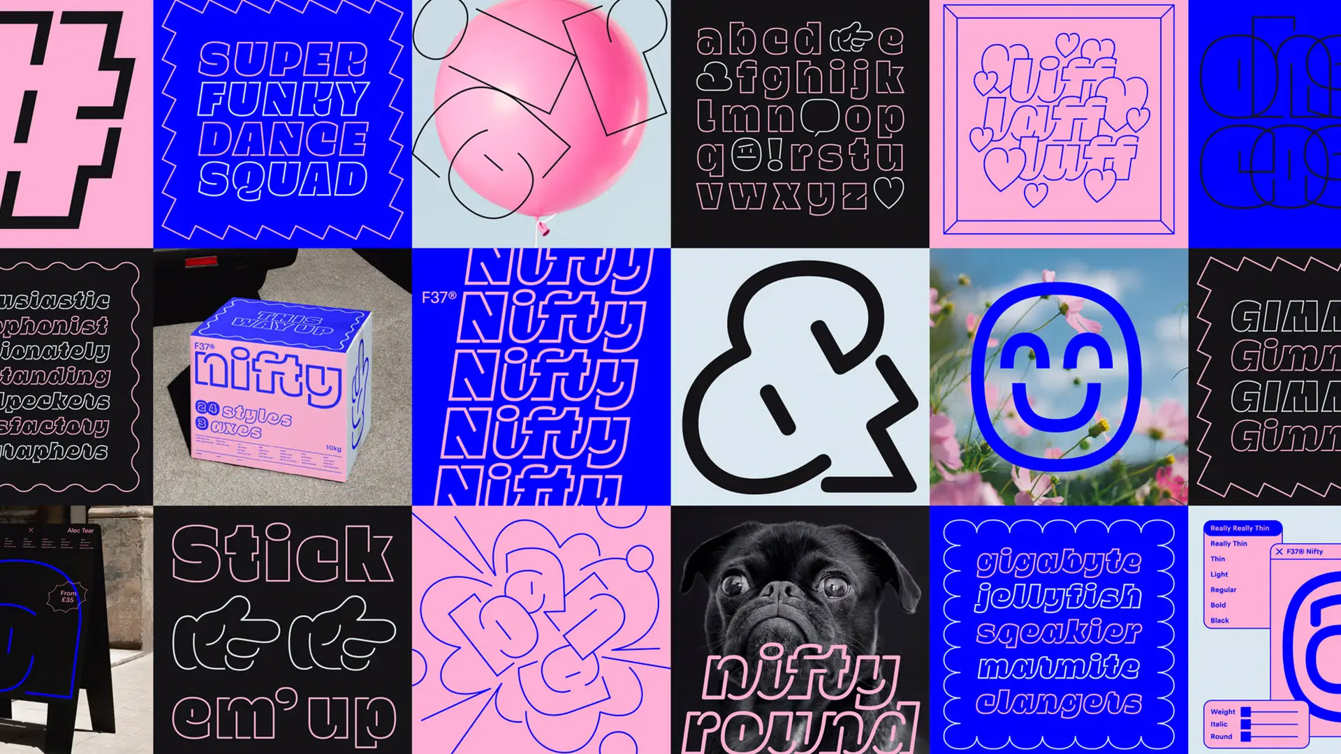
What are the limits of typeface creation, and how can they be broken? These are the kinds of questions that arise when looking at projects like Nifty, a unique display typeface designed by Alec Tear in collaboration with F37 Foundry. As we can see, it is possible to craft functional fonts without abandoning the free, flowy feeling of hand-written characters.

A new role for stroke lines
As we learned in our 10 ways to boost creativity article, finding new approaches and combinations can lead to amazing ideas. This happened to Alec Tear as he sketched the first drafts of this project. Normally, lines create the shape of the letter, but what if they could trace the lack of that shape? In other words, what if the stroke highlighted the negative space of each character? This is Nifty’s defining trait, where the outline becomes the protagonist.

Repurposing typographic contrast
Nifty is described as a mono-weight font, and since there’s no “shape”, how can we create contrast? This typeface comes with 24 styles anchored to 3 axes: weight, italic, and round. But how does the weight work with the white space argument? Well, the outline becomes the variable asset. This arrangement creates an unusual feature: as the lines get thicker, the white space decreases, making the letters actually look lighter. Imagine the fun combinations we can create with that.

The challenges behind creating a Script Font
Ryan Williamson, one of the type designers from F37, was in charge of developing Nifty. His input on creating script typefaces assured the smooth connections between characters, a stunning work that we can especially detail in the italic fonts from this family. Unlike working with sans-serif fonts, which tend to be based on geometric shapes, crafting script fonts is a more complicated task. Consistency can be very hard to achieve, as well as mantaining readibility. Yet, Nifty works well even in the tightest of kerning adjustments.

A Stellar Team for an Awarded Typeface
Nifty was awarded with the D&AD Graphite Pencil for Type Design and Lettering / Typeface Family as well as the TDC Certificate of Typographic Excellence for Type Design. Alec Tear, the designer and lettering artist for the project, fuses his brand experience with a deep passion for lettering through his independent work. Ryan Williamson (type design) and Rick Banks (creative direction) were the other building blocks to bring this project to life. You can purchase Nifty here.
See you soon amigos!
A Type of Ari.


