Creating custom typefaces is crucial for brand positioning, and Abbreviated knows that. Establishing a distinct and consistent visual voice is extremely important for brands in this oversaturated market, and with the write typeface you can do that and much more. A bespoke typeface becomes an integral part of a brand’s identity, reflecting its values, personality, and uniqueness more authentically than generic fonts.
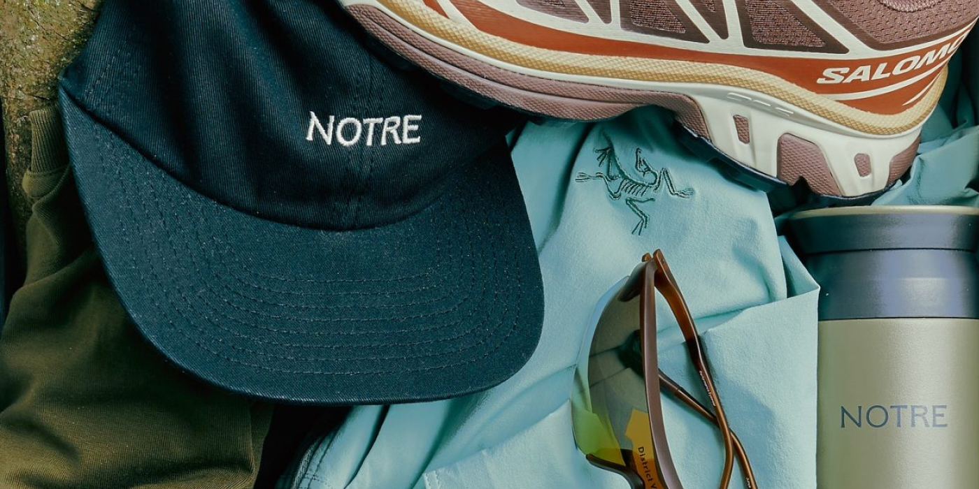
Notre is a name that goes along with evolution in Chicago’s fashion landscape. Emerging from the city’s skate and sneaker culture, they rapidly matured into embracing everything from technical apparel to formalwear. As the team prepared to launch its first in-house collection and major footwear collaborations with names like Salomon and Nike, they required a look that matched this new era. In their partnership with Abbreviated, a main question was brought to light: How do you balance strong midwest roots with a new global ambition? Notre needed a visual language that was sophisticated enough to shine in the fashion sphere while remaining true to its origin, and the starting point for this development was custom typography.

Midwest Hospitality as Brand Strategy
Abbreviated worked on a strategy focused on a powerful and accessible theme: hospitality. Notre was defined as “an international house of products and experiences built to host your aesthetic evolution.” This conceptual shift moved the brand beyond simply selling clothes to hosting an experience. A domestic vibe that starts with a new crest with artful swashes suggest the motion of swirling incense or the inviting gesture of opening doors. The use of “The Archway” as a supporting mark, represents the entrance to their visual language dominated by warm palettes and raw textures that makes patrons feel completely at home within the world of style.

Custom Typography Sets the Tone
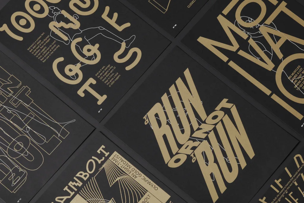
The studio’s in-house typography practice, Abbreviated Foundry, designed two custom type families, demonstrating the power of tailored type design. Notre Brick acts as the brand’s workhorse, communicating all necessary information with direct clarity. On the other hand, Notre Mason’s classical weight and form evoke the craft of hand-carving, setting Notre in a place of permanent prominence.
Notre’s custom typefaces supports clear recognition across all touchpoints, setting a tone that conveys the brand’s irreverent and stylish personality. Custom fonts can reinforce brand differentiation and strengthen market presence, making the brand memorable and trustworthy in the eyes of consumers. The power of crafting a beautiful glyph is undeniable.


The optimization of Notre Mason results in the final logotype of the brand, which was unveiled, alongside the entire identity system, through their website, social media, signage and packaging back in 2023. The release also included a brand new collection of homewares and apparel that helped Notre achieve their objective: to become global and remain classic.


About Notre
Notre Shop has been a pivotal destination since its founding in 2014 by José Villanueva, MJ Jaworowski, and Charlie Nordstrom. Located in Chicago’s West Loop neighborhood, the boutique specializes in a highly curated selection of streetwear, sneakers, and apparel. They expertly balance a range of global brands with their own distinctive private label of quality basics. You can visit their website here.

Abbreviated Projects is a strategic design studio focused on accelerating brand evolution. Their method is rigorously field-tested, designed to produce identities and experiences of the highest order. Their work is driven by a powerful mission: proving that creativity can actively shape a more intelligent species and a beautiful world. You can check out their stunning portfolio here.
See you soon amigos!
A Type of Ari.