Dear Amigos,
Humans have already explored the world over and over again, so now the thrill of discovery has shifted from geography to other things, like taste. This realization served as the spark for Legal Wines, a project born from the shared passion of two restaurateurs and a sommelier, determined to curate the finest bottles in the universe for the Paraguayan market. They needed a brand that, beyond selling wine, could act as a “seeker” of flavors, bridging the gap between world-class producers and the most discerning local drinkers through a dynamic digital presence. That’s when Estudio Cariño, the Guadalajara based creative studio, entered the game.

A New Map of Flavors: The “Wine Hunter” Concept
We had the privilege of directly asking José Pablo Salazar, the founder of Estudio Cariño, about the brief for Legal Wines. What was the motivation behind the project?
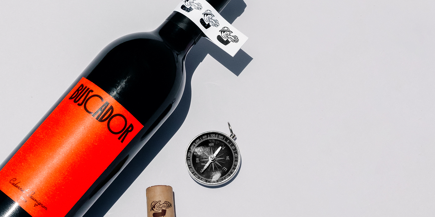
JPS: Three amigos (two restauranteurs and a sommelier) got together to create Legal Wines. This great brand curates wine from Paraguay. Using Instagram, they work in the humanitarian labor of uniting the best drinkers with the best bottles of wine in the universe. We loved to work on this amazing project that believes, like us, that all you need to succeed in this world is a lot of cariño and some wine. We created a character that represents the wine Hunter. A simple and fun illustration. His binoculars are two wine bottles because he sees through the qualities of each of the brands that are imported to Paraguay.
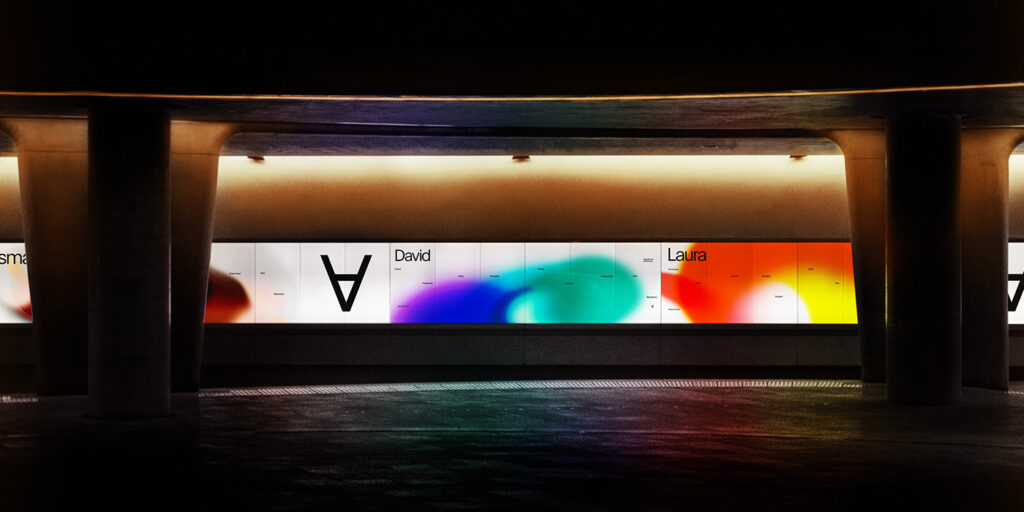
The identity relies on a balance of adventure and sophistication, utilizing a system of visual assets that feel both like a vintage explorer’s journal, mostly from the typographic choices, and a contemporary Instagram-first brand.


Seeking Wine, Seeking Type
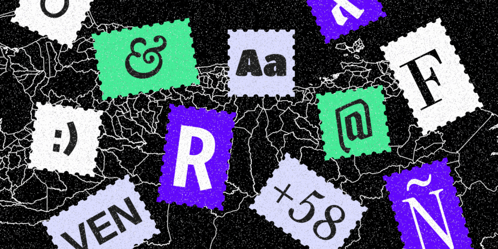
As we mentioned, there’s a back and forth between the idea of a vintage explorer and the current needs of a modern wine consumer. This relationship generates a rich typographic palette that mixes the best of both worlds. Henrietta, a soft serif revival by Kyle Benson for Very Cool Studio serves as a bold anchor that contrasts with the nostalgic Palm Canyon Drive by RetroSupplyCo, a mid-century inspired script that evokes the golden age of travel and glamorous resorts, straight out of a touristic postcard.
To lean into the unconventional nature of the curation, the studio utilized Irregardless by OhNo Type, a variable family that feels more like an entire design system than a typeface. The wide O’s contrasting with the mostly condensed use of the font for Legal Wines, become a great resource for the strategic wordplay using “Vino”, which means wine in spanish, but it can also be a very common verb that relates to both transportation and intention. Finally, the system is grounded by Atak by Out of the Dark, a Swiss-inspired sans-serif. Atak provides the functional clarity required for a brand that handles imports and legal curation, ensuring that beyond the whimsy, the expertise of the sommelier remains front and center.


Legal Wines Today
Since its creation, Legal Wines has maintained its presence as a digital-first brand, operating primarily through their Instagram profile. Today, the brand continues to fulfill its mission of humanitarian wine labor by acting as a bridge between international vineyards and the Paraguayan community. Their feed serves as an evolving archive of their latest hunts, featuring limited-run bottles and curated selections that reflect their passion for discovery. By focusing on a direct-to-consumer approach through social media, they have successfully turned the act of buying wine into an interactive experience, where their followers can follow along with the “seekers” as they find new flavors to share with the universe.


About Estudio Cariño
Based in Guadalajara, México, Estudio Cariño is a design microbureau specializing in brand creation. Founded by José Pablo Salazar and later joined by Iván Soto Camba, the studio operates on a unique hypothesis: that affection changes everything. Since their inception around 2018, they have focused on a human and playful approach to branding, combining deep narrative storytelling with functional design. Their “kaleidoscopic” vision, treating affection as a raw material, has earned them international acclaim, including features in Mindsparkle Magazine and The Dieline, as well as multiple Latin American Design Awards (LADA) for their work in packaging and brand identity. Make sure to check out their full portfolio here.
Project Credits:
Brading & Design: Estudio Cariño
Copywritting: Iván Soto Camba
Photography: Presente Continuo Perfecto
Signed,
A type of Ari.