Dear Amigos,
Pava is a small specialty café located in the Moscardó neighborhood of Madrid. It is no secret that the coffee niche is a saturated market, but this coffee branding project proves it’s still possible to stand out from the crowd. Established in 2024, the business had the challenge to fit into the area’s industrial aesthetic while simultaneously highlighting its warm and simple nature. Merging these two polarities was the task assigned to a creative ensemble formed by Majo Prenassi, Santiago Brandani, Norberto Batiz, and Maria José De Boni.

A Visual Identity Between Geometry and Local Fauna
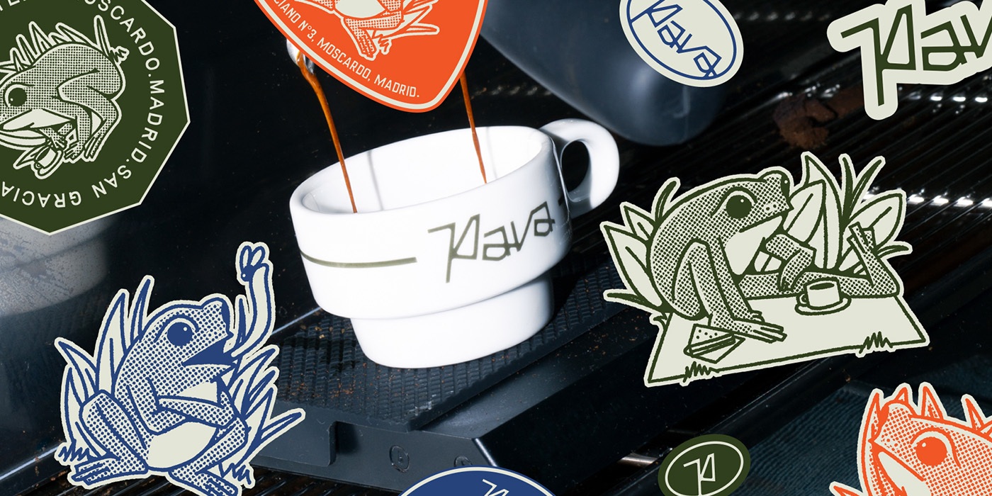
The visual identity for this coffee branding adventure with Pava stands on two pillars. The first, its logo, is a construction that mediates between geometric essentiality and the natural feel of a handwritten sketch. The organic connections between the letters feel fluid, yet the entire mark is traced with consistent lines and angles. This logo lives within a flexible system where it can be used in isolation or as a monogram variant that maintains the brand’s identity in smaller formats. The palette takes primary colors to a warm point that extends across their menus, tableware, and promotional materials.
The second pillar is the brand’s mascot: an adorable frog inspired by the local fauna of the Manzanares River, a major landmark of Usera, where the Moscardó neighborhood is located. Illustrated by Norberto Batiz, the frog accompanies Pava’s coffee branding on its menus, mugs, and merchandise, blending in with the clientele by appearing to drink coffee, enjoy a picnic, or simply hunt flies. It serves as a memorable visual link between the café and the community of Moscardó.


Typography with a Human Touch
This coffee branding DNA is composed by several visual elements. The logo is well-supported by two auxiliary fonts that continue this organic-yet-geometric approach. Rosemary, a classic condensed font, is carefully constructed to show character without feeling aggressive. It is paired with Birdie, a sans-serif with an analog appearance inspired by vintage print typography, featuring rounded edges and slight inconsistencies that make it feel human while remaining precise.
Both typefaces are the work of Taylor Penton, a designer based in Maui, Hawaii, who focuses on typographic products and brands that emulate manual craftsmanship. You can purchase his fonts and view his portfolio on his website.


Visual Consistency as the Key
Pava is a beautiful coffee branding case study for the visual continuity of an impeccable project. To this day, they carefully follow the visual universe established for them in every post they share. Every element—photography, design, and communication—works together to translate Pava’s inherent warmth and honesty to all their products. Their proposal is not only visually rich, they also offer an excellent range of services spanning from morning coffee to dinner.
You can follow them on their Instagram profile [@paaaaaava] and, if you find yourself in Madrid, don’t hesitate to pay them a visit here.


Project Credits:
Direction: Majo Prenassi
Design: Santiago Brandani y Norberto Batiz
Illustration: Norberto Batiz
Photography: Maria José De Boni
Signed,
A type of Ari.