
Dear Amigos,
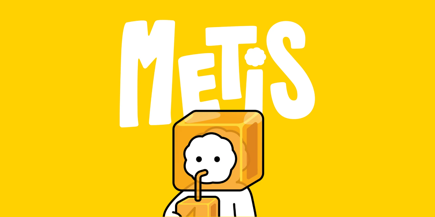
If you’ve been keeping up with the internet lately, you know that capturing Gen Alpha’s attention is a modern challenge. Social media has wired them for rapid dopamine hits in the shortest time possible. Enter Metis, a new flavored barley and chewy jelly milk brand by VitaDairy, a Vietnamese company with a history of milk brands. The brief was tricky: how do you design a product for pre-teens that sheds a childish aesthetic, but acknowledges they aren’t quite ready to connect with something serious and corporate? VitaDairy trusted the creative minds at M — N Associates with this exact development process.

Meet Vitrô: AI and the Everyday
M — N Associates’ solution was to create a visual system built from small, everyday fragments. It’s dynamic, light, and practically begs you to explore it. They designed an official mascot for the brand named Vitrô—a being created specifically to be approachable. Interestingly, Vitrô’s initial sketches were developed using AI. This wasn’t a shortcut; rather, it was a deliberate nod to the very tools this generation is growing up with. From those early generative seeds, Vitrô was refined into a highly relatable character for everyone. Optimistic, curious, and remarkably natural, the character feels close, as if it has always existed and was just waiting to be discovered.
The brand’s visual system complements itself globally. The Metis logo echoes a sense of movement and growth—that specific step you take when moving forward. It successfully captures the spirit of strength, height, and boundless curiosity that defines Gen Alpha.


MN Metis Sans: Spontaneity in Type
You know we can’t look at a project without diving into the type. The typography was custom-tailored for the project. MN Metis Sans is a sans serif typeface with a distinct handwriting style, inspired directly by the spontaneity of its target generation. It is built with soft, sweeping curves that mirror Vitrô’s own forms. It’s robust, features minimal contrast, and comes equipped with three weights alongside full support for the Vietnamese language. It’s a perfect example of typography doing the heavy lifting to bridge the gap between playful and structured.

Designing for Collectibility
The packaging presented another unique challenge. It was designed with a collectible mindset. Every box features a distinct front design, complemented by a side panel that follows a three-panel comic narrative showcasing Vitrô’s everyday moments. M — N Associates even ensured that each flavor had its own packaging variations, allowing the buyer to collect the series without giving up their favorite flavor.
The Minds at M — N Associates
The creatives responsible for translating all this youthful energy into a flawless identity are the team at M — N Associates. Founded in 2013 by M — Lan and Duy — N in Ho Chi Minh City, this boutique strategic branding studio operates on a crystal-clear vision: design is never just decoration, but the physical tool to bring a brilliant idea to life, merging strategy with impeccable visual execution. M — N Associates have spent years building worlds for highly innovative brands like Pizza 4P’s, HiRaw!, GHTK, and PetChoy. Their work continues to make serious waves internationally, earning them a well-deserved place on platforms and awards like Pentawards, The Dieline, the ADC Awards, and Communication Arts.