Dear Amigos,
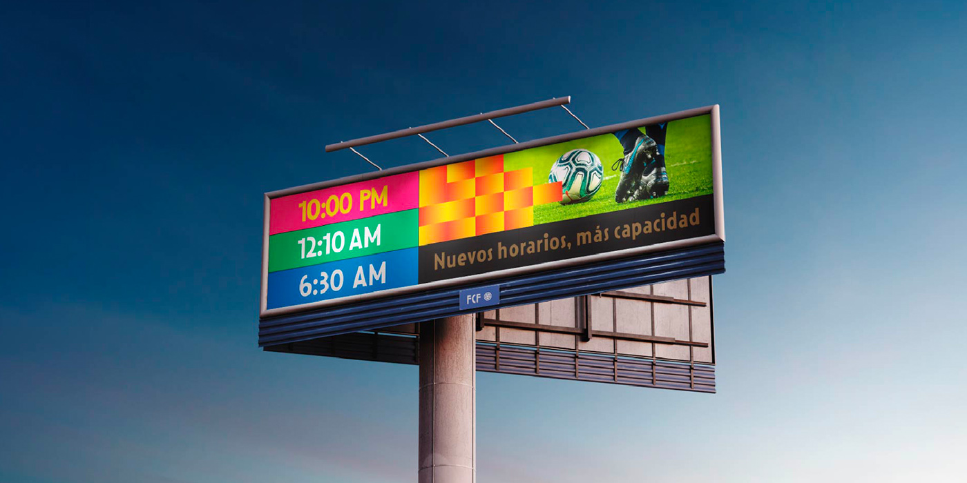
The rebranding of the Colombian Football Federation (FCF), besides representing an aesthetic update, became a mission to capture the soul of a nation. Tasked with this challenge, the Colombian creative studio Mellow & Banana sought to modernize a shield that had remained static for over 30 years. To create a truly authentic visual identity, they identified the need for a proprietary voice, a typeface that could embody the history, culture, and unique rhythm of the Colombian people. This realization led to a collaboration with the Bogotá-based type foundry Bastarda Type, who was commissioned to design the custom typeface that serves as the backbone of the brand: Leyenda BT.

The Rhythm of a Nation: Mellow & Banana’s Visual Strategy
Under the conceptual umbrella of “El ritmo que nos une” (The rhythm that unites us), Mellow & Banana developed a visual ecosystem designed to capture the collective energy of the Colombian people. A central pillar of this rebranding was the strategic evolution of the national shield; by rotating the pentagon at the heart of the soccer ball, the studio transformed it into a symbol of home and inclusion that also represents the five thermal floors that define the country’s geography. This pentagonal geometry serves as the structural guide for the entire graphic universe, providing infinite possibilities for implementation across digital and physical touchpoints, which are unified by a vibrant color palette that refreshes the traditional yellow, blue, and red. Mellow & Banana is a Bogotá-based creative boutique that specializes in building human-centric brands through a fusion of strategy and deep cultural insight.


Leyenda BT: A Typeface Born from Heritage and Movement
Leyenda is a typographic tribute to Colombian identity, blending historical rationalism with modern athletic energy. Designed by Seb Castellanos de la Hoz and Jason Guzmán, the typeface draws its geometric foundation from the work of Sergio Trujillo Magnenant, a prominent 20th-century Colombian illustrator and artist. The font is characterized by rhythmic angles and a distinctive “dot” feature, which is used in diacritics and punctuation and is directly inspired by the form of a soccer ball.

This versatile family balances pre-Columbian heritage with contemporary digital efficiency. It even includes three distinct and scalable versions of the national shield within its character set, ensuring the brand remains legible and proportional across all platforms.

The Rise of Latin American Type Design
The creation of Leyenda is a significant milestone in the evolving typographic landscape of Latin America. According to the investigation “Latinoamérica: Nuevos horizontes tipográficos,” developed by the team at the Latin American Typographic Directory, the region has historically been at the margins of typographic technology, often relying on imported styles and tools from Europe and North America. However, the current modernization has redefined this reality, shifting the region from being a consumer of fonts to a prolific producer. As noted in the study, Latin American typography is currently in a phase of professional formalization and legitimization, where local designers are creating work that reflects their specific sociocultural context rather than merely follwing global trends.


The Power of Branding in Modern Football
As the 2026 World Cup approaches, the intersection of graphic design and soccer has become a vital tool for sport diplomacy and nation branding. Research highlights that a holistic branding strategy through sport can leave a lasting socio-economic legacy and foster a deep sense of community identification. Renowned designers like Matthew Wolff emphasize that football crests and identities must represent the fans to be successful. For Colombia, Leyenda fulfills this role by reinforcing the country’s brand through a visual language as unique as its playing style. It proves that in modern sports, a team’s identity is as crucial to its legacy as its performance on the pitch.

Bastarda Type is a Bogotá-based studio specializing in typographic production and “typebranding”. Led by co-founders Seb Castellanos de la Hoz and Jason Guzmán, the studio has gained international recognition, including Certificates of Typographic Excellence from the Type Directors Club (TDC) and accolades from the Latin American Design Awards. Their approach merges meticulous attention to detail with an innovative spirit, creating fonts that are culturally resonant and technically superior. From commercial giants like Alpina to prestigious national symbols like the FCF, Bastarda continues to elevate Colombian design on the global stage.
Signed,
A type of Ari.


