HardCuore was invited to reimagine one of the best-stablished brazilian supplement brand, formerly known as True Source. They needed to evolve into something more direct, sophisticated, and perfectly aligned with the modern wellness universe. This evolution started with the name itself: the brand is now simply True, a bold move that reinforces their authenticity and purpose. Its new signature, “Live True,” serves as a clear statement about clarity, quality, and focusing on the elements that truly matter for a balanced life. The studio’s solution was to create a cohesive visual system to walk with True in their new strategic phase.


Designing Movement and Authenticity
The studio’s main challenge was developing a proper identity that conveyed truth in flavor, nutritional value, and lifestyle. HardCuore chose the idea of movement as the core creative solution. This concept became the logo, the symbol, and the foundation of the entire visual language.
Movement here is not just an abstract concept. It connects directly to the active, daily life of the supplement brand’s community. It references the literal spin of a mixer, the rotation of a bicycle wheel, or the nourishing light of the sun. This concept moves across the different touchpoints, including the logo and typography, that adds dynamism to a sans-serif base through curved details. These elements reinforce the vital energy that drives the brand and keeps pace with its consumers. True is reborn as a living, vibrant system, constantly in motion, just like the people it inspires.


Art Direction and System Clarity
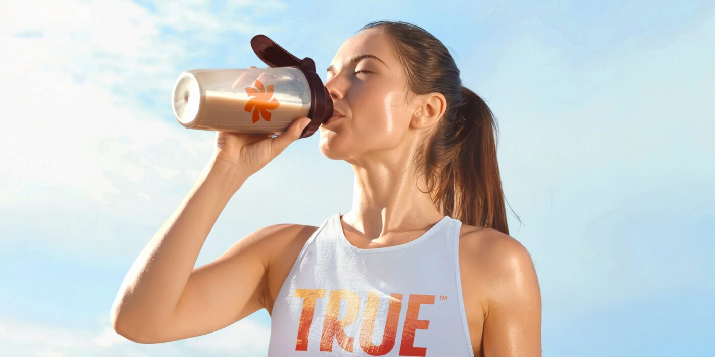
The new identity successfully reflects both authenticity and sophistication. This was achieved through meticulous art direction. The visuals use warm photography and a sunlit look. Scenes communicate clear messages of pleasure, health, and well-being, avoiding the sterile feeling often found in the category.
Beyond the visuals, HardCuore designed a clear architecture for the sub-brands. This ensures consistency across the portfolio while allowing each product line to stand out clearly. The final design expresses the strength of a premium brand that goes beyond performance metrics. It’s focused on the holistic goal of living well, with balance and flavor.


About True
True is a Brazilian brand committed to delivering essential products for health and well-being. They aim to make nutritional excellence accessible to everyone. Their main product lines focus on supplements like Whey Protein, Creatine, Magnesium, and various specialized vitamins. They are positioned as a clean, high-quality choice for consumers. The business emphasizes transparency about what matters most: clarity, quality, and the elements necessary for a balanced life.


HardCuore operates as a design agency focused intensely on creating powerful brands. The studio emphasizes diving deep into strategy before crafting any visuals, partnering with select clients to elevate their unique vision. HardCuore is known for handling the entire brand journey, from its inception to becoming a market icon. Their expertise covers everything from naming and visual identity to packaging and motion graphics, building transformative, memorable brands. You can check out their website here.
See you soon amigos!
A Type of Ari.