
Dear Amigos,
Mr. Bucket Chocolaterie is a growing chocolate brand that has made a name for itself as a champion of bean-to-bar Asian chocolate in Singapore. However, as the business expanded, they faced a new challenge: how to elevate their perception and stand tall in a highly competitive artisanal market. Mr. Bucket partnered with Somewhere Else, a Singapore-based strategic brand consultancy, to develop a leading identity and a full packaging system. Beyond including this amazing case study in our Inspiration gallery, we were able to interview Yong Ng, the founder and creative director of Somewhere Else, to give us more insight into the development of Mr. Bucket and their work as a creative team. Enjoy!


A Collectible Packaging Ecosystem
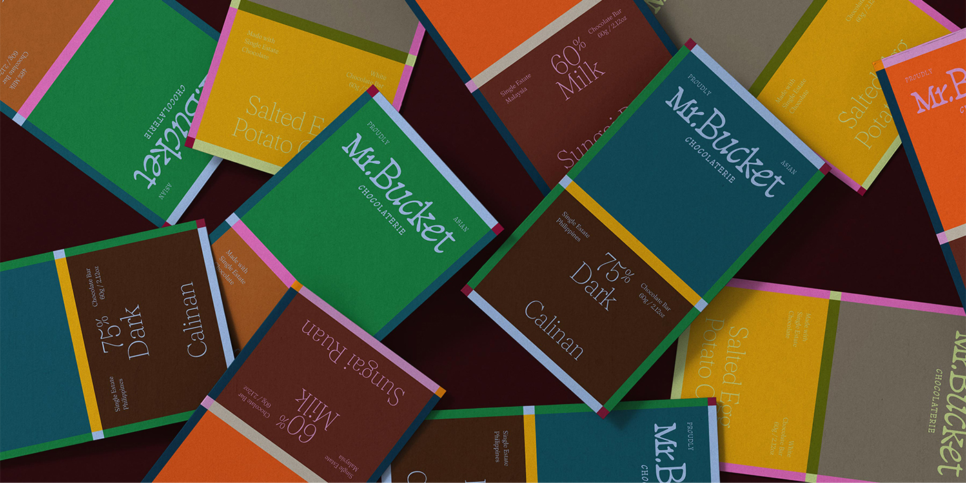
The visual decisions crafted by Somewhere Else hinge on balancing playfulness with a premium presence. To protect Mr. Bucket’s price point and reflect the high level of handmade craft behind their chocolate, the team designed a suite of packaging that feels collectible. The different color and pattern combinations make their products look too beautiful to be hidden away in a pantry. A visual winning point that matches the quality of their product.
The identity relies on a boldly minimal graphic system that relies on the intersection of colors and lines. The refined wordmark features characters that appear to be moving, capturing a sense of whimsy without losing substance. This airy approach is grounded by a strong color palette, where bold core tones, including the necessary chocolate brown, are paired with vibrant accent hues to easily differentiate seasonal and special editions. Across chocolate bars, bonbons, and dragée boxes, every detail works to set a new standard for the artisanal chocolate segment in Asia.


The Wonky Elegance of Tagada
A key component of this brand refresh is its typographic curation. When we asked Yong Ng about their approach and how the selected typefaces fit into the new brand universe, he explained:
Y: “We used Tagada for the logotype and accent, Fraunces for text. For this brand refresh, the focus was in elevating their brand to protect their price point, and develop an identity that stood out against even the category leaders.
With that in mind, we sought to achieve a sophisticated yet ‘playful’ brand identity to reflect the Mr. Bucket level of craft/quality and innovation, so we lucked out when we found Tagada. For the logotype we were trying to find a rational font to balance the equation, that was also easy to procure and use.”
This curation perfectly captures the narrative Somewhere Else aimed to build. Tagada, designed by Laurent Müller and available through Future Fonts, was originally born from a sketch of a lowercase ‘b’ with a highly inclined bowl and a straightened stem. It naturally adopts a style that feels both regular and subtly italicized, providing the rational foundation the team needed while bringing an undeniable sense of character to the logo.
To balance the display type, the team chose Fraunces for the body text. Designed by Phaedra Charles and Flavia Zimbardi at Undercase Type (available via Google Fonts), Fraunces is a variable font inspired by the mannerisms of early 20th-century “Old Style” typefaces like Windsor and Souvenir. Its soft-serif nature introduces an elegant warmth that complements the bold packaging design, making the brand feel approachable and human.


About Somewhere Else
The creative force behind this transformation is Somewhere Else, a boutique brand consultancy founded in Singapore in 2011. They specialize in strategy and identity for “challenger brands”—businesses that quietly refuse to play by the usual rules and care deeply about the people they serve. Their people-first philosophy focuses on establishing genuine connection and trust rather than just chasing attention. If you want to see more of their thoughtful, strategic work and how they build momentum for their clients, I highly recommend visiting their portfolio here.
To dive deeper into the mind behind the studio, Yong Ng shared a few more brilliant insights about their process, culture, and experience:
1. How has Singaporean culture shaped your design philosophy? Is there an insight in the way you approach creative projects that you relate to your culture?
Y: Singapore’s national identity and culture is still early in its development. So far the country has always been outwardly / international minded, so our clients and ourselves are always thinking about where we fit globally. Another characteristic of Singaporeans is our pragmatism where thinking has to be concurrently imaginative and rational. These two factors weigh heavily in our thought process, where we aim to be relevant not just locally, but globally and we build brand strategy and identity that are easy for our clients to maintain and scale.
2. As a 15 year old consultancy/studio, what advice would you give to creatives that are starting their studio journey today? What have you learned across the years?
Y: I don’t have advice anymore as we’re also learning to navigate these changing times. But I can share that, every day only gets more challenging, but with that, we gain personal growth which is priceless.
We primarily work with challenger brands of a particular streak, which can be hard to find, yet we’ve always been lucky to meet like-minded clients that trust our process and thinking; and it’s been this spirit of mutual trust that encourages us to keep going.
The clients we meet today are more design savvy than ever before; and we being strategic, focussed on their business goals establishes mutual trust faster which leads to better work that gets our clients breakthroughs and results.
In dealing with today’s algorithm driven way of life, we are increasingly intentional about looking for references outside of social media and searching for raw ideas vs. finished ones. In recent times, the design world has become flatter / homogeneous and overly trendy, which is unavoidable but we’re trying to add our own voice within that.


Project Credits:
Client: Mr. Bucket
Brand Consultancy: Somewhere Else
Creative Direction & Design: Danielle Nicole Ng
Signed,
A type of Ari.