Giulia Boggio crafts her freelancing career on the go, working as a designer between London and Milan. Her skill set has led her to work in a bundle of amazing creative projects, including the type design for Glassdoor’s rebrand. We had the fortune of speaking with Giulia about her experience being a part of this dream-team, so we can absorb some wisdom about developing big briefs like this one.
How did you become engaged in Glassdoor’s rebranding? How was that first approach like?
G: Glassdoor Sans was the largest scale project I worked on so far, especially in terms of client. When KOTO sent over the NDA with some information about who the client was, I quite literally GAGGED. Then I panicked and called Amber to jump in on the production side of it. I am a bit allergic to all of the corporate talk and email back and forths, would rather focus my energy on what I think is the fun part of it.
G: It’s funny because it’s not maybe widely considered a “cool brand” but the company being so huge, their usage of type across many platforms and media was surely a challenge to keep in mind.
What was the brief for Glassdoor Sans?
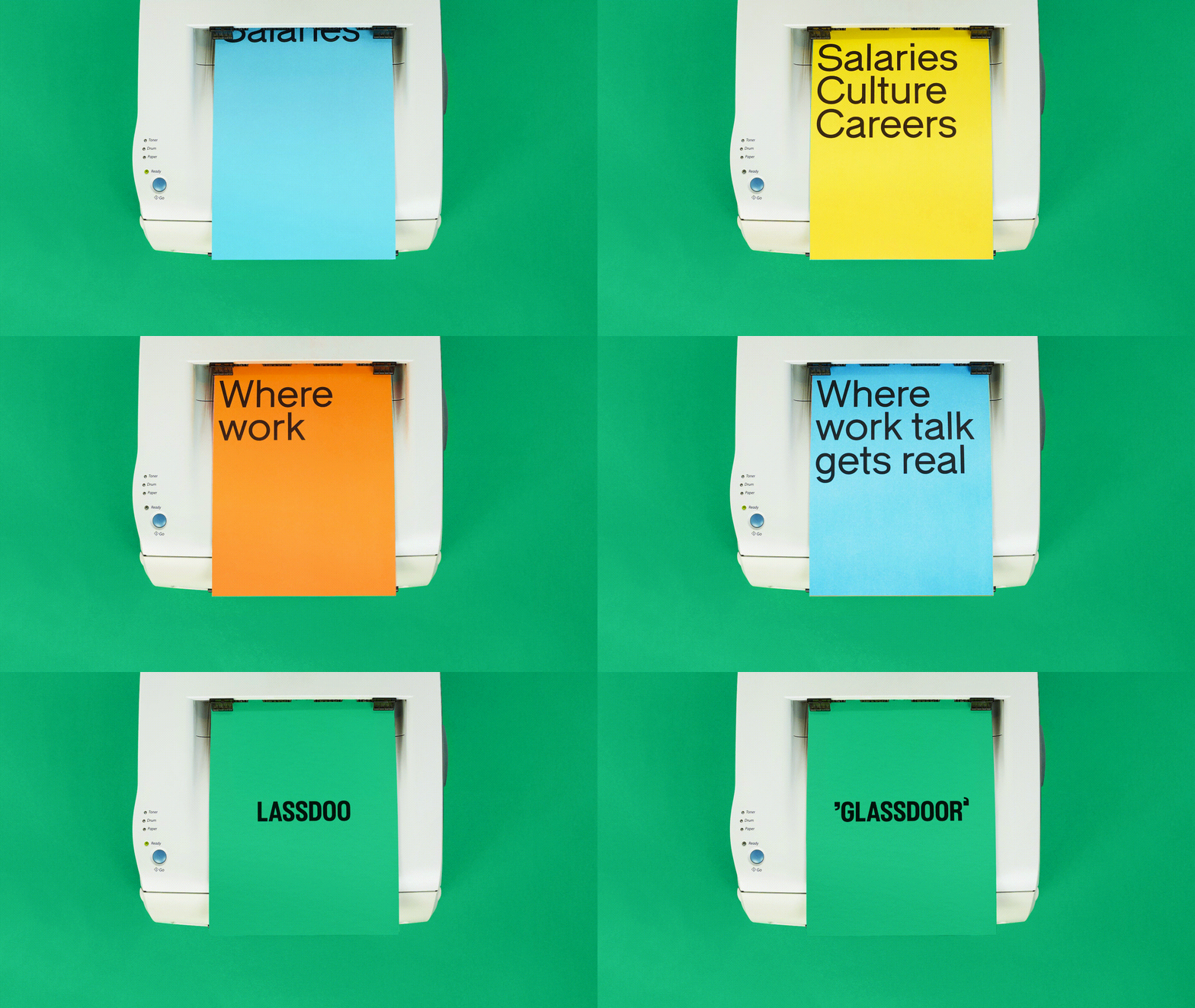
G: What KOTO had in mind for Glassdoor’s rebrand was to create a customized version of Fabio XM tailored to their needs, as part of their rebrand. They fell in love with Fabio and wanted to tweak it to fit perfectly to their needs. What we did was injecting Fabio with some canonical elements from their rebrand, particularly in the symbols and the use of quotes and marks.
G: In addition to the customization, we created a family expansion for them, to make sure they could use this as their main brand typeface across. A lot of the focus has been on legibility and accessibility. For example, Glassdoor has traditionally been a green brand, but KOTO wanted to build on this and find “the right shade of green that was AAA compliant [the highest level of Web Content Accesibility] so we kinda applied the same thought when looking at Fabio and how we could improve it to fit the brief.
As an insider from the team, what are the expectations the brand has for this new image?
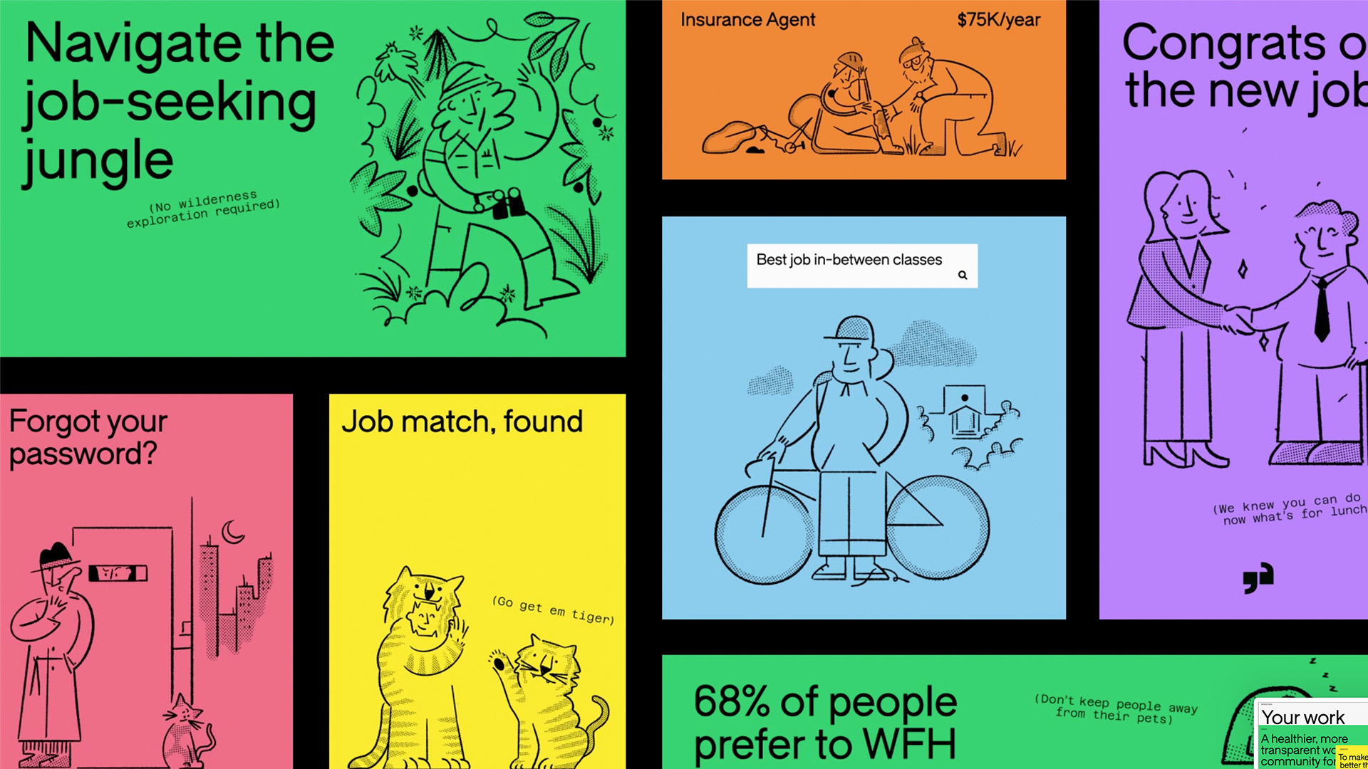
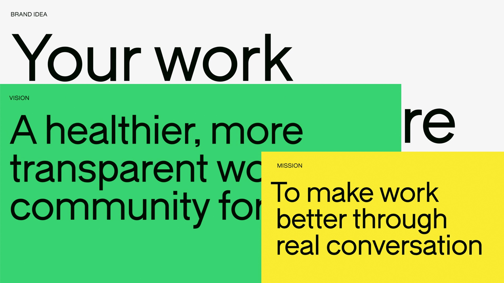
G: Deanna German, Koto creative director, says, “We wanted to represent the evolution of Glassdoor from being a destination for insights, to a thriving community for real workplace conversations. By strategically positioning the brand and designing a visually captivating identity, we have empowered Glassdoor to truly own their brand experience and thrive in their next phase of growth.”
G: The logo, typography, illustrations, icons, and unique brand voice act as powerful amplifiers of Glassdoor’s mission, reflecting their commitment to participating in a healthier and more transparent work community for all.
Team Credits:
Brand Design Studio KOTO (@studiokoto)
Type Design Giulia Boggio (@bojjoe)
Production Amber Weaver (Type01)
Kerning Igino Marini
Hinting Edgar Walthert
A Type of Quiz with Giulia Boggio
What is design for you?
G: Design is a way to make my brain make sense. I always reverted to something creative to express myself, in many forms, so I guess to me it’s a form of expression and self determination.
Why did you decide to do what you do?
G: I was just naturally drawn to it, I never really sat and planned it, to be honest. I remember being always keen on doing something creative.
What is your dream project?
G: I would love to work on more books and printed stuff, I love working on small projects and digital stuff, but seeing your design translate into an object you can touch is just special.
Give an advice to a young designer
G: I don’t want to be obvious and there would be so much but if I have to chose one, here and now, is learn to speak your mind kindly but firmly.
Follow Giulia’s journey as a designer by looking at her stunning portfolio. You can also contact her at info@giuliaboggio.xyz and find her in Instagram and Behance.
See you soon amigos!

