Dear Amigos,
Coffee is a social anchor, a quiet ritual, and for some, an obsession with the perfect extraction. When the creators of ASTE CAFÉ decided to open a space where specialty coffee and tea meet, they were looking to create a sense of belonging. Inspired by the tradition of coffee culture and club spirit, they needed a visual identity that danced between heritage and modernity. This is where Parche Studio (formerly PEZ Brand Studio) stepped in, tasked with creating a brand that communicates expertise while inviting every visitor to feel like they’ve just been granted membership to an exclusive, but welcoming club.

Tradition Meets Contemporaneity
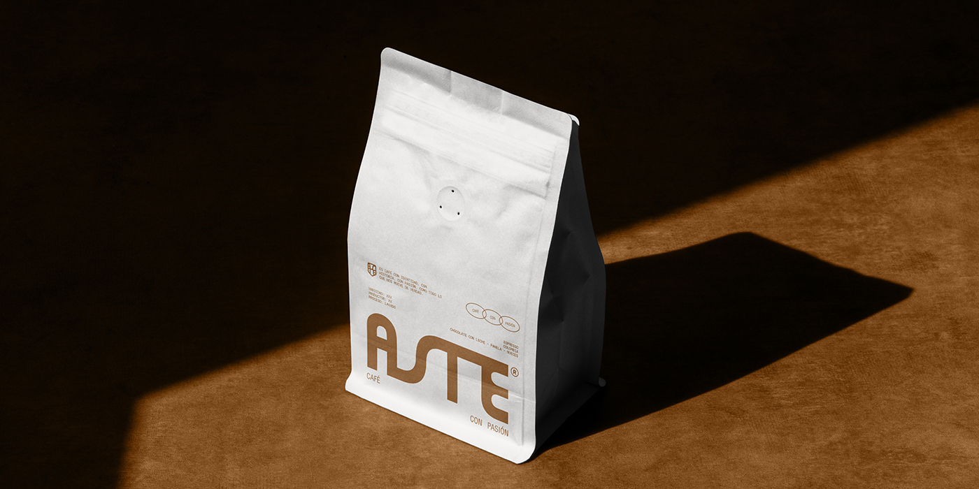
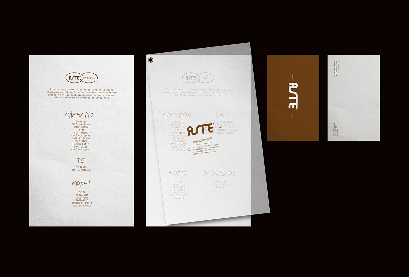
The project is built on the concept of “Encounter.” Parche Studio developed a brand system that balances vintage aesthetics and minimalism. The logo functions as a symbol of union, a sophisticated isotype that anchors the brand’s positioning. Visually, the development relies on a palette inspired by the quality of their product: deep, earthy tones contrasted with clean layouts. The art direction for the photography follows this same logic, classic compositions creating a club atmosphere that feels high-end but never unapproachable. Every touchpoint, including the minimalist coasters and the architectural integration by Casa Esquina, reinforces the idea that ASTE is a place where coffee is celebrated as a craft.


Typogaphic Precision
This coffee expertise narrative is carried by the project’s typographic collection. The primary voice is DM Mono, designed by Colophon Foundry. Its monospaced structure brings a sense of digital precision and “behind-the-counter” transparency, perfectly reflecting the scientific nature of specialty coffee brewing. This is paired with Helvetica Condensed, the timeless creation of Max Miedinger and Eduard Hoffmann. Its compact presence grounds the brand in a vintage-commercial aesthetic, reminiscent of mid-century industrial signage. Finally, for the more expressive and dynamic moments of the identity, the studio utilized Fast My Car by Nisrine Sarkis. This font adds a layer of speed and modern movement, breaking the rigidness of the technical type and connecting ASTE’s visual world to a more contemporary club vibe.

About Parche Studio
Based in Argentina and led by Pepa Luquez and Paz Dutari, Parche Studio (formerly PEZ) has built a reputation for crafting brands with a strong editorial soul and a “℗” mark of quality. Their portfolio is a masterclass in visual storytelling, with standout projects like the vibrant BRAVA ℗, the ethereal AFTONIA ℗, and the conceptually bold CHIZ ℗. They specialize in branding that feels less like marketing and more like a curated experience, often playing with the intersection of luxury and “trash-chic” aesthetics. Whether it’s through perfume packaging or specialty coffee, Parche Studio continues to prove that a brand’s power lies in its ability to create its own universe. Check out their portfolio here.


Project Credits:
Design by Parche Design Studio: Pepa Luquez and Paz Dutari
Architecture: Casa Esquina
Signed,
A type of Ari.