Brusco means rough in portuguese. The quest for this visual identity was clear: how to accurately represent such a self-describing concept while elevating a product. A smash burger brand needed to feel premium while keeping its essence of simplicity and flavor. The goal was to create a brand with a strong voice that was visible at every touchpoint, from the packaging to the tone of voice. Another Collective’s solution was to create a visual world that was as blunt as the product itself.

A visual language rooted in typography
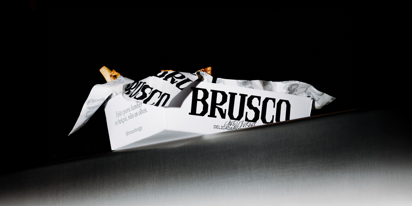
Another Collective opted for a type-led approach, making the brand’s name the central element of its communication. This choice gave them a robust, and cohesive visual language. Brusco’s essence can be easily seen in their logo: a serif approach, but taking out the classic elegance of most serif typefaces by avoiding curves, resulting in a raw, almost hand-made look. The logo became the core of the identity, used on everything from the cups to the burger boxes, creating a consistent look.
This typographic system also features a selection of fonts thar recall the rough feeling of Brusco in different ways, bold condensed sans-serifs, handwritten highlights and artisanal serifs that feel hand-cut, complementing the logo.

The raw elegance of a smash burger
The design mirrors the product it represents. A smash burger hits the hot griddle with a raw, intense force, but the result is disarmingly elegant. The brand identity captures this dichotomy. It has a raw, nostalgic feel but is executed with precision and subtlety. This visual language gives the brand a distinct personality that resonates with its audience and celebrates the imperfections and charm of a well-made burger.

Brusco Today
Brusco takes its product seriously. Located in Time Out Market in Porto, the brand focuses on one main product: the smash burger. Specially centering the aged meat, one of their star ingredients. It’s the simplicity that defines the excellence. According to reviews, the fries are addictive and the mustard sauce is to die for. This commitment to quality, from the aged meat to the side dishes, is the same confidence you see in the brand’s design, which doesn’t need frills to shine.


Based in Matosinhos, Portugal, Another Collective is a small studio of five people who believe in a conceptual approach to design. They see each project as a new challenge, a chance to explore a fresh idea. Their philosophy is that a strong concept is the pivot for all good work, and they pay special attention to typography as a key tool. Their dedication has been recognized with awards, including the 366 Award, highlighting their excellence in graphic design in the region.
Creative Credits:
Art Direction
Bruno Soares / Eduardo Rodrigues
Design
Eduardo Rodrigues
Motion Graphics
João Randmer
Photography
Eduardo Rodrigues / Pedro Lopes
Copy
Gustavo Sousa / Pedro Tavares
Production Coordinator
Maria Lourenço
See you soon amigos!
A Type of Ari.