Dear Amigos,
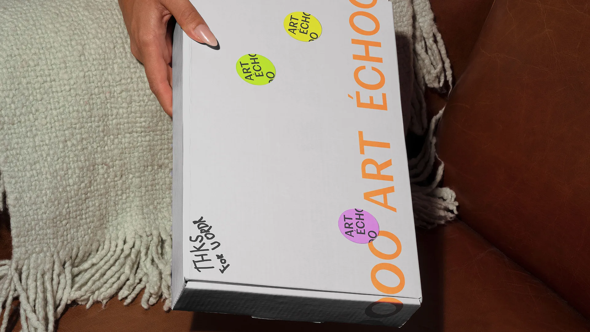
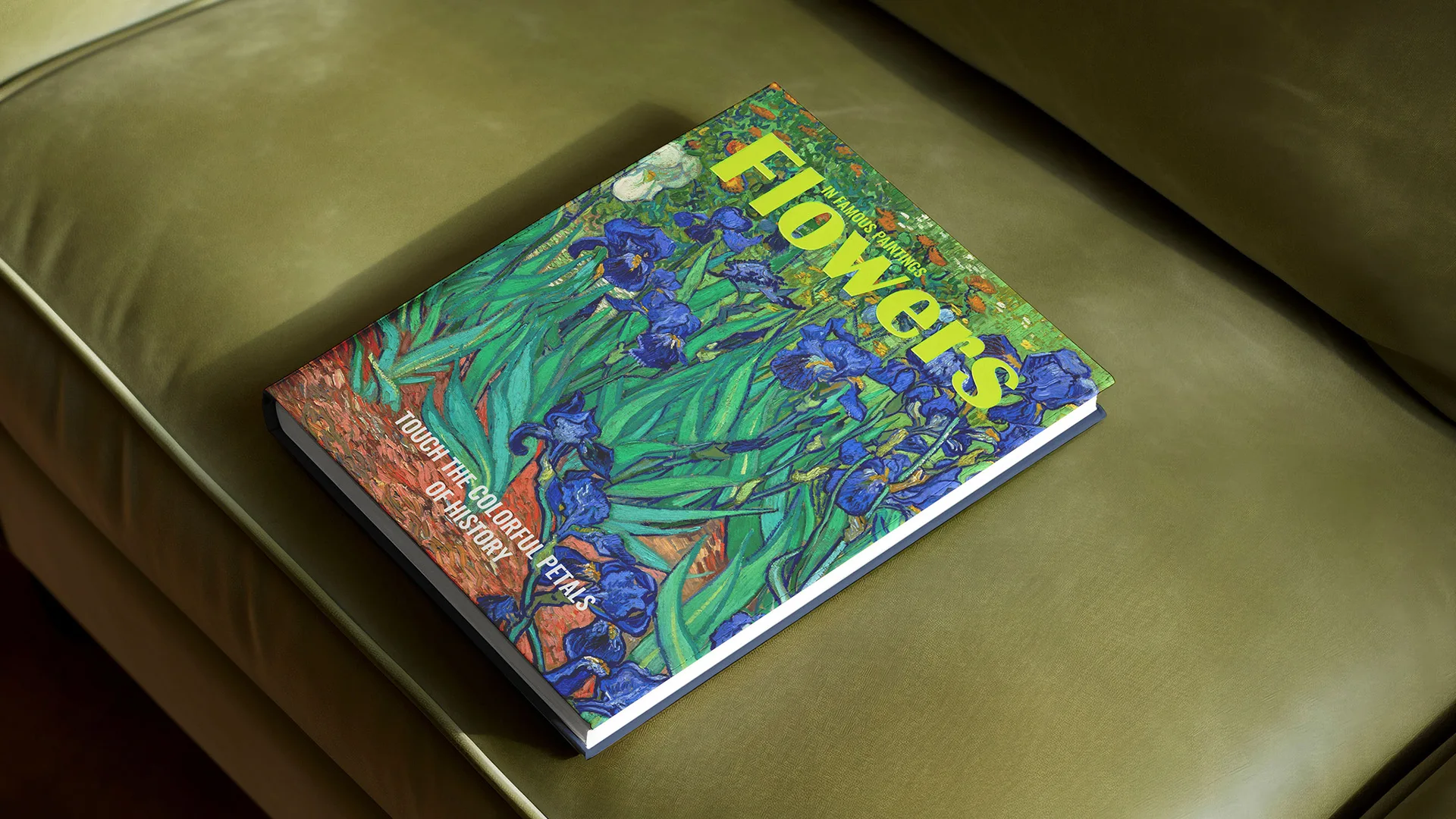
Art Échoo is a publishing house born on the concept of connecting the dynamic mix between classic and contemporary art. This creative concept created and designed by Mary Marko sparkles a common thread of human expression and creativity. Learn more about it below.
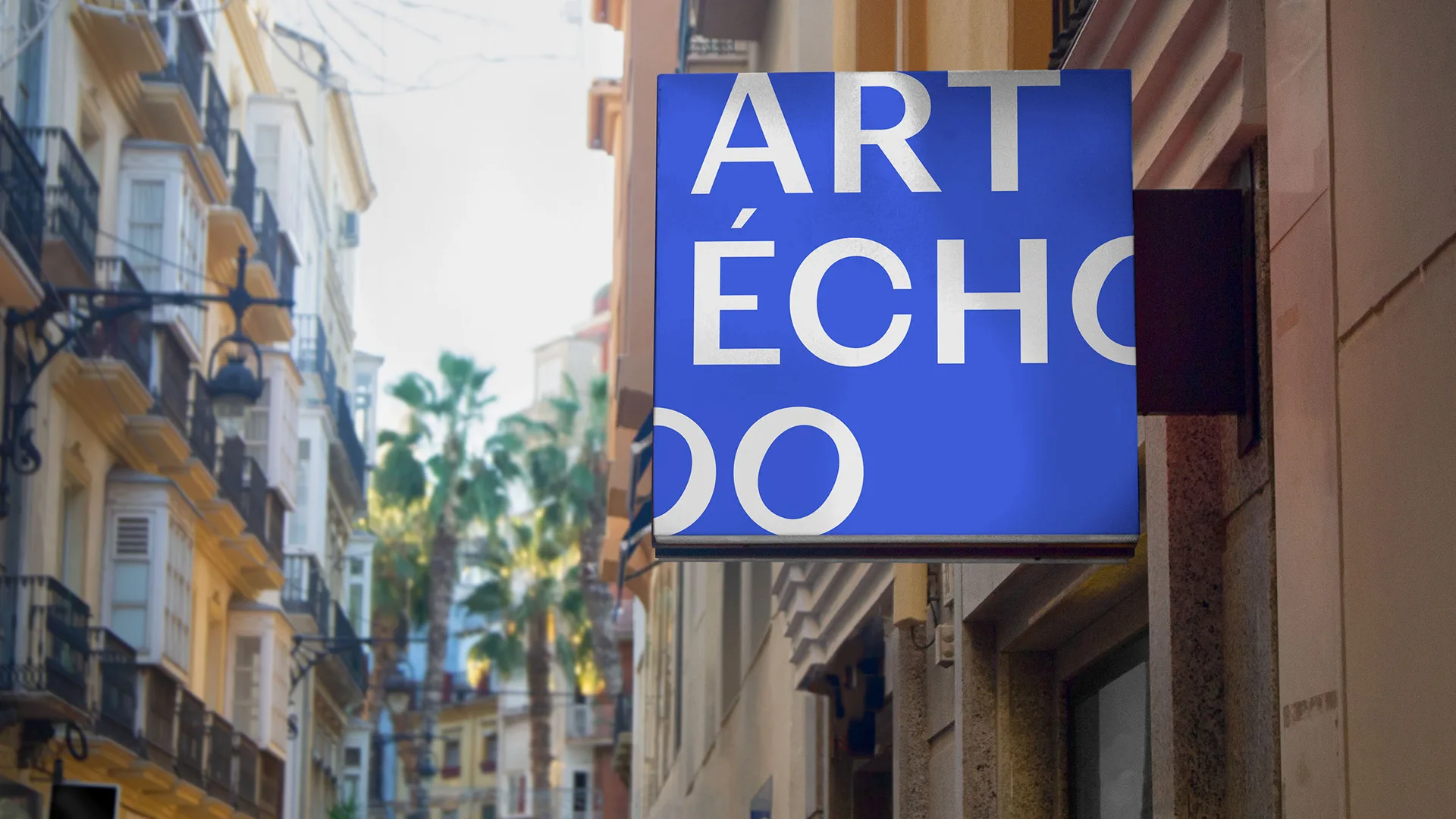
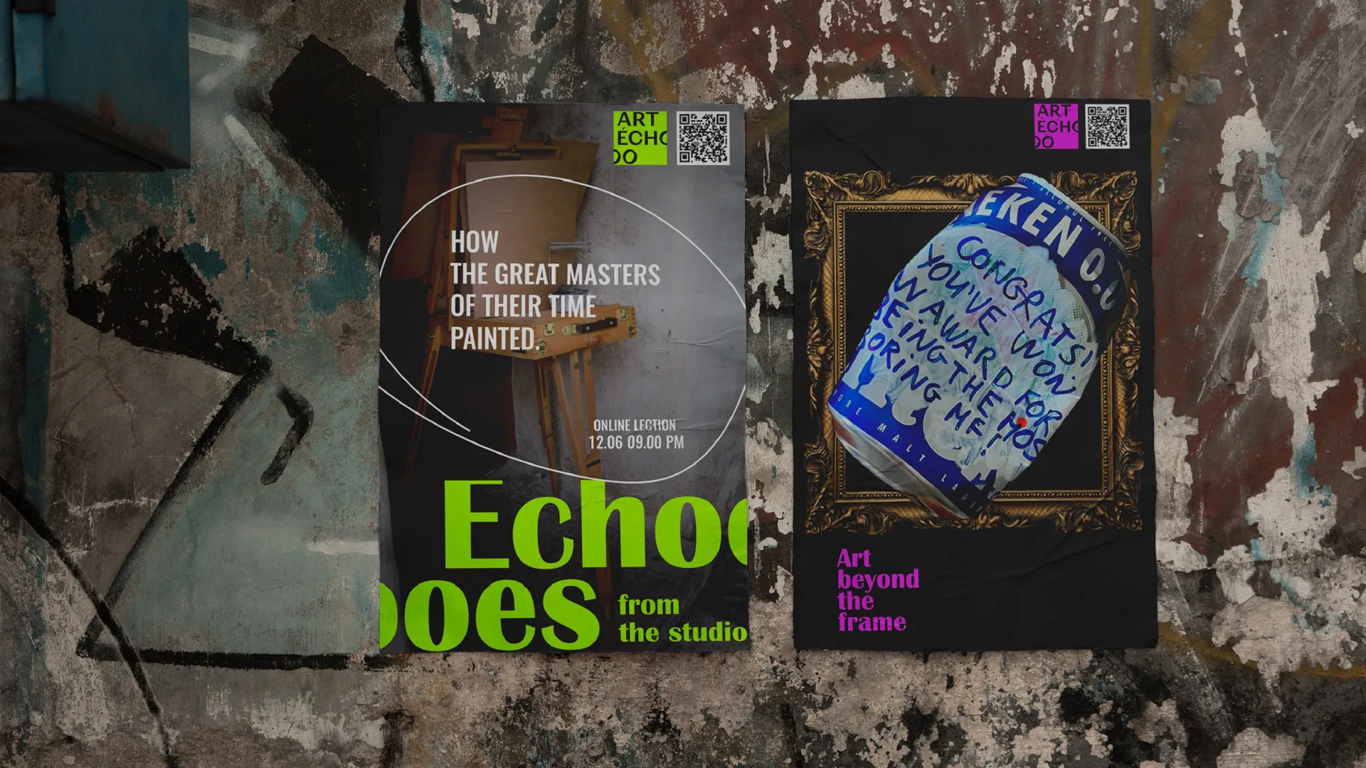
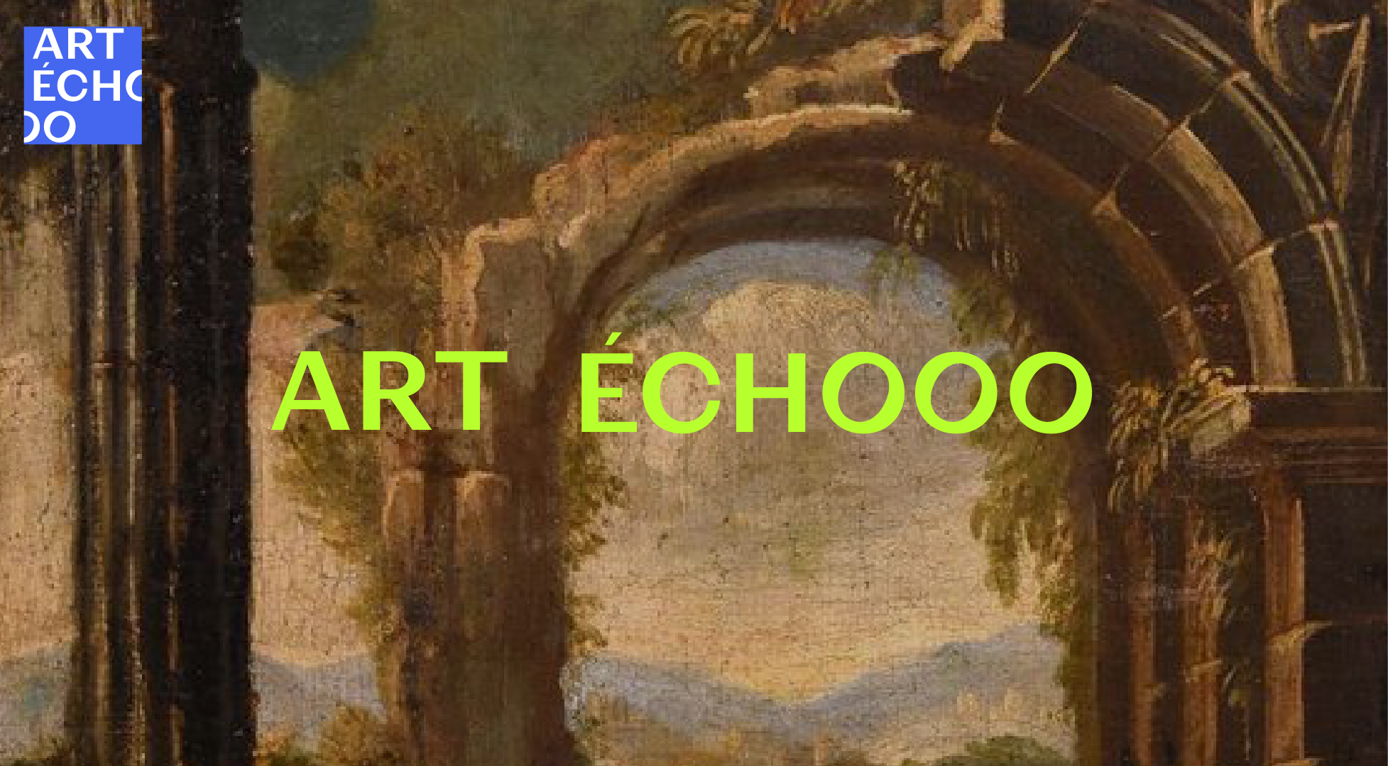
The artistic foundation of Art Echooo is rooted in a striking color palette that juxtaposes the vibrant energy of Pantone neons with the rich, earthy tones of ochre and the deep, somber hues found in classic paintings. This combination creates a visual tension that is both captivating and thought-provoking.
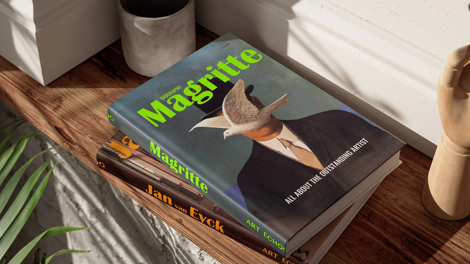
By blending the bold, contemporary aesthetic of neon with the timeless elegance of traditional art, Art Echooo establishes itself as a brand that is unafraid to push boundaries while remaining grounded in artistic heritage.
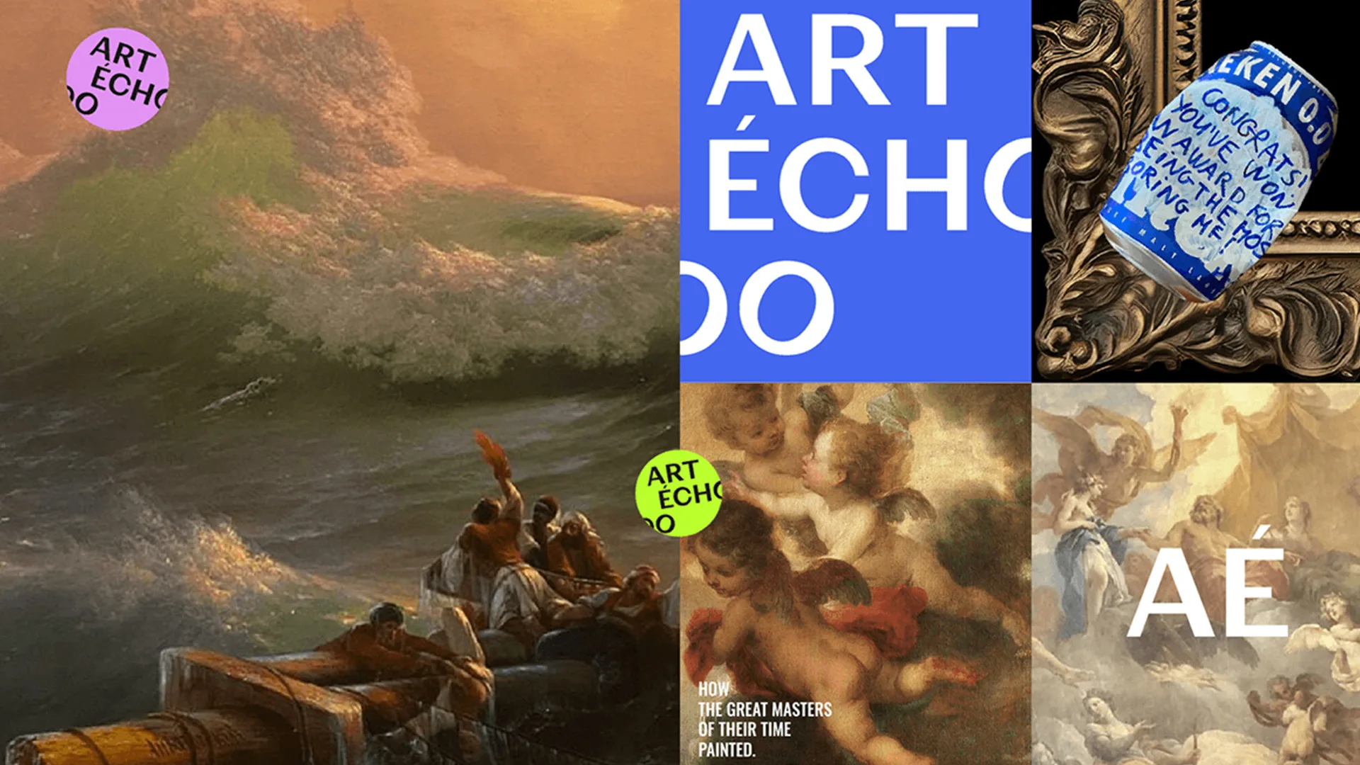
Featuring classic pieces and contemporary art created by Keser, the Art Échooo visual identity is flexible enough to display different artistic expressions, keeping itself recognizable without outshining the original sources.
Mary Marko is a Ukraine-based graphic designer with a special focus on branding, helping her clients turn their projects into powerful brands with impactful stories. You can see more of her work through her Behance profile.
See you soon amigos!
