Dear amigos, the baseline grid is a fundamental concept in graphic design. Applying it to your daily work can significantly enhance your editorial projects. By using this mathematical approach, you will upgrade your graphic skills.
Surprisingly, we’ve noticed that baseline grids aren’t well-known among designers today. That’s why we’ve decided to write a basic guide to baseline grids. Here, you’ll find everything you need to know about them, including calculations and applications. So, open your InDesign file and get ready to give your editorial project a professional touch.
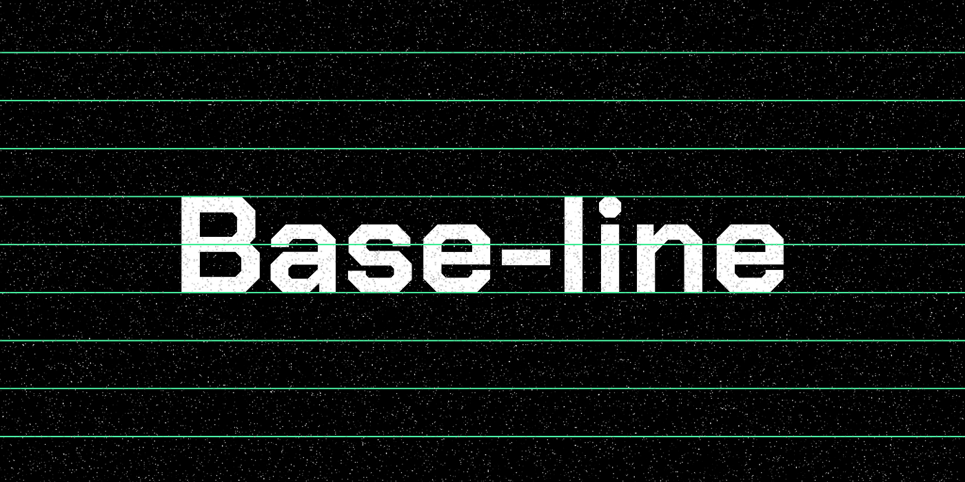
What is a Baseline Grid?

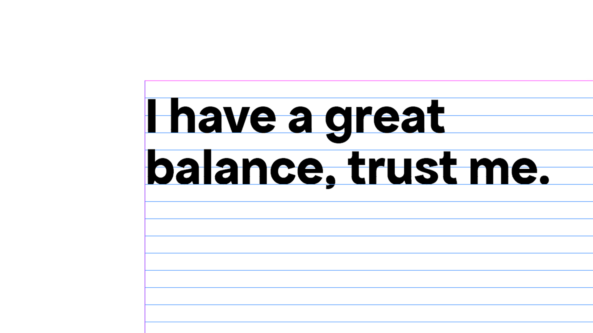
A baseline grid is a system of horizontal lines that align with the baselines of text. This system ensures consistent vertical spacing and alignment of elements in a layout. It acts as an invisible framework, crucial for maintaining readability and visual rhythm. In editorial design, baseline grids are particularly useful. Whether printed or digital, this concept is valuable for balancing text and/or images in a layout. Baseline grids prevent misaligned text blocks, which can disrupt reading flow. This grid strikes a balance between the layout, different type hierarchies, and their alignment.
What is the right Baseline Grid for my document?
The main factor when calculating the baseline is the grid increment. It is typically equal to the leading (line height) of your body text. For example, if your body text uses a 12pt font with 16pt leading, the baseline grid increment is 16pt. There are several factors you should take into consideration when choosing the right increment, such as layout height, type of content, the text hierarchies you might need, etc.
Grid Increment and Layout Height
The document’s leading (line height), relates to the layout height and the content. If you are making a book, you need different type hierarchies. This different titles, paragraphs, need to be recognizable and consistent across the book. Let’s say you are making a book that has a 30cm layout with 2 cm margin. Using a grid increment of 16pt allows for a consistent alignment of text and other elements.
To calculate this convert the layout height into points (1 inch = 72pt, 1 cm ≈ 28.35pt).
The size of the layout influences how a baseline grid is set up. A Larger layout means larger grid increments. Smaller layouts require smaller increments for flexibility.
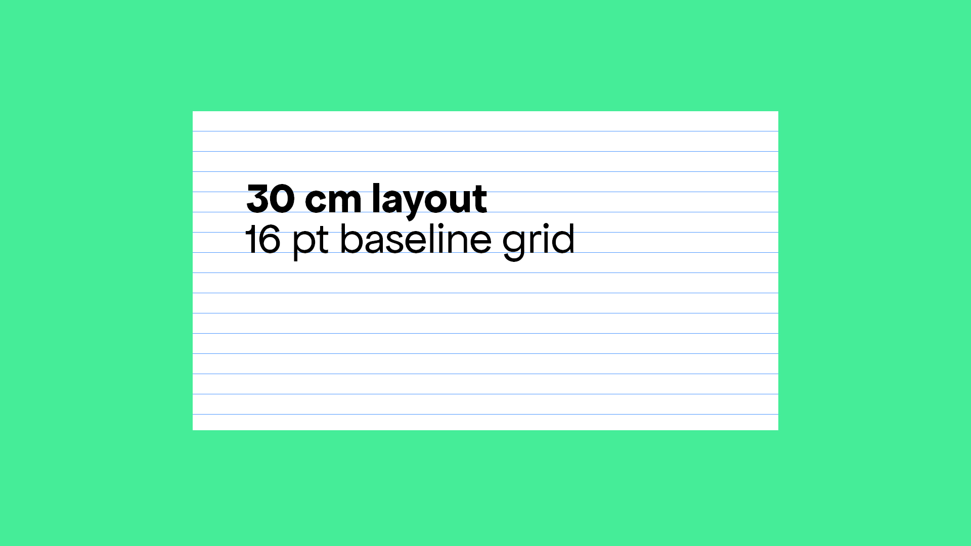
Example A
A 30 cm layout is approximately 853pt. This allows for about 53 grid lines (853pt / 16pt), which can help in aligning text and other elements consistently.
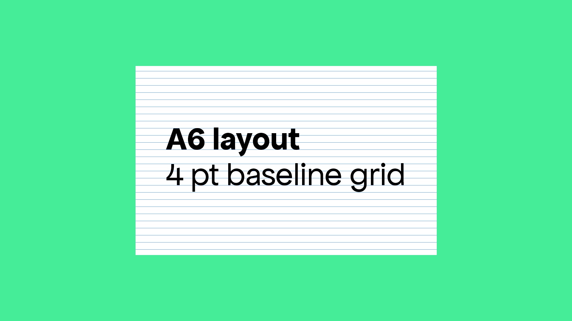
Example B
Small Layout (e.g., A6 size, approximately 10.5 cm x 14.8 cm): Use a 4pt or 8pt grid increment.
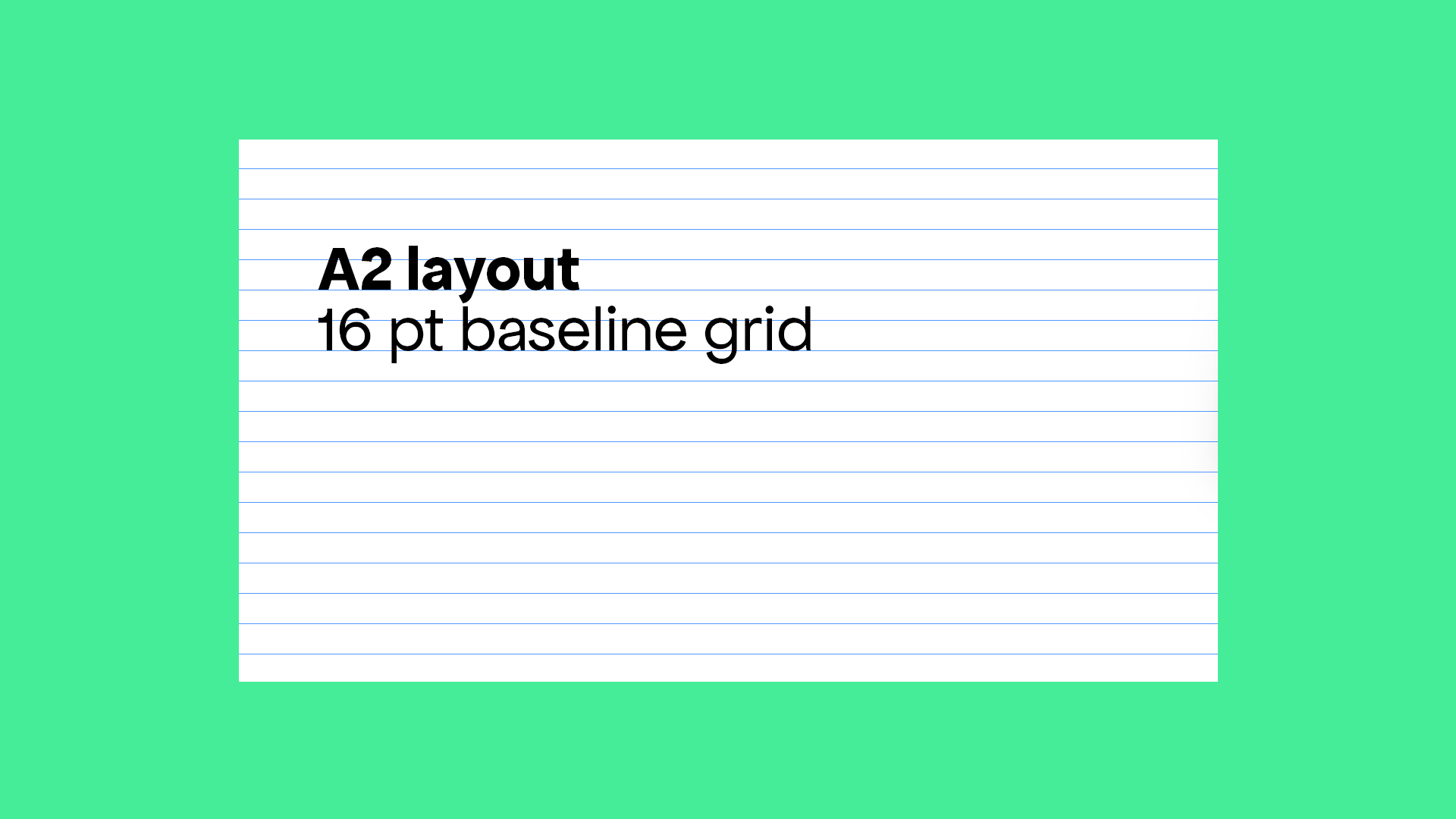
Example C
Large Layout (e.g., A2 size, approximately 42 cm x 59.4 cm): Use a 16pt or 24pt grid increment.
How to set the Baseline Grid in InDesign:
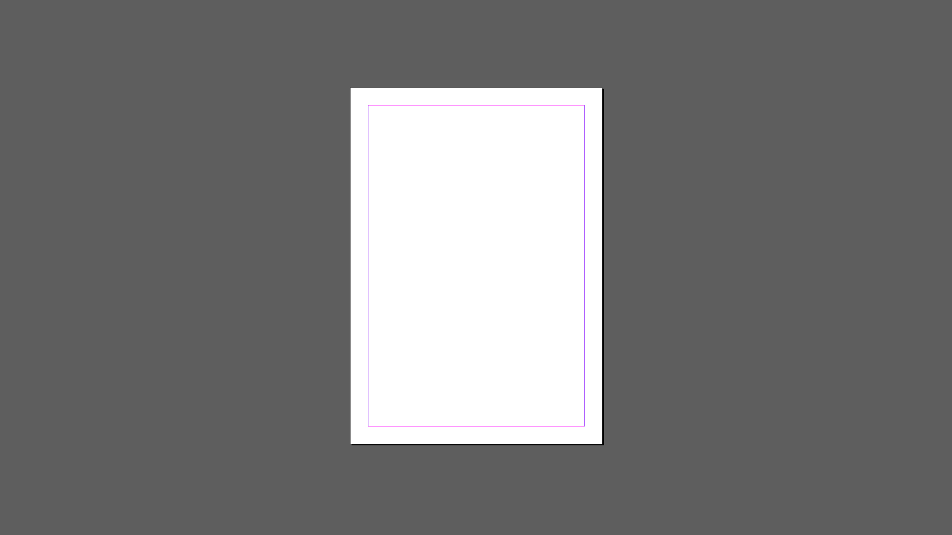
1. Choose the size of your document and determine your margins. For this example, let’s work with an A4 document with 15 milimeters margins.
2. Create a text column that covers the page from the top to the margin to the bottom, and fill it with fake text using the font and size of your preference.
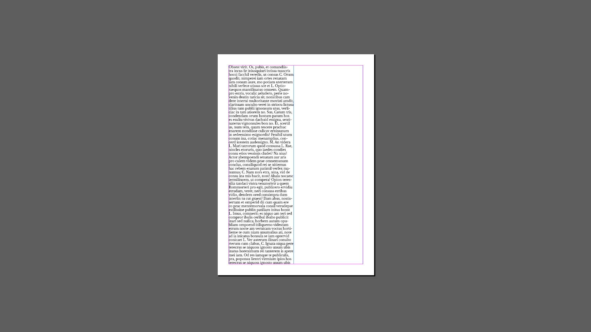
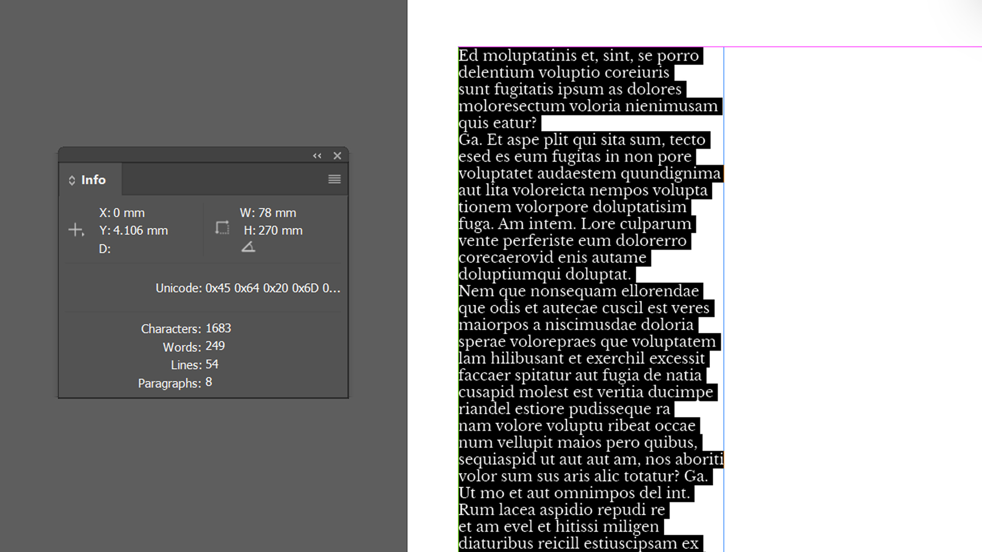
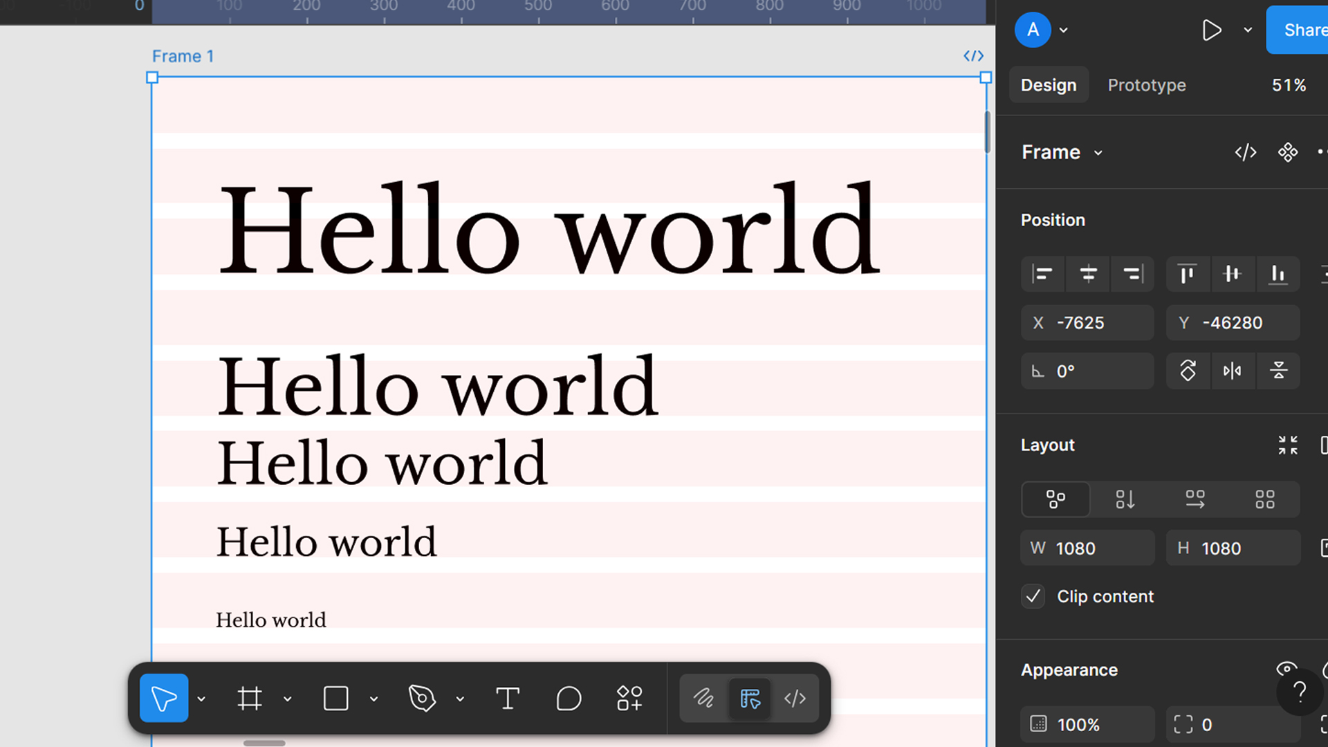
3. Open the information pannel in Window > Information. Then, with the text tool, select the entire text you just created. The pannel will show the ammount of lines that your paragraph has. In our case, it has 54 lines.
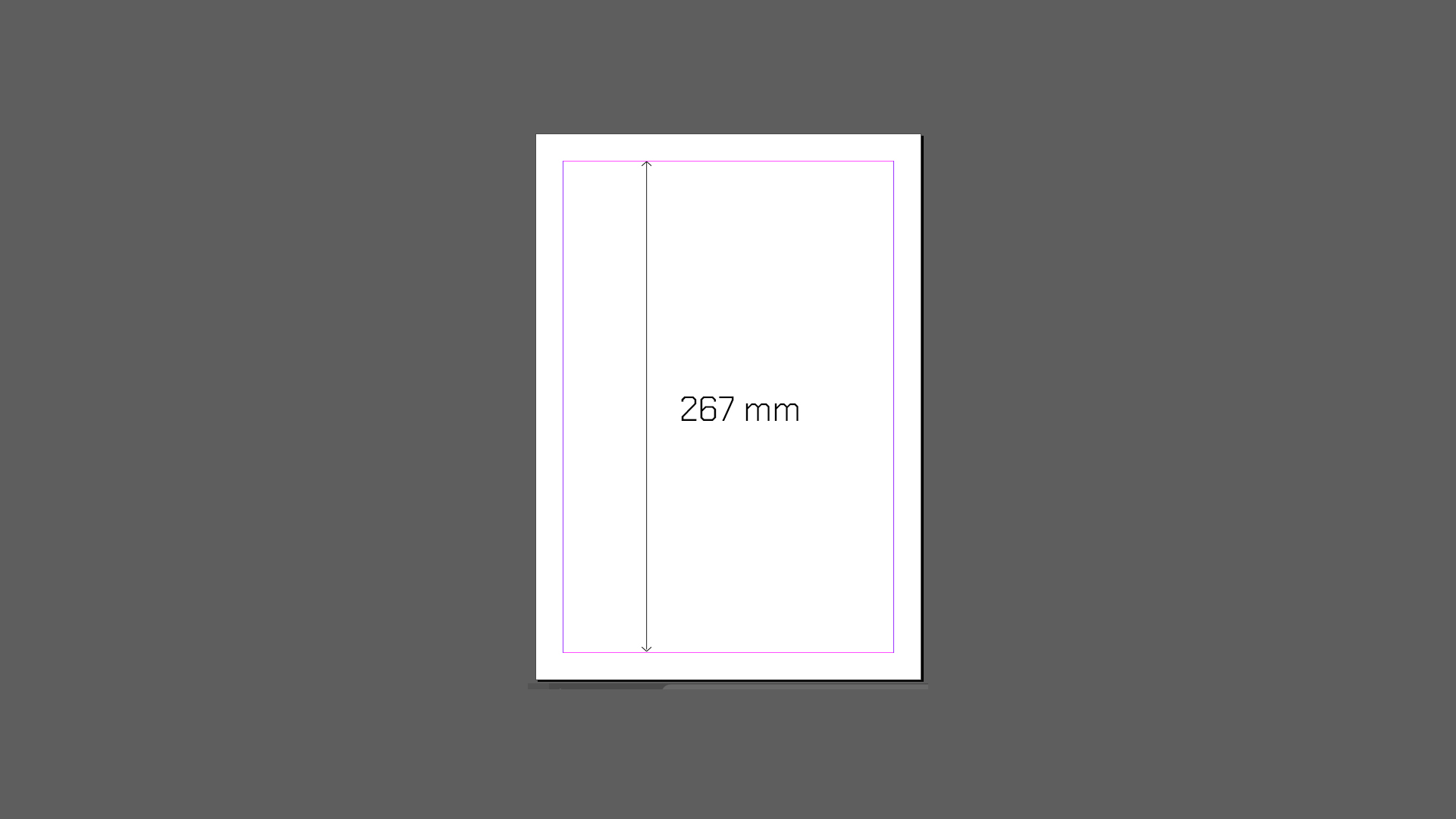
4. Measure the height of the area inside your margins. Then, divide this number between the number of lines you got from the information pannel. This number will be your leading value.
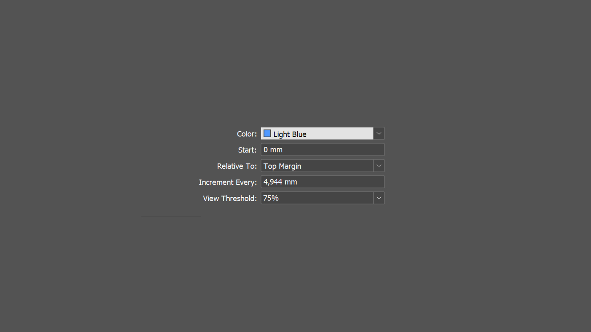
5. Configure the grid: Navigate to Preferences > Grids in InDesign, set Increment Every to your leading value, and adjust the Start value to align with page margins.
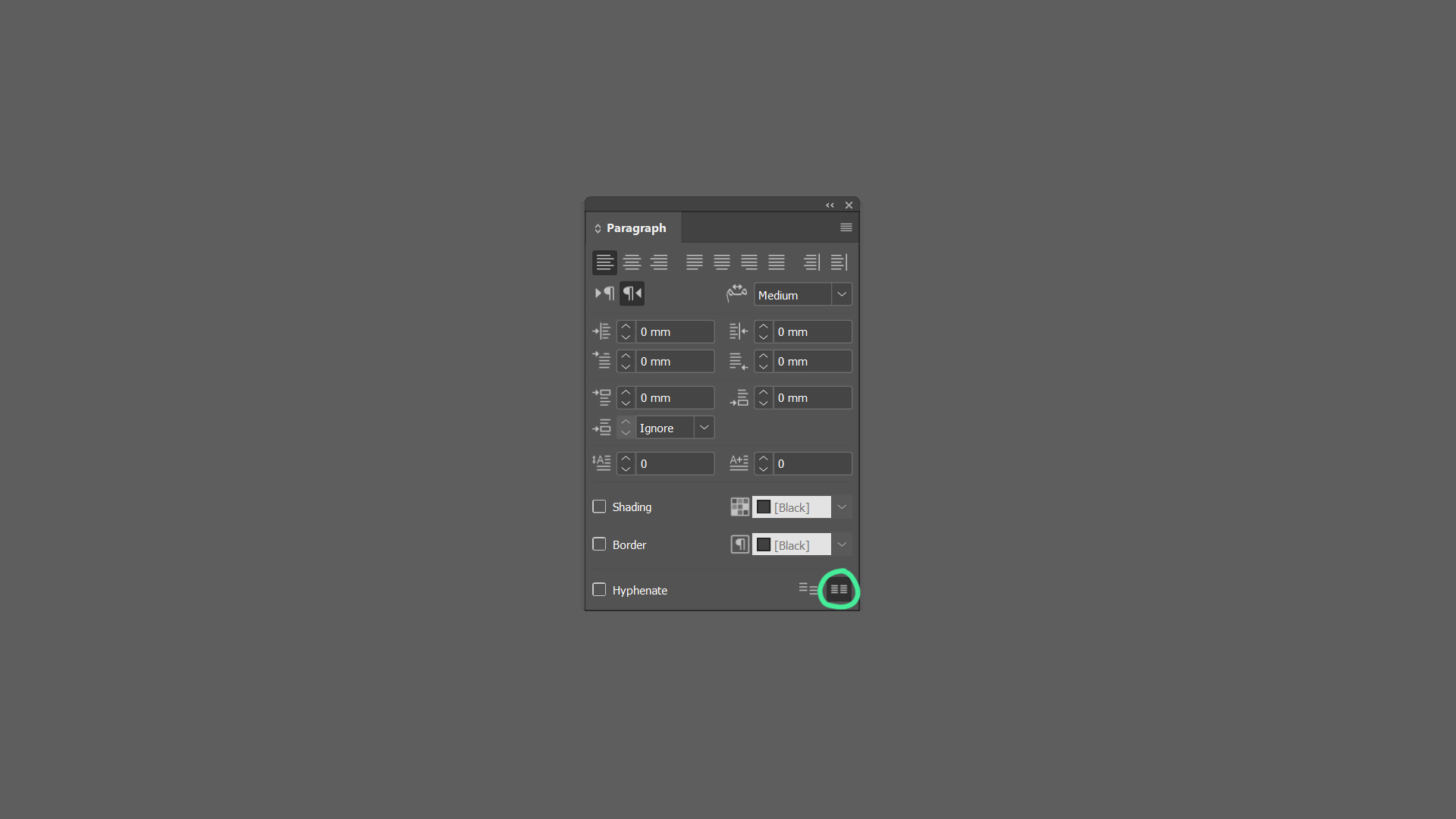
6. Align text: In the Paragraph panel, click the “Align to Baseline Grid” icon.
Tip: if you’re unable to see the baseline grid, go to View > Grids & Lines > Show Baseline Grid
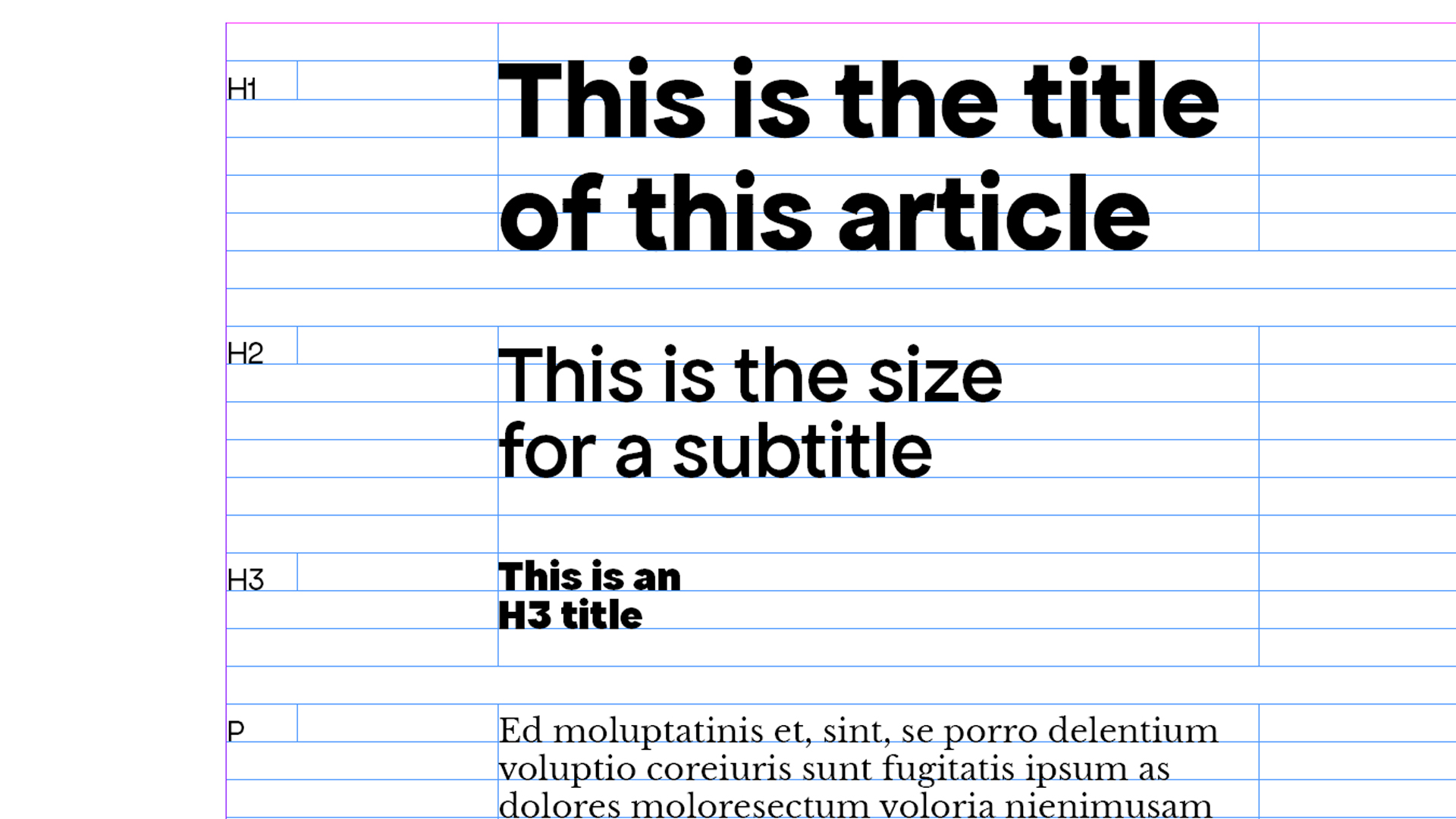
Typeface Hierarchies and Grid Compatibility
- Metrics matter: Fonts with inconsistent x-heights or descenders may require grid adjustments. For example, a bold headline font might need larger offsets than body text.
- Hierarchy alignment: Ensure all font sizes (headings, subheadings, body) have line heights that fit the grid.
Text Improvements, and Layout
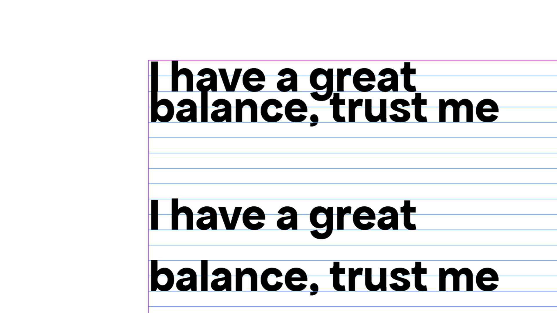
- Offsets: Fonts with descenders may need top/bottom padding to prevent clipping. Example: You notice that the font you’re using has deep descenders (e.g., the “y” or “g” characters extend below the baseline). To prevent these descenders from being clipped by the next line of text, you add a small amount of padding (offset) at the bottom of each line. This ensures that the descenders have enough space and do not overlap with the following line.
- Flexibility: Smaller grid steps allow finer adjustments than larger ones.
Example: Using a smaller grid increment like 4pt allows for more precise adjustments. For example, if you need to insert a caption or a smaller text element, you can align it to the grid without having to make large adjustments. This flexibility is particularly useful in complex layouts where multiple elements need to be aligned.
Why are baseline grids important?
Baseline grids are a powerful tool for creating structured and visually appealing designs. By understanding how to calculate and apply baseline grids effectively, designers can enhance readability, consistency, and efficiency in both print and web design:
- Consistency: Aligns text across columns and pages, critical for multi-page documents.
- Readability: Establishes a predictable vertical rhythm, reducing eye strain.
- Efficiency: Streamlines design workflows by automating alignment.
Whether working with editorial content or web layouts, integrating baseline grids into your design workflow can elevate your projects to a new level of professionalism and harmony.
Check out how Perfect Bound puts all of these tips into practice, while designing a modular baseline grid.
Baseline Grids in Web Design
While baseline grids are more straightforward in print design, they can be applied in web design with some adjustments. Web layouts must adapt to various screen sizes, making it challenging to maintain a strict baseline grid. However, designers can use CSS techniques to approximate baseline grid behavior by setting line heights and margins as multiples of a base unit.
Best Practices for Web Design:
- Use Flexible Units: Employ units like
remor%for scalability.
- Test Responsively: Verify that your design maintains its intended rhythm across different devices.
- Combine with Modular Scales: Use modular scales to create a harmonious typographic system.
Yours truly,
Since you are really into typography, you might be interested in these other articles and resources:
Here Are The Best Font Libraries Curating Open-Source Fonts
Open Source Fonts Licensing and Use: What You Need to Know
Insider Tips: The Best Type Foundries with Open Source Fonts