Dear amigo,
In the age of the infinite scroll at digital spaces, album covers have evolved from a simple protective sleeve into a portal. If you have been anywhere, from Spotify to Bandcamp, you should be aware that we aren’t just consuming audio anymore. These days, we are looking for a vision, a curated palette, a statement of intent that we believe can bring us closer to the musician’s inner world. And that’s where art direction comes to play.
For those who want to know more, art direction can be considered as the process of overseeing every visual aspect in a project. This could extend but not limit to: typography, color, style, imagery, among others, to look for a final result that could play as much part of the main artist (in this case, the musician or band) music in showcasing their talent.
Now, coming from such an interesting year for music as 2025, here are five records, featuring a few heavy-hitters that come from different sides of music (and an underrated gem from the past year of 2021) that prove art direction is key in shaping the listening experience.
1. Bad Bunny – DeBÍ TiRAR MáS FOTOs (2025)

We start with an artist that defined much of the sound of this first half of the decade, Bad Bunny. If his last record, Un Verano Sin Ti, was the saturated color of a Caribbean postcard, Benito Antonio Martinez Ocasio’s latest project felt like finding a roll of undeveloped film in an abandoned drawer in your old home. The art direction, one where Bad Bunny had a direct input, abandons polished finishes for the imperfection of reality: blurry candids, accidental crops, and an almost intrusive sense of familiarity.
The final result is a simple but striking cover image: Two plastic chairs in the middle of a tropical garden that can be reminiscent of any house in Benito’s native Puerto Rico, or in other countries of Latin America and the Caribbean. This image accompanies the record as a visual logbook of a “mudanza” (moving out), both literal and emotional.
Also, the back cover also plays a role as Mosh Rivera’s art with Sapo Concho as a mascot for a statement: “Puerto Rico: Seguimo Aquí”. A phrase used to stand ground against the rapid changes the island has experienced. This album is also a reminder that in a world of perfect filters and mundane album covers, authenticity is the new luxury. The art behind it feels tactile, grainy, and, above all, honest.
2. Rosalía – LUX (2025)

The Spanish superstar Rosalía has always had a knack on how to play with imagery on her album covers ever since her breakout with El Mal Querer. With her last record, LUX, she looks up to light and glow to find something nearly spiritual in its concept. The cover, photographed by Noah Dillon, wasn’t the result of a massive, over-calculated production, but rather a moment of pure technical spontaneity.
By capturing how natural light interacted with her skin in an organic setting, the visual feels both high-fashion and vulnerable. Here you can also see how the typography frames the light, rather than competing with it. It is, quite literally, music illuminated. This result is part of a creative process very streamlined between Rosalía herself and her sister Pilar, who has worked as her right hand in creating the aesthetic and visual style of the singer in this record and in past projects.
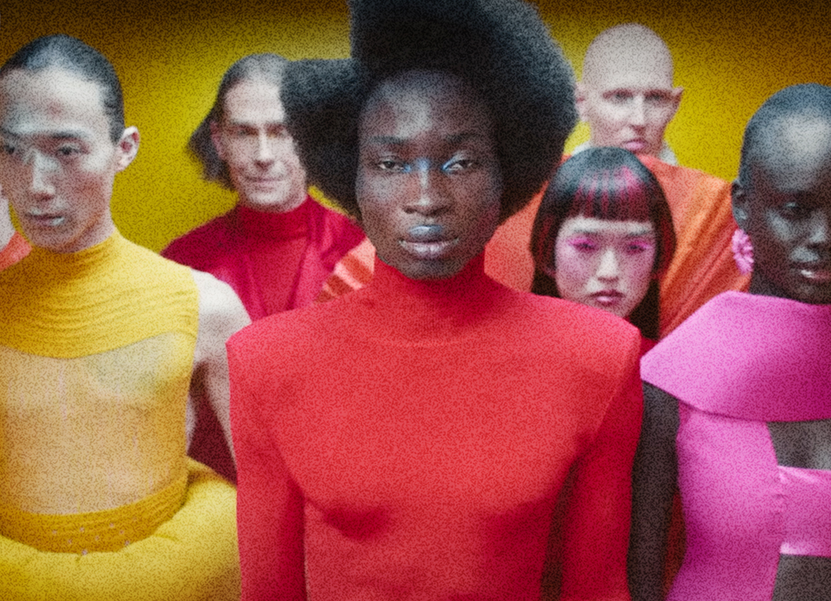
3. FKA Twigs – Eusexua (2025)

FKA Twigs, an avant-garde pop star and accomplished contemporary dancer, is someone who knows the intricacies of the human body, something that she also had shown on previous album covers. For her work on Eusexua, she materializes a specific state of mind as well: that moment of transcendence on the dance floor.
In here, the art direction merges the biological with the synthetic in a way that feels like a piece of contemporary art. A collaboration between Office Ben Ganz, Twigs herself and the team at her label, Atlantic Records, that shows skin that looks like liquid metal and textures evoking 90s techno-industrialism on its visual identity.
On the main cover, the face of the singer-songwriter is filtered through a clinical cleanliness that makes you feel like you’re looking at a future that hasn’t arrived yet but that already has a soundtrack.
4. Stereolab – Instant Holograms in Metal Film (2025)

The masters of avant-pop return with a visual proposal that is pure nostalgia for a future that never was as Anglo-French band Stereolab, led by Laetitia Sadler, came back after 15 years in hiatus. Their comeback, as their sound, could not be bound to conventionality, instead bending what you know to bring something to catch your eyes and ears.
Continuing their tradition of album covers inspired by 60s signage and Swiss School minimalism that was started by their previous collaborator, Julian House, the sleeve design is attributed to mysterious designer Vanina Schmitt (seriously, try and get info on them, good luck beyond their collabs with Stereolab).
Meanwhile, the inner cover art plays with images of light refraction on metallic surfaces: an instant hologram. It’s a vivid picture of an object that changes depending on how you hold it, which is also a perfect metaphor for the music of this retro-futuristic anglofrench band: layers and layers of sound that reveal something new with every shift in perspective.
5. Sr. Presidente – Concorde (2021)

We’re taking a quick trip back to 2021 to highlight one of the most visually cohesive records in the alternative scene of Venezuela. Heberto Añez Novoa, under the moniker Sr. Presidente, delivered Concorde, an album whose art direction is a masterclass in referencing the past with underrated artworks.
The main concept behind the record was the idea of two halves, “Desechable” (Expendable) e “Inmaculado” (Inmaculate), each half having a different approach to music composition. Inspired by editorial design, Pedro Medina grabbed the concept made by Heberto, who is a visual artist on his own, and based the font of the cover on a design made by Carlene Schnabel, from the Cocaine Handbook by David Lee.
Ultimately, these five albums remind us that art direction is never just decoration, it is an aid to physically manifest a record’s idea. These visual identities provide the essential context we need to truly inhabit the music. When design and sound align in the art direction, the album stops being a product and starts being a world we can actually immerse in.
Yours truly,
A Type of Jesús
Since you are really into typography and cinema, you might be interested in these other articles and resources:
Yorgos Lanthimos’ movies: Outstanding and Offbeat Typography
Stunning Movie Titles Taking The Spotlight At This Years Oscars