Dear Amigos,
Ever heard about the Futura typeface? Of course, you have. A historical typeface created by Paul Renner, that once changed the course of design. Futura went to Hollywood, and became famous in the car, fashion, and art industries. Most importantly, was the first typeface to ever step on the moon! I know, it seems we are talking about a basketball player, or a famous actress. Sadly (or not) Futura now is everywhere we look: from designer chairs, rockets, and movies. You may also find the Futura font in the menu of that shady restaurant in the corner that has the business logo written in Comic Sans. So let’s say it is a widespread but misused font.
For non-designers, this typeface might scream “style” or “innovation”, but the truth is, Futura was once that, but today it might be part of the Museum of Typography. Don’t misinterpret what we are saying, we love Paul Renner, and the Futura typeface. We acknowledge the outstanding creation it is, but let’s face it, nowadays there are more than thousands of typefaces out there, available. Choosing Futura without any conceptual justification seems just lazy in terms of design.
That being said, we want to tell you everything we know (and there is a lot to be said) about the Futura typeface. This geometric and outstanding font family once disrupted the realms of visual communication, you’ll see why. We hope that by reading this article you’ll be an informed and conscious designer who chooses Futura for the right reasons.
The Origins of Futura
Many graphic design historians agree that Paul Renner, is the author of the Futura typeface. Nevertheless, some rumors attribute the initial sketches of the typeface to the architect Ferdinand Kramer in 1925, who worked together with Renner in the New Frankfurt housing project. Allegedly he made a drawing of a geometrical sans serif for the building department of the city of Frankfurt on which Renner based his Futura, debated by many, but still a rumor out there.
The Futura typeface is a geometric sans-serif initially designed as a contribution to Frankfurt’s Housing Project: New Frankfurt. This collaborative creation involved many talented architects, artists, and designers of the moment. Futura was released as a typeface by Bauer Type Foundry and was clearly influenced by the strong Bauhaus spirit of the time.
While Renner wasn’t formally linked to the Bauhaus movement, he embraced numerous aspects of its style and philosophy. He advocated for modern typefaces rather than simply reviving past designs. According to Typeroom: The typeface’s slogan in the font’s brochure was “die Schrift unserer Zeit” (“the typeface of our time”) and in English “the typeface of today and tomorrow.”
How almost the Nazi party ruined Futura forever
The Futura typeface, a Bauhaus-inspired font family, became a symbol for the future. It spread internationally quite fast, gaining global recognition and usage, even in the U.S., which was evidently a problem for the Nazi party. Futura’s sleek and modern design symbolized change and the essence of German aesthetics, making it a focal point for Hitler’s empire.
Luckily for this modern typeface, the regime showed a preference for the elaborate Fraktur typeface over the innovative Futura during most of its existence. Only almost at the end of World War II, they started using it discretely. By that time the Futura typeface was already considered an international icon, therefore Futura never got conceptually linked with Nazism.
Follow this link to watch a video about this historical fact about Futura.
Futura’s characteristics
A perfect marriage between form and function, characterized for high readability, modern strokes, geometric shape, and aextended family, which makes it also a very versatile typeface. Almost feels like a person: perfect marriage with a big family. Futura’s clean lines, simplified shapes, circular O’s, and sharp letters, represent a rational farewell of the historical ornamental typefaces and a step forward towards a new era where clarity and function in typography are primal.
Classified as a geometric sans-serif typeface, Futura typically comes in several weights and styles, although the specific number can vary depending on the version or foundry that produces it. The most common weights and styles of Futura include:
- Regular
- Bold
- Medium
- Light
- Book
- Heavy
- Extra Bold
Additionally, there may be italic or oblique versions available for some weights, providing further style variations. Some digital versions of Futura also include condensed or extended variants, offering even more flexibility for designers. Overall, Futura is known for its versatility and adaptability across a range of design applications.
4 Futura’s use cases that left a mark in history
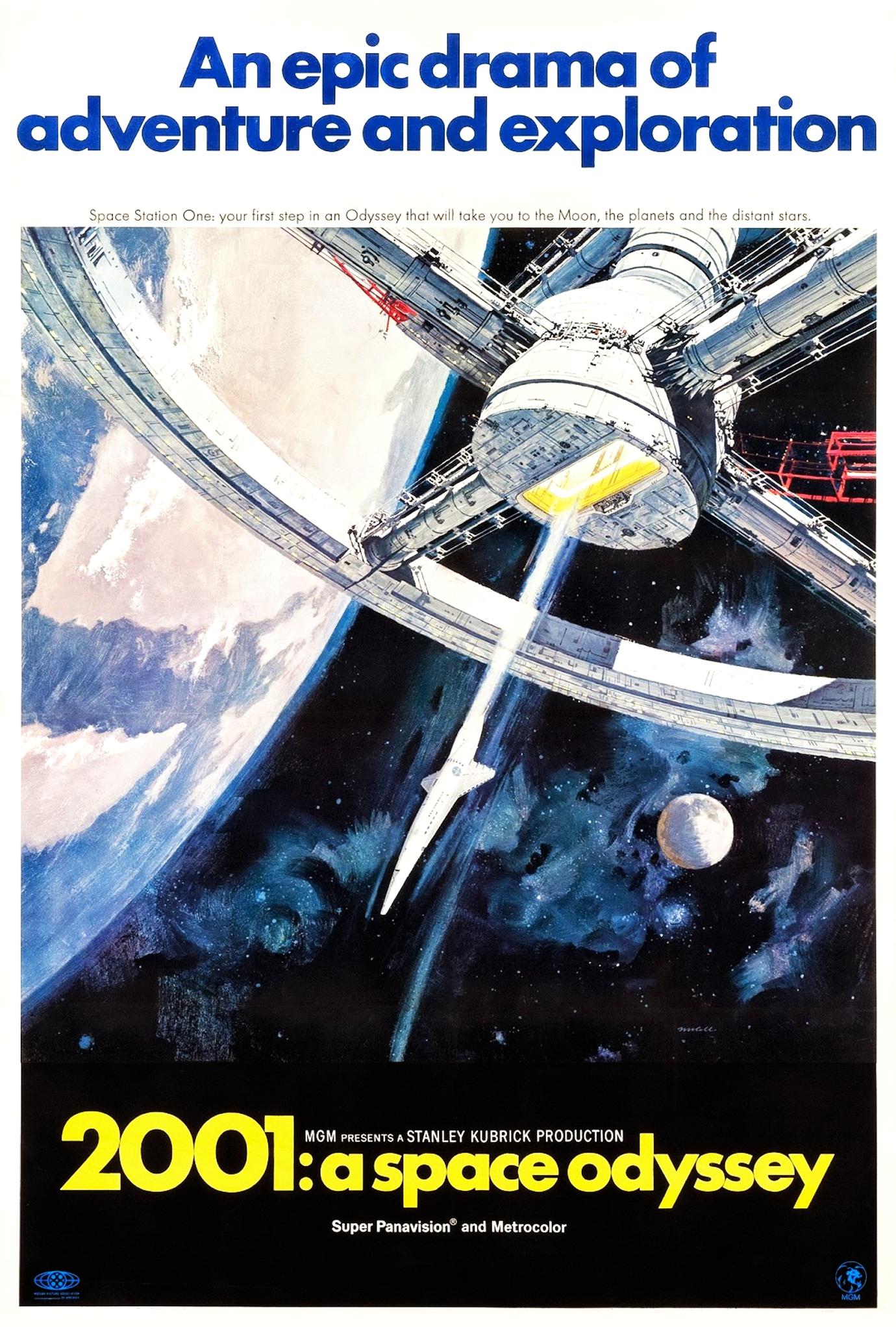
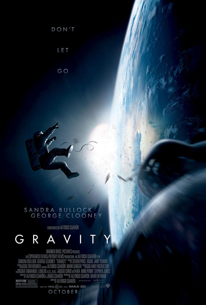
#1 Futura became an icon in the film industry
Source: IMDB.
Please note, that using Futura here is the most logical of choices. Is a movie about astronauts, that is targeted to almost the same audience as Kubrick’s Odyssey, but in different decades. Is a thought choice, the context of Futura worked in more recent times.
As noted by Maya Leack for 99designs , it is very interesting to see how this typeface became part of the movie industry, several other film posters also use Futura. American Beauty, Gone Girl among others. Is it because of Kubrick’s success? Did Futura become part of the Hollywood ecosystem? Does it have a common place for the audience? Many reasons could be behind this phenomenon.
Always referring to the cinema niche, some filmmakers are totally obsessed with futura, like Wes Anderson, who has use it for several movie posters as well as for the graphic elements inside many of his movies.
#2 Futura was seen by millions because of The Volkswagen Logo
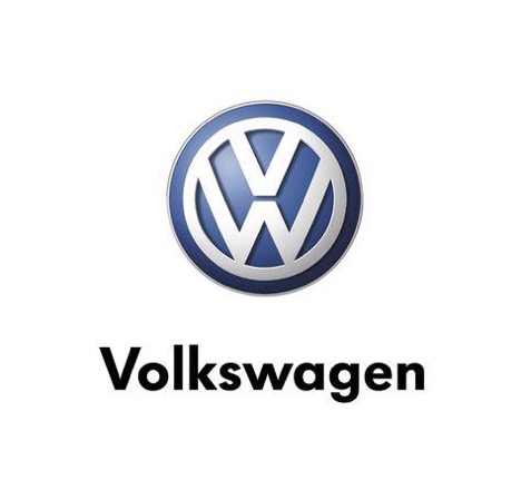
Source: The History of Futura , allegedly designed by Franz Xaver Reimspeiss and Nikolai Borg.
The relationship between Nazism and Futura explains this application of Futura. Being a typeface so representative of modernity and the Germany Hitler wished to convey, it was a very logical font choice. Volkswagen was a state-owned company at the time.
Previously called Volkswagenwerk, or “The People’s Car Company.”
In 1937, Hitler founded “The People’s Car Company.” He wanted to make a car that everyone could afford. He teamed up with Ferdinand Porsche to design the “KdF-Wagen.” But when World War II began in 1939, they had to stop making it.
Volkswagen faced challenges in America because of its Nazi connections and strange looks. In 1959, a clever ad campaign called the car the “Beetle” and emphasized its small size. This made it popular in the US. Later, the government sold most of Volkswagen to the public. The Beetle became the best-selling car worldwide, even beating Ford’s Model T.
In the 1970s, Beetle sales slowed down. Volkswagen introduced new models like the Rabbit and Golf to bring back interest. In 1998, they launched the “New Beetle.” But after over 70 years and making millions of cars, the last original Beetle was made in 2003, marking the end of a Volkswagen era. But this car brand’s story continues to date.
#3 Futura made a strong statement in the fashion industry and in art
Supreme Logo. Source: Wikipedia
Supreme logo is Futura all the way: Heavy, Oblique, and White. The creator James Jebbia got inspired in Barbara Kruger’s work, who used the typeface in the same way over a red box.
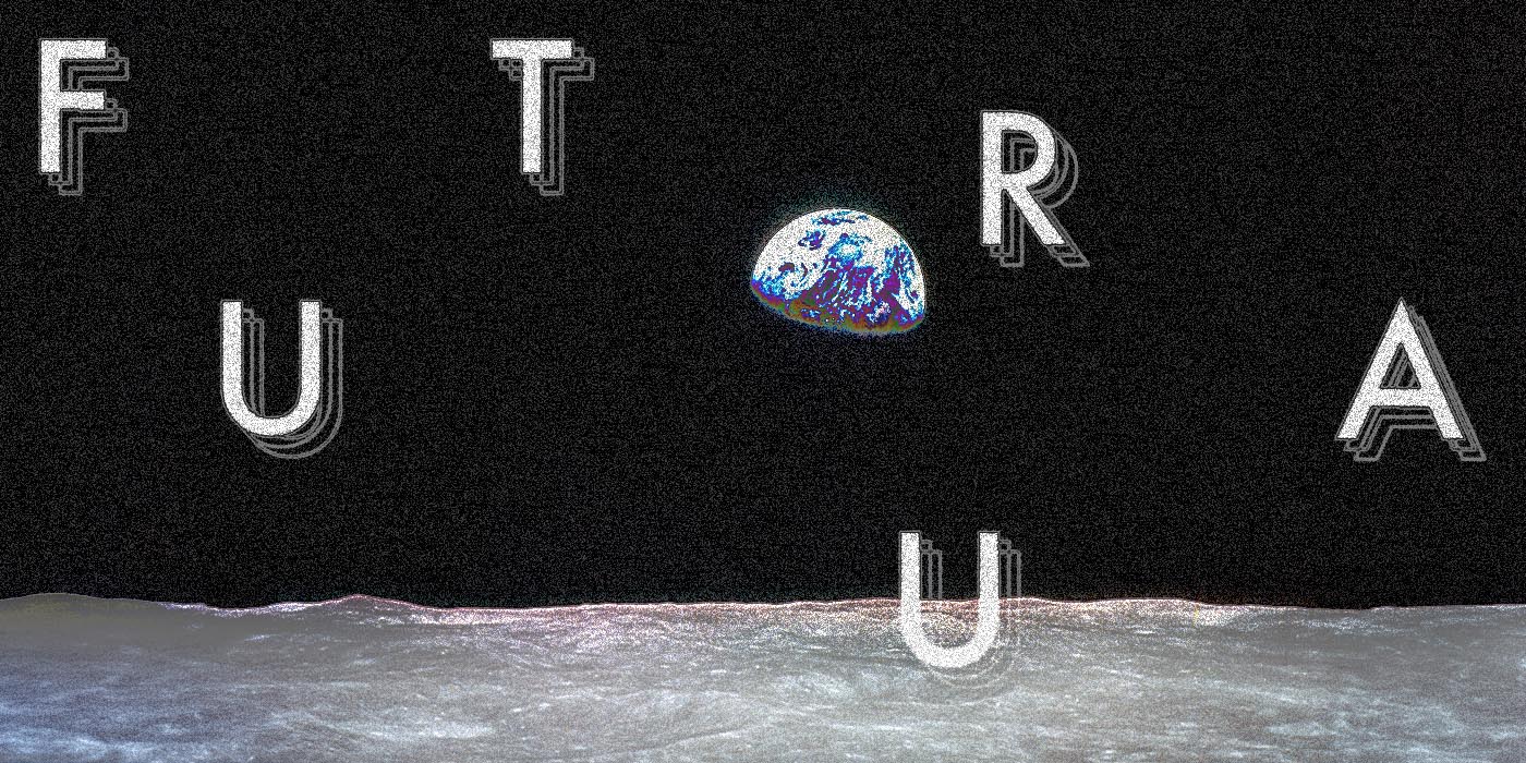
#4 Futura was the first typeface to step on the moon
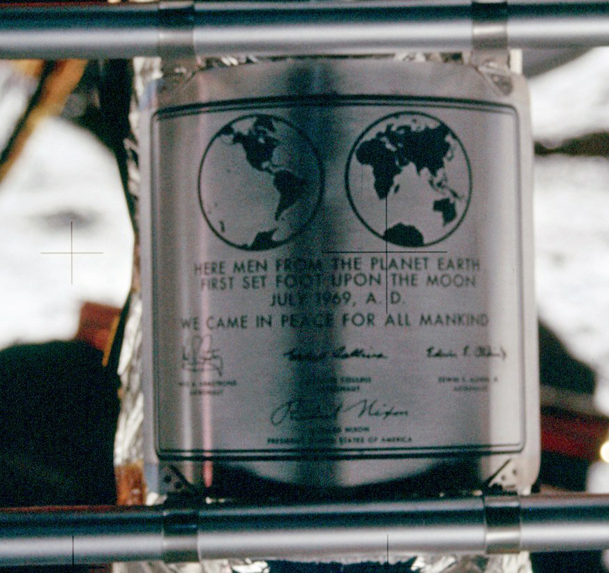
The Apollo 11’s Lunar Plaque with the signatures of Neil Armstrong, Michael Collins, Buzz Aldrin, and U.S. President Nixon. Source: Wikipedia

Apollo 11 logo. Source: Wikipedia
One of Futura’s most astonishing accomplishments happened in 1969 when this typeface became the first one to have ever existed on the moon, together with Armstrong and Aldrin who were officially the first humans. Read more about this interesting fact.
This site contains affiliate links, view the disclosure agreement for more information.
Where to download the Futura Font Family?
You can download the licensed version with your Adobe or at Bauer Types.
There are some free versions out there, but remember to always read the documentation, and to bear in mind that these might not be the original versions and they might be imperfect. We are not advising anything! But why don’t pay for an Adobe subscription? You have the typekit and your softwares, sounds like a good deal.
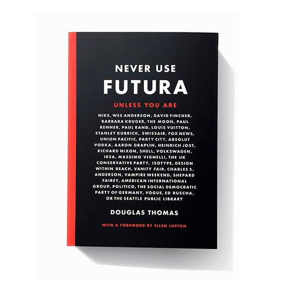
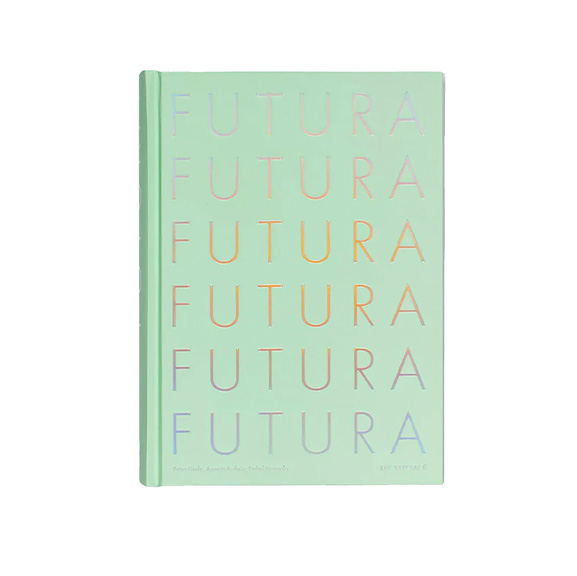
Books about the Futura Typeface
If you want to study more in-depth this historical typeface, you can read these books I found on Amazon, they are a great starting point:
Conclusion
Futura occupies a unique place in the pantheon of typefaces – and our hearts. It is one of the most commonly used typefaces, fonts to date. If you are talking about innovation, we would probably avoid using Futura for your project, but if you wish to revive the 1920s values or a specific moment in history, or a niche connected with what Futura represents, go for it.
It is a great typeface, has all the “checks” in typography: versatile, and legible. Just take into consideration all the baggage this typeface brings with it. So, welcome Futura for all its complexities, and use it wisely. There is always room for reinterpretation and reinvention.
Could Futura, nearly a century later, continue to ignite innovation?
We’d love to see your Futura projects! If you feel like sharing, email us at info@atypeofamigo.com Hopefully, this was useful, and it will help you in your graphic design journey.
See you soon Amigos,
