Dear Amigos,
Visual identities are the secret ingredient that can truly make or break a food brand. In a niche as sensory as cafés and bakeries, the brand experience starts long before the first sip or bite; it’s in the texture of the menu, the curve of the take-away cup, and the warmth of the signage. It is no surprise that coffee branding projects have become the absolute favorite for designers looking to build a standout portfolio. They offer a unique playground where tactile materials and bold typography meet to create a complete sensory journey.
Today, the ATOA team pretends they’re making a coffee branding project just with free resources. What mockups would we use? And what are some projects we would look into for inspiration? Keep reading to find out.
If you’re really into Food Branding, also check out our first article on this series Food Branding: Best 10 Free Mockups for Delicious Brands.
Freshly Baked Resources: 10 Mockups for your Library
Finding the right way to showcase your coffee or bakery project is essential to bridge the gap between a digital layout and a tangible experience. You need assets that feel high-end but realistic enough to look real. Here is a curated selection of 10 mockups to help you serve your designs with five-star quality:

Context is everything when presenting a brand. This mockup places your cup design right in the heart of the action: an espresso machine. By showing your branding in an active cafe environment, you help clients imagine the daily ritual of the barista, making the design feel grounded in a real-world setting rather than just a floating digital asset. Check it out here.

When it comes to specialty coffee or artisanal granola, the pouch is the gold standard for maintaining freshness while providing a large canvas for storytelling. This mockup features two standing pouches in a clean, front-facing view, which is ideal for displaying a “before and after” comparison or showcasing two different products in a single lineup—such as a house blend and a seasonal single-origin. The realistic plastic or paper texture, combined with the subtle shadows of the gusseted bottom, helps you present a professional and high-end packaging solution that looks ready for the pantry shelf. Get the mockup here.

A brand lives through the people who represent it. This apron mockup is a fantastic way to show the human side of a café identity. It allows you to visualize how a logo or mascot looks when printed on fabric, helping to build a more comprehensive and professional brand universe that goes beyond just paper and plastic. Get it here.

Presentation is everything when it comes to artisanal goods, and this comprehensive set offers the variety needed to showcase a full bakery brand. Featuring both white and kraft paper options for bread bags and pastry boxes, it allows you to test how your logo adapts to different material finishes. The high-quality textures and realistic folds in the paper give your designs a “fresh-off-the-shelf” look, making it an essential resource for designers who want to prove their visual identity works across multiple packaging formats in a single, cohesive scene. Download it here.

The most iconic asset for any café branding project. This mockup features two disposable cups in a minimalist studio setting, providing a clear view of how a logo or pattern wraps around the cylindrical surface. The sharp details and realistic lighting make it the perfect canvas for your “to-go” branding ideas. You can access it here.

Bakery branding is often about the set. This scene provides a high-quality square box mockup that is essential for presenting cake packaging or subscription gift sets. With its clean 3D visualization and professional shadows, you can effortlessly apply your patterns and logos to both the lid and sides for a photorealistic result that screams freshly baked. Download it here.

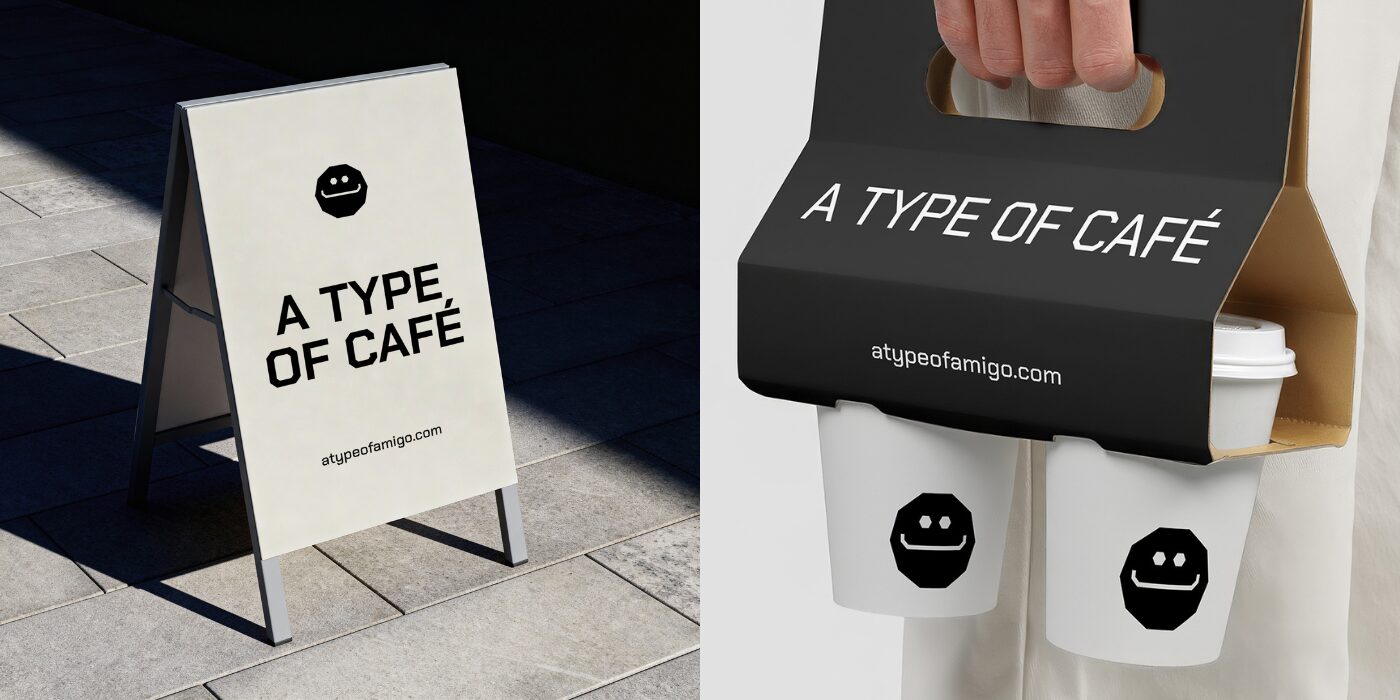
In the competitive world of coffee and bakeries, the sidewalk is often where the customer journey begins. This A-frame street sign mockup is a vital tool for visualizing how a brand’s personality translates into high-traffic, physical environments. Whether you are displaying daily specials, a playful brand tagline, or a simple “Open” message, this resource helps you test the scale and impact of your typography from a distance. The realistic wood and metal textures, paired with natural outdoor lighting, ensure that your design feels like a permanent fixture of a trendy neighborhood street. Download the resource here.

Typography is the star of any menu. This mockup provides a clean and modern layout to display your drink lists and pastry selections. It’s an ideal tool for testing legibility and hierarchy, ensuring that your typographic choices are not only beautiful but functional for a busy morning rush at the counter. Get it here.

The window of a café or bakery is its most important billboard, acting as the transparent layer between the craft inside and the community outside. This high-quality mockup allows you to visualize how your logo and secondary brand graphics look when applied as vinyl decals on a glass surface. Download the mockup here.

This high-quality mockup features two disposable cups in a minimalist setting, providing a perfect view of both the cup’s surface and the lid detail. It is an essential asset for visualizing how a logo or a complex wrap-around pattern will adapt to the cylindrical shape of the product. With sharp details and realistic lighting, this mockup helps you present a professional 3D version of your beverage branding that feels ready to hit the streets. Get the mockup here.
Real-World Inspiration: Putting it All Together
Now that you have the assets to visualize your work, let’s look at the projects that are setting the standard. These three cases show how a distinct vision—driven by smart typography and unique storytelling—creates an iconic brand experience.
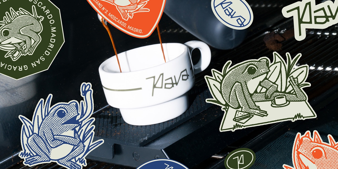
Pava, a specialty café in Madrid, proves that the coffee niche still has room for fresh perspectives. The visual identity for this project stands on a masterclass of balance, merging an industrial aesthetic with inherent warmth. Its typographic DNA is built on two specific fonts by Taylor Penton: Rosemary, a condensed font with immense character, and Birdie, a sans-serif with an analog feel that emulates manual craftsmanship. This combination, paired with a charming frog mascot, creates an identity that feels both precise and approachable. Discover the full project here.
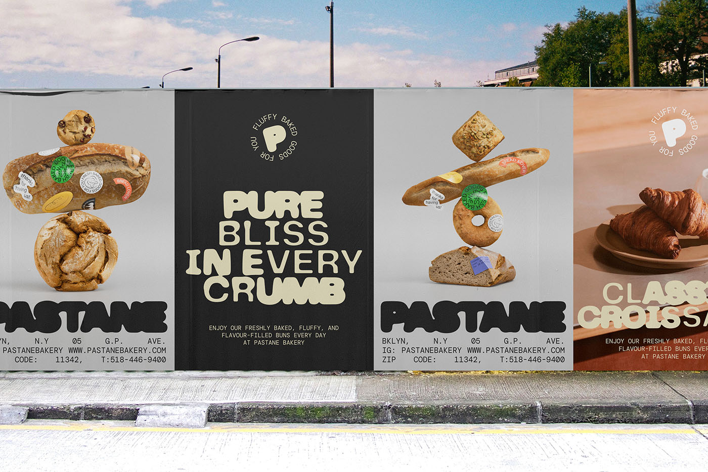
This project is a beautiful exploration of the “magic of dough.” For Pastane, the design team at High on Type literally translated the malleability of baking into a visual language. The brand is centered around a custom-made typeface that mimics the soft, organic, and rising nature of bread dough. The result is a fluid and highly tactile identity where the type itself becomes the primary illustration, proving that custom lettering can serve as the strongest ingredient in a brand’s recipe. Read the whole case study here.
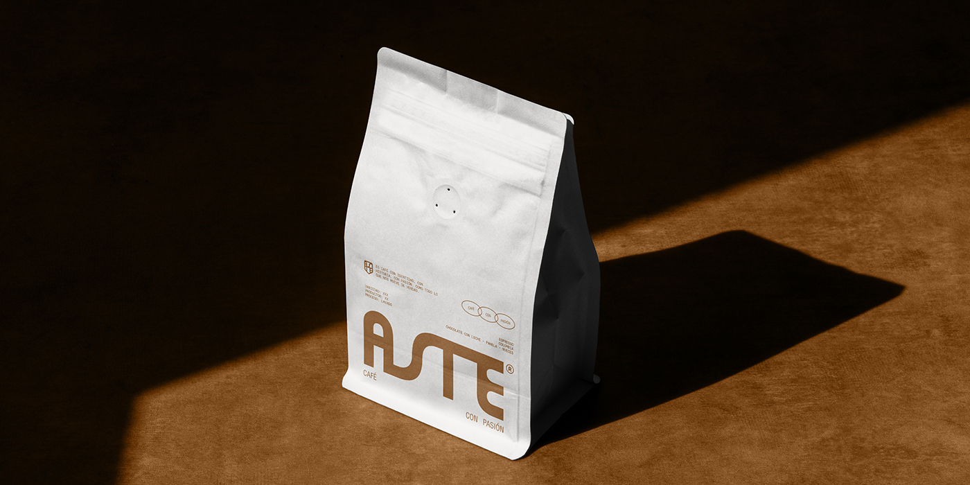
Astê Café focuses on the ritual of brewing, utilizing a nostalgic and “slow-living” aesthetic to connect with its audience. The visual system draws inspiration from vintage coffee culture but with a modern, conscious twist. The typography plays a vital role here, featuring classic serif headlines that evoke a sense of history and trust, paired with clean layouts that keep the project feeling contemporary. It’s a perfect example of how to use “old-school” type to create a trendy, premium brand. Discover the full project here.
We hope these case studies spark your appetite for creativity and that these mockups help you present your next food branding project with five-star quality. Stay tuned for more curated mixes of inspiration and resources!
Yours truly,
Since you are really into creativity, you might be interested in these other articles and resources:
How to Make the Perfect Design Portfolio
Here Are The Best Font Libraries Curating Open-Source Fonts
Insider Tips: The Best Type Foundries with Open Source Fonts