Dear Amigos
How many times did you Google the difference between kerning and tracking this month? We wrote an article about both concepts last year, but it’s never too soon to recall one of the main ingredients of a design full-meal: the tracking. What is it? How to adjust it? What rules should we follow and how to break them?
What is Tracking?
Imagine the space between all the letters in a word or a block of text. That’s tracking. Unlike kerning, which adjusts the space between two specific characters, tracking uniformly adds or subtracts space across a whole selection of text. It’s like expanding or condensing a spring, affecting the overall density and rhythm of your words. When used thoughtfully, tracking can significantly impact readability and visual appeal.
Adjusting Tracking in Adobe Illustrator
Getting your tracking just right in Adobe Illustrator is straightforward. Here’s how you can fine-tune it in a few simple steps:
- Select Your Text: Use the Selection Tool (V) or Direct Selection Tool (A) to select the text frame, or the Type Tool (T) to highlight specific words or paragraphs.
- Open the Character Panel: If it’s not already open, go to Window > Type > Character.
- Locate the Tracking Option: In the Character panel, find the “Tracking” icon, which looks like “VA” with an arrow underneath.
- Adjust the Value: Click the up or down arrows next to the tracking value, or type a numerical value directly into the field. Positive values increase the space, while negative values decrease it.
- Observe and Refine: Watch how the text changes as you adjust the tracking. Make small increments and observe the visual impact, focusing on overall balance and legibility.
Tips to Avoid Bad Tracking
Good tracking is often subtle, almost invisible. Bad tracking, on the other hand, can make your text difficult to read and visually jarring. Here are some tips to keep your tracking on point:
Prioritize Readability: Although it’s often overlooked, accessibility is one of the most importants aspects of design. If your tracking is too tight or too spaced out, words might become uncomfortable or straight up impossible to read. Always test your tracking choices by reading the text aloud. If it feels difficult, adjust it.
Context is Key: Consider the typeface, font size, and the medium where the text will appear. Larger display type often benefits from tighter tracking, while smaller body text usually needs more generous spacing for legibility. You can put it this way, if you need to adjust tracking in a very noticeable way, try to apply it to titles or subtitles, avoid using heavy tracking adjustments on paragraph texts.
Go for contrast or consistency: If you’re using different tracking adjustments for elements on your design, make sure the elements have enough contrast, preferably by size or shape. If two elements are too similar and their tracking is different, it just creates an unbalaced design. When working with similar elements, it’s best to strive to consistency and mantain the same tracking adjustments across them.
Using tracking to improve your paragraphs
Tracking isn’t just for headlines; it’s a powerful ally when finessing blocks of text. Whether you’re working with left-aligned, right-aligned, or justified paragraphs, you’ve likely encountered those stubborn lines that disrupt the visual flow. This is where subtle tracking adjustments can make a significant difference. However, a light touch is essential.
Here’s how to approach it:
Keep it Surgical: When refining paragraphs, make minimal tracking adjustments to individual words or lines. The goal is to create an even, visually pleasing texture without drawing attention to the adjustments themselves. Remember, readability is always the priority. Aim to keep your tracking changes within a small range, typically between -20 and 20.
Maintain Visual Harmony: Avoid drastic shifts in tracking from one line to the next. A line with very tight tracking followed by one with very loose tracking will be jarring and noticeable. Strive for consistent visual density throughout the paragraph.
Taming Justified Text: Justified paragraphs, while often appearing neat, can sometimes create awkward “rivers” of white space. Judiciously reducing the tracking on lines with excessive gaps, or slightly increasing it on lines that appear too dense, can significantly improve their visual balance and overall readability.
Next steps: Breaking the rules
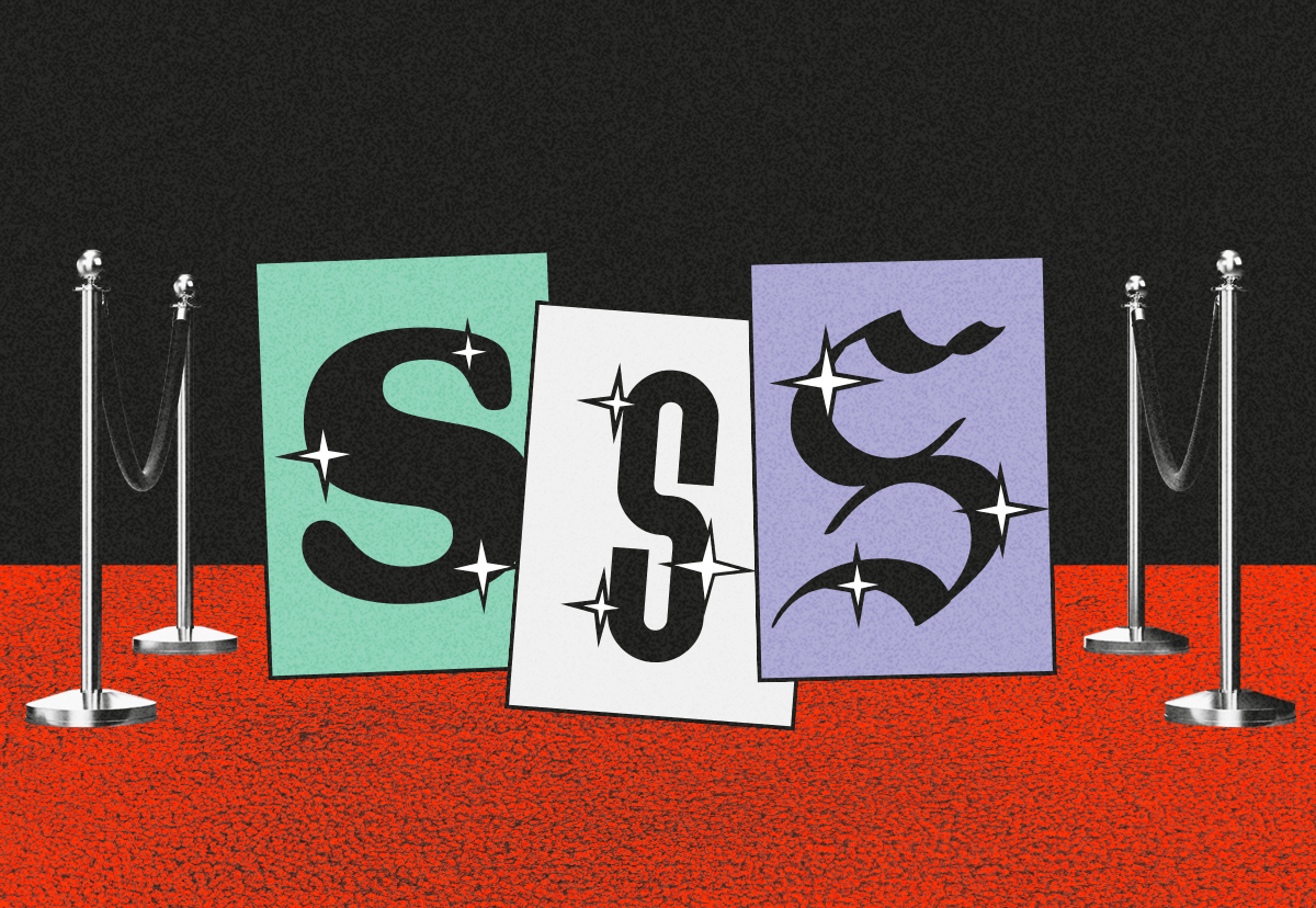
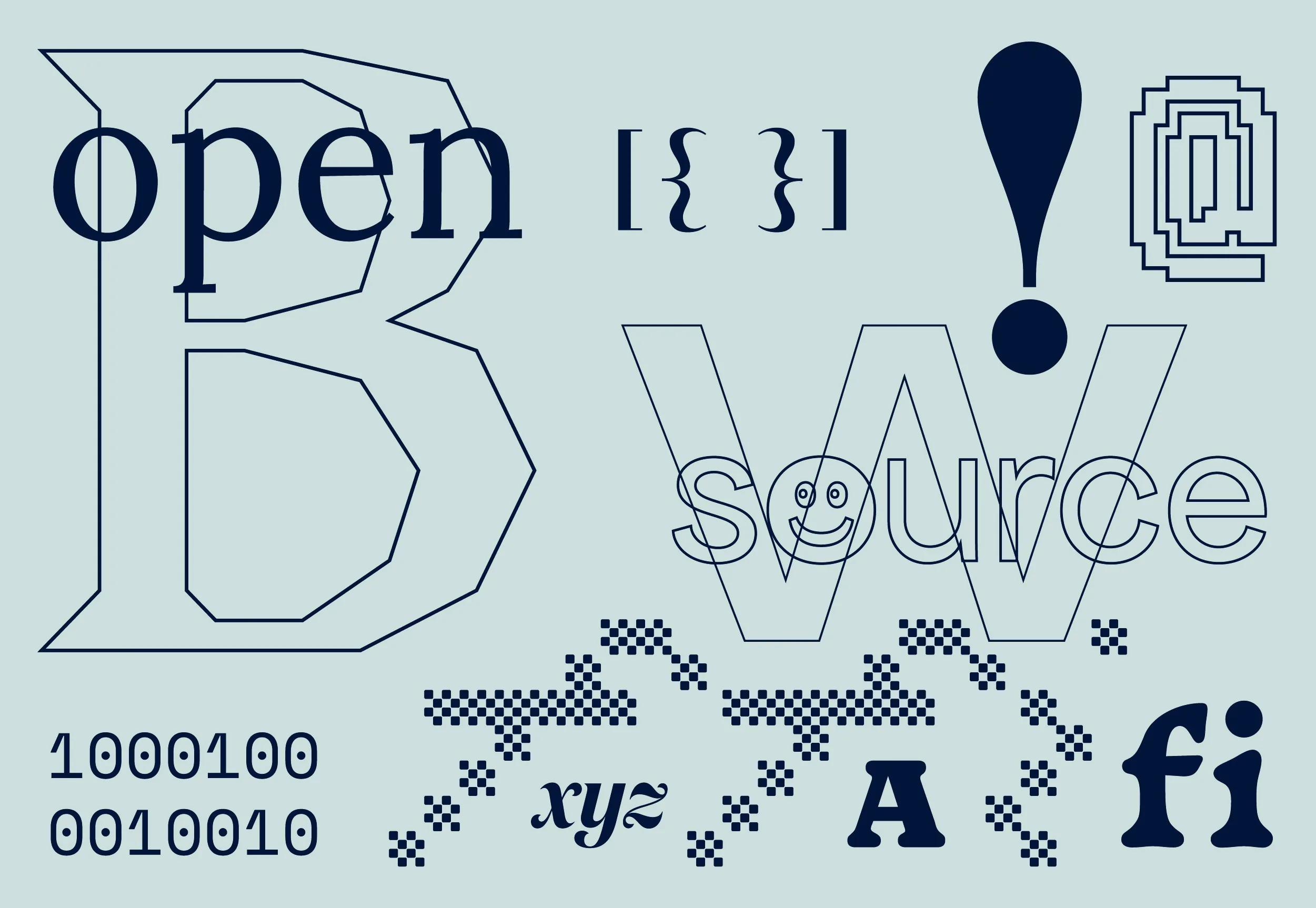
After mastering our craft as tracking experts, there’s only one thing left for designers: experimenting. There’s a very fine line between stretching a rule and breaking it completely, but exploring typography in extreme conditions is a practice that often creates some of the most memorable pieces in graphic design. The key is to refine your eye. Try new things, learn from what doesn’t work, and build on your successes. As you gain confidence, let your creativity flow. Here are some of our favorite designs that bravely use unconventional tracking.

Image Credit: ZAK zine 15 | Lukas Holinka

Image Credit: Imagine Coral Reef | Institute of Design Research

Image Credit: PLAY! Bergen 2024 | ©2024 Overhaus
Why Tracking Matters in Graphic Design?
Tracking is more than just adjusting space; it’s a powerful tool that contributes to the voice and personality of your design. Thoughtful tracking can enhance readability, convey specific emotions, and differentiate your brand. It can make a logo feel sturdy and grounded, or a headline appear airy and elegant. Don’t shy away from experimenting with tracking to discover its full potential! Just remember to always keep readability at the forefront and ensure your tracking choices align with the overall brand personality you’re aiming to create.
Yours truly,
Since you are really into typography, you might be interested in these other articles and resources:
Kerning vs. Tracking: All you need to know
How to Calculate the Baseline Grid and Conquer Graphic Design