Even as designers, there’s a truth we can’t deny: our world is visually overwhelmed. Our need for quick replication and adaptability can distance us from enjoying the wonders of expressive typography. Using type as an anchor to explore our connection to the world surrounding us is becoming a lost art.
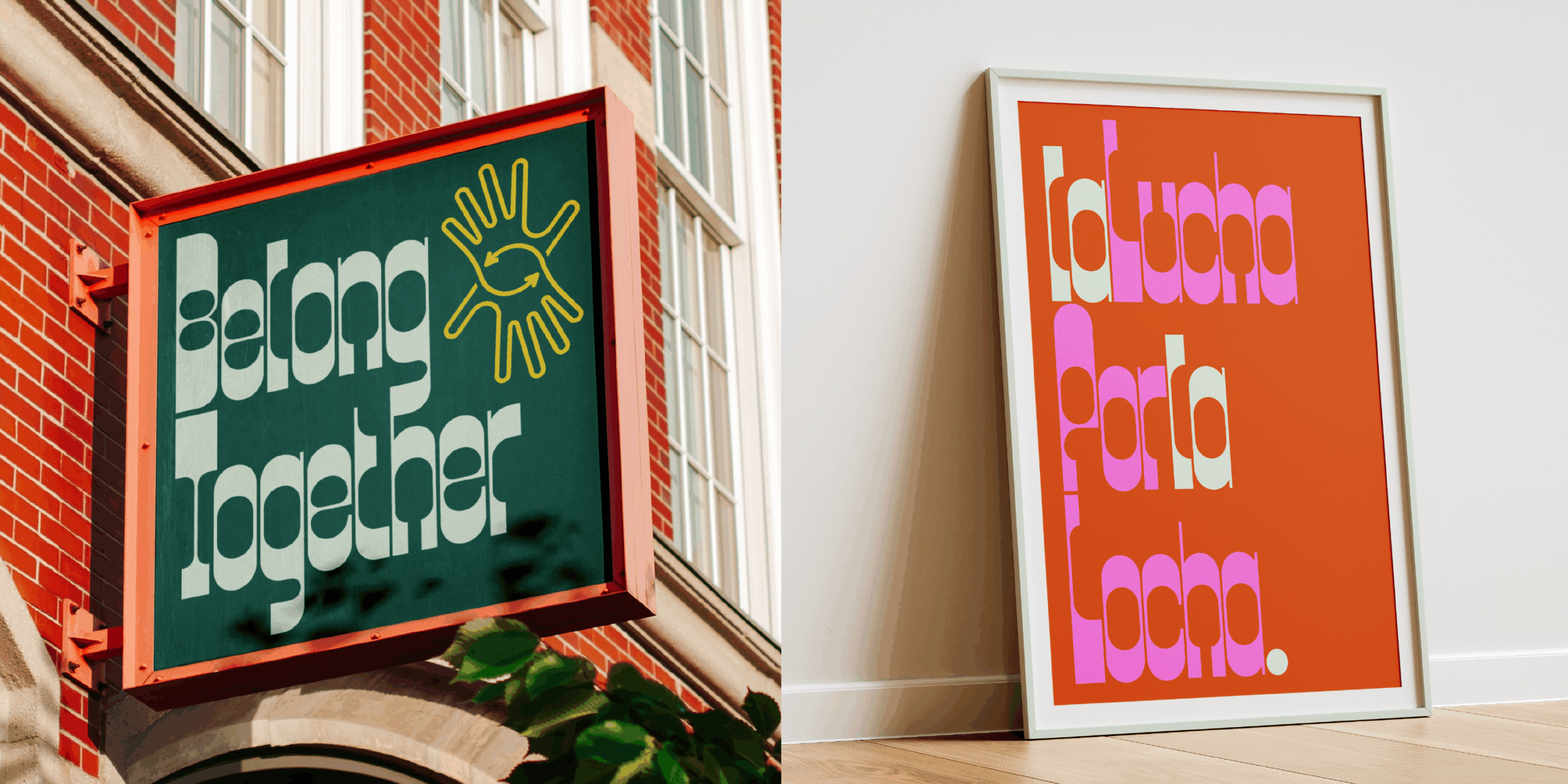
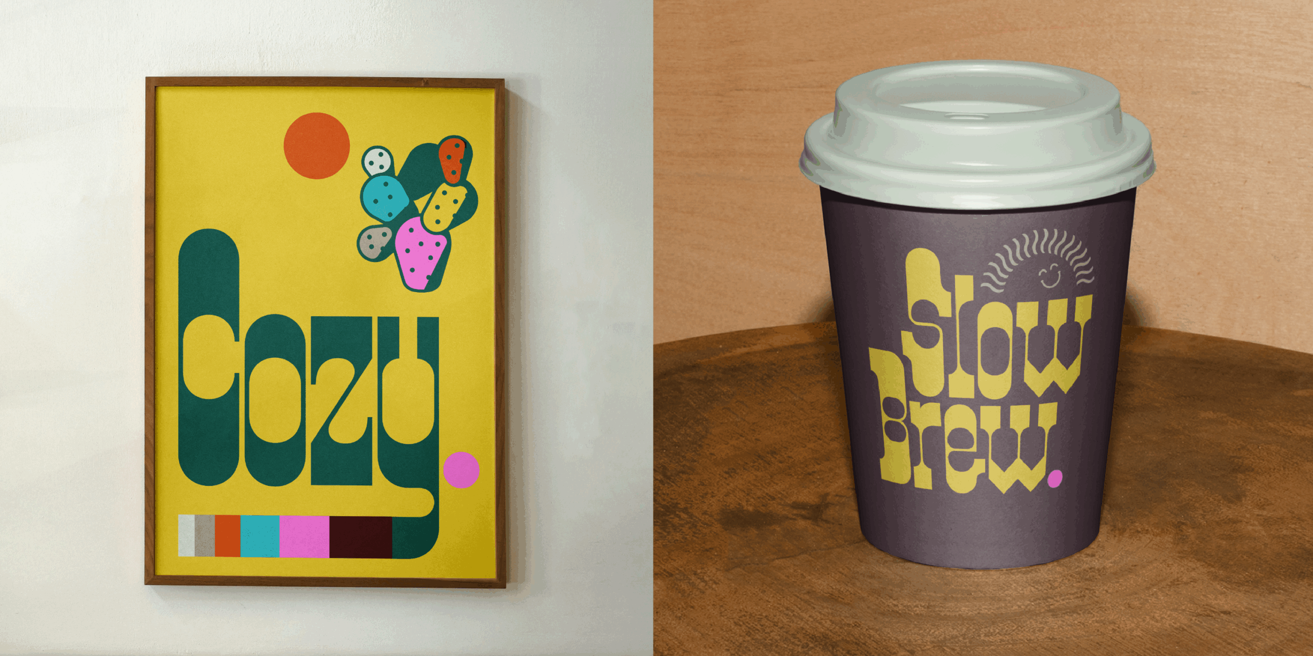
This is the feeling that Locha, the new font by In House International, seeks to change through its intentional visual rhythm. An invitation to value details from a tranquil approach.
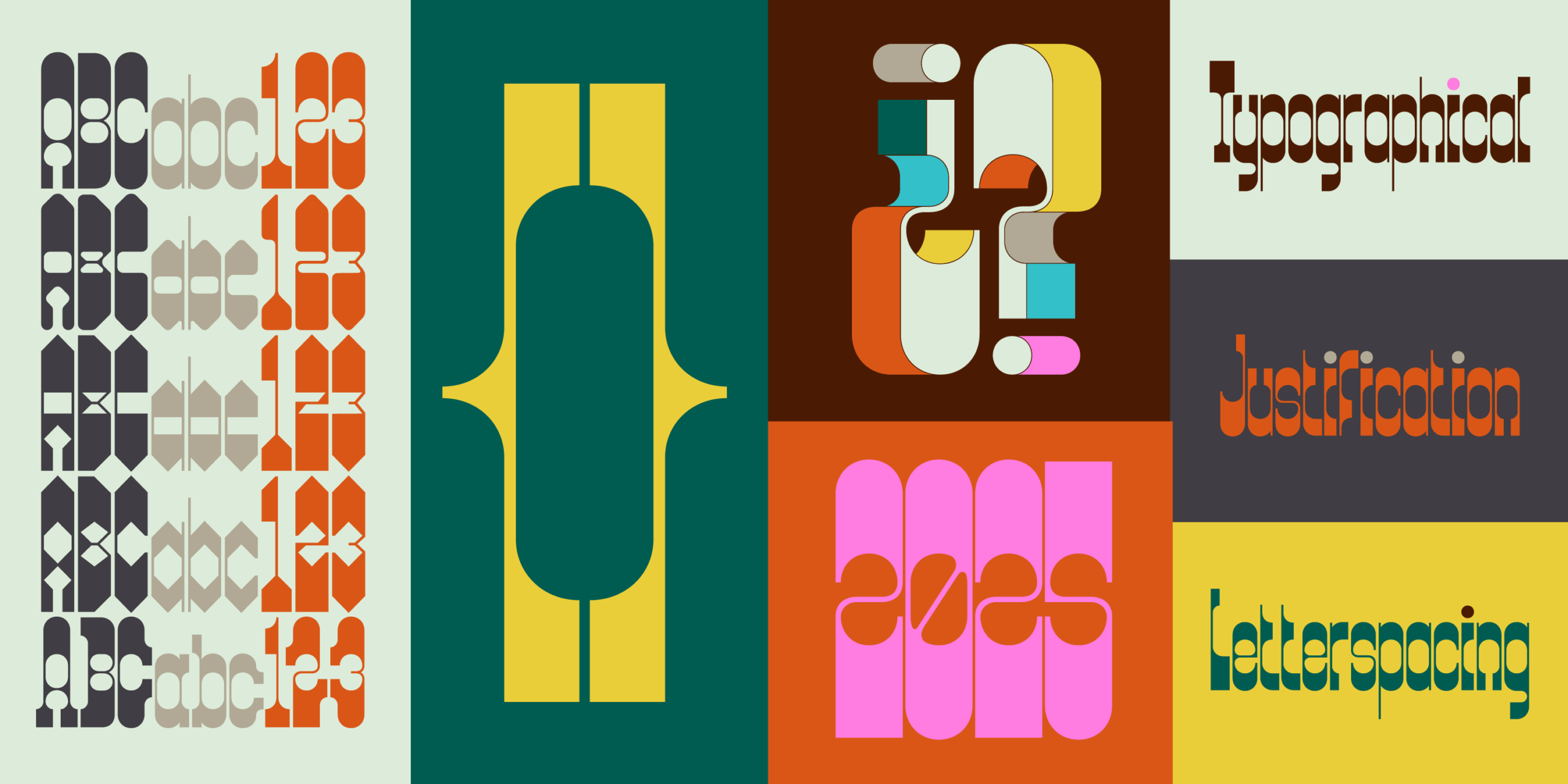
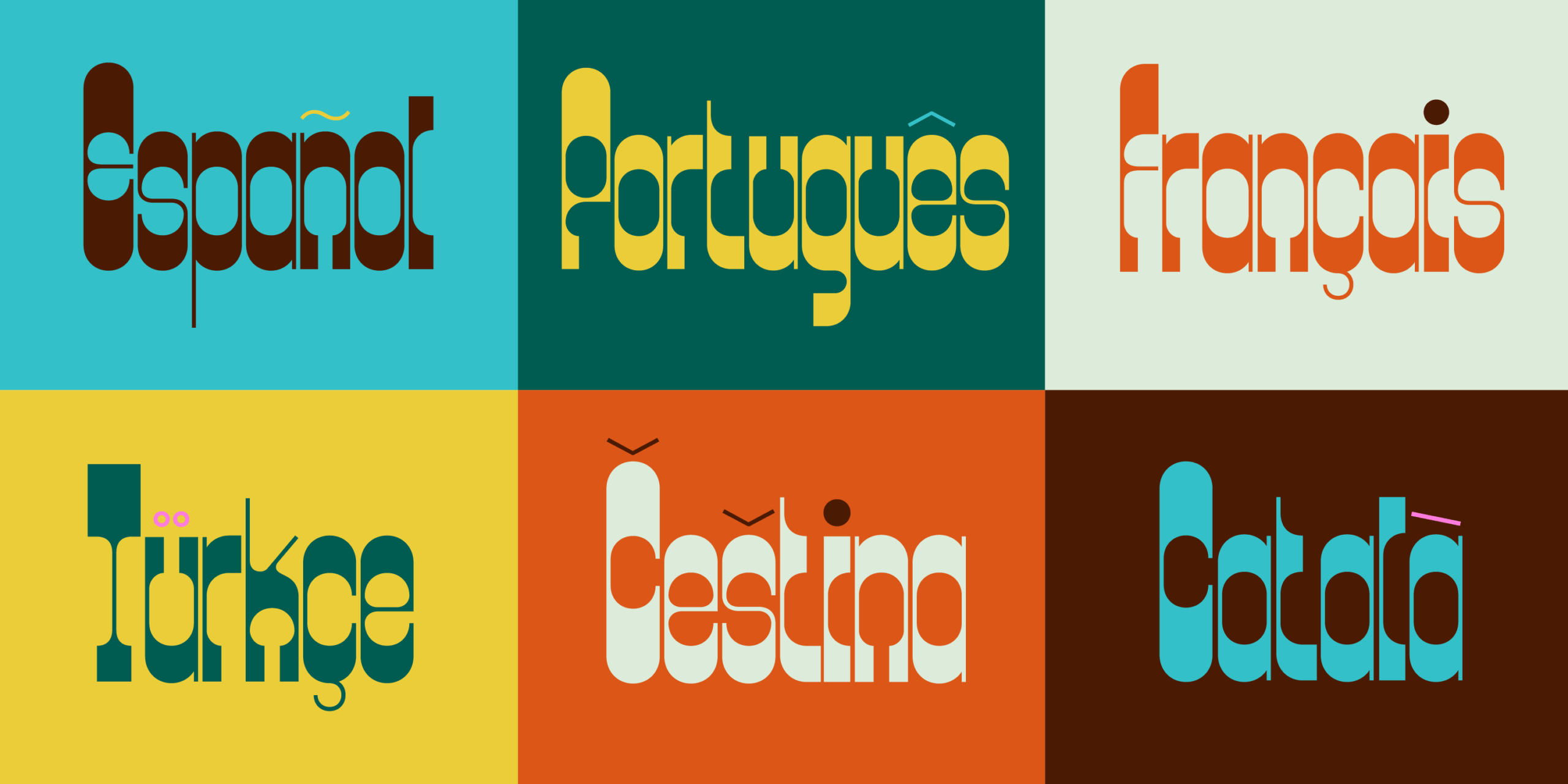
70’s inspiration for todays needs
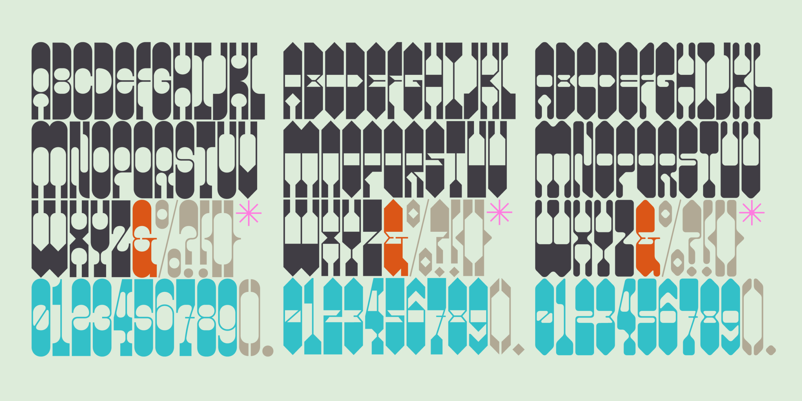
Designed by Alexander Wright alongside Michu Benaim Steiner and developed by Rodrigo Fuenzalida at FragType, Locha’s fun-shaped edges, constructed carefully, recall the soft geometry from 70’s type while shining with flexibility and clarity, needed for contemporary uses.
Unlocking creativity with Locha’s range of styles
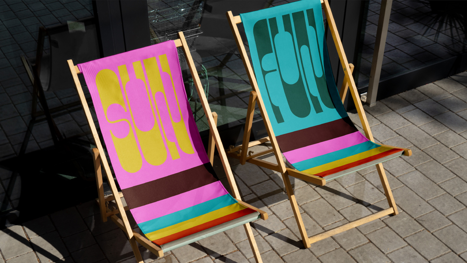
Locha comes in 5 styles: Regular, Diagonal 1, Diagonal 2, Slab and Soft. Its variations add personality and distinction to any project. From headlines to branding, this display font anchors its meaning to preserving the present while remembering the past.
A Familiar Name Returns: In-House International’s Latest Work
In-House International is a creative studio founded by Lope Gutiérrez Ruiz, Michu Benaim Steiner and Alexander Wright. Their groundbreaking work has made it to our blog before. Zanco, one of their previous releases, is one of our most read features. If you loved Locha as much as we did, make sure to get it here.
See you soon amigos!
A Type of Ari.