Dear Amigos,
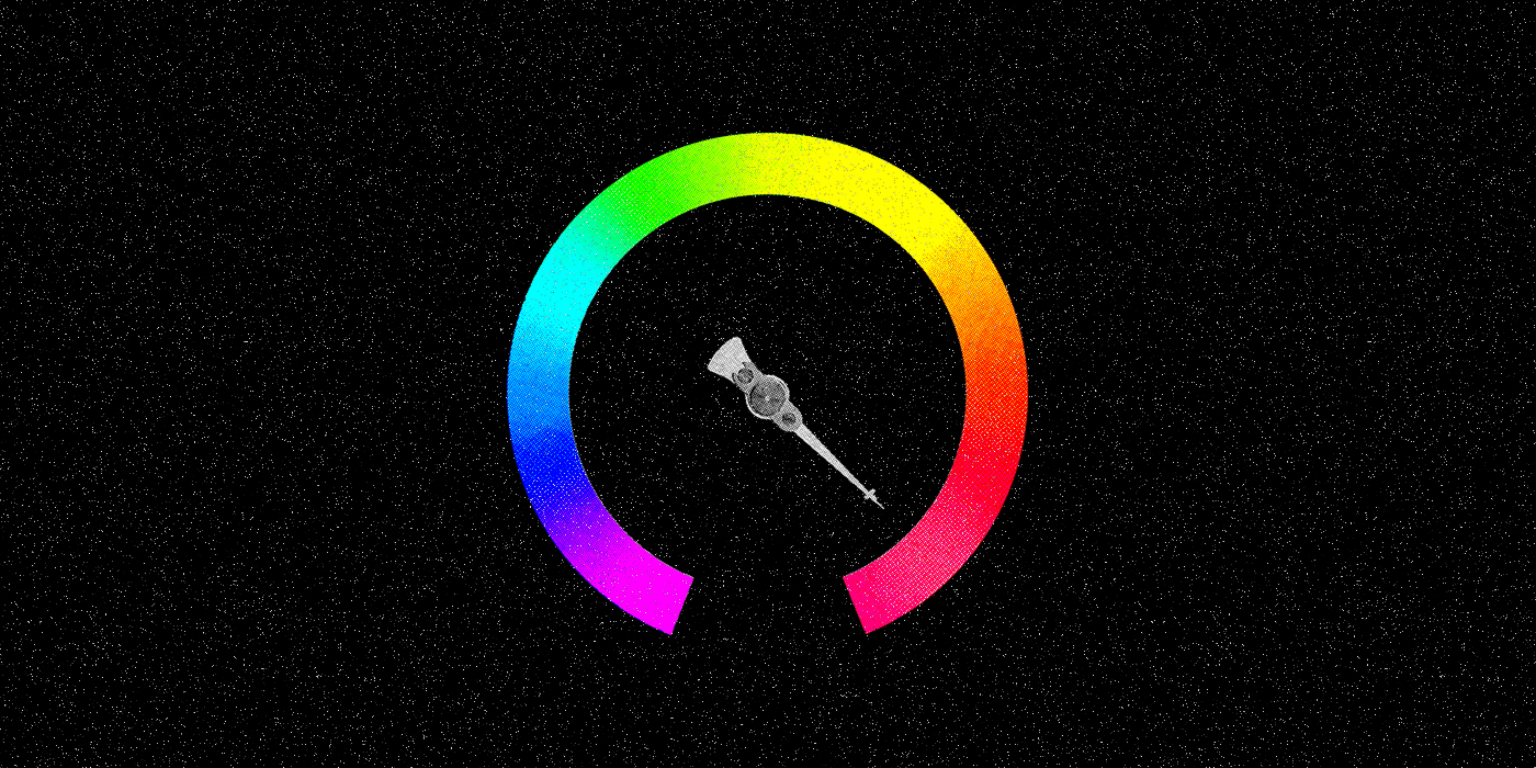
When it comes to branding and design, Google is often at the forefront. They’ve revolutionized what a digital experience means for the past few decades. YouTube, as a member of the Google family, is part of this massive digital transformation. This video-first platform, is constantly improving the user experience. Subtle, yet impactful updates, are part of these enhancements. Recently, YouTube made a notable shift in its iconic red color, among other tweaks. These small changes might be imperceptible for many, yet they significantly improve accessibility. However, do they truly improve the brand positioning?

The New Red: A Shift towards Accessibility
Image credits: YouTube
YouTube’s updated red hue leans more towards pinkish tones than orange. This shift addresses technical issues like burn-in on screens. The color tweak is not the only surprise Youtube prepared for us. Other evident design enhancements were put into place such as:
- Button animations
- Gradients used in key actions like the playback bar.
- Less percentage of branded colors on the UI, more monochromatic tones.
“For instance, we caught a few potential issues rendering the gradient on large screens, and found ways to keep the red versatile to meet accessibility needs.” – Jessie Zo, senior visual designer
Image credits: YouTube
All these changes definitely improve the accessibility of the platform. Not only that, they position YouTube as an inclusive brand. A platform that offers an experience available to a wider audience. With the new hues, they now provide sufficient contrast based on accessibility guidelines. The main consideration was ensuring adequate contrast between text and background.
“…avoiding color as the sole means of conveying information. For instance, instead of applying branded colors to all buttons, we reserve them to highlight key actions a user might take. This approach keeps default states in monochromatic tones, maximizing both efficiency and accessibility.” – Jessie Zo, senior visual designer
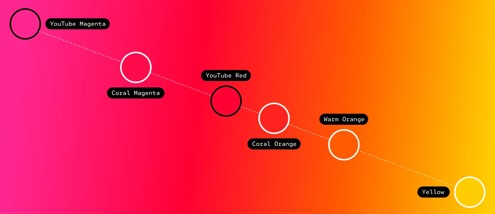
Image credits: YouTube
Do colors continue to influence consumer perceptions in branding?
YouTube’s new red hue, also highlights the complexities of color association: ”For better or worse, red is a very strong color that has been synonymous with a lot of different movements throughout history, and it has different meanings in different societies”. –Amy Yip, visual design lead
Will you relate YouTube with the Chinese Communist Party just for sharing a similar hue? Red is related to various historical movements and has different meanings. That is a fact. Implying that colors should be chosen based on that associations, is subjective. The meaning of color is context-dependent, or at least it should be. Should we heavily rely on such broad associations when choosing a brand color?
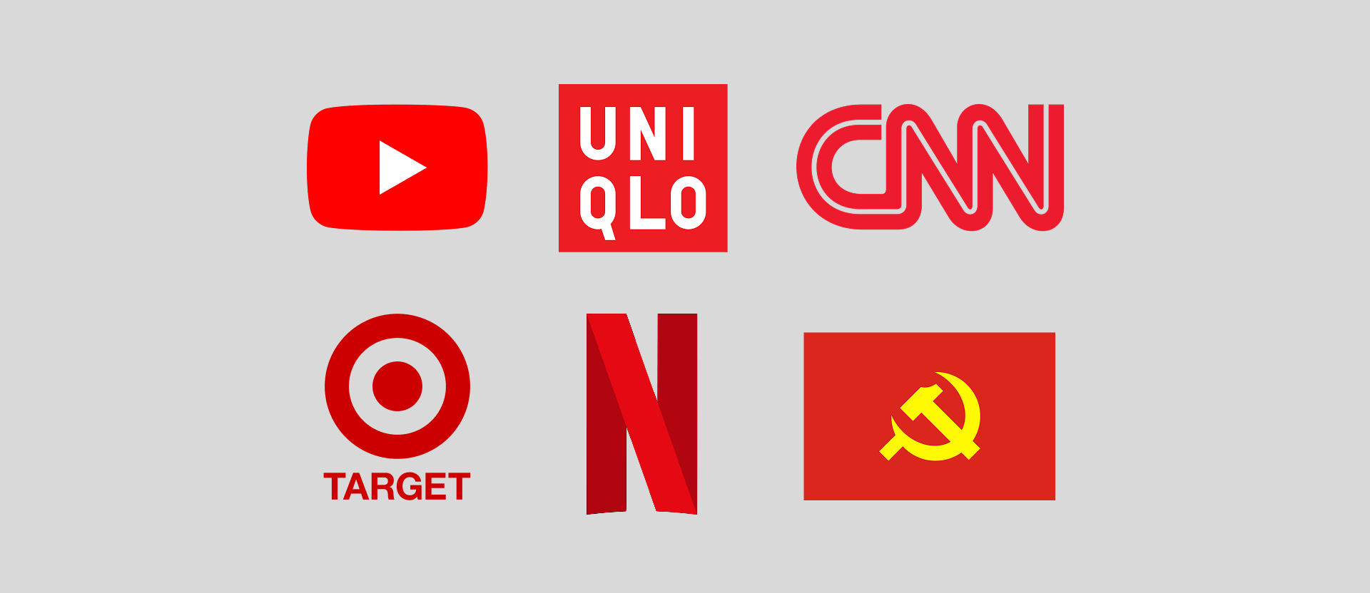
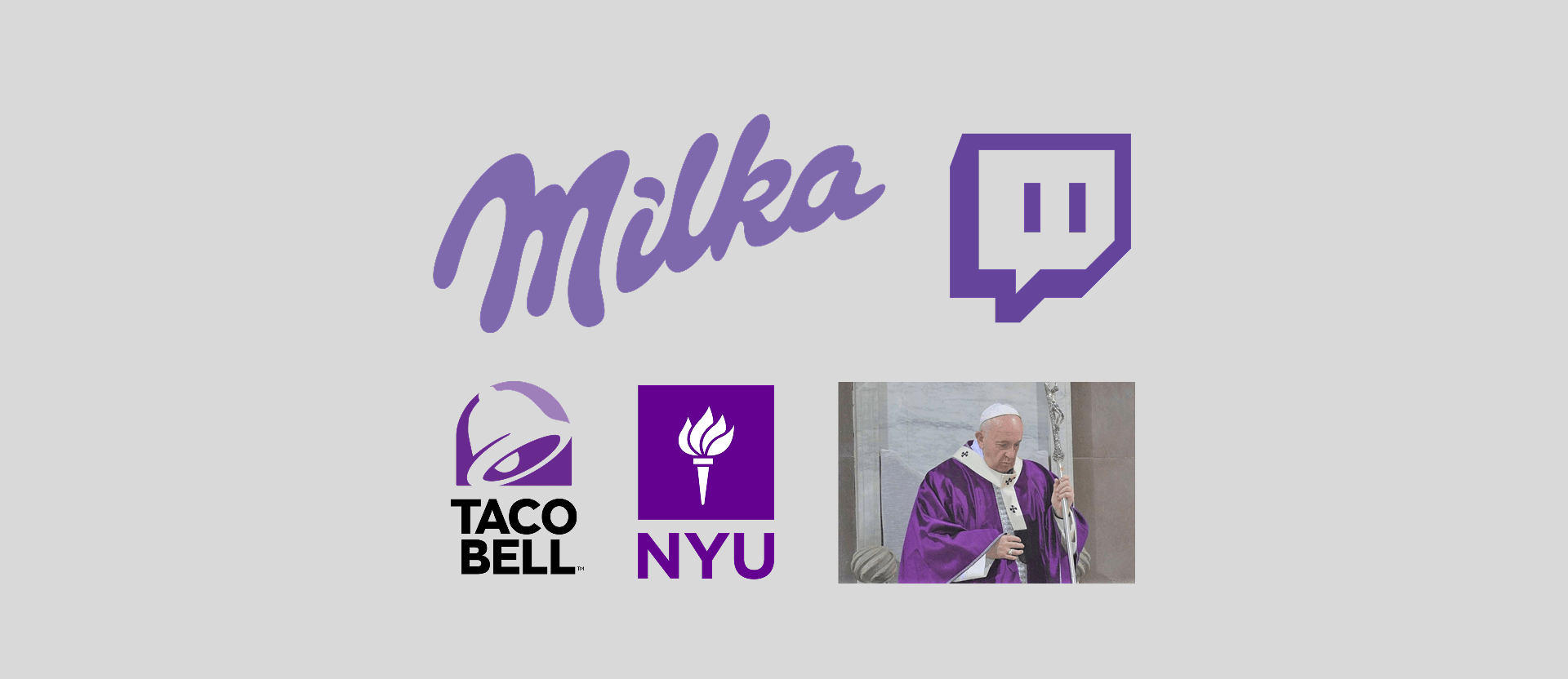
If this new red motivation is true, we should contact Milka’s CEO. Historical connotations related to purple, might evoke church-related thoughts in the audience. The reality is that primary colors like red are ubiquitous. You can associate them with everything from love to communism, or even violence. Their meanings vary widely based on personal experiences and cultural backgrounds. Perhaps it’s time to revisit how we apply color psychology. Focus more on nuanced contextual understanding rather than simplistic emotional associations.
Similarities Across Platforms
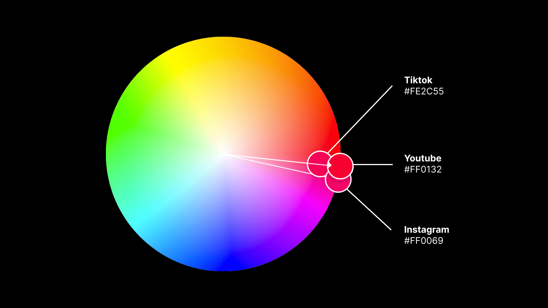
However, these new upgrades, did made a particular context-based connection: TikTok and Instagram. The new gradient palette recalls Instagram’s logo and UI applications. By the other hand, the new reddish tone brings TikTok to mind. This raises questions about brand differentiation in today’s digital landscape. Is everything looking the same?
Are brands across same niches starting to communicate almost identically? Is there an overlap in visual communication? Is this happening because “imitating what works” seems effective? In the branding spectrum, understanding your niche’s language is important. The same can be said to finding out how to find your brand’s unique voice in that ecosystem.

Similar gradients across social media platforms. Image credit: Youtube/Meta
Innovation vs. Imitation
This overlap prompts us to ask whether big brands are truly distinguishable. Are they just mimicking successful trends? Is it possible to stand out? Is it possible to innovate and to still connect with your audience?
Clearly, decisions are not only yours to take, but thinking outside of the box is a risk worth taking. I would even encourage you to create your own box. Yes, YouTube’s new red is undeniably effective for accessibility and user experience. But also yes, everyday things more look of the same. It seems performance has the lead in the priority list. It is fundamental to raise questions. It is imperative to create distinctive brand experiences. This is the only way to stand out in today’s crowded digital space.

Are metrics and algorythms transforming the world we live in into a homogenic gray mass? Is any big brand willing to take the risk? Decision makers today are all about the numbers. They demand immediate results and comprehensive data. Maybe that’s how modern society has shaped us.
Yours truly,
A Type of Camila
Since you are really into branding, you might be interested in these other articles and resources:
A Masterclass on how to destroy an iconic brand: Jaguar’s rebranding