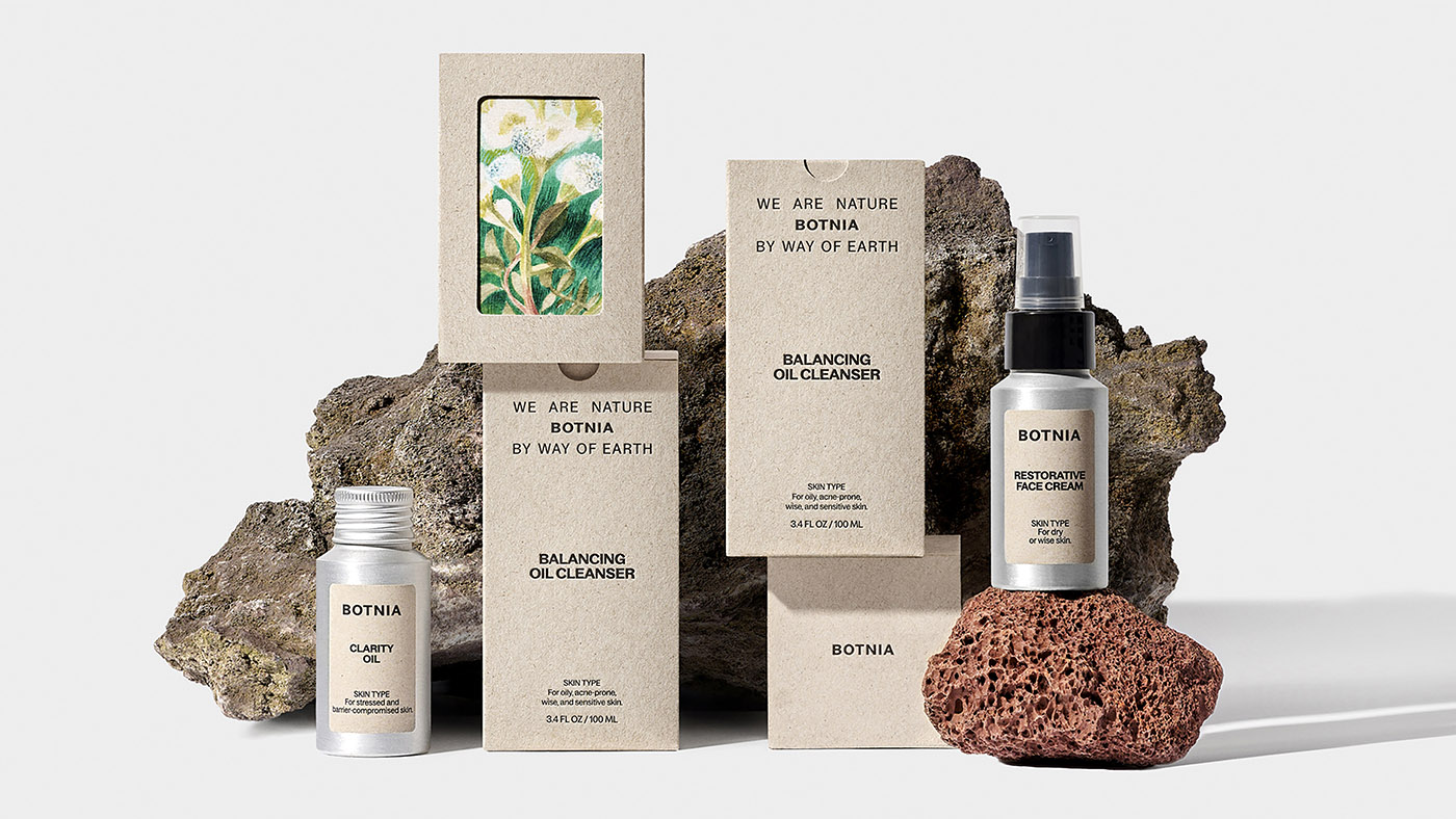
Dear amigos, today we’re thrilled to spotlight a branding and packaging project with a natural look, that introduces earth to your skincare routine. Hugmun, a boutique Danish design studio based in Denmark’s capital, Copenhagen, has crafted a visual identity for Botnia, a California-based skincare brand that embodies nature and nurturing in every detail. Through clean, minimalistic visual communication, this design project highlights a balanced blend of simplicity, holistic wellness, and a grounded connection to the earth, creating a memorable natural look.

Botnia, rooted in Sausalito, California, is a professional skincare company defined by its core ethos: “we are nature.” Using ingredients sustainably grown on their microfarm, they craft small, carefully controlled batches. Botnia’s skincare embodies the union of caring for our ecosystem and our skin simultaneously. Hugmun’s design took this concept word by word, and transformed it into an identity characterized by a natural look, that aligns high-quality skincare with a profound respect for the natural world. As Chloe Gordon, from the Dieline said: “Farm-to-table is popular jargon amongst natural food lovers, but farm-to-face is a new up-and-coming trend in skincare”.

Hungmun: “The logo symbolizes Botnia’s position between nature and earth, while the packaging mirrors honesty and eco-friendliness, showcasing raw materials like aluminum”.

Each element of Botnia’s visual identity—from the logo to the packaging—embodies an honest, eco-friendly aesthetic. The choice of raw materials, such as aluminum, reflects Botnia’s eco-conscious philosophy. Aluminum’s recyclability and minimal environmental footprint make it an ideal choice, while the bright, pastel hues inspired by natural materials add a fresh, spa-like feel.
Hugmun explains that the design “emphasizes honesty and transparency, signaling to consumers that what they see is what they get: pure, sustainable skincare.” This thoughtfully crafted brand identity is printed on eco-friendly packaging from Marceli Printery, a project coherent not only with a natural look and feel, but also with its actions. To further enhance Botnia’s visual appeal, Hugmun enlisted illustrators, including Dominika Brychcy, whose beautiful watercolor artworks capture the brand’s connection to nature.

Hugmun: “The color palette, derived from raw materials, fosters a bright, pastel, and organic feel, creating a harmonious, spa-like experience for users.”

This dreamy natural look ecosystem created by Hugmun, is uplifted by the minimal and function-oriented, but still quirky and fun personality, typeface Baggos, by Displaay, an independent type foundry established in 2014 and based in Prague, Czech Republic. As Hugmun’s team highlighted, this sans-serif turned out to be very a flexible typeface for the packaging system, since it has extended font weights and adapts well to various situations.

Behind this remarkable work, there was, of course, a talented team that made it possible. A big shout-out to Dominika Brychcy, Maria Milenko, Laura Junger, Emily Walker, Marek Degórski, Paulo Schinzel, Marceli Printery, Zuza Rogala, and Bartek Konopka. We believe it’s essential to recognize every team member’s contribution in a project like this, so well done, Hugmun!
Amigos, we hope this project was as inspiring to you as it was to us. This small but incredibly skilled studio shows us how to transform a brand’s essence into impactful, versatile design. We also want to highlight the importance of sustainable practices in design—aligning our creative choices with the world’s ecological needs. As designers, we can make a positive impact by proposing branding solutions that are more nature-friendly.
