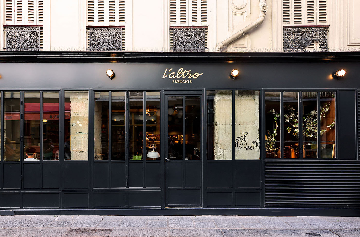
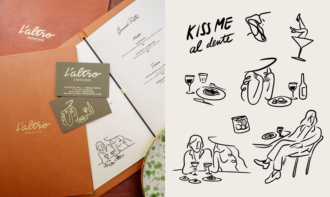
L’Altro Frenchie is a culinary and visual exploration of time, place, and culture. Conceived by Michelin-starred chef Gregory Marchand, this bistronomic Italian restaurant dares to bring a nostalgic twist to contemporary Paris. Yet, it’s not just an Italian restaurant; it’s an Italian restaurant as if viewed through the lens of 1950s New York and British influences, all while grounded in 2024 Paris. The bold fusion of influences, behind the L’Altro Frenchie Branding, calls for a distinctive brand identity, one that could visually express its eclectic yet harmonious blend of eras. Fortunately, Abmo succeeded in bringing this tasteful blend to life in a characteristic and memorable visual identity—a brand that embodies heritage, exquisite typography, and illustrations as artful as Gregory’s kitchen. The Bordeaux-based studio managed to reflect the restaurant’s diverse culinary style, effortlessly weaving together various cultural influences.
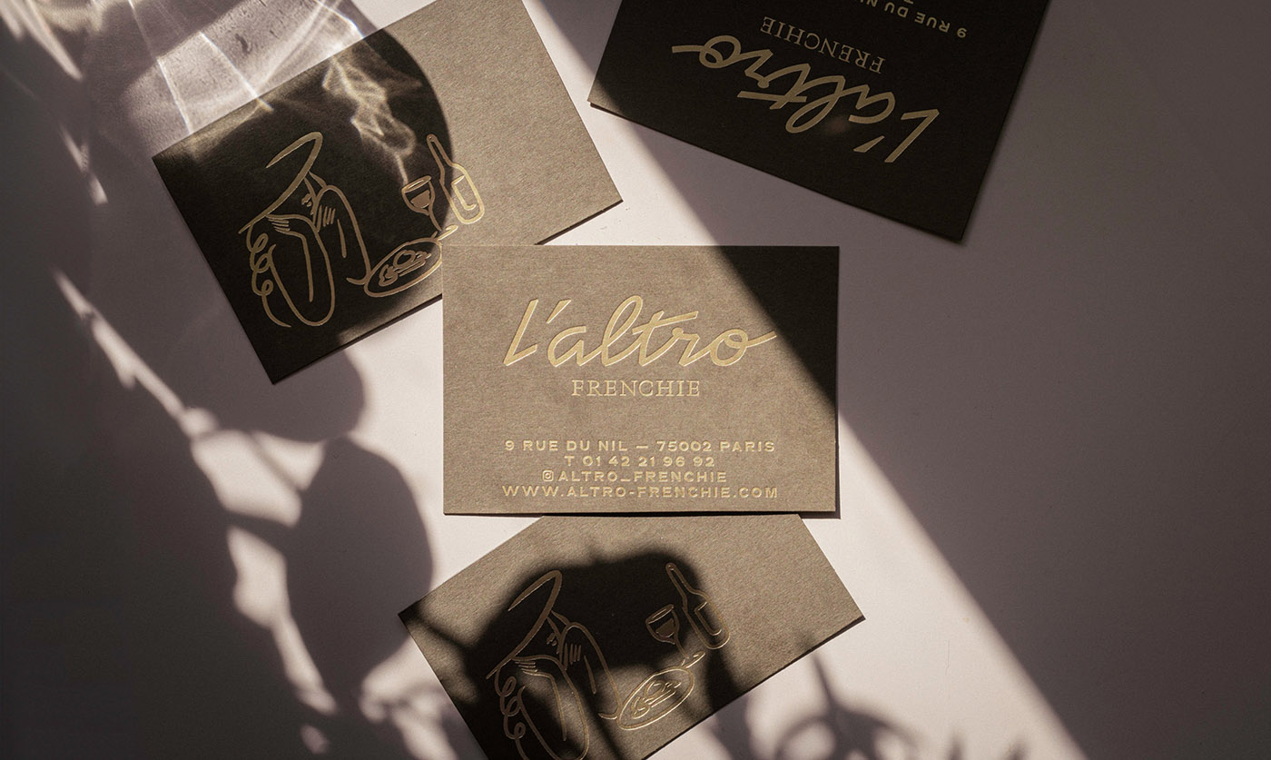
Abmo: “This fusion concept naturally led us to take inspiration from vernacular Italian and American typographic elements and mix it with the existing Traulha, a custom version of Yoan Minet‘s Traulha typeface we designed 10 years ago for Gregory’s first restaurant.”
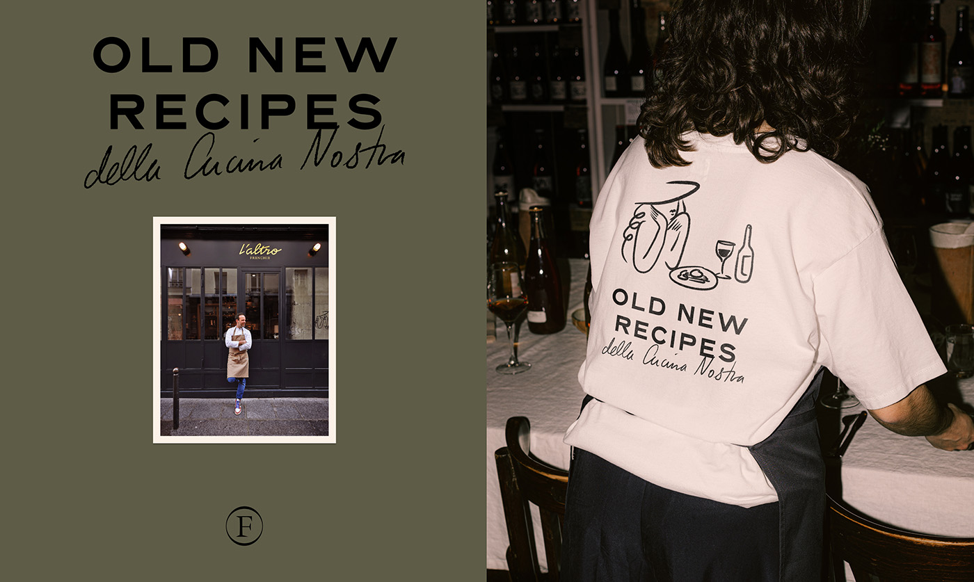
The Magic Behind L’Altro Frenchie: Typography
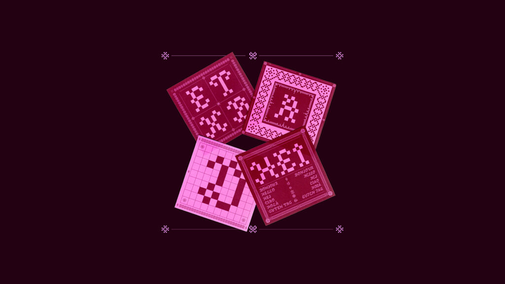
L’Altro frenchie branding project comprehends a wonderful type choice as well as minimal illustrations. Traulha, a typeface developed by Bureau Brut, is rooted in calligraphic design and breaks from traditional stroke patterns. Its distinctive placement of thick and thin strokes in certain letters creates a unique texture and visual rhythm. This typeface is combined with Neuf by Eliott Grunewald, a revival typeface inspired by the 1920s French font Gravure Taille Douce, designed to closely match the original bold style while incorporating subtle updates for modern aesthetics. It combines the character of French Antique fonts with unique design details, giving it a distinct personality within the sans-serif category. These structured typefaces create a beautiful contrast with Dez Gusta’s handwriting, offering an elegant yet fresh visual communication.
The brand’s wordmark, created by French graphic and type designer Keussel, reflects a midpoint between the clean lines of the typography and the freehand style, blending seamlessly with the overall elements of this expressive brand identity.
A Glympse of Ambo Studio
Ambo is Founded in 2013 by Sonia Cordier, strategist, and Dez Gusta, designer. This boutique studio has established itself as a powerhouse in creative strategy and design, curating communications filled with intelligence and purpose.
Abmo: “Together, we built Abmo into a cohesive creative force, collaborating with brands to craft bespoke solutions and achieve measurable success.”
Since 2013, Abmo has been crafting impactful brand identities and strategic communication solutions that resonate deeply with audiences. The diverse team blends French, Polish-German, and Ecuadorian perspectives, balanced by gender and enriched by multigenerational insights. This diversity drives Abmo’s creativity, which they apply in global collaborations across key markets like the US, China, France, Switzerland, Belgium, and the UK. Although Abmo takes on ambitious projects, it remains a boutique studio supported by a network of skilled freelancers, enabling customized teams for each project’s unique needs.

Abmo: “We elevate brands by fusing creative design with strategic intelligence. We craft compelling brand narratives and distinctive visual identities that resonate.We do it with a collaborative, methodical, attentive yet rigorous approach, and without preconceived ideas. No surface-level marketing speak, just intelligent solutions tailored to your story.”
The studio’s name means ABsolutly MOdern, an idea that was born from Arthur Rimbaud‘s famous quote “il faut être absolument moderne”. This phrase has become Abmos north: “We create design that is resolutely of its moment yet built on timeless principles. Not trendy, but truly modern—advancing what’s possible while maintaining the clarity of purpose that marks all enduring work”.
Amigos, we hope this project was as inspiring for you as it was for us. It’s a joy and a pleasure to showcase projects from talented designers who are shaping the world we live in. Follow Abmo’s incredible work on Instagram and Behance to stay inspired!
Yours truly,
A Type of Camila.

