
Dear Amigos,
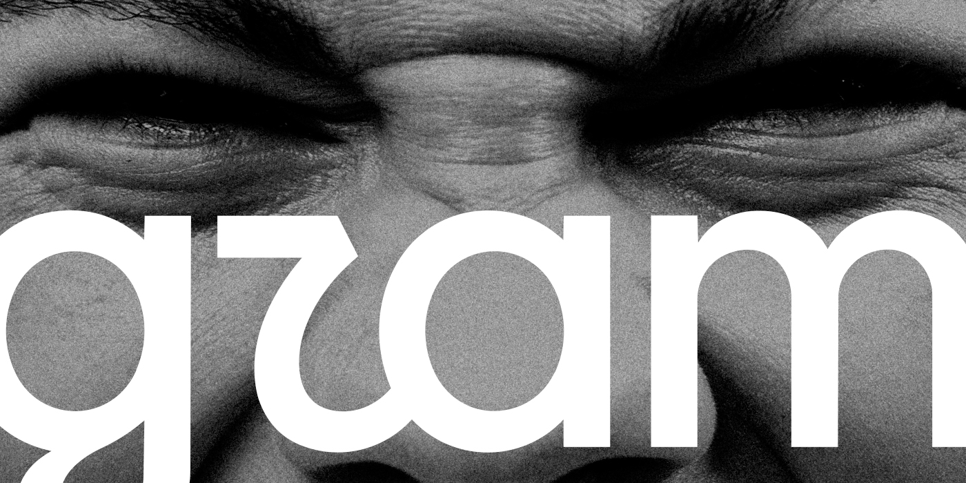
Within hours of Adam Mosseri posting the reveal of the new Instagram wordmark, there was a pile of comments pointing out that the new cursive “r” reads more like a “z.” “Instagram” became “Instagzam” and brands came out of nowhere to run with the joke: Wendy’s, KitKat, Knorr, Canva, Oppo, even ChatGPT posted their own logos “refreshed” in a suspiciously Instagram-adjacent script, mocking the update on the app’s own playground. It’s the kind of bullying that only happens when a redesign touches something almost 3 billion people look at daily. Some of the criticism is fair, some of it is just the internet doing what the internet does best. But underneath the memes is a genuinely interesting typographic problem, and that’s the part we actually want to dig into.
So, why did Instagram need a rebrand at all?
Here’s the thing about Instagram’s old wordmark: it had been doing the same job, unchanged, for over ten years, while everything underneath it kept evolving. Meta’s in-house team, led by Christy Silva (creative director) and Cynthia Pratomo (director of brand design), alongside Meta’s Jasmine Probst (director of product design) and May Hartono (director of brand design), worked alongside global creative studio Koto on the execution. Koto has since published its own case study on the project, titled A new mark with old memories.

Image credit: Meta.
The communication problem they were solving is more interesting than “it’s time for a refresh.” When Instagram launched, the camera glyph and sunset gradient had to carry the full weight of telling you what the app even was. Now that Instagram is, in Christy Silva’s words, familiar to billions, the brand doesn’t need to explain itself anymore. It needs to express what Instagram has become: a platform that holds serious campaigns, shitposting and blurry concert photos all at once. Cynthia Pratomo describes it as Instagram “growing up”, not becoming more serious, just admitting it no longer speaks in one single voice.
Image credit: Meta.
The refresh brings an updated Instagram Sans, a new handwriting typeface called Instagram Pen (still in development, built from testing everything from soft pencil to bold ink), and a brand-new Instagram Mono. Motion, layout and UI all got more breathing room, and the sunset gradient now shows up more sparingly, sometimes as a “light leak” nod to actual film photography instead of a flat digital fill. The camera glyph itself hasn’t moved an inch. The rebrand is a system-level update dressed as a logo change.
About that “r”
Now, the technical bit. Instagram’s wordmark has always been a script. That means connected letterforms and in the case of the lowercase “r”, a small “loop” or “peak” that curls up and continues the letter. That little loop is what tells your eye “this is an r,” distinct from an “n” or, in this case, a “z.”

When a rebrand tightens up a script to feel more in line with a sans-serif system, tha loop is often one of the first things to get shaved down in the name of restraint. From there, designers are walking on thin ice: if they flatten it enough, and the r loses the one feature that separates it from other characters. That’s just how cursive letterforms work: legibility in script typefaces leans heavily on those connecting strokes, and removing them can compromise how quickly the word reads at a glance.
In their own case study, Koto describes explicitly targeting that ‘r’, testing variations of handwritten and calligraphic forms to find the point where the letterform could bend without breaking. Their words: the goal was a mark that felt authored, not optimized.
🡢 If you liked this mini type class, you can chack out our full article on type anatomy.
Can Instagram afford to be a little less legible? Actually, yes.
Change is uncomfortable, and readability complaints are valid feedback. But Instagram is one of the very few brands on Earth that can genuinely afford to compromise a little bit of legibility, because the shape of that word is already tattooed onto our eyes. We’re talking about a platform with roughly 3 billion users. That kind of brand recall buys you room to take typographic risks that would sink a less omnipresent product.
The old script clashed with everything else Meta has been building. Instagram Sans, the geometric typeface the platform has been rolling out across its UI for years, doesn’t share much DNA with a loose cursive. The new wordmark solves that by pulling from both directions. We’re watching a wordmark catching up with the system around it.

This isn’t the first time Instagram has done this, either. Go back to 2016, when the Polaroid camera got replaced by the flat gradient glyph we know today. The backlash was enormous — The New York Times literally called it “the great Instagram logo freakout.” A decade later, that gradient icon is one of the most recognisable marks on the planet, and most of us look back at the old camera with nostalgia rather than any real desire to bring it back. It was charming, sure. It was also nearly impossible to sustain across a design system. We have a feeling this new wordmark will follow the same arc: loud complaints now, quiet acceptance later, and eventually we’ll all forget we ever minded. We always find our way back to being Instagram addicted anyway.
The real headline here: typography matters
If there’s one thing we want you to take from this entire saga, it’s this: look at how much conversation a purely typographic decision has managed to generate. A single letterform tweak turned thousands of casual scrollers into overnight type critics, debating ascenders and legibility. That’s proof of exactly how much power it holds.
As designers, this is the reminder we all need every so often: typography is never just a finishing touch. So the next time type feels like an afterthought in your own process, remember the Instagram “r.” Care about your letterforms. Value the type designers and foundries doing this work. Make typography a decision you make on purpose, every single time, not a default you accept because the deadline is close. That’s the whole lesson, amigos.
Yours truly,
A Type of Ari.
Since you are really into typography, you might be interested in these other articles and resources:
Letters Save Lives: Typography in Emergencies
Kerning vs. Tracking: All you need to know
Insider Tips: The Best Type Foundries with Open Source Fonts