
Dear Amigos,
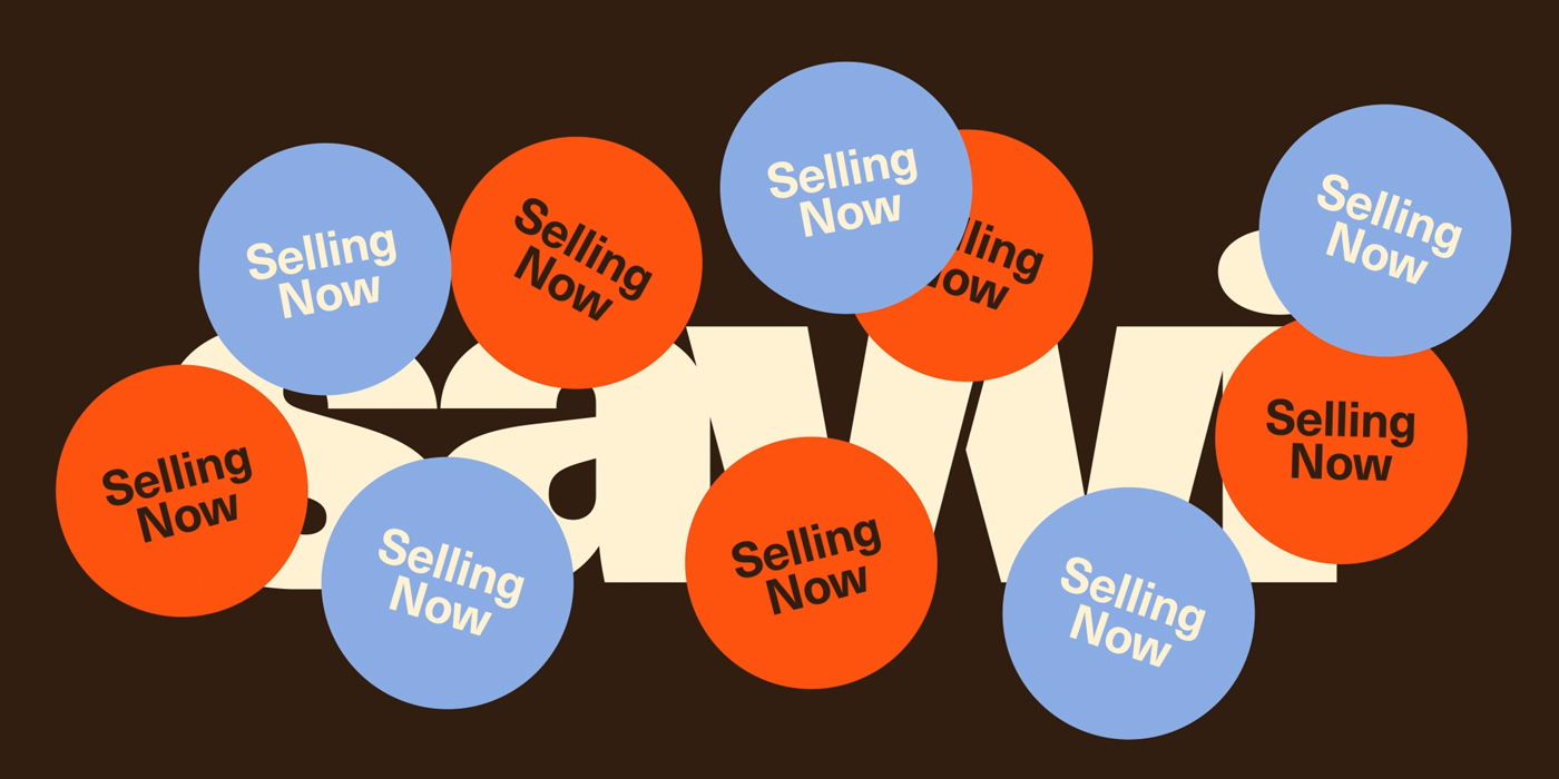
Savvi walked into the Property branding market as a brand new player and decided to skip the script entirely. It is not a typical real estate agency, and the difference was intentional from day one: while the rest of the category talks about buildings and numbers, Savvi wanted to talk about people, especially first home buyers stepping into one of the biggest decisions of their lives. The brief handed to Melbourne studio Something Great was to launch Savvi in a way that surpassed category noise and built a brand that buyers could actually trust, not just another logo promising a lifestyle.


From Property-Led to People-First
Something Great’s answer was to flip the category’s usual hierarchy. The studio built the identity around a playful tone of voice, warm lifestyle photography that favoured real moments over polish, and a positioning that reads closer to a modern lifestyle brand, repositioning Savvi as a guide walking alongside the buyer, not a salesperson standing across the table. That decision, guide instead of salesperson, is the thread that holds the identity together, from the visual system down to how the brand’s own materials are written and paced.
The result is a brand that feels immediately human in a category that rarely bothers to. It’s confident without being cold, and it’s built to earn trust in a market where trust is the hardest thing to sell.


Typography That Looks Like a Conversation
A brand this dependent on tone of voice needs typography that can carry personality without losing clarity, and Savvi’s type system does exactly that.
Gravity, designed by Dinamo’s Robert Janes together with Johannes Breyer, Fabian Harb and Fabiola Mejía, brings the confidence to the brands logo. It’s a headline typeface built across twelve widths, with a skeleton borrowed from the heavy grotesk display faces of the ’60s and ’70s but redrawn softer and friendlier, so the curves stay curvy well past the point where a typical condensed face would turn rigid.
Editorial New, designed by Mathieu Desjardins with italics by Francesca Bolognini for Pangram Pangram, adds the narrative layer. It’s a narrow serif built for long-form copy but sharp enough to hold its own in a headline, carrying a slight mid-90s editorial feel that reads as considered rather than trendy.
And underneath both, doing the quiet work, sits Neue Haas Unica, Toshi Omagari’s revival for Monotype of Team ’77’s 1980 original Unica®, a typeface conceived as a hybrid of Helvetica, Univers and Akzidenz Grotesk. Clean, neutral, endlessly legible, built to carry the everyday interface and body copy without competing for attention.


The Studio Behind It All
Something Great is a Melbourne-based creative studio and strategic consultancy working across brand strategy, visual identity, digital experience, and launch campaigns. Their own words sum up the approach well: they believe every brand has greatness within it, and their job is to find it — through story, strategy, and design that refuses to play it safe. That philosophy shows in how they handled Savvi. Rather than defaulting to the property industry’s usual visual shorthand, they built a case for warmth and honesty as a genuine market differentiator. If Savvi is the kind of case study that makes you want to see more, their portfolio is worth the visit, amigos.
Signed,
A type of Ari.