Dear Amigos,
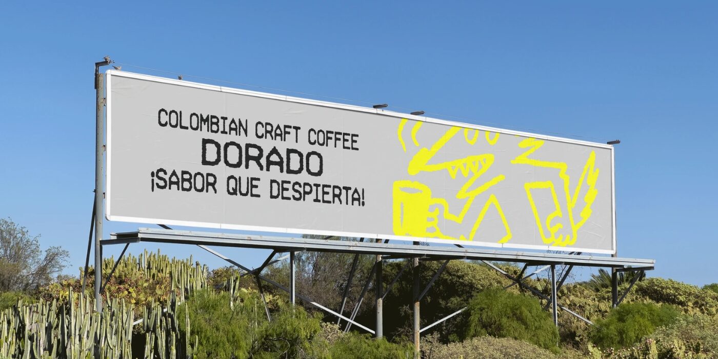
Coffee has always been a culture before it is a commodity. And when a new artisanal coffee brand steps into a crowded market, the visual challenge isn’t simply to look good — it’s to feel alive. That was exactly the task behind Dorado, a 2025 brand identity project crafted by Bleucoeur Studio. Dorado is an artisanal coffee brand that needed a visual language with enough energy and personality to match the intensity of the product itself. What emerged from that brief is a striking coffee identity that’s raw, graphic, and hard to ignore.


A Ticket to Something Bigger: The Visual Concepts
The identity Bleucoeur built for Dorado draws from an unexpected reference world: the thermal receipt. Instead of reaching for the usual artisanal coffee codes, the studio turned to the visual grammar of checkout counters and receipt rolls, reinterpreting those codes as something radical and contemporary. The result is a system that borrows from the world of retail typography and register printouts, then elevates it into something expressive and culturally charged.
At the heart of the identity lives a wireframe mascot, a dynamic figure that acts as the structural backbone of the brand. This character directs the rhythm of the compositions, guides the eye, and gives Dorado a truly singular presence. The inverted exclamation marks “¡ !” pepper the system as graphic punctuation, extending the Latin typographic energy into a visual gesture that reads as both attitude and origin. Saturated colours and bold contrasts amplify everything further, turning each touchpoint into something that vibrates on the shelf. The whole system feels alive, coherent, and deliberately radical in the best possible way.


The Type That Makes It Work: Hypermarket by Green Type
None of this visual energy would land without the right typographic foundation. Hypermarket by Green Type is the engine driving it all, designed by Dmitry Greshnev and published by the independent Green Type foundry. This is a font family born from the aesthetic of shopping receipts, that specific texture of monospaced and thermal-printed lettering. The family comes in nine styles spanning condensed, regular, and expanded widths, each in light, regular, and bold, giving the designer a flexible toolkit that can shift between tight display settings and more airy applications.
Hypermarket carries the DNA of the very reference world the identity is built around: the receipt, the register, the checkout counter. When used at large scale on packaging, it reads as bold and authoritative; at smaller scales, it retains a kind of mechanical warmth that softens the overall graphic intensity. The condensed styles, in particular, create dense typographic blocks that echo the stacked information of a printed ticket.


About Bleucoeur Studio
Bleucoeur Studio is the independent creative practice of Raphaël Renoncourt, a multidisciplinary graphic designer building identities with character, clarity, and strategic intention. He constructs visual languages that are legible, distinct, and built to last.
The studio’s services span the full identity spectrum: visual identity, brand systems, naming, web design, art direction, print and digital applications, and brand deployment across all touchpoints. Make sure to explore the full portfolio here.