Dear Amigos,
In the midst of the global demographic aging, the conversation about the places we’ll inhabit has prioritized the necessity for functional empathy over mere aesthetic considerations. This waking call catalyzed Curating Homes, a project initiated by the Chinachem Group in collaboration with The Chinese University of Hong Kong to bridge the gap between abstract aging-in-place theories and the practical needs of architects and developers in Hong Kong. The project aims to transform complex residential design requirements into an actionable roadmap for senior-friendly living by creating a comprehensive design guide aligned with the World Health Organization’s concept of Healthy Ageing, crafted by the Toby Ng Design Studio.

A Surface of Accountability: The Design Concept
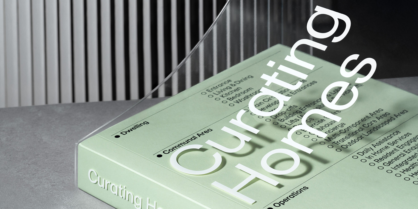
Toby Ng Design centered the entire identity of the project on the use of checklists, both as an effective device and as a visual narrative. This universal symbol of structure and clarity defines the guide’s pace, effectively turning every page into a surface of accountability through thoughtful editorial design. The studio utilized a clever system of solid and open circles, illustrating essential actions versus best practices, to visually distinguish between the necessary and the ideal for aging in place environments. This language also encloses a collection of architectural diagrams, spatial strategies, and real-world examples, all living through an articulate and consistent layout.
Curating Homes is a working tool designed to be annotated and used daily by those shaping the future of our homes. The concept extends to the tactile experience of the object, with a cover that features the content of the guide on selection boxes, all wrapped in a translucent plastic jacket.


The Precision of ABC Diatype
The typographic identity of the project is grounded in ABC Diatype, a grotesque typeface designed by Fabian Harb and Johannes Breyer from Dinamo. Diatype is brought into the narrative of Curating Homes through its optimization for reading and utility, mirroring the project’s functional clarity inside a complex field. The typeface’s standardized proportions provide a sense of authority, while its subtle details prevent the information from feeling cold. When every dot and line carries weight, Diatype becomes a bridge between precision and comfort.


About Toby Ng Design
Based in Hong Kong, Toby Ng Design is an independent studio founded in 2014 by Toby Ng, a Central Saint Martins graduate who honed his craft across London and Singapore. Known for a philosophy of “distilling ideas to their essence,” the studio tackles complex editorial design challenges with a unique blend of wit and aesthetically meaningful communication. Their work has earned international acclaim, including prestigious nods from D&AD, The One Show, and the Type Directors Club. Toby himself has been recognized as one of Asia’s top design talents, serving as a juror for the ADC Annual Awards in New York and the Golden Pin Design Awards, cementing his studio’s reputation as a staple of modern, high-impact branding. You can take a look at their projects here.