Dear amigo,
If you’ve ever watched a Yorgos Lanthimos film, you know what you’re in for: black comedy, absurdist drama, and visuals so meticulous they feel almost clinical. From the sterile environments of The Lobster to the Victorian grotesquery of Poor Things, Lanthimos uses every element on screen to build his unique, deeply unsettling worlds. But while film critics often focus on the direction and dialogue, we, as type geeks, know that the visual storytelling starts even before the first scene: with the title card. Or even further, by looking at the poster before the screening.
This is where Lanthimos truly excels. Unlike other projects where the typography is often just a little more than an afterthought, Lanthimos’s font choices are just as flamboyant and eccentric as his narratives. They are essential aesthetic components, designed not just to convey information but to immediately set an unsettling tone. Now, let’s dissect how this director and a trusted graphic genius that collaborates with him behind-the-scenes use mismatched fonts, exaggerated spacing, and old-school techniques to make us squirm in the best way possible.
Yorgos Lanthimos, a visual storyteller
Lanthimos’s cinematic style is defined by an uncompromising vision. His films are dark, original, and have achieved both critical acclaim and a cult following precisely because he pays meticulous attention to aesthetic details. Beyond directing actors, he’s engineering a complete sensory experience.

This meticulousness extends far beyond the cinematography and costume design. Lanthimos has historically been involved in every aspect of the film’s visual identity, including the promotional posters and the title sequences. It’s this active fight for unconventional choices that empowers his collaborators to be equally bold. If the poster design for The Killing of a Sacred Deer felt really eerie, that was entirely intentional. And endorsed by the director. But he’s not alone in this craft.
Vasilis Marmatakis: Traditional genius and collaborator
The man responsible for translating Lanthimos’s bizarre genius into graphic form is Vasilis Marmatakis, his long-time creative partner since Dogtooth in 2009. Marmatakis’s work is the connective tissue between the films, creating eye-catching imagery that compels viewers to fill in the metaphorical blanks. He views the poster, and by extension the type, as the entry to the film, creating the necessary mind-frame for the audience.
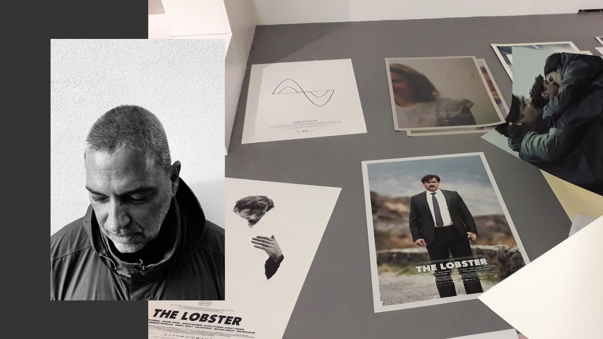
Photo by Natalie Anderson, via Dazed Digital
What makes Marmatakis very distinctive among his current peers is his analogue approach, working against the grain. According to an interview with It’s Nice That, he’ll design type blocks on the computer, print them out, and then manually smudge the edges with a water brush before scanning them back in. This DIY process leaves the letters slightly imperfect, wobbly, and alive, matching the rough, human texture of Lanthimos’s stories. It’s a gorgeous commitment to tactile design in a digital world.
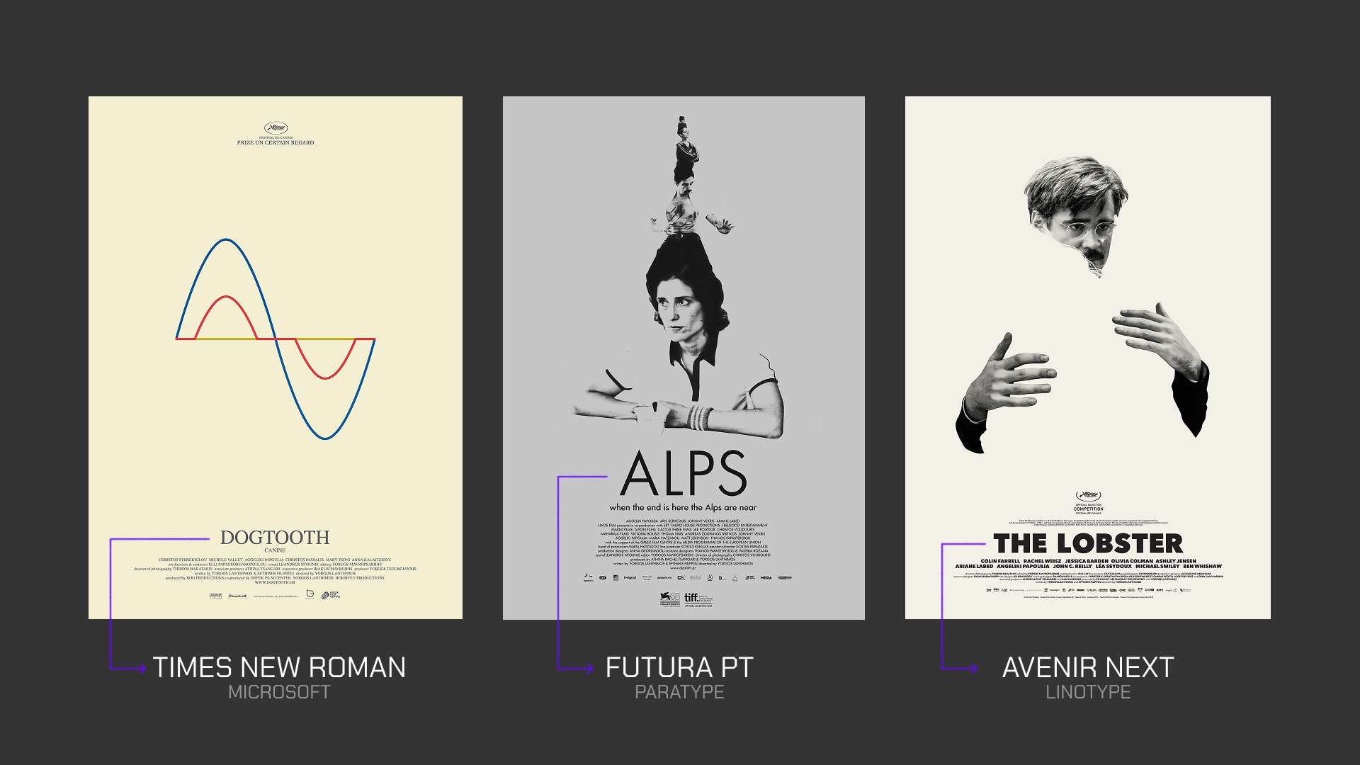
Typefaces from Dogtooth to Poor Things
In the right hands, a movie can transform into a playground for typography. For Dogtooth (2009), the design was relatively simple: a standard serif in the original Greek poster, Times New Roman, but it was immediately accompanied by colored lines that shaped a waveform diagram, hinting at the film’s distorted reality. For Alps (2011), they started with the use of Futura PT, a typeface made by Paratype, to contrast the uneasiness of the poster. Fast forward to The Lobster (2015), and the choice was the sleek, sans-serif Avenir Next, a 2004 relaunch made by Akira Kobayashi for Linotype of the 1988 original font Avenir made by Adrian Frutiger. The name Avenir translates to “future,” a sharp, slightly ironic choice for a dystopian story about mandatory coupledom, reflecting the film’s sterile, minimalist aesthetic.
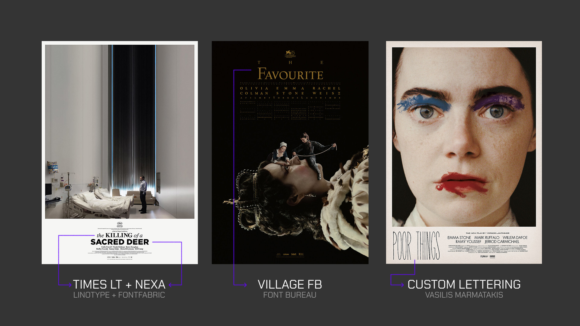
Lanthimos and Marmatakis then started to deliberately break the rules. In The Killing of a Sacred Deer (2017), they used a mix of two different typefaces, Times Linotype for serif and Nexa, a geometric sans-serif, tossing in bold, italics, and exaggerated kerning to create a sense of unease. This can also be seen in The Favourite (2018), where they chose Village FB, a modern retelling of a serif made all the way back in 1903, but deliberately used exaggerated spacing and water-brush technique in the borders of the letters shown on screen to give the historical period piece a bizarre, modern tension. The eccentricity reached new heights in Poor Things (2023) with a thin, almost skeletal lettering style, also reminiscent of Kubrick’s Dr. Strangelove, that was so dynamic it actually began framing the images in the closing credits.
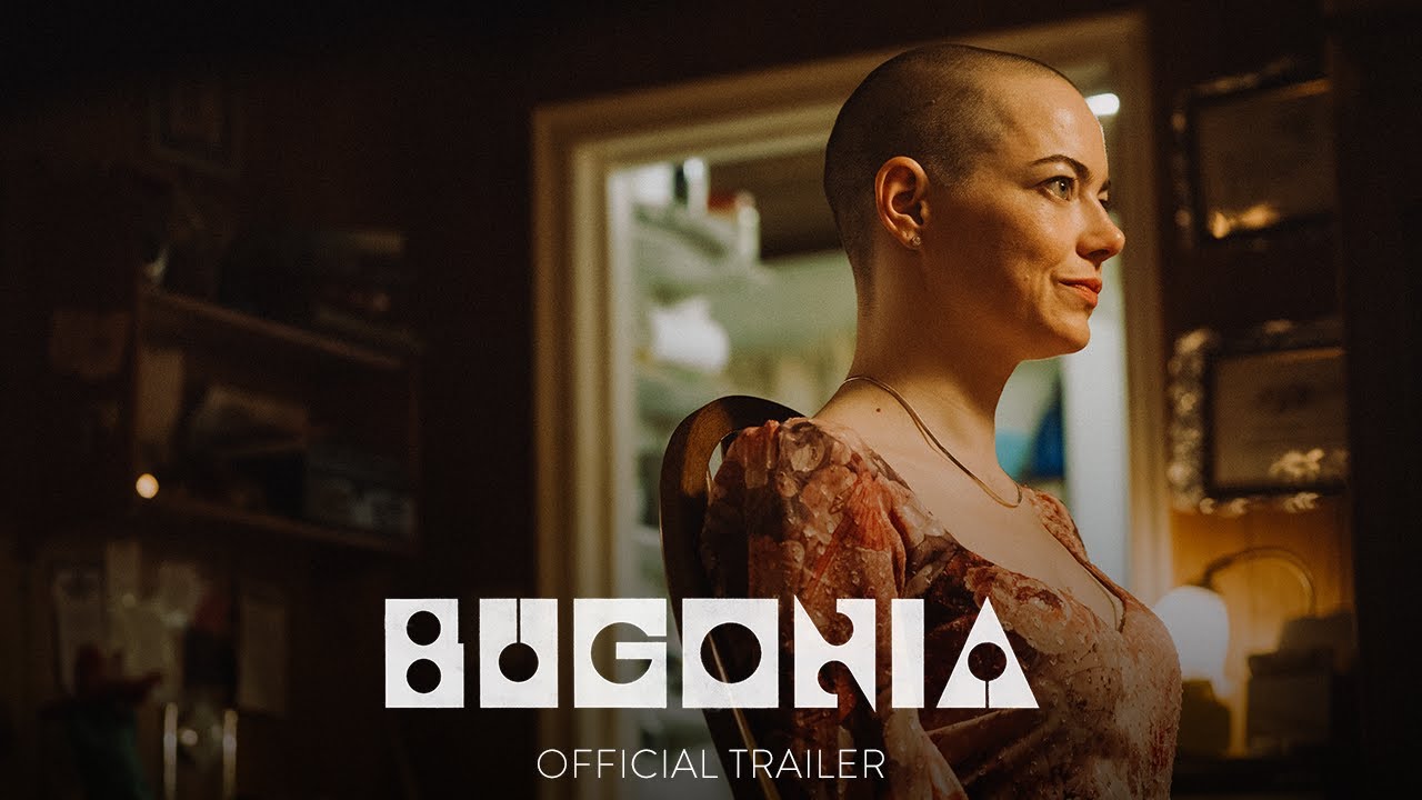
Bugonia: Yorgos and Vasilis new alien craft
The duo’s latest venture, Bugonia, continues their legacy of unearthing gems. For the title card, Marmatakis revived a geometric typeface called Churchward Roundsquare, created by the late Samoan New Zealand designer Joseph Churchward. Marmatakis tracked down the archetype in a museum archive, secured permission from the designer’s family, and digitized it.

The resulting aesthetic is mesmerizing. Marmatakis describes Roundsquare as “monumental yet sharp, even a little threatening,” feeling “futuristic, but in a very analogue way.” This contradiction perfectly mirrors the film’s themes of conspiracy, technology, and myth. The choice is also deeply poetic: Bugonia is named after an ancient myth about bees being spontaneously born from a dead ox. By resurrecting a typeface buried in an archive, Marmatakis performs his own creative Bugonia, showing that the most revolutionary designs often emerge from looking closely at the forgotten past.
Amigo, we hope that by reading all of this can get you inspired to pursue interesting ventures in your creative endeavors, as Yorgos and Vasilis process shows that you can use tradition and handcrafting to bend the rules and make something new and unnerving. Experimentation can always be found, even in places where you can think at times that everything is done so far, like film and typography, and that’s why you can find beauty in the strange posters and letters in Yorgos’ movies. Keep going.
Signed,
A type of Jesús.