From its conception, the Austrian Wine Mafia (AWM) project started with a clear creative challenge. It needed to make a bold, unique statement in a market often constrained by traditional rules. The collaboration brings together Matthias Warnung, a dynamic young winemaker, and the siblings Magdalena and Lorenz from Allram Winery, a family-run estate in Austria’s Kamptal region, renowned for its ethically focused viticulture.
Their goal was to establish an experimental playground for new ideas. This meant a conscious, deliberate departure from the usual stuffy rules of wine branding. AWM holds its own set of values, much like the syndicate it is playfully named after. This need for a strong initial identity sparked this design project skillfully resolved by designer and art director Lukas Diemling.


Judging a bottle by its label
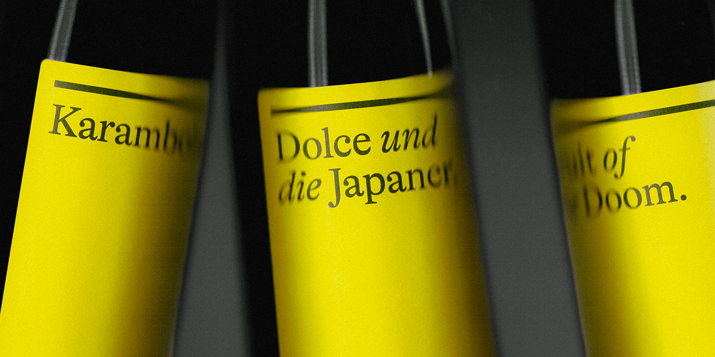
The visual solution developed by designer Lukas Diemling consciously steers away from standard wine cues. Each wine is intended to be an experienced narrative. It leans into the structure of classic book design instead. Considering Austria’s classic literary culture, this concept recalls the world of pared back, simplified book covers while creating contrast through a striking use of color. A bright yellow tone becomes the protagonist of the story, assuring the boxes and labels don’t go unnoticed, emphasizing the rebellious heart of the AWM project and the playful nature of the product.


A distinct typographic pairing
Contrast is not only found in the narrative of AWM, it also enfolds the selection of the two typefaces that work together to reinforce the identity. The primary typeface is GT Alpina designed by Reto Moser for Grilli Type. This modern serif is known for its charming and slightly unconventional details, balancing authority with an open, accessible feel.
It is paired with Neue Haas Grotesk Display, a font included in the restoration of Miedinger’s original design distributed by Commercial Type. This choice brings a crisp, no-nonsense foundation to the text. This strategic pairing ensures a visual system that is both sophisticated and ready for high-impact communication.

The force behind the name
AWM is driven by the belief that great wine should be fun and accessible to everyone. The team is not tied to ancient dogmas or overly complicated processes, focusing instead on producing great, hand-stretched natural wines without the pretension. This spirit of experimentation and approachability is key, and this spirit is what enabled the design to be as rebellious and lighthearted as the product itself.

The successful look of AWM is the work of designer and art director Lukas Diemling. Based in Austria, Diemling‘s approach is rooted in clean, impactful communication with a focus on typography-driven identities that feel both classic and contemporary. Covering fields of branding, packaging, typography, still life photography, print design and digital environments, he’s an expert in creating visual systems that are enduring and emotionally engaging.
A Type of Ari.