Domino’s, the world’s largest pizza company, recently launched its first brand refresh in thirteen years. This initial change was a response to a honest realization: the brand had become known as a technology company that happens to sell pizza. Why? Because of their continuous investment on online ordering logistics, a plan that allowed them to become an indistry leader, but shifted the focus away from the product itself. The agency WorkInProgress stepped in to lead Domino’s rebrand, which was sparked by the new Hungry for MORE strategy. The main communicational need was clear: they had to make every aspect of the brand feel as craveable as the pizza. The goal was to bring the focus back to delivering the most delicious products and experience to both current and future pizza lovers.


A New Visual and Audio Identity
Domino’s rebrand blends heritage with a more modern and playful look and sound. Instead of relying on a traditional tagline, the team created a unique audio concept they call a Cravemark. Their new jingle Dommmino’s™, literally bakes the idea of craveability right into the brand’s name. It is designed to be memorable and fun to mimic. The new audio strategy is anchored by the recognizable voice of singer-songwriter Shaboozey.
There’s a long story of iconic campaigns led by Domino’s, a brand that been consistent on keeping their communication directly anchored to powerful insights from their audience, making them feel like a down to earth business. One example is the Paving for Pizza campaign launched in 2018 under a clear premise: bad roads can ruin a customer’s pizza during the drive home. They ran an ethically focused initiative where the company offered grants to municipalities across the United States to fix potholes and repair damaged roads.
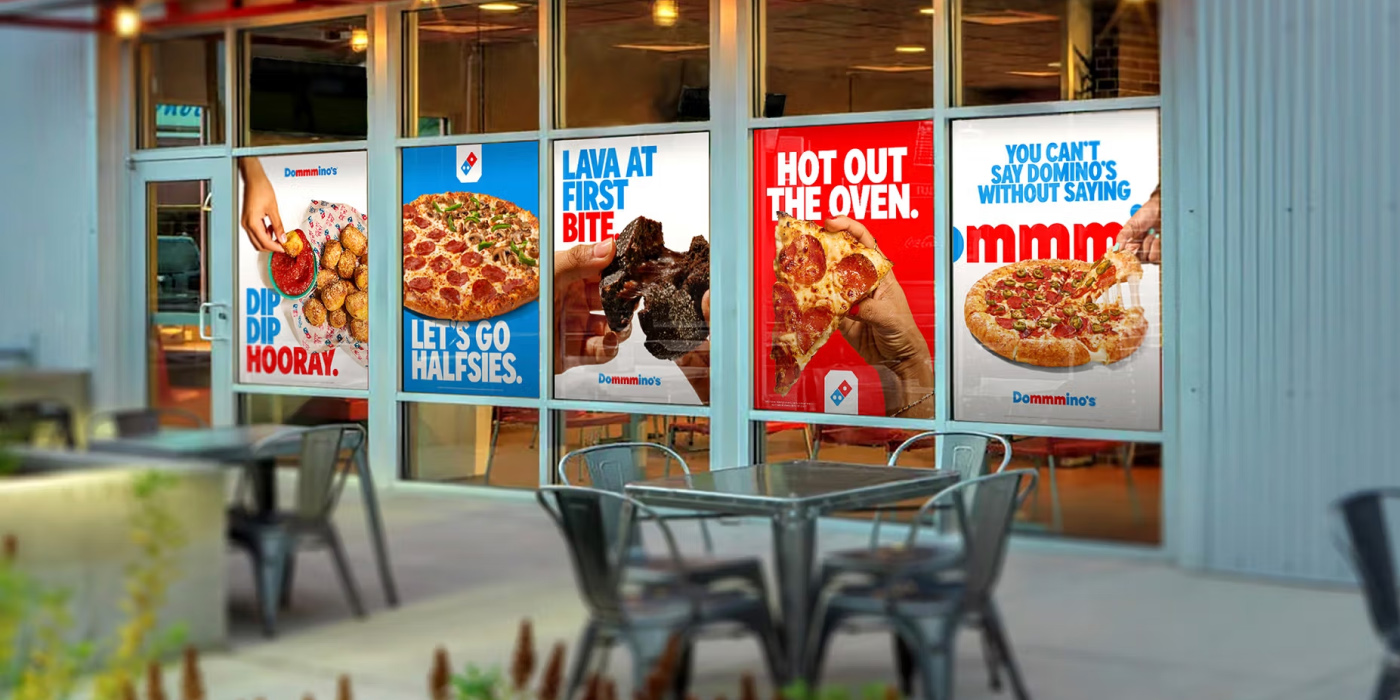
For this rebrand, the touchpoints elements also received a fresh update. The packaging is perhaps the most important new element. The new suite of boxes features a more bright and simplified design overall, embodying the brand’s memorable logo. Keeping the signature red and blue colors in brighter hues, the boxes recall the tiles of a traditional dominoes game, which was the seed for the development of the original visual identity of the brand.


The Custom Typeface: Domino’s Sans
A standout detail of Domino’s rebrand is the custom typeface, Domino’s Sans. The font is bolder, thicker, and doughier. The development of Domino’s Sans serves an important unifying purpose. As Domino’s Executive VP–Global Chief Marketing Officer Kate Trumbull noted, the overarching goal was to unify their look, feel, and sound. The new font and colors are simple and bold, acting as unifiers that are applied consistently everywhere the brand shows up and ensures that any new product launch will have a consistent, instantly recognizable treatment.


Domino’s: A Global Pizza Giant
Domino’s is an instantly recognizable name globally. It began with humble beginnings in 1960. Today, it stands as the largest pizza company in the world. They operate a global enterprise of more than 21,500 stores in over 90 markets. The brand is known for its rich history of innovation in both the pizza and delivery industries. The company continues to invest heavily in its digital presence. Over 85% of U.S. retail sales now come through digital channels. This solidifies its position as a global leader in its segment.


The agency behind Domino’s rebrand is WorkInProgress, a full-service innovation and advertising agency founded in 2016. Their belief is that every brand and person should be a work in progress, aiming for transformative business results through memorable advertising. Their work has earned them significant accolades, including being named Ad Age Small Agency Agency of the Year in both 2025 and 2020. You can check out their website here.
See you soon amigos!
A Type of Ari.