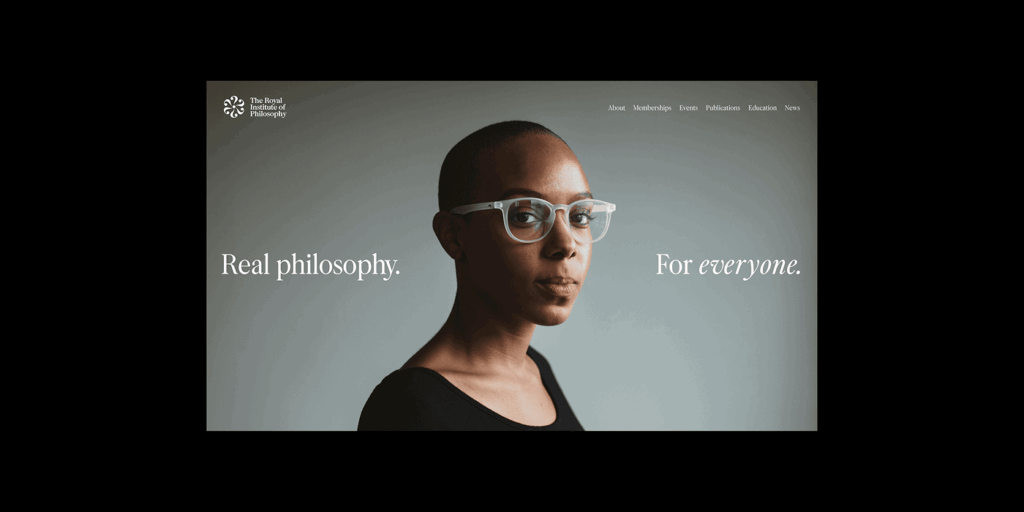
How to make philosophy accessible? This is one of the questions that Only Studio faced when building the new look of the Royal Institute of Philosophy, UK’s leading independent charity dedicated to making philosophical ideas accessible to everyone. As a legacy brand, they encountered a common challenge: staying relevant while honoring a rich history. For their centenary, they approached Only Studio to help redefine their visual identity, aiming to become an open, questioning, and contemporary force. The studio took on this challenge by focusing on a simple yet powerful concept: “Question Everything.” getting straight to the heart of what philosophy is all about: curiosity and deep thinking.
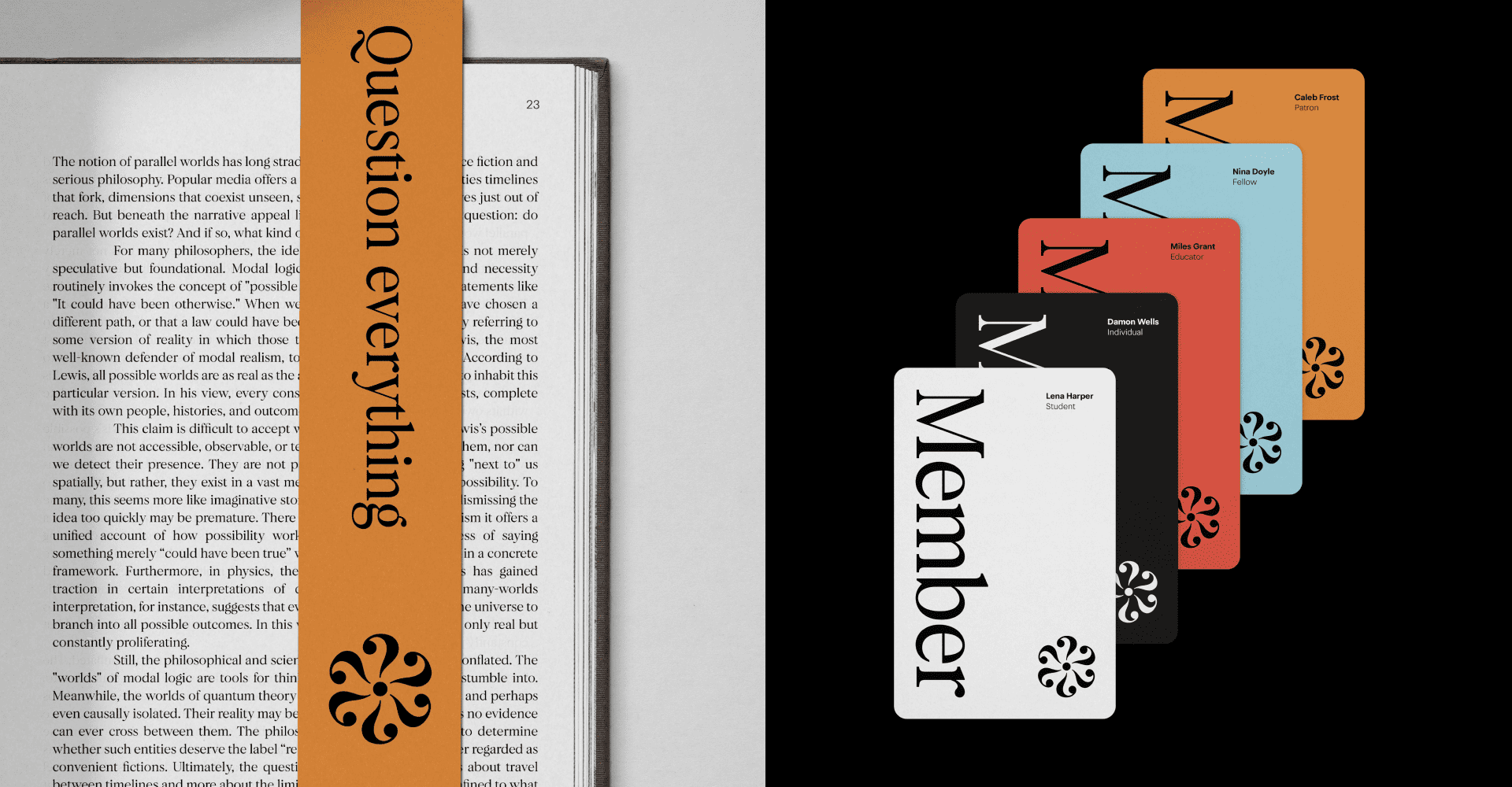
The Question Mark
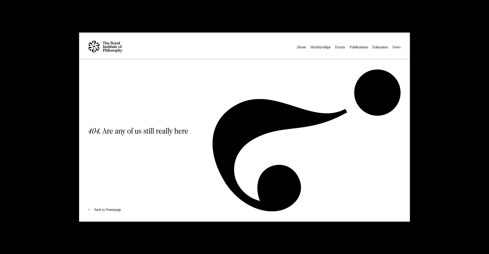
Questions are where philosophy begins, and this concept comes to life in the Institute’s main icon. The mark is built from six repeating question marks, all united at a single point. This creates a visual puzzle, a shape that can be interpreted in different ways depending on the observer. It could be a flower, a spark, or even a galaxy. No matter your take, the idea of a simple beginning expanding into something much bigger is always present. The contrast in the glyphs makes the mark a simple, but truly memorable symbol.
Telling a story through type
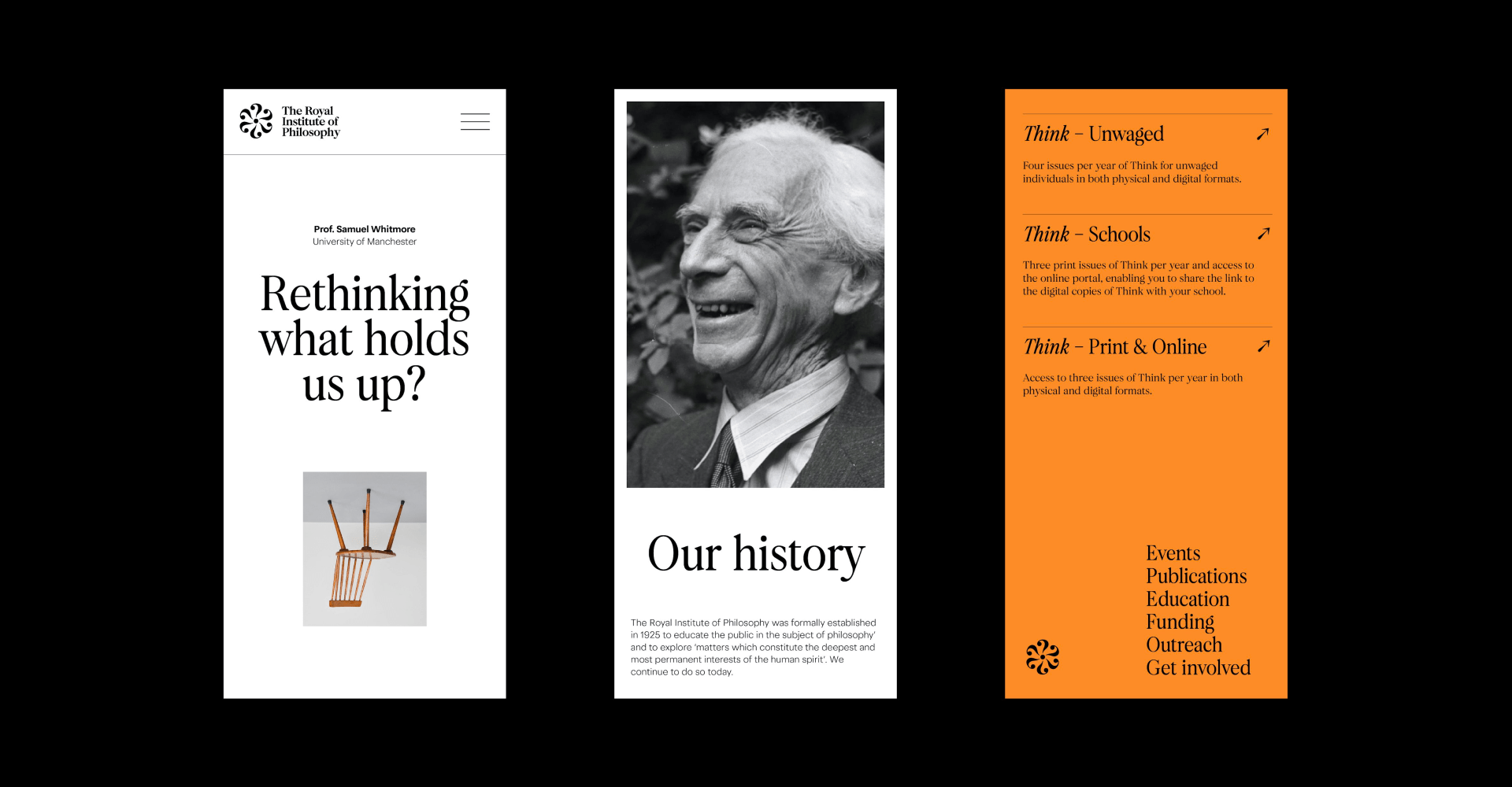
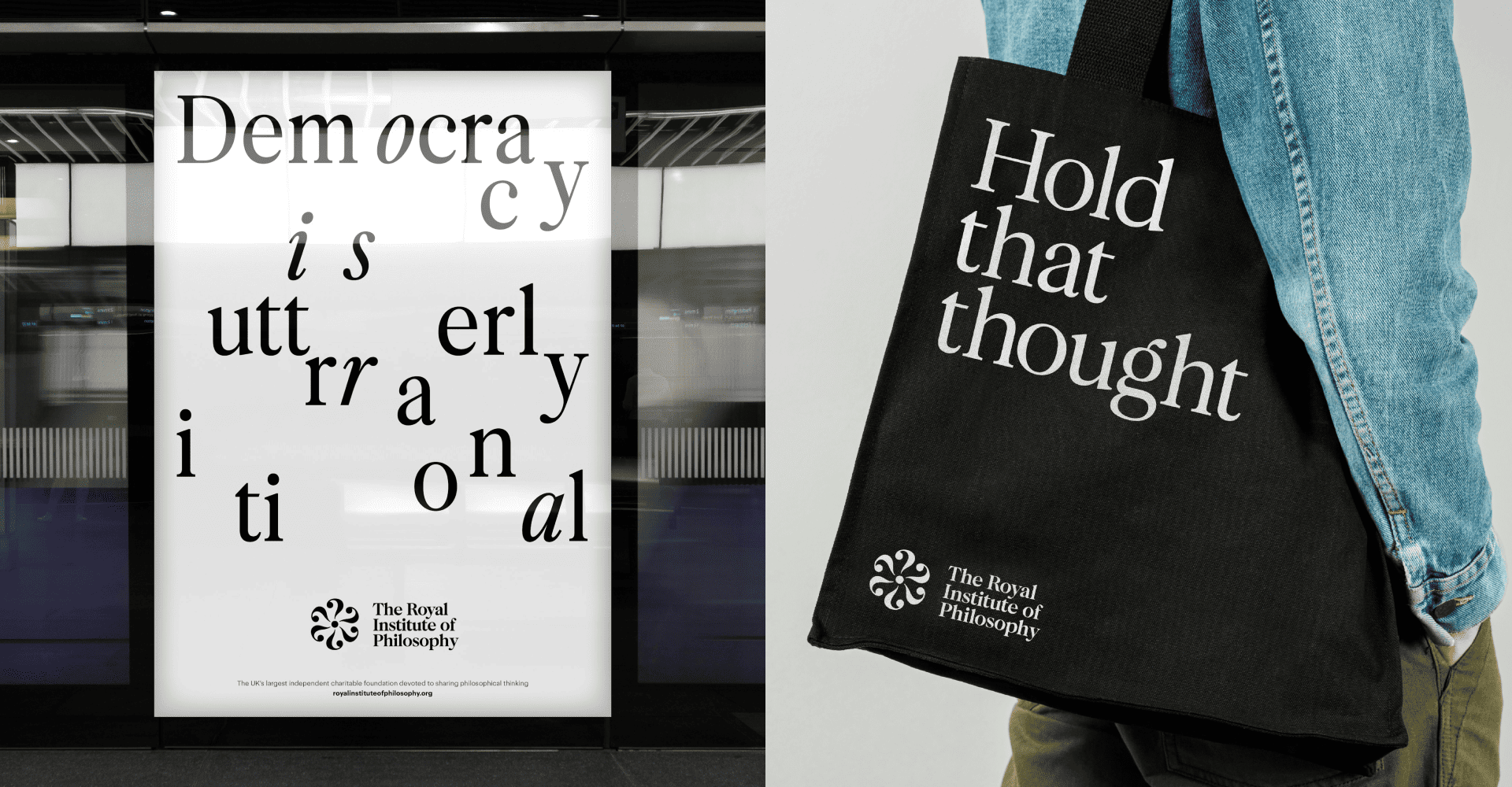
Typography is the main narrative tool for the Institute’s identity. Beyond using a glyph as the building block for their icon, there’s a whole typographic conversation going on across all touchpoints. The studio chose two distinct typefaces: F37 Calson and F37 Blanka, both under the F37 Foundry catalogue. F37 Calson, a refined serif, brings a sense of warmth and history to the identity. Paired with F37 Blanka, a modern sans serif, it creates a dynamic system that feels both serious and inviting.
Building a Brand That Invites
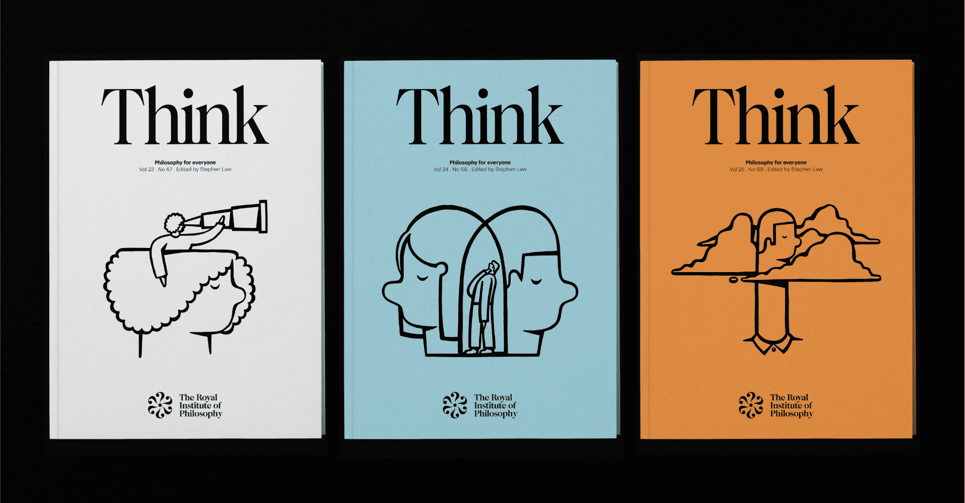
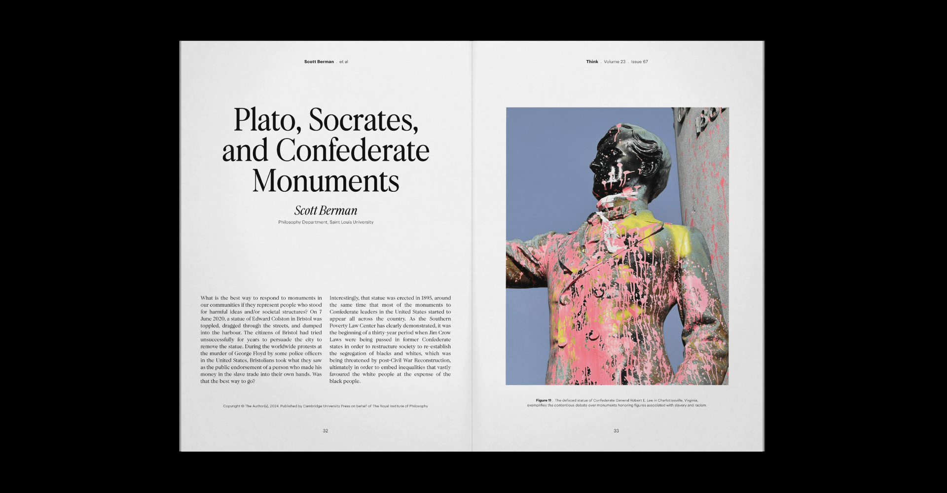
Only Studio’s work transformed The Royal Institute of Philosophy’s presence, from its website to its publications. They created a clean, timeless layout that ensures clarity and makes rich philosophical material easily accessible. The new design for the journal Think, for example, uses confident typography and layouts to make the content inviting, featuring illustrations by Beth Walrond. It brings to life the journal’s mission of making philosophy for everyone. This rebrand signals a new chapter for the Institute, one that is more ambitious and active in bringing powerful ideas to a wider audience.
A Legacy of Ideas
Founded in 1925, the Royal Institute of Philosophy was created to make philosophical thought more accessible to the public. For nearly a century, it has grown into the UK’s largest independent charitable foundation in this field. The Institute’s mission has always been to bring big, foundational questions to curious people from all walks of life, empowering them to think for themselves. This rich history provided Only Studio with a solid ground to build upon, ensuring the new identity honored the past while confidently moving into the future.
Only Studio’s own philosophy of simple is powerful shines through in this project. They are a branding agency focused on transforming complexity into clear, powerful ideas. Their meticulous approach to craft builds brands that stay relevant and gain significance over time, rather than chasing fleeting trends. For The Royal Institute of Philosophy, this meant creating a brand that stands out and connects with people by focusing on a clear, strategic concept, proving that the most direct ideas are often the most impactful. you can check out their website here.
See you soon amigos!
A Type of Ari.