The Brussels-Capital Region needed a brand that could tell its story on a global scale. Far from just a logo, this transformation was about capturing the unique spirit of a city known for its rich history and dynamic, multicultural energy. Brussels tasked Stoëmp Studio with creating a visual identity that could stand out to tourists, investors, and residents alike. The studio approached this opportunity by going straight to the source, conducting in-depth research to understand how Brussels is perceived by the rest of the world. Their goal was to move past traditional clichés and develop a brand that felt both timeless and progressive.
Understanding Brussels
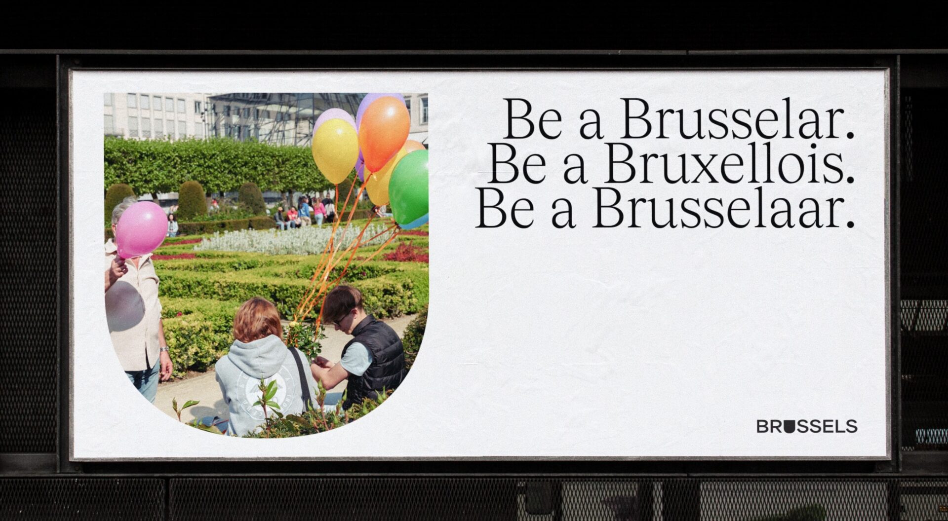
The project’s success was rooted in a strong strategic partnership between Stoëmp Studio and Resonance, a renowed team of global experts on place performance, completing more than 100 visioning, strategy, marketing and branding projects for destinations around the world. The goal was to unify Brussels’ fragmented identity, which had been diluted by a complex government structure. Through extensive pan-European surveys and meetings with over a hundred stakeholders, the team discovered that Brussels was seen as more than just a bureaucratic center. It was valued for its culture, history, and tolerance.
Using these insights, they developed the core concept of “Dare to be Yourself,” a brand platform that challenges existing perceptions and celebrates the city’s open, non-conformist character. This strategic foundation ensured that the visual identity would have a powerful, unified voice across all sectors.
A Visual Language of Motion and Connection
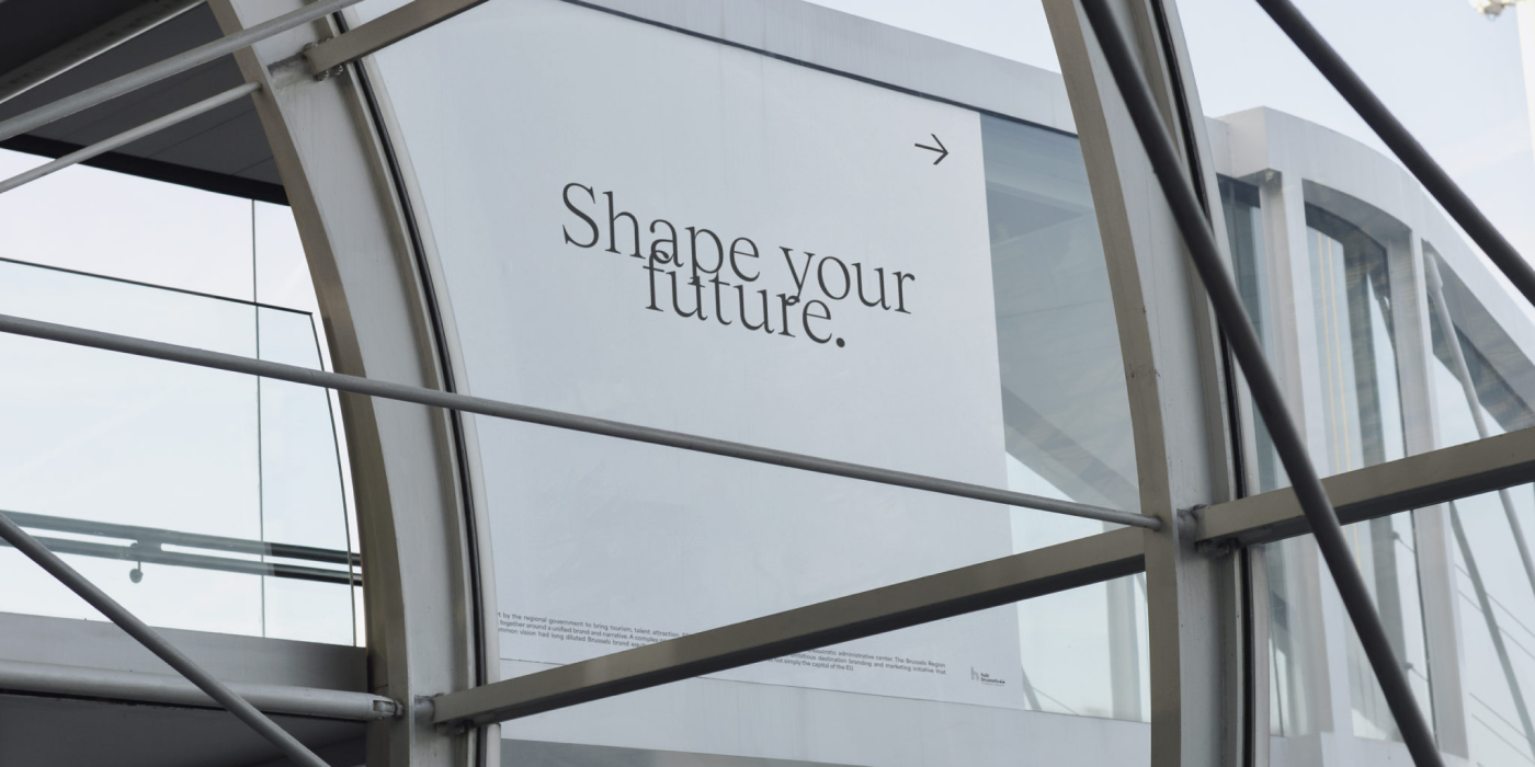
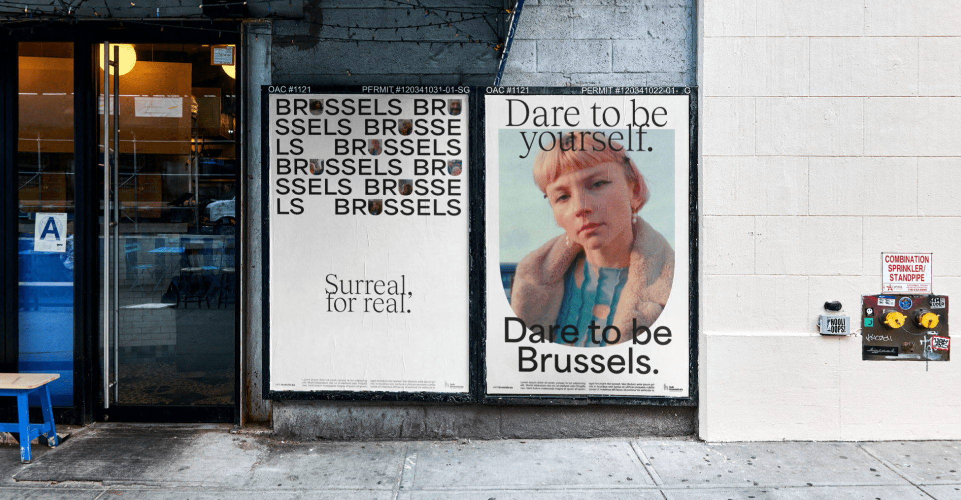
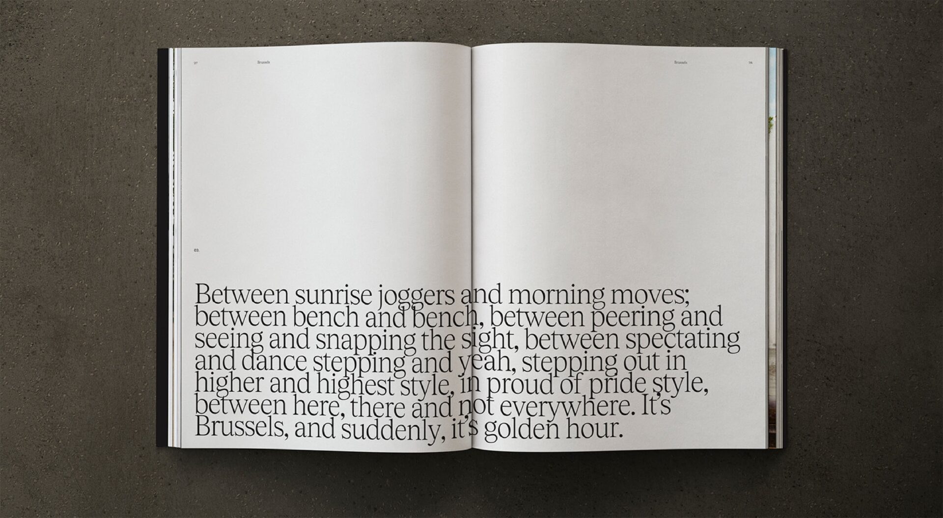
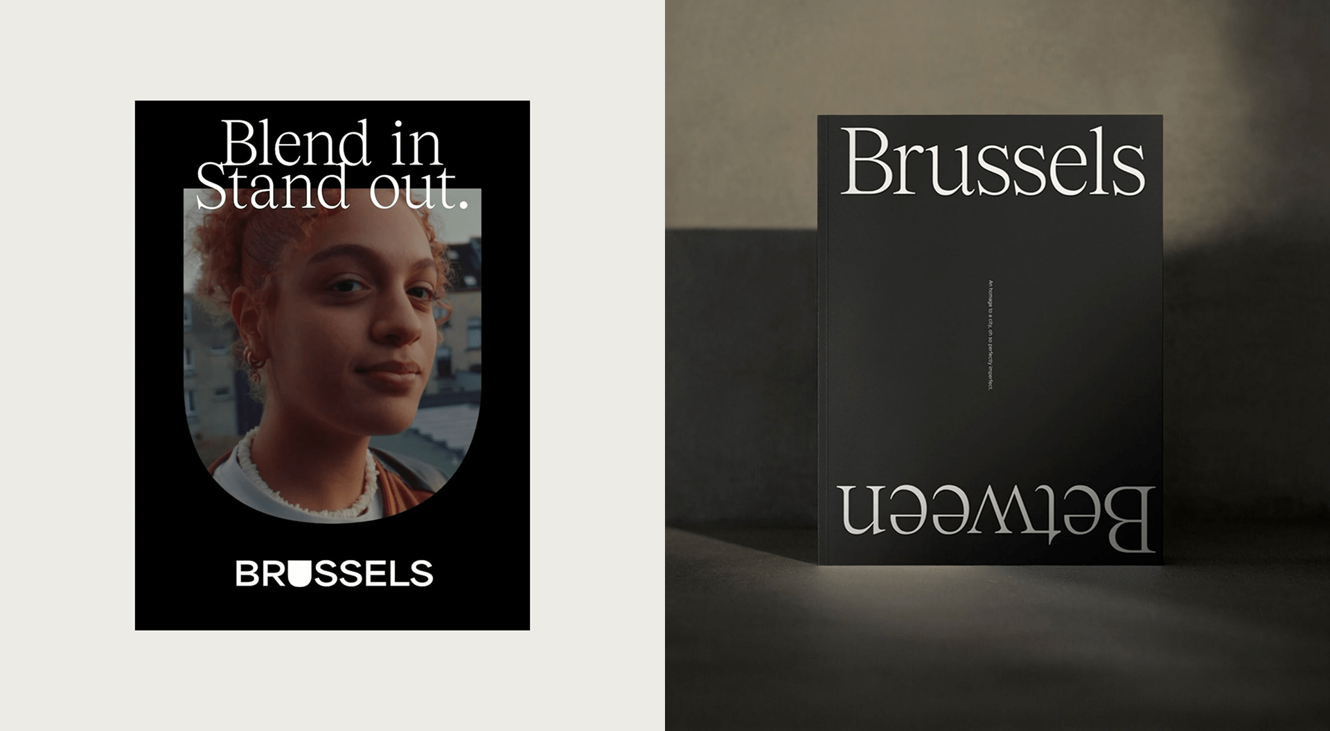
One of the most striking elements of the new Brussels identity is its use of typography. The identity features two main fonts: Tobias Light, a baroque inspired serif designed by Martin Vácha and Kristína Jandová for Displaay, and Area Bold, a grotesk sans-serif designed by Matthieu Salvaggio for Blaze Type. Stoëmp Studio turned their choices into a narrative tool. Letters are deliberately overlapped and intertwined, creating a visual rhythm that represents the city’s intricate layers and the harmonious coexistence of its diverse cultures and languages. This isn’t a mistake; it’s a symbolic gesture that reflects Brussels’ nonconformist nature, the Zinneke spirit, which refers to mixed dogs that roamed the streets of Brussels, evolving into a proud nickname for the city’s inhabitants, celebrating the city’s blend of cultures.
Remember our article about tracking in typography and how breaking the rules can be beneficial? This is a great example of how stretching the limits of typography can result in memorable visual statements.
The playful, dynamic typography serves as a metaphor for the city itself: a constant flow of new ideas and collaborations. It’s a smart and impactful way to tell a story without using any words.
The ‘U’ in Brussels
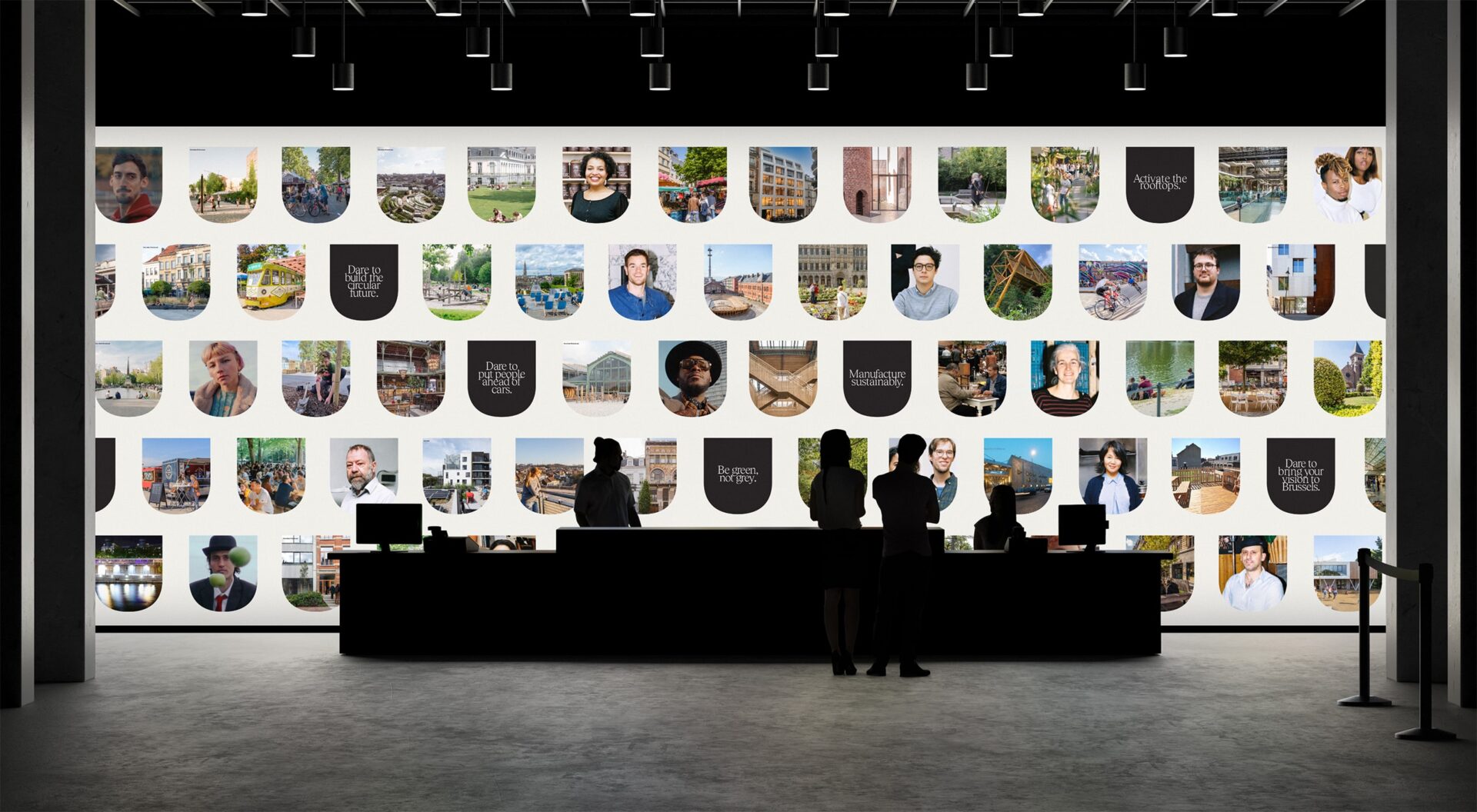
At the heart of the brand concept is the phrase, “There’s U in Brussels.” This simple but powerful idea places the individual right at the center of the city’s story. The identity is designed to be inviting, creating an immediate and inclusive connection with anyone who encounters it. This approach moves away from a top-down narrative, instead positioning Brussels as a place where everyone can feel they belong. The brand’s aesthetic, which is sleek and timeless, supports this narrative by focusing on storytelling and curated photography that emphasizes personal experience. It’s an identity that’s not just seen but felt, resonating with a global audience through its focus on human connection.
Stoëmp Studio, a creative agency founded in 2009, operates with a clear, human-centric philosophy. They see themselves as a sharp alternative to large, traditional agencies, focusing on radical simplicity and a direct, collaborative approach. Their design philosophy, which they call Mindful Minimalism, is all about stripping away the non-essential to let a brand’s core identity shine. You can check ther website here.
Creative Credits
Strategy: Resonance
Design: Gaetano Licata, Wojciech Szlachta, Hannah Lamarti
See you soon amigos!
A Type of Ari.

