The world of padel is expanding across the United States, and with that growth comes the need for brands that truly capture the sport’s unique energy. PADELHUB, a project by THE OFFSITE agency, sets a new standard for sports branding. Far from generic, its identity is a testament to thoughtful design, built for a community that thrives on motion, but also in connection and confidence.
New generations are redefining how we engage with sports. The focus has shifted beyond just physical effort; community and culture now sit at the core. PadelHub understood this evolving perspective, recognizing that to truly connect with its rapidly growing audience, a distinctive brand and visual identity would be essential. This insight became the driving force behind the project.

The Challenge: Elevating a Rapidly Growing Sport
THE OFFSITE faced a clear mission: create a distinct, user-centric brand for PADELHUB. The goal was to develop a complete brand ecosystem that resonated with padel’s fast-paced, social, and strategic nature.
The way sports brands look is totally changing, since audiences are seeking more than your standard local gym aesthetics. A thoughtfully curated brand, one that communicates beyond the obvious, is no longer merely an option, it’s a necessity. Although padel is a relatively new sport, its rise has been quite agressive and the market has been flooded with many similar visual solutions that are starting to tire users. PADELHUB needed something fresh that could help them trascend this emerging hub.

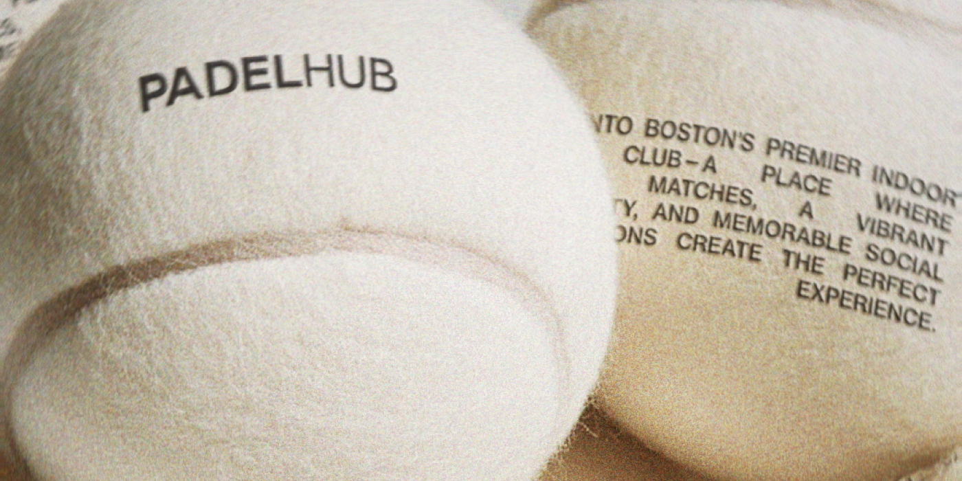
A Visual Language of Motion and Connection
THE OFFSITE’s solution is a bold visual identity, deeply inspired by the game itself. They built the brand on dynamic typography, striking contrasts, and a rhythmic layout system. They mix motion blurs with grainy scanner textures, creating an unique visual dialogue. This approach mirrors the back-and-forth flow and energetic movement on the padel court.
The result is a visual language that expresses not just physical energy, but also the vibrant, community-first spirit inherent in padel. It’s a brand designed to stand out, with strong visual recognition that can evolve as the sport grows.

The Typographic Foundation: Neue Haas Grotesk
Designed by Eduard Hoffmann and Max Miedinger in Switzerland, Neue Haas Grotesk was first released in 1957. It draws inspiration from older grotesk styles, popular among Swiss designers. The resulting font features distinct horizontal stroke terminals, a generous x-height, and tight spacing, giving it a dense and sturdy appearance. The typeface was famously renamed Helvetica for broader market appeal. While the digital version of the original Neue Haas Grotesk was lost for a time, Christian Schwartz undertook a restoration in 2010 to match Miedinger’s initial design.

This typeface grounds PADELHUB in modern clarity and strength, offering versatility across different applications. While Neue Haas Grotesk is mantained through all text sizes, each of its weights (Bold for headings, Medium for subheadings and Roman for body text) allow for hierarchy and differentiation. This typographic flexibility allows the fonts to command attention in headings, reflecting the decisive nature of the sport while ensuring readability in larger texts mantaining a consistent, refined voice throughout all brand communications.

PADELHUB’s compelling brand ecosystem is the work of a talented team at THE OFFSITE, with key contributions from Francisco Muñoz Correa and Macarena Torres Puga. Their expertise brought PadelHub to life, a brand that truly embodies the dynamism of padel. Make sure to check out the rest of their portfolio here.
See you soon amigos!
A Type of Ari.